Starting a New Quilt: Palm Fronds
I’m having great fun working on my latest quilt. It’s inspired by a photo I took on an outing with some friends.
Click any imagerfor a larger view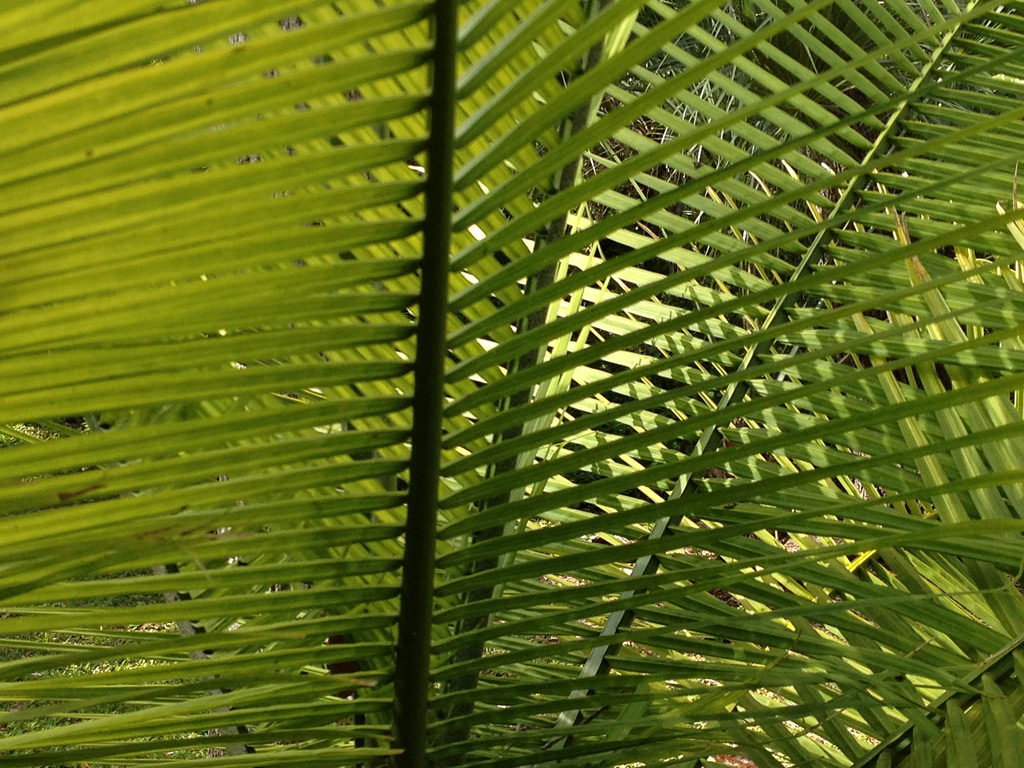
Don’t you love the way the spiky palm fronds cross? I think the contrasting values and the resulting shapes are very interesting.
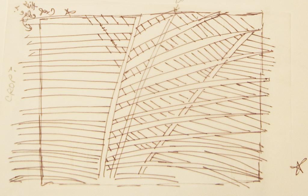
Although the photo already had a good composition, I spent a lot of time sketching the design. (Time well spent, in my opinion.) My big question: what can I leave out and still do justice to this image? This was my final sketch. I couldn’t wait to get started.
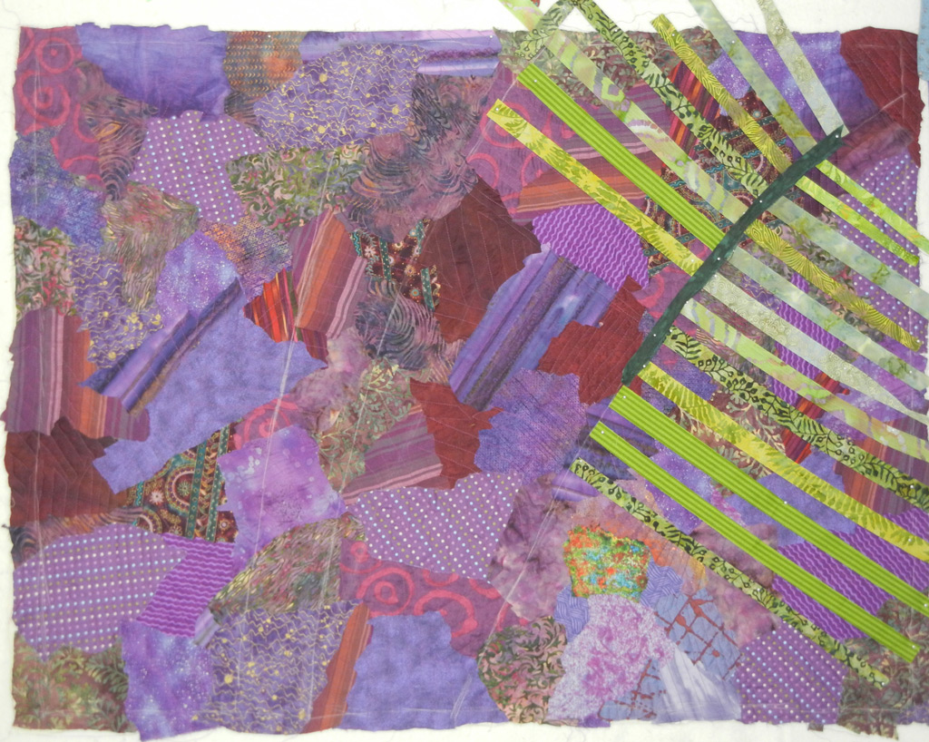
So, let’s see…if the plants are yellow-green, what color and value should the background be? Dark definitely. And maybe red-violet, the complementary color? Yes, let’s see what that looks like.
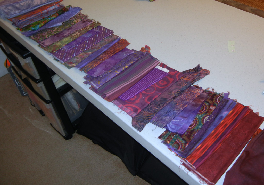
Of course, it’s not enough to plan/construct a background in isolation. You have to see what the COMBINATION of background and foreground look like together. So, a little fabric auditioning was in order.
Clearly, the lighter fabrics show up best. Good to know.
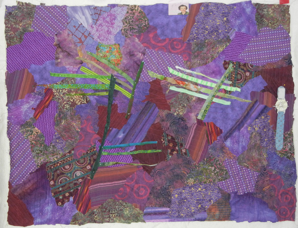
Finally, I sketched in the frond stems and set to work in earnest. Loved the colors. I was still undecided, however, on how wide each spike should be. I started them out at 1″, shown here.
What do you think? Too skinny?
Ellen Lindner

Don’t think they’re too skinny. But think one end should be tapered, maybe?
Thanks, Sally. I’m also considering the tapering (although the inspiration photo showed very little.)