


Abstract Exercises: Line and Composition
Continuing with my abstract exercises, I focused next on line. (Although I’d been using it since the very first exercise.)
What kind of line(s) did I like? What came naturally?
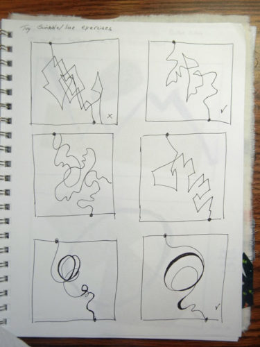
I’m still trying to figure that out. On the grid above, my favorite line is the one top right.
The next assignment was to use two shapes and add a line.
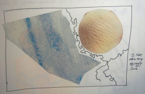
I love that little squiggly line above!
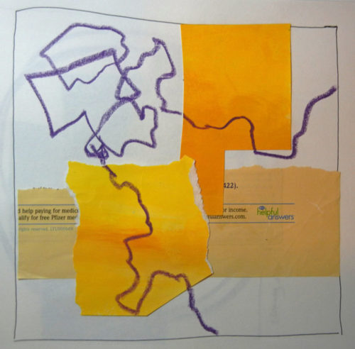
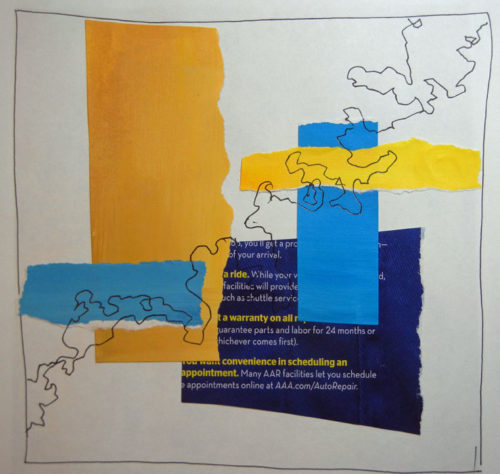
The next exercise required multiple shapes, arranged in a grid format, with line added. By now I found myself leaving space for the future line.
I was beginning to smile more and cringe less at my results. It was beginning to gel in my brain, I think.
Finally, I read (or saw?) something in the book that surprised me. First, some background: I’ve often heard that elements in a composition shouldn’t “kiss.” That is, they shouldn’t just barely touch. They should either clearly miss one another, or clearly overlap. Same for elements in relationship to the edge of the composition.
However, Jane’s work often has elements kissing. So, I decided to test the kissing, non-kissing concept. I cut out similar elements and made two different compositions. The first one had no kissing.
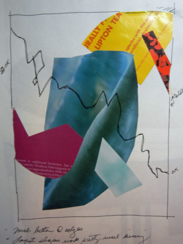
And I was pretty happy with it.
Next, came full on kissing!
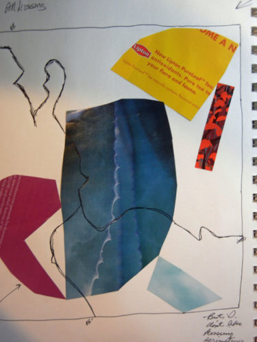
Hmm, to my surprise that wasn’t too bad. It had a certain edginess to it. I decided I might occasionally ignore the “no kissing” rule. But not at the edges. I didn’t care for that.
How about you: kissing or not?
Ellen Lindner


It seems that “kissing” makes the negative space pop out more. Kissing is negative? (LOL)
You’re right about that, Candace. I noticed it in the little space created by the fushcia shape. But, I hadn’t noticed it anywhere else until you pointed it out. Thanks.
I think that in your 2nd example, the ‘kissing’ results in elements that are disconnected from each other with no implied relationship. Interesting concept.
You’re right, Kristin: they definitely don’t relate as well. But, maybe that’s okay sometimes? I’m not sure. I don’t think I’d want a full composition with kissing. Maybe just a couple of elements.
I think the kissing thing can be exciting if carefully used. When each shape is kissing (or even separated) there is a loss of depth to the overall work.
You’re right that overlapping adds a sense of depth, Lif. Without it, depth would have to be achieved with colors, saturation, texture, etc. I hadn’t even thought of that with regard to the kissing issue. Thanks for getting me thinking.
I think the kissing elements could be considered the “repeated” element (unifying).
Hmm, maybe, Kara. Do you think the kissing one looks unified? I’m not sure that one thing would do the trick.
I think the kissing implies tension where as the overlapping is more comfortable or compatible. So I like limited kissing, maybe one that causes a rift or implies a boundary. Enjoying this, good work, I got the book but haven’t had time to dive in, can’t wait!
I think you’re right, Cindy. Which means the artist can choose either, depending on her desired effect. A new thing to think about! (Better than hurricanes for sure.)