Tag Archives | Collage

Featured Spotlight on Creative Whimsy

Creative Whimsy, a website about artists and their endeavors has just done a spotlight on me. How nice!

Ellen Lindner Artist Spotlight - Creative Whimsy. Adventure Quilter.com/blog

They sent me a ton of questions and I answered most of them. (I mean, you didn’t want to read PAGES about me, right?)

I was glad they asked about my process. I explained how I make decisions at the design wall, since it’s the part of quilt making I really like the most. I showed this series of pictures as an example.

Composing with an Eye Toward Value. Ellen Lindner, AdventureQuilter.com/blog

Composing with Value. Ellen Lindner, AdventureQuilter.com/blog

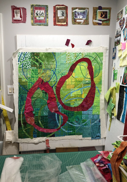
They also asked for a photo of my studio. So, I bravely walked in, LEFT EVERYTHING IN PLACE, and took a photo. This gives you an idea of what it looks like mid-project, although it’s usually much worse!

Ellen Lindner's studio 2024, mid-project. AdventureQuilter.com/blog

I hope you’ll check out the full article (and be willing to scroll past all the ads.)

Ellen Lindner

2

Adding Interest to a Background

My current quilt is progressing along nicely, (but slowly.) I spent a LOT of time piecing the background and was quite happy with it. But, I wanted to tie the background of angular shapes into the design more. Since I planned to use large circular shapes in the foreground I thought skinny circles in the background would add interest and unity.

First, I auditioned fabrics for the background circles. I wanted them to be fairly subtle. Maybe about 5 or 6 of them. I thought these would be pretty close. But is that darkest blue too dark? We’ll see.

Adding interest to a background. Ellen Lindner, AdventureQuilter.com/blog

I drew the circles on my computer sketch and used that as a loose guide. I spent a good bit of time cutting the fused fabrics and arranging the circles. Here, 3 of my planned 6 are in place. But not attached yet! I pinned everything and studied it before fusing the circles in place.

Adding interest to a background. Ellen Lindner, AdventureQuilter.com/blog

What do you think about the dark blue circle, top left? I think it stands out a little, but I think it will work.

And this is where I am now. The background circles have been fused on and I’m working on the two foreground circles. (The colors are actually much brighter and I’m in love with them!)

Adding interest to a background. Ellen Lindner, AdventureQuilter.com/blog

OK, what about that skinny blue circle now? I think it’s okay, since the strong red foreground elements will attract more attention.

One thing that didn’t work: a wheat stencil. Actually, the stencil itself worked fine. But, it was just too large and too different from everything else. I’ll save it for something else.

Piecing a Green Background. Ellen Lindner, AdventureQuilter.com/blog

I’ve been thinking about the title. This piece is about my parents. My working title was “Daddy Was a Farmer, Mama was a Southern Belle.” While that’s a great title, I don’t think it goes with the narrative of this story. I’ll simplify it and am still thinking about. Maybe I’ll use their names, the number of years they were married, or something along those lines. I can still reference farming and southern hospitality in the artist statement.

I’m getting close!

Ellen Lindner

0

Empty Spools: Lucy, Ellindale, and Phyliss

Here’s another report on my awesome Design Your Own Nature Quilt students, at Empty Spools.

Lucy was a delight. Like Katie, her only quilting experience was with simple piecing. The design concepts and construction techniques were completely new to her and she was very willing to learn them. Her inspiration photo was one she had taken herself. We talked about simplifying things by omitting a few trees and IMPLYING the distant foliage. Busy prints did the trick.

Empty Spools: Lucy, Ellindale, and Phyliss. Ellen Lindner, AdventureQuilter.com/blog

Since she added a dark border, Lucy added a narrow blue inner border on both the left and right. This kept the border and the left tree from merging together. The photo below shows the colors better. Can you tell that it’s quilted and faced? AND, it has the hanging sleeve already attached.

Empty Spools: Lucy, Ellindale, and Phyliss. Ellen Lindner, AdventureQuilter.com/blog

You can tell from her face that Lucy was very happy with her quilt!

Ellindale sent me a photo of a monarch butterfly, asking if it would work as a good inspiration photo. I said yes, but that I thought she should add one or more additional butterflies. She found a copyright free image of a butterfly with folded wings and added it to her sketch. She constructed the butterflies separately, so she’d be able to audition placement later. That really paid off, because she eventually turned the entire composition 90 degrees and came up with this.

Empty Spools: Lucy, Ellindale, and Phyliss. Ellen Lindner, AdventureQuilter.com/blog

She made a lot of progress in class, completing the quilting on the background (with added stems, butterfly antennae, and legs.)

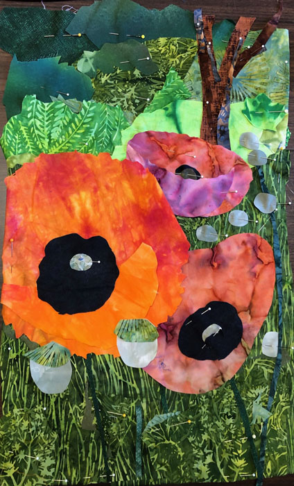
Late on the 4th day, Ellindale started playing around with a poppy photo and very quickly came up with this. Isn’t it striking? The photo only had 2 flowers, but she wisely added a third. She also enlarged the flowers quite a bit, which filled the space very nicely. Another great example of being INSPIRED by the photo, rather than controlled by it.

Empty Spools: Lucy, Ellindale, and Phyliss. Ellen Lindner, AdventureQuilter.com/blog

Phyliss had a photo that really spoke of a particular place. Where do you find prickly pear cacti and blue doors? That’s right, the American southwest. But, again, Phyliss altered some things from the photo.

Empty Spools: Lucy, Ellindale, and Phyliss. Ellen Lindner, AdventureQuilter.com/blog

She left out some of the cactus paddles and suggested the door with just a colorful shape. Also, Phyliss brought some lacy textured fabrics from home that she used for “flowers” (insects) and other details.

Empty Spools: Lucy, Ellindale, and Phyliss. Ellen Lindner, AdventureQuilter.com/blog

She added some detailed quilting and soon had a completed quilt. Like some of the others, she got hers faced and added a hanging sleeve before the end of class.

I’m so proud of what these ladies accomplished!

Ellen Lindner
P.S. I’ll be teaching the same class next year at Empty Spools, March 16-21, 2025. I’d love to have you in class!

0

Empty Spools: Carol, Larsja, and Barb

I’m just back from teaching Design Your Own Nature Quilt at Empty Spools Seminar, in Pacific Grove, CA. It was fabulous!!! The beach side setting was lovely, complete with historical architecture, wind-swept trees, and the sound of the surf.

Empty Spools Seminar. Ellen Lindner, AdventureQuilter.com/blog

But, of course, the real excitement was occurring in the classrooms. I had nine fantastic students who followed the supply list and packed their artistic courage. They worked outside their comfort zones and created very dynamic quilts. Each student brought one or more inspiration photos from which she designed her quilt. We often reminded one another of the class motto, “Be inspired by your photo, not controlled by it.” Wait till you see what they did.

Carol had a dramatic photo of a red flower. Single color flowers are often tricky, but Carol was able to work loosely, which helped immensely.

Empty Spools: Carol, Larjsa, and Barb. Ellen Lindner, AdventureQuilter.com/blog

For her second quilt, (yes, several students made TWO,) Carol chose an image of what we think are box fish. In her inspiration photo the two fish were on a black background. As you can see, she improved upon that quite dramatically, and energized the composition with more fish.

Scaling up from the sketch to the quilt is a little bit of a hurdle at first. Carol spent time making mock up fish shapes to help her get it right.

Empty Spools: Carol, Larjsa, and Barb. Ellen Lindner, AdventureQuilter.com/blog

Students used cardboard L shapes to help them decide on cropping.

Empty Spools: Carol, Larjsa, and Barb. Ellen Lindner, AdventureQuilter.com/blog

One day the students toured around the classrooms to see the various projects. Most of my photos will be the display boards from that event.

Larsja had a great tulip photo to start with. She wisely omitted several flowers and leaves to better show off the remaining ones. And to make the background (negative space) more interesting. And then check out that border! Don’t you love the “drawn” black tulips?

Empty Spools: Carol, Larjsa, and Barb. Ellen Lindner, AdventureQuilter.com/blog

Larsja really wanted to make just one quilt so she could get is mostly done. Sure enough, it’s almost completely quilted.

Like Carol, Larsja did a collage exercise with magazine pages. I’ll show you those images more clearly in a later post.

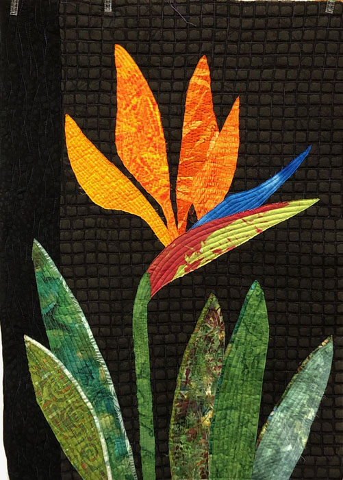
Barb used a photo of a Bird of Paradise blossom as her starting point. It was actually a double blossom, which made the distinction between petals hard to make out. Like Larsja, she omitted quite a few blossoms and did the same with the leaves. (She just scribbled over them on her photo.) She also cropped her inspiration photo quite a bit. (It’s folded on her board.)

Empty Spools: Carol, Larjsa, and Barb. Ellen Lindner, AdventureQuilter.com/blog

She finished quilting it in class. Isn’t it striking?

Empty Spools: Carol, Larjsa, and Barb. Ellen Lindner, AdventureQuilter.com/blog

It was all very exciting! More photos in the next few posts.

Ellen Lindner

0

Collaging with Magazine Pages

Do you ever hit a creative stumbling block? Or just don’t have the mental stamina to take on something major? How about a quick little collage with magazine pages.

I especially like doing this with calendar images. Since the images already relate to one another, it makes for easier going.

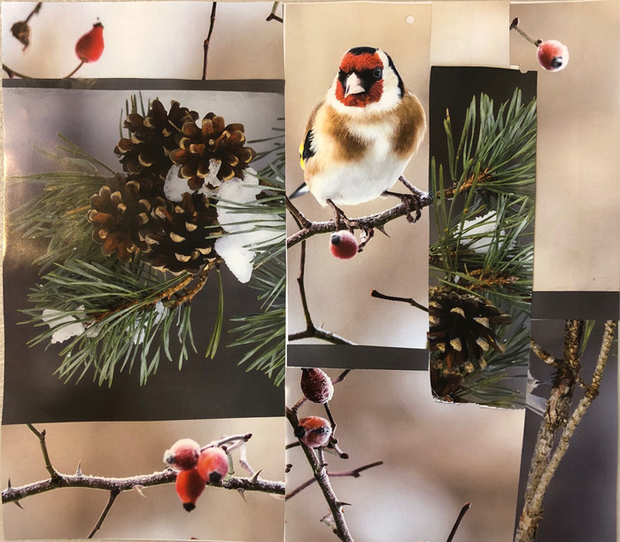
Here’s one I did with winter birds.

Collaging with Magazine Pages. Ellen Lindner, AdventureQuilter.com/blog

And with Western/Native American motifs.

Collaging with Magazine Pages. Ellen Lindner, AdventureQuilter.com/blog

These are NOT meant to be works of art. Or even inspiration for something else. They’re purely a playful exercise in arranging colors, shapes, and values. Just a moment of creativity. I love making them.

Of course, magazine pages are also great if you’re trying to make an abstracted version of something realistic. In that case, I tear the pages, knowing that everything will be somewhat imperfect: just what I need for abstracting.

Loosen Up with Torn Paper Collage. Ellen Lindner, AdventureQuilter.com

I’ve written several blog posts about this technique. See the links below.

Ellen Lindner
Links: Loosen Up with Torn Paper Collage
Torn Paper
Overcoming my Left Brained Tendencies
Three Cherries Complete


0

Designing in Maine, Part One

I recently taught two classes. One was “Design Your Own Nature Quilt,” and the ladies did a great job. The supply list includes artistic courage and they did not disappoint.

After a morning learning about design and preparing a sketch, the students start creating their fabric collages in the afternoon. It can be a little intimidating because it requires INTERPRETING their inspiration photos, rather than just COPYING them.

With only a few hours to work with fabric, they still made excellent progress on their quilts. Each student worked from her own inspiration photo, so each quilt was different and each student had her own issues to contend with.

Michelle’s photo was taken while canoeing on a very calm lake. I cautioned her about the subtleties of merging water colors, but she came with the right fabrics and was willing the spend the time needed to create her effects.

And this is where she left off. I think it’s very successful. Can you see all the time she spent shredding fabrics in order to give a feel of the water reflection? She’ll add French knots to emulate rivets on the point on the canoe.

Heather’s photo featured a favorite tree.

She cropped it to improve the composition and made excellent progress on her quilt.

Sharon chose a beautiful sunset.

She had to leave class early, but still made a good start on her piece.

Susan’s photo included two different types of flowers, with a foliage background.

She simplified shapes and made a good start on her quilt.

Jenn used a wonderful photo featuring lupines.

She knew she couldn’t easily replicate the entire image, so she cropped it down and simplified. She’ll be able to cut her flower petal/shapes more irregularly, which will speed things up.

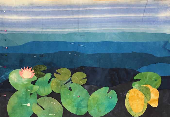
Charlene selected a VERY complex photo of lily pads and flowers. She knew she’d have to simplify and crop, so she got to work.

She still had her work cut out for her, but had no qualms about cutting many lily pads. As  you can see, it began to take shape nicely right away.

Won’t these be great? I’ll show you more quilts in-progress in the next post.

Ellen Lindner

4

My Version of Muted

Possible duplicate post

When putting away hand dyed fabrics, I noticed that my least favorites, the dark muted pieces, actually looked pretty good together. I decided to make a quilt with them, and to include a few accents of lighter colors. I was headed for a quilting retreat, so I packed up my potential fabrics to see what I could come up with.

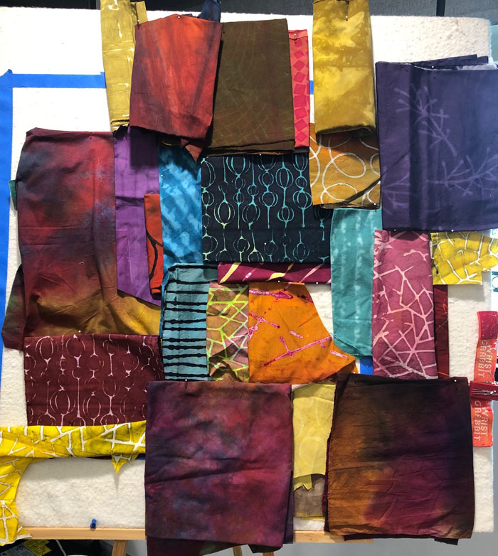
First, I wanted to get the color palette right.  I threw all possibilities up on my portable design wall and easel combo.

My Version of Muted. An art quilt in-progess. Ellen Lindner, AdventureQuilter.com/blog

Not bad, but I could see that some of these colors would need to be used in smaller amounts. See the next photo for modifications. Note that I scaled back a few of the brightest colors. (Ignore the blue tape.)

My Version of Muted. An art quilt in-progess. Ellen Lindner, AdventureQuilter.com/blog

I spent quite a bit of time getting happy with the palette. Then, I started joining fabrics in pairs. Next, I altered each pair in some way. Maybe I added a skinny line, a skewed alignment, or a curved seam. I call this process”slicing and dicing.”

My Version of Muted. Art quilt in progress. Ellen Lindner, AdventureQuilter.com

I continued adding alterations, trying to make each unit interesting. Other than making sure I mixed up the colors well, I didn’t think about composition, shapes, or joining. Once I was home, I assembled units into larger sections.

Finally, it was time to think about composition, size, and shape. I spread out units to see what I had. I was happy with the level of energy and interest, but I didn’t want a horizontal quilt. I knew I’d need to make additional units for the top and bottom, and to fill in some other places. No more random “slicing and dicing.” I was now designing “with intent.”

My Version of Muted. Art quilt in progress. Ellen Lindner, AdventureQuilter.com

Watch for my progress in the next post.

Ellen Lindner


0

“Toast and Jam”

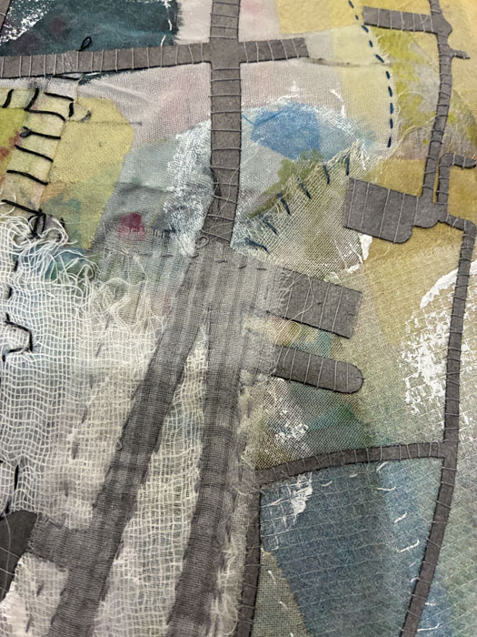
Remember that ugly exercise that I’ve been considering? This is the portion of my ugly painted which I selected as my inspiration for a small quilt.

Super Cool UGLY Exercise. Ellen Lindner, AdventureQuilter.com/blog

I played around with the individual elements in the computer and, at one point, accidentally colored the background red. Which I liked!

"Toast and Jam," and art quilt by Ellen Lindner. AdventureQuilter.com/blog

So, I started pulling fabrics and got to work. Actually, I got to work in a hotel room. This was my set up. Construction on the coffee table and Netflix on my laptop. With the iron at the perfect height, of course.

"Toast and Jam," and art quilt by Ellen Lindner. AdventureQuilter.com/blog

Once home, I stitched the background and fused up a bunch of fabrics for the background squares. (I fuse very seldom.)

"Toast and Jam," and art quilt by Ellen Lindner. AdventureQuilter.com/blog

I noticed that some of my lovely squares were attracting a lot of attention. I knew that wouldn’t work in the end, so I had to swap them out.

Eventually, I was happy with the background and started with the part I DID want to attract attention: the wonky open squares. This is a detail shot.

"Toast and Jam," and art quilt by Ellen Lindner. AdventureQuilter.com/blog

I added a little hand stitching, but that was difficult through the fused fabrics.

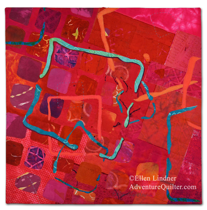
Here’s the full quilt, Toast and Jam, 24″ x 24″.

"Toast and Jam," and art quilt by Ellen Lindner. AdventureQuilter.com/blog

This was fun to work on, but I think I’m ready for something other than red!

This piece is available for $195 US. Contact me if you’re interested.

Ellen Lindner

2

Working on a New Class: Sticky Fingers

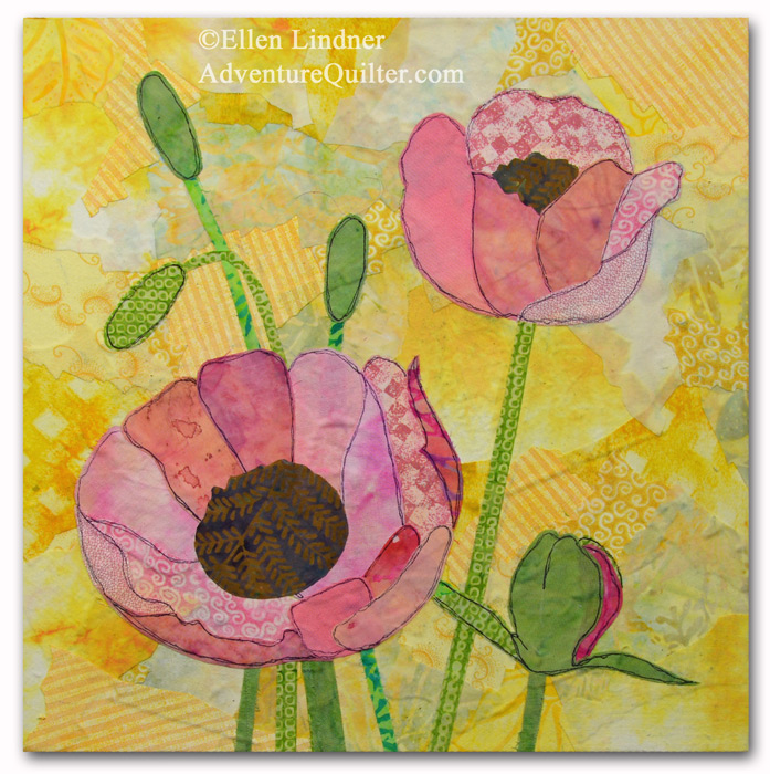
I’ve been BUSY getting a new online class ready to go. It’s called Sticky Fingers and it’s a glued collage technique. This is the class sample:

Sticky Fingers class project, taught by Ellen Lindner, AdventureQuilter.com

Sticky Fingers class sample. Teacher: Ellen Lindner, AdventureQuilter.com

I really love it.

For the purposes of the course I needed to make another one, so I could record it. And I chose pastel colors. VERY unusual for me, but I really like these bright and happy hues just as much.

Here it is, in-progress.

Sticky Fingers class sample. Teacher: Ellen Lindner, AdventureQuilter.com

Along with a very wet in-progress detail shot.

Sticky Fingers class sample. Teacher: Ellen Lindner, AdventureQuilter.com

And here’s the final result:

Sticky Fingers class sample. Teacher: Ellen Lindner, AdventureQuilter.com

Ooh, me likey! What do you think?
Which do you prefer?

This was really fun to make! (I have such a great job.) I’ll have the class published in a few days. Update: the class is now ready to en joy.

Full class details

I think you’ll really like it.

I’m getting excited!
Ellen Lindner
P.S. In case it’s not obvious: this is a non-sewing project. Anyone can do it!

6

“Beet Salad” Complete

Whew! After LOTS of rearranging and trial and error, I’ve finally finished this piece. And I’m quite happy with it.

The finished piece is 36″ x 26″. It’s available for $695.

The yellow in this detail shot looks a little yellow-green, but it will show you the circular quilting pattern, done both on the machine  and  by  hand.

I think it’s well named, don’t you?

Ellen Lindner
P.S. See recent posts about how I dyed the fabric for this, and in-progress construction photos.

14