

Short
Design Lesson
Using Layers
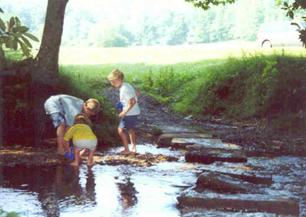
I love this old grainy photo of my son and two of his cousins building a dam in a cold mountain stream. Not only does it have sentimental value, but I think it's very narrative. The body language of these three clearly tells what they're up to.
One of these days, I'd like to make a quilt inspired by this photo, so I've been experimenting with the design. I've decided to crop the right side, but to extend the left. (The left extension helps with the placement of the focal point.) I've also auditioned several different arrangements of the key elements, the children. To do this, I created individual layers, placing one element on each.
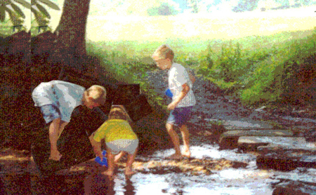
Layers can be physical drawings, or if you have the appropriate photo editing software, they can be digital layers. In my case, I started working with this image long before I had much computer skill, so I created layers with tracing paper, drawing a different child on each page. Later, I learned more about my software and transferred my tracing paper decisions to a digital format. This posterized* sketch is what I came up with. (I'll need to add some body parts for the boy on the left.)
Another way to make physical layers is with clear acetate, which is easier to see through than tracing paper. An inexpensive source for this is a clear plastic page protector. Simply cut it apart, creating two pages. Use a regular felt tip pen to trace each design element onto a seperate page. Move the pages around to find a pleasing arrangement, then photograph the result. You can wash off the acetate and use it again and again. (Test the pen first! It should wash off easily, with water.)
With any type of physical layer, remember that you can flip it over and reverse the item to its mirror image.
These days, I've mastered layers in Photoshop Elements, so I can use it for auditioning different compositions. (The following example is an excerpt from Design Your Own Nature Quilt.) The parrot photo, below, would be a wonderful starting point for a quilt. It has lots of great color, but also a few flaws.
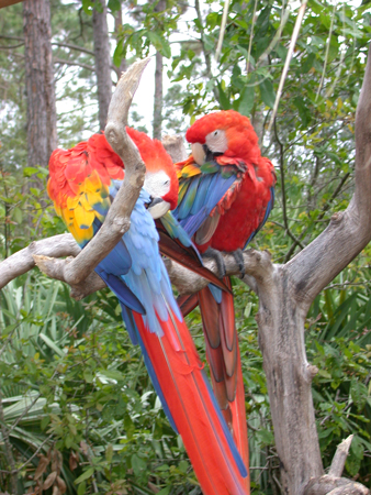
Let's digitally remove the foreground branch, and take a look at composition. To help with that, I've copied each bird to a seperate digital layer. (I've also "cloned" a few feathers to make each bird look complete.) I've simplified the background, so we can focus on the positioning of these two birds. Later, that can be added back in.
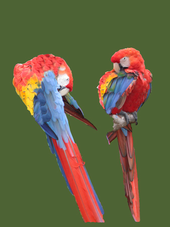
Now, I can alter and rearrange these two layers to my heart's content. I can move the two birds anywhere, tilt them, or flip them to a mirror image. In addition, I can change each layer, perhaps resizing, or adjusting color and contrast. In the version below, I've made the left bird slightly smaller, so that it no longer appears to be in front, and I've cropped it horizontally. This is one of endless possiblities. Maybe there needs to be a third bird. If so, I could duplicate the one on the right, but maybe cut and paste the head so that it's facing the other way!
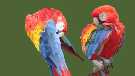
There are non-stop options for any image. Using layers is an easy and effective way to consider them.
*Posterize is a feature in Adobe photo editing software which converts shaded colors to obvious chunks of a few colors. I use it a lot, for designing.
©2007-2012 Ellen
Lindner
|