
Backgrounds by Design
Part One: Contrast.

What's the subject of your latest quilt? Is it something representational, like a plant or a person? Or is it purely geometric or abstract? Either way, the background and foreground elements must work together to make a design work. That's why quilt backgrounds deserve just as much thought as other design elements.
A good quilt background does two things: it enhances the foreground design and it adds interest. In that order. The main function of a background design is to provide contrast with the primary imagery/design. That contrast can be subtle or bold, based on your personal preferences.
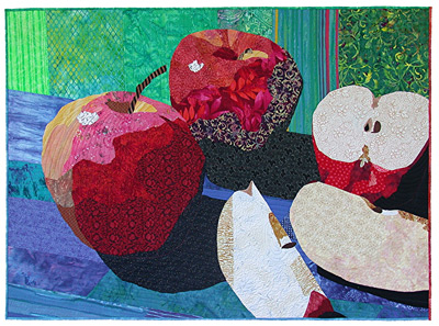
A common way to provide contrast is with color. “Apple Still Life," above, is a good example of this.
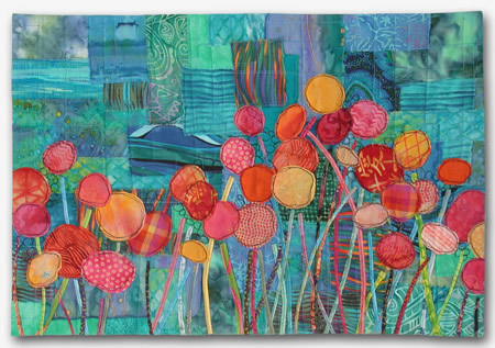
“Blossom Boogie,” at right, utilizes this concept, as well. With both quilts the background colors provide a high degree of contrast, setting off the foreground elements beautifully.
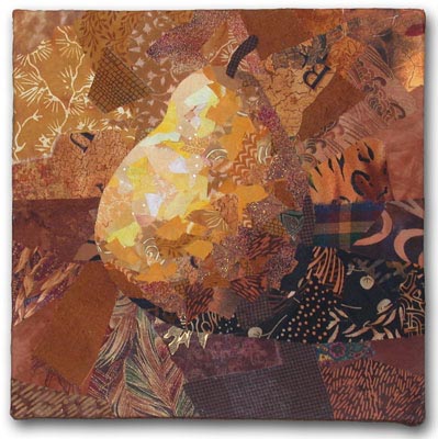
Another form of contrast is value, (light and dark.) In “Gold Pear,” at left, the same color was used throughout. With only value variations to provide contrast, the effect is subtle. As a matter of fact, it was almost too subtle. As I was working on it, the pear began to merge into the background on the right side. I had to increase the contrast by making the background lighter in that area.
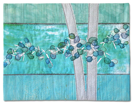
“Rhapsody in Blue Berries,” at right, also uses a background of a different value. It’s lighter than the berries and darker than the tree trunks, providing contrasts both ways.

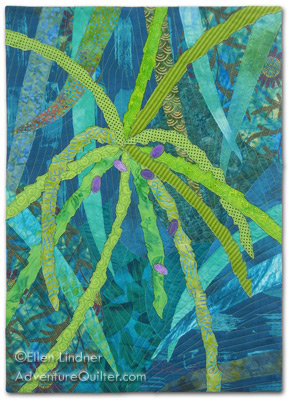 Most quilts will have both contrasting colors and contrasting values in the background. For example, see “Sketching in Silk #3,” at left, and “The Last Few Dates,” at right. Although different palettes are used, both quilts have contrast provided by both concepts.
Also note that they both have backgrounds of dark blue-green, but they do not have the same amount of contrast. That’s because it’s always about the combination. In the left quilt, the tan foreground provides a very high contrast. But, in the right one, the foreground color is much closer to the background one. Two different combinations yield two different feelings. Either way, there MUST be some level of contrast in order for the foreground design to show.
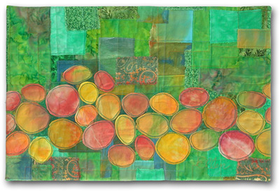
Another way to add contrast between the background and foreground is to vary the intensity, or brightness, of the colors. Bright colors always get more attention than dull ones, so if the background is created with slightly duller fabrics, this will help show off brighter foreground elements. These next two quilts are examples. Both have similar color themes: a yellow-green background and foreground elements of yellow-orange and/or orange. In “Tropical Fruit,” at right, I was inspired by the colors of mangoes. Therefore, I used fairly bright colors throughout. And I’m happy with the result.
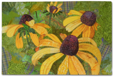
But, with “Blessings Underfoot,” at left, I really wanted to emphasize the flowers only. So, I use yellow-green fabrics that were duller and darker, to help set off the yellow-orange flowers.
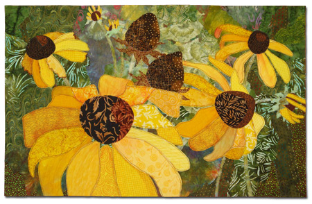
Depending on the values and colors of your design, the background plan may need to change from one spot to another. As with “Natural Progression,” at right. Originally, the background was a pretty consistent value throughout. However, it was quickly obvious that the dark seed heads in the center of the quilt weren't showing up. The solution was to lighten the background in that area, thereby creating the needed contrast.
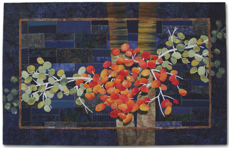
With any background plan it’s important that printed background fabrics don’t merge into the foreground elements. For instance, look at “Ripening,” at left. I had some great printed fabrics I would have liked to use in the background, but I didn’t want them to blend into the berries. So, I used near-solid fabrics in most areas. I was still able to use a few prints, placing them in the open areas of the background. This avoided any conflict with the foreground design.
I used the same idea in several other quilts in this article. Can you identify a quilt with plaid fabrics on the perimeter only? And another with a busy print seen only on the sides? (I haven't always been aware of this principal, so there's a least one quilt in which I could have done better. But, now I know: paying attention to contrast is the key!)
Of course, any quilt background should do more than just provide contrast. It's also an opportunity to add interest to your quilt, and to visually support the primary design.
Read Part Two to learn more about this.
If you found this information useful, you may be interested in my other free articles, online classes, and e-books. You'll find a full directory here.
©2013 Ellen
Lindner
|