My Chicago area “Design Your Own Nature Quilt” students brought their artistic courage to class, and made some really great work. (These photos were showing on my computer when photographed. The quality is sometimes low, but you’ll get the idea.)
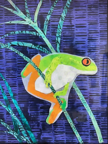
Sue did a great job with her tree frog. She constructed him with fusible web on some release paper. (See the white outline?) Once she removes that he’ll be a little slimmer.
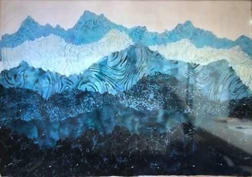
If I remember correctly Terre had never made an art quilt before. But, didn’t she do a great job? She fully embraced “jagged cutting” the mountain tops, which worked beautifully.
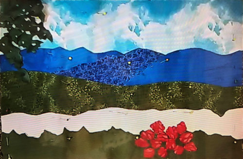
Deborah had never made any sort of quilt before! However, she bravely embraced fusible web, jagged cutting, and abstracted rhododendron flowers. (Don’t they look better than some perfect fussy cut version?)
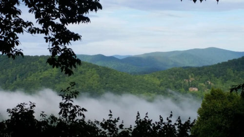
Deborah’s inspiration photo.
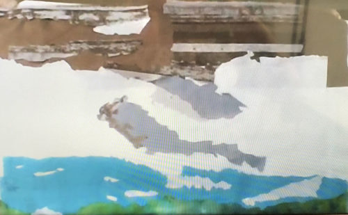
This photo of Susan’s work doesn’t begin to do it justice. She’s working on a rock face, snow with shadows, a lake, and – the missing items – tall evergreen trees. It’s going to be a lovely composition.
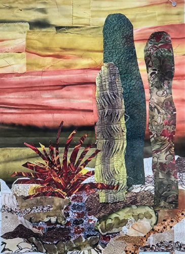
Beth took a lot of artistic license with her cactus grouping, which worked really well. She had a pleated scrap that made great texture for one of the plants. See her finished piece in the “Design Your Own Nature” gallery. (Link at bottom of post.)
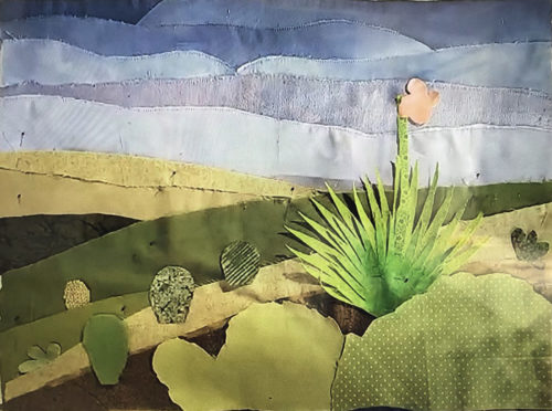
Cindy also worked on a desert scene. She used mostly solids to capture the austere beauty. She’ll use fusible web to secure the spiky plant. Won’t it be great?
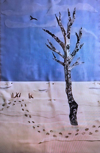
Although Frances’ image was simple in composition, it wasn’t simple to construct. She did an excellent job capturing the subtleties of variation in the sky and snow.
My students always do an awesome job and these were no different. It sure makes it fun for me!
My latest quilt has been coming together nicely, even though the fabrics are a little bit diverse. The colors, patterns, and values of the fabrics have dictated what looks good where and the fabric sizes have determined what will actually fit where. Things evolved on the design wall as I folded and auditioned fabrics in…
The supply list for my class, Design Your Own Nature Quilt, includes artistic couraage, and the ladies in Venice, FL brought it in spades! During our two day class they didn’t even whimper. 😉 But, they DID make some extraordinary quilts. Let’s start with Helen, who was taking her first ever quilt class. (These images…
In my last post, I showed you how I abstracted a photo to create a new design. This was my computer-colored sketch, although I knew I’d kick up the colors a good bit. Soon, I was on to fabric selection. I spent a good bit of time on this, since I knew the value contrasts…
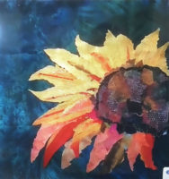
Two students brought photos of sunflowers as their inspirations. This was Jo-Ann’s. She needed to make a long skinny piece to fit a particular backing so she was NOT controlled by her photo. She edited it very successfully. Here it is before stems are added. Isn’t it vibrant and lively? After her first wonderful piece,…
After cutting my primed slats to length it was time to add the D rings. The venue wanted the D rings set wider than the sleeve, so I measured accordingly. This was my prototype. I checked to see that it wouldn’t show from the front, (using my test set up in the garage.) I found…
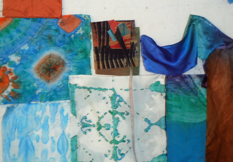
I’m very comfortable using commercial and hand-dyed fabrics in my creations, but I have a few quirky fabrics that I have to treat differently. Things that ravel, ones that melt, and thin silks. I recently pulled out a few of these to think about how I might use them. The yellow-green fabrics are the result…