My Chicago area “Design Your Own Nature Quilt” students brought their artistic courage to class, and made some really great work. (These photos were showing on my computer when photographed. The quality is sometimes low, but you’ll get the idea.)
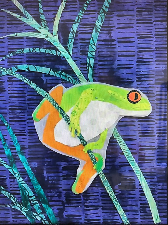
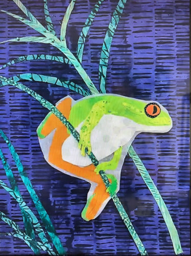
Sue did a great job with her tree frog. She constructed him with fusible web on some release paper. (See the white outline?) Once she removes that he’ll be a little slimmer.
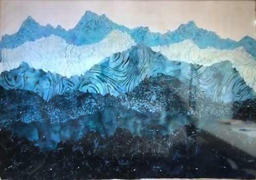
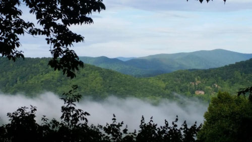
If I remember correctly Terre had never made an art quilt before. But, didn’t she do a great job? She fully embraced “jagged cutting” the mountain tops, which worked beautifully.
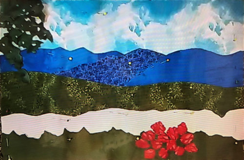
Deborah had never made any sort of quilt before! However, she bravely embraced fusible web, jagged cutting, and abstracted rhododendron flowers. (Don’t they look better than some perfect fussy cut version?)
Deborah’s inspiration photo.
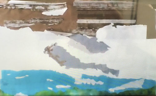
This photo of Susan’s work doesn’t begin to do it justice. She’s working on a rock face, snow with shadows, a lake, and – the missing items – tall evergreen trees. It’s going to be a lovely composition.
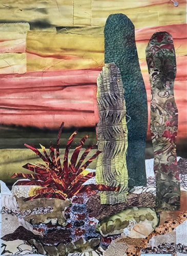
Beth took a lot of artistic license with her cactus grouping, which worked really well. She had a pleated scrap that made great texture for one of the plants. See her finished piece in the “Design Your Own Nature” gallery. (Link at bottom of post.)
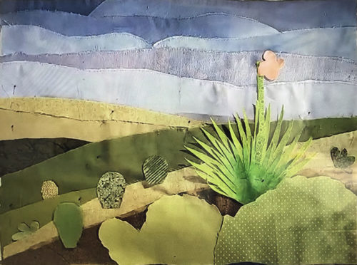
Cindy also worked on a desert scene. She used mostly solids to capture the austere beauty. She’ll use fusible web to secure the spiky plant. Won’t it be great?
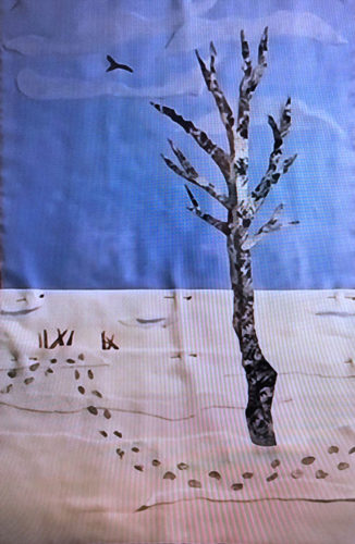
Although Frances’ image was simple in composition, it wasn’t simple to construct. She did an excellent job capturing the subtleties of variation in the sky and snow.
My students always do an awesome job and these were no different. It sure makes it fun for me!
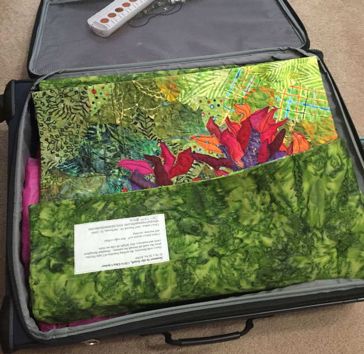
One third personal, one third class stuff, and one third quilts: that’s about the ratio of my luggage contents when I travel to teach. Since I want the quilts to arrive with a minimum of wrinkles, so I’ve developed a way to let each one pad the crease of another. I start with the one…
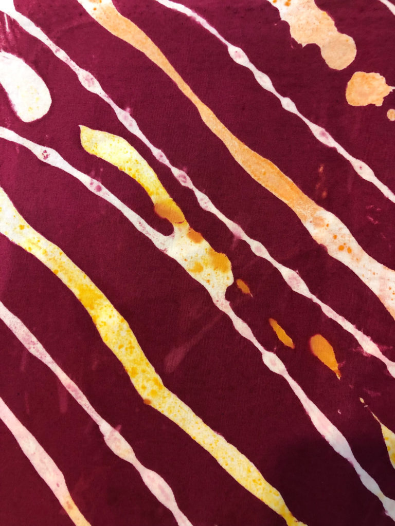
When dyeing fabric, it’s not at all unusual for me to wash out a fabric, decide it needs more, treat it (again) with soda ash, and continue on. Such was the case with this one. The eyeballs/ovals on this piece were originally pale yellow. Well, that was just creepy! It looked like a lot of…
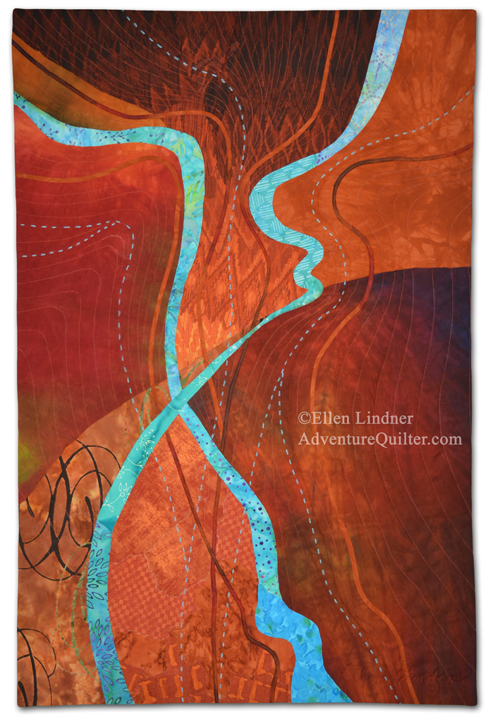
My latest artwork, Deliberation, is complete. I’m quite happy with it and I really enjoyed creating it. I did deliberate (get it – deliberate?) quite a bit over the title. It does look like an overhead view of rivers and many people suggested titles with that in mind. That would have been fine, except I wanted…
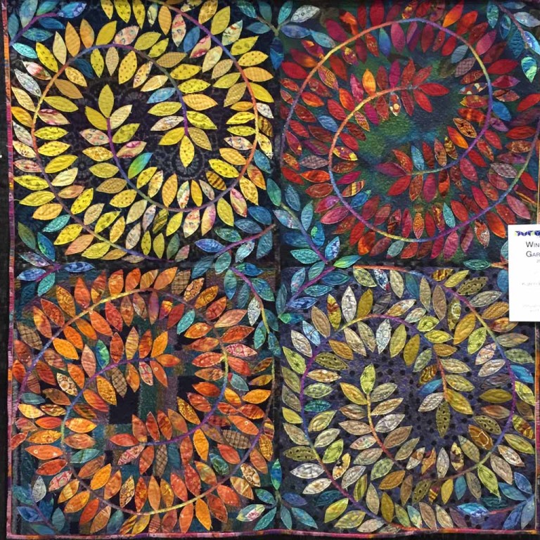
A little more eye candy for you from the AQS Daytona show. This is Petals in the Wind by Cassandra Ireland Beaver. (Sorry for the fuzzy phone photo.) There is no black in this quilt. The black you see are holes which show the black curtain behind. Wouldn’t this be pretty against a pale wall,…
Sometimes I dye specialty fabrics: those that are almost a full design and that will be big players in a future design. After a class with Pat Pauly, I’m now designing such fabrics to have larger patterns. (These are harder for me to use, but do wonderful things in a composition, once I get it…
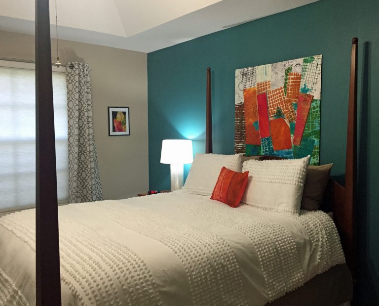
I recently redecorated my bedroom and I’m LOVING the results! Here’s the bed wall, with my quilt Rhythm of the City prominently displayed. More of my work moving across the window wall. This is Croton Leaves 3. Continuing to look left, a corner featuring my paper collage Three Cherries. And, to complete the artwork roundup, at the foot…