

A Completely New Palette
Well, this is a surprise. Who thought I’d ever work with black, grey, and some gold accents? But, that’s exactly what I’ve been doing. It all started when I purchased some commercial fabrics with a hand-dyed look: big black circles and a great grungy grey. I pulled out all the fabrics I thought MIGHT work. (This stage is typically ugly, but I don’t want to overlook any good contenders.)
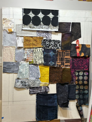
I culled the obvious outlyers (is that a word?) and found a great gold in my stash. Better.
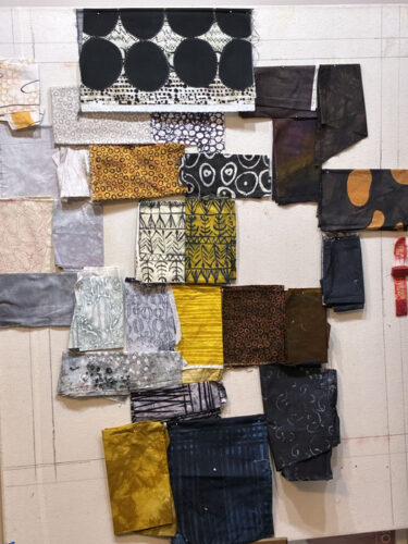
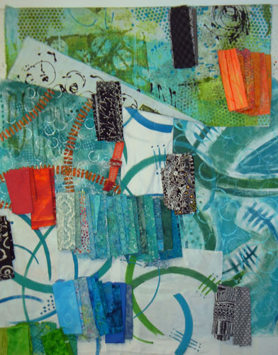
This was the final selection. I arranged them in what I thought the overall color proportions might be. Not bad! That gold accent excited me. I knew I wanted to use some fairly large undulating gold shapes somewhere.
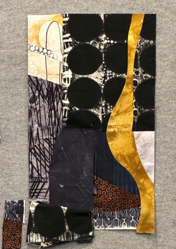
And that’s where I started. In my improv process I make units to get going and this was number one.
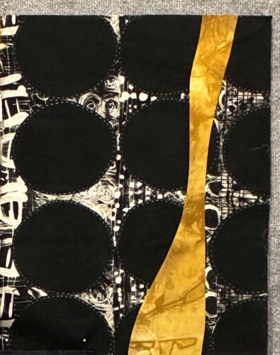
Ooh, I loved it so much I almost wanted to stop there. I was very happy with the gold shape and the contrast between the colors. I knew I was on the right track.
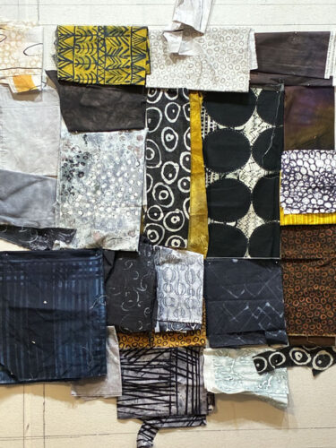
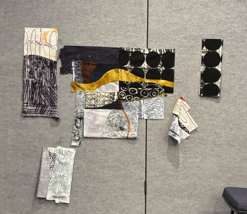
I made a few more units, including one that extended the gold shape. It was going nicely. Then, I went to retreat and everything got pinned up to the fabric covered walls. How convenient!
I turned it horizontally, just to explore all options. Several retreat-goers in the room commented that they liked the horizontal orientation better. But, I wasn’t sure. I still had that first vertical shape in my head.
You can see other units that I created, below.
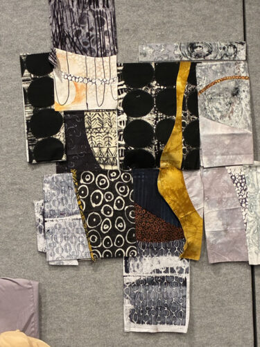
Nope. Back to vertical. And lots of trial and error. In the photo below the two units with the gold shape are partially stitched together. All other units are just pinned in place.
Time to head home: I had to take lots of photos and thorough notes to figure out how to get this home and put back together.
Back home, I decided to make it longer. Which meant I’d probably need another undulating gold shape. I began to audition that idea.
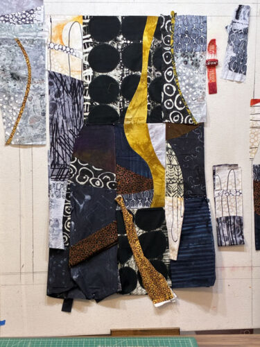
I found myself using much more of the dark fabrics than the grey ones. Some of those grey units would probably not get used. Stay tuned to see where this goes.
Ellen Lindner
P.S. The commercial fabrics I used were designed by Marcia Derse.


Happy New Year Ellen
I have to say this is my favorite one so far……I love the color combination and abstract feel. I myself have ventured in the abstract creativity mode
With my sewing/painting. I love black, white, gray and a splash of something ………..
Valerie
Thanks so much, Valerie! Maybe I’ll do some more “dull” pieces. 🙂
And thanks for commenting, too.