My husband and I recently had our kitchen remodeled and I’m loving it!
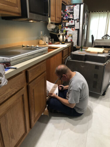
I did a very poor job of providing a before photo. This one of my husband installing the oven will give you the idea: oak cabinets, aqua wall, no backslash, no cabinet hardware, and formica counter tops. It was time!
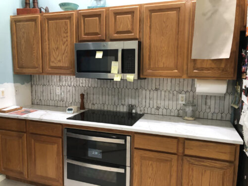
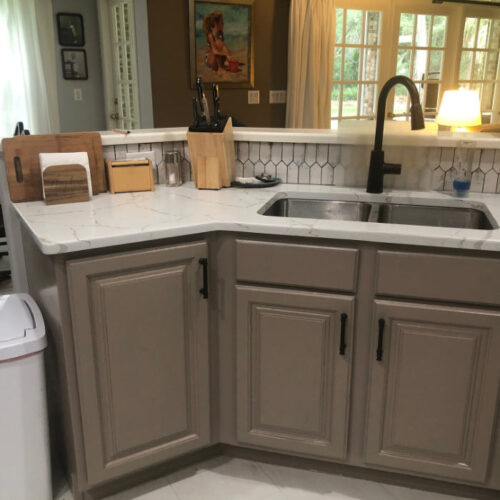
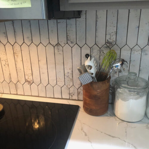
Adding quartz countertops and an awesome backslash really changed things for the better!
Look on the left of that photo above and you’ll see the old aqua paint. On the right you’ll see me auditioning cabinet colors.
We got a new induction cook top and electric ovens. (Two smaller ones.) I’m enjoying these new cooking options.
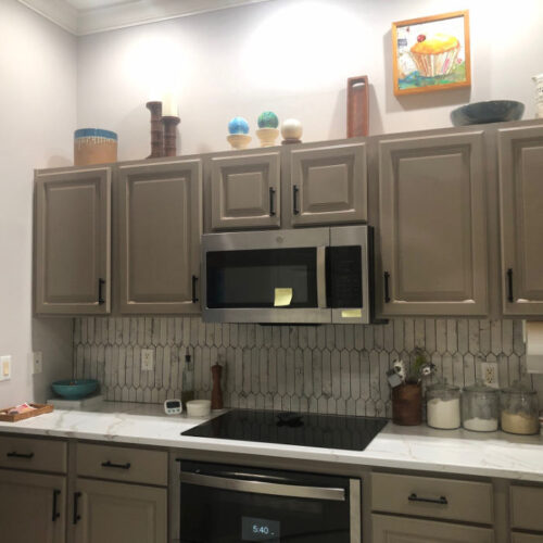
Finally, the walls were painted a very pale gray and the cabinets a taupe. Black cabinet handles and a black faucet finished things off.
An under counter sink improved the look much more than I anticipated.
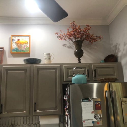
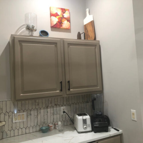
Continuing around the room…
I LOVE the back splash and used it as the jumping off point for all other decisions.
I’m really enjoying the changes AND cooking more!
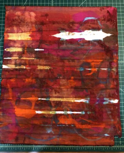
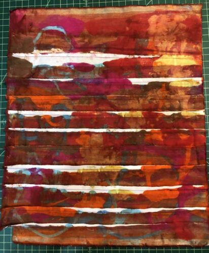
And, in case you’re wondering: all of this is dye proof and cleans up easily. I’ve already tried it out.
Ellen Lindner