“Floral Improv” in Peachtree City, GA

There was lots of energy, colorful fabric and fun when I met up with the quilters of the Southern Crescent for a “Floral Improv” class.

Floral Improv in Peachtree City GA. Ellen Lindner, AdventureQuilter.com/blog

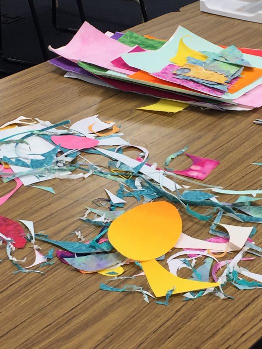
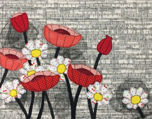
First, students learned how to make free-form “daisies” and “poppies.” No rulers or patterns, please!

Floral Improv in Peachtree City, GA. Ellen Lindner, AdventureQuilter.com/blog

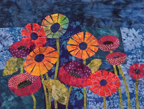
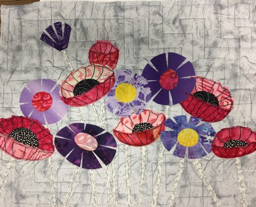
Evie chose bright colors with a darker background.

Floral Improv in Peachtree City, GA. Ellen Lindner, AdventureQuilter.com/blog

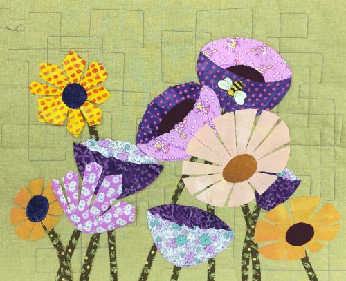
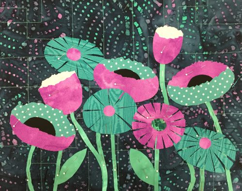
Ellen chose complementary colors

After creating their flowers, students learned about composition as they arranged all their elements and added stems and leaves. Some liked high contrast foliage.

Floral Improv in Peachtree City, GA. Ellen Lindner, AdventureQuilter.com/blog

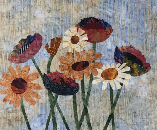
MJ’s stems added a lot of contrast so she decided to omit the leaves

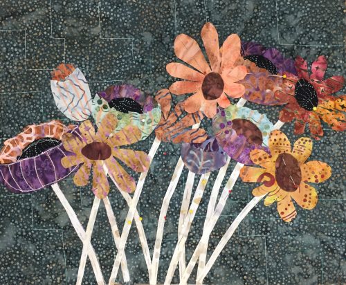
Others wanted very low contrast.

Floral Improv in Peachtree City,GA. Ellen Lindner, AdventureQuileter.com/blog

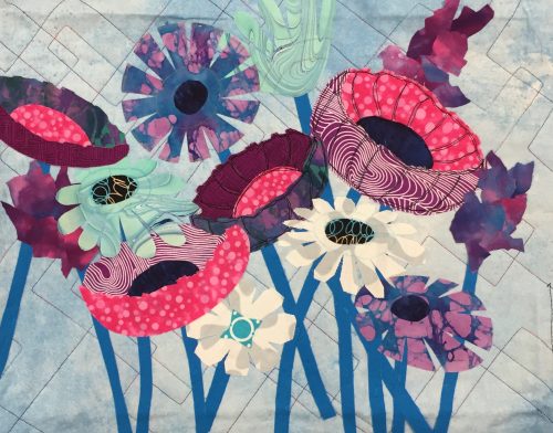
Brenda opted for vibrant flowers and played down the vegetation.

Students carefully considered each option and made their own decisions at every turn.

Floral Improv in Peachtree City, GA. Ellen Lindner, AdventureQuilter.com/blog

Sherri’s sherbert colors and dark contrasts really popped.

Floral Improv in Peachtree City GA. Ellen Lindner, AdventureQuilter.com/blogSteph chose subdued colors and they worked beautifully.

Floral Improv in Peachtree City, GA. Ellen Lindner, AdventureQuilter.com/blogCandy selected both high and low contrast flowers.

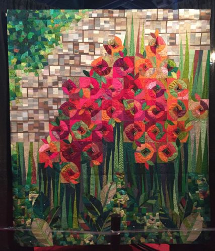
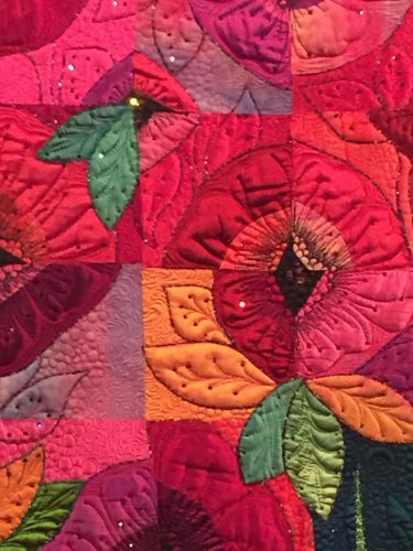
After fusing everything in place it was time to add contrast stitching (usually black) to the poppies. Can you see how it adds definition?

FLoral Improv in Peachtree City, GA. Ellen Lindner, AdventureQuilter.com/blog

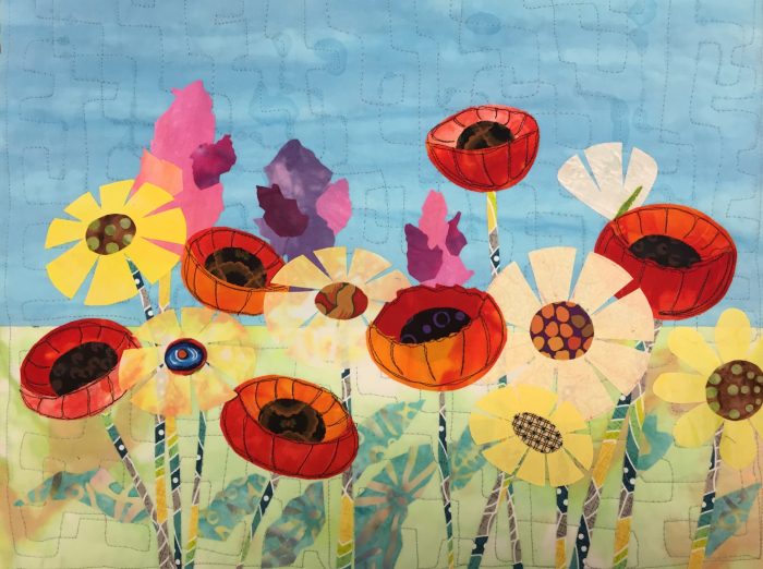
Kathy’s garden even had a horizon.

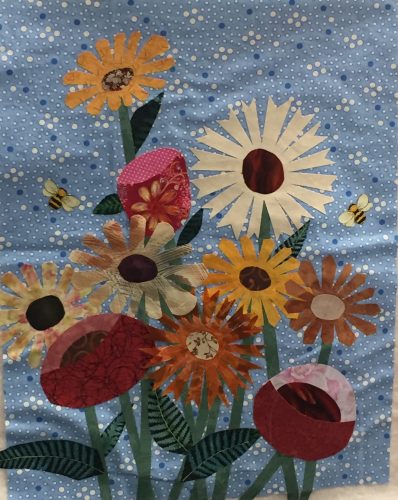
Although most of the students made a horizontal quilt (which is easier,) Laura challenged herself with a vertical orientation. It gives more of a bouquet effect.

Floral Improv at Peachtree City, GA. Ellen Lindner, AdventureQuilter.com/blog

Laura’s vertical composition.

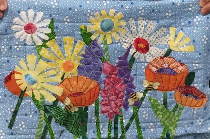
Several students added snap dragons to their pieces. (See also Kathy above.)

Floral Improv in Peachtree City. Ellen Lindner, AdventureQuilter.com/blog

Sarah made excellent progress.

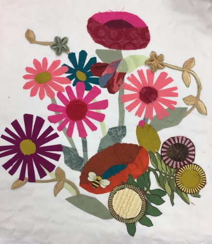
A couple of students deviated from the norm, which I whole-heartedly endorse!

“Floral Improv” in Peachtree City, GA

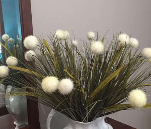
Wanda brought lots of interesting foliage options with her. And some of her flowers even have fur centers!

Heather wanted to increase the contrast between her white daisies and her background fabric. So she brought a lot of precut black tulle circles with her. They worked very well and also added interest.

Floral Improv in Peachtree City, GA. Ellen Lindner, AdventureQuilter.com/blog

Layers of black tulle add interest to Heather’s piece.

These quilts are all shown at the end of a one day class. Didn’t they accomplish a lot?

I’d love to come teach this class for your guild!

Ellen Lindner
P.S. We learned that paper backed fusible web slows things down. I’ll be recommending paperless fusible in the future.

6

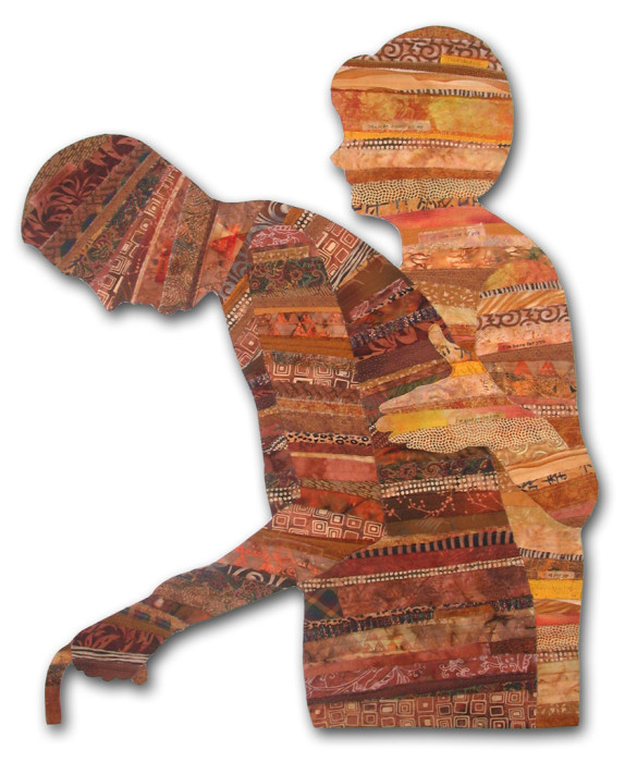
“Caring” Wins Best of Show

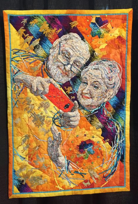
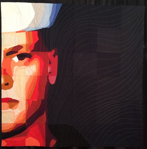
My piece, Caring, has just won Best of Show in a local exhibit. How nice!

Caring, an art quilt by Ellen Lindner. AdventureQuilter.com

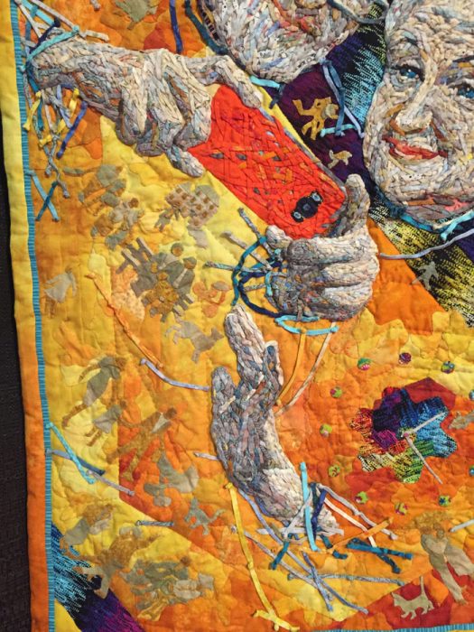
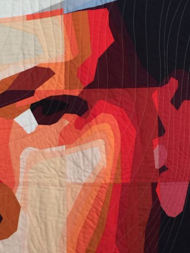
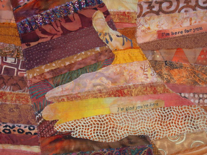
At 40″ high, this piece is nearly life-sized. To enhance the message I’ve included little thoughts throughout. He thinks, “I rely on you.” She thinks “I’m here for you, you can count on me,” and so forth.

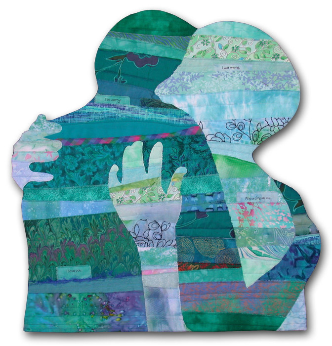
This piece is part of my “Body Language” series. Each one shows bodies (or parts of bodies) in various positions which tell their own stories. See more of them.

It was a joy to design these pieces. In each one I tried to edit out as much as possible, while still keeping the message in tact. I wanted them to be both universal and personal at the same time. For instance, in Reconciliation , above, is it showing a husband and wife hugging? Two women? A parent and their grown child? Your answer will depend on your life experience.

These pieces are mounted onto Plexiglas, which makes them hard to ship, so I’m always happy when I can show them locally. If you want to see Caring and also Security in person, vision Studios of Cocoa Beach between now and November 19th.

Ellen Lindner
P.S. Caring is available for purchase. (And I have a free audition-it-in-your-home program.)

1

A Fabric Book

My friend, Marilyn, taught our fiber art group how to make fabric books. Hers were lovely, with pale pages, lots of embellishments, and amazing contents.

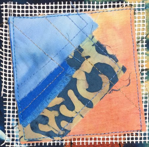
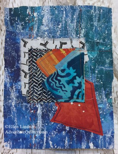
I had just whacked off a good bit of an already quilted quilt and thought that piece would make a good start for the cover. This is what it looked like when freshly trimmed. (From the bottom of this quilt.)


The start of a fabric book. Ellen Lindner. AdventureQuilter.com/blog

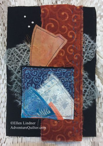
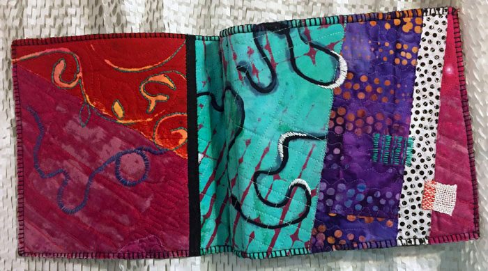
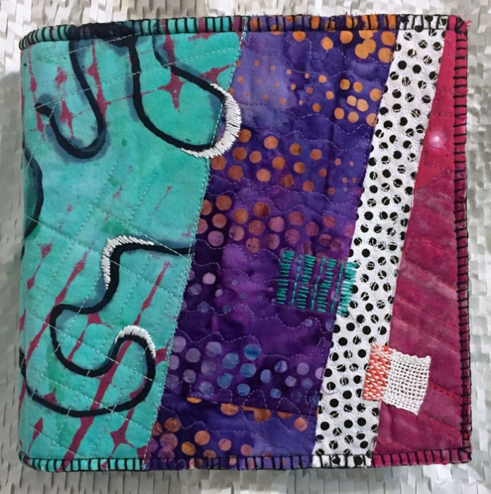
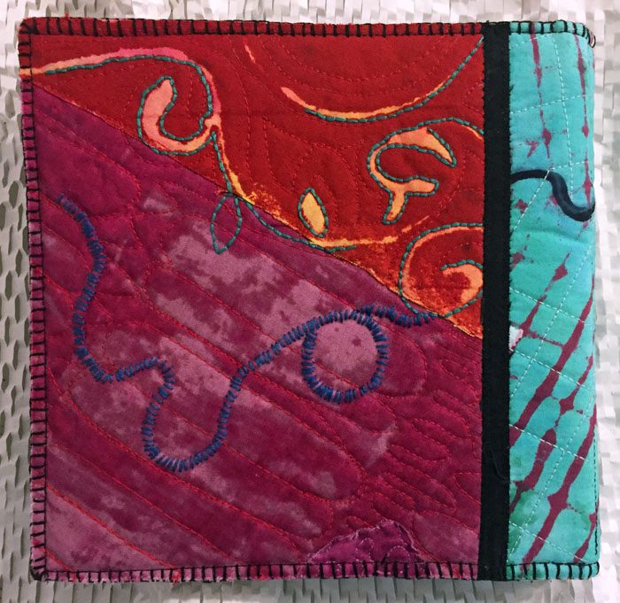
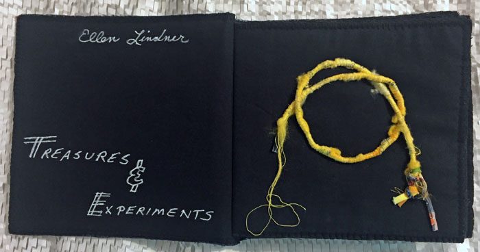
And here it is as the book cover, front (right) and back (left.)

A fabric book by Ellen Lindner. AdventureQuilter.com/blog

I added hand embroidery to both covers.

A fabric book by Ellen Lindner. AdventureQuilter.com/blog

I initially planned to leave the edges unfinished, but later added hand buttonhole stitching, which I really like.

A fabric book by Ellen Lindner. AdventureQuilter.com/blog

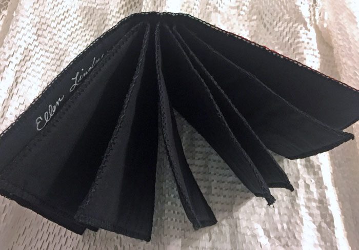
Knowing that I would probably add colorful items to my book, I chose black for the pages.

A fabric book by Ellen Lindner. AdventureQuilter.com/blog

The pages are about 6″ square with one layer of batting between two pieces of fabric. The batting gives it some body. But, maybe the coolest thing about the structure of the book is that it’s made with signatures. These are groups of pages that are sewn as one into the spine of a book. In this case there are 3 signatures, creating 6 pages. The signatures are attached with a space between them, (1/2″ here,) which creates a flat spine. A very nice shape.

For my content I plan to add little samples and things I’ve done over the years, as well as ones I’ll do in the future.

A fabric book by Ellen Lindner. AdventureQuilter.com/blog

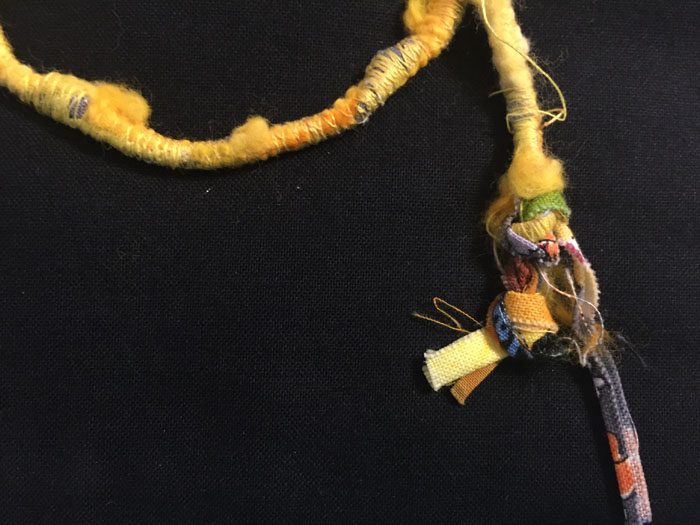
This first page shows a sample I did of cording made on the machine.

Isn’t the knot cool?

A fabric book - detail, by Ellen Lindner. AdventureQuilter.com/blog

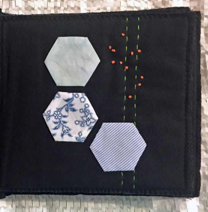
The only other page I’ve done is one I did after the book was constructed. The batting layer makes it easy to slip a needle around without having stitches and knots showing on the back. A nice feature.

A fabric book by Ellen Lindner. AdventureQuilter.com/blog

This little book was quick to make and I look forward to adding little things to it.

Other bookish things I’ve tried:
Mixed media book
A book using tea bags
A video about how to make an accordion book

Ellen Lindner

14

Follow Along as I Learn Deconstructed Screen Printing

“Deconstructed Screen Printing.” That’s a mouth full isn’t it? Perhaps the alternate term is a little more self-explanatory: “Breakdown Printing.” This technique uses thickened dyes applied with screen printing and it often yields extraordinary results.

Like this (detail shot.) Don’t you love the squiggly irregular shapes and “halos?”

Follow Along as I learn Deconstructed Screen Printing. Ellen Lindner, AdventureQuilter.com


You probably know about screen printing using a stencil. The solid parts of the stencil act as a barrier, or “resist”, to the dye and it only goes through the open parts, creating a pattern or motif. With Deconstructed Screen Printing (DSP) thickened dye is applied directly to a screen and allowed to dry. This dried dye acts like a resist to the wet thickened dye applied later.

*** I’ll be adding to this blog post as I try new things. ***
Entry #1

Here is the first screen I prepped. The color is a dark blue-green. I drew a grid and then pulled the tail end of a paint brush through it diagonally. That last part didn’t work too well. Maybe I needed thinner paint? Or thicker lines?

Follow Along as I learn Deconstructed Screen Printing. Ellen Lindner, AdventureQuilter.com

This took the better part of a day to dry here in Florida.

There’s one big difference between printing through a stencil and printing through a design made with dried dye. The latter will slowly dissolve as dye is repeatedly pulled through it. This is a lot of the charm of DSP, but it requires a little planning. The lines of the dried dye will erode and create little halos around each shape. This is lovely, but it also means that the color of the dried dye design will mix with the color of the wet dye. So, you have to plan ahead a little.

I chose a darkish green and got this with my first pull. It worked pretty well, although the grid didn’t show up very well. Again, did I need thicker lines? I think so.

Follow Along as I learn Deconstructed Screen Printing. Ellen Lindner, AdventureQuilter.com

However, I immediately realized I hadn’t mixed enough dye so I had to mix more, and ended up with a variety of greens as I proceeded. (Because I learned this lesson slowly and I kept having to mix more.)

Here’s the second pull.

Follow Along as I learn Deconstructed Screen Printing. Ellen Lindner, AdventureQuilter.com

Can you see how the design has already altered? There’s less white because the design lines have eroded. I did two more pulls, but then stopped because I could see I’d gotten all I could from this screen. Rather disappointing.

Here you can see how the design dissolved throughout the 4 pulls.

Follow Along as I learn Deconstructed Screen Printing. Ellen Lindner, AdventureQuilter.com

But that wasn’t as bad as my next screen. I forgot to take pictures of it, but it used the same dye in a squiggly swirly design. I printed it with green.  Right there. In that big SOLID green spot. It didn’t show at all! I had no idea what was wrong. I’ve since had a clue so I’ll experiment more to see if I’m right.

Fortunately, I got much better results pretty quickly, so check back on this post for updates. Regardless of the results I’m having fun!

*** I’ll be adding to this blog post as I try new things. ***
Entry #2

This was the next screen I prepared, using a dark red color. This screen is my largest and that ended up being a plus, since I didn’t have to move it and realign it so many times.

Follow Along as I learn Deconstructed Screen Printing. Ellen Lindner, AdventureQuilter.com

And this is what I got when I screened on what I hoped would be a dark red-orange. (Shown still wet.) I was pretty happy with this, aside from the big dark spot (more on that later.) You can probably tell that I started on the right and went left. I was very happy with the way the design broke down. I printed along the bottom edge 3 more times and it was printing almost solid red by the end.

Follow Along as I learn Deconstructed Screen Printing. Ellen Lindner, AdventureQuilter.com

About that dark spot: I mix my colors directly on plastic, with various dye colored puddles here and there. At one point I got distracted and accidentally swiped some black which ended up on the fabric. I wasn’t too worried about it.

Now, check out a detail shot, still wet.

Follow Along as I learn Deconstructed Screen Printing. Ellen Lindner, AdventureQuilter.com

I missed an opportunity on this one. My dried dye design and my wet printing dye were too close in color, so I didn’t get the cool merging effect of the two. Something to work on.

This is what it looks like dry. Much brighter than I anticipated, but definitely usable. As a comparison, look at the detail shot above (wet) and then find in on the left side of the full piece to see the change in color. This is not uncommon with dying. Colors always dry lighter and it’s rather tricky trying to get them just right. Something else to work on.

Follow Along as I learn Deconstructed Screen Printing. Ellen Lindner, AdventureQuilter.com

Once dry, my error with the black dye shows up more. See the streaks below. Oh well, it’s still usable and I’m learning!

Follow Along as I learn Deconstructed Screen Printing. Ellen Lindner, AdventureQuilter.com

You know, I’m pretty delighted with this patterning. I’ll want to revisit it.

*** I’ll be adding to this blog post as I try new things. ***
Entry #3

This time I let my screen dry while propped on an angle, thus giving me drippy diagonal lines. (Dark blue-green again.)

Follow Along as I learn Deconstructed Screen Printing. Ellen Lindner, AdventureQuilter.com

It produced an interesting pattern. I used cerulean blue with some black to make it duller and some print paste to make it lighter.

Follow Along as I learn Deconstructed Screen Printing. Ellen Lindner, AdventureQuilter.com

I thought it looked quite good, even though the breakdown effect wasn’t too evident.

But, of course, when I washed and dried it the color lightened significantly. Still usable, of course, but not nearly as dramatic. Predicting color = another thing to work on.

Follow Along as I learn Deconstructed Screen Printing. Ellen Lindner, AdventureQuilter.com

Do you see the blue-green lines above where the screen patterns meet? I did that intentionally, trying to fill gaps in the printing. As you can see, the color mix I used didn’t quite match. Darn. Something else to work on.


*** I’ll be adding to this blog post as I try new things. ***
Entry #4

For this screen I squirted dark blue-green dye onto it. I really like the random look of it. (The pale green look of this screen is just staining due to its age.)

Follow Along as I learn Deconstructed Screen Printing. Ellen Lindner, AdventureQuilter.com

Because I needed some black fabric, I printed this one with black. The pattern resisted the dye very well and I got nice white sharp shapes.

Follow Along as I learn Deconstructed Screen Printing. Ellen Lindner, AdventureQuilter.com

But, where are those vertical white lines coming from? I had no idea. When printing, I did notice that the dye seemed to puddle in the center like that, so I expected to possibly have extra dye there. Instead, that spot resisted the dye. Maybe I hadn’t cleaned it properly? I never figured it out.

As you can see the blue-green did spread into the white areas a little. I’ve now realized that the bleeding/halo effect works best with dark dried dye and medium wet dye. I’m learning!

And I think I’ve solved the mystery of the missing pattern from my earlier screen (entry #1.) For that screen I used a homemade one. I did so again as I prepped this next screen. I could immediately see the problem as the dye dripped through pretty significantly.

Follow Along as I learn Deconstructed Screen Printing. Ellen Lindner, AdventureQuilter.com

To deal with this, I went over the pattern one more time. Like this.

Follow Along as I learn Deconstructed Screen Printing. Ellen Lindner, AdventureQuilter.com

But, can you see how speckled the drawn line is? Not solid at all. I thought I had found the culprit.

Sure enough, when I printed it the design broke down almost right away (starting at right and moving left.) I just printed it these 3 times.

Follow Along as I learn Deconstructed Screen Printing. Ellen Lindner, AdventureQuilter.com

This is what it looked like dry.

Follow Along as I learn Deconstructed Screen Printing. Ellen Lindner, AdventureQuilter.com

Can you believe the change in color? This is my nemesis! I predicted well this time, but it’s a continual challenge.

*** I’ll be adding to this blog post as I try new things. ***
Entry #5

Finally, I got something that was exactly what I wanted. Progress!

This is the screen I prepared, using a dark red dye.

Follow Along as I learn Deconstructed Screen Printing. Ellen Lindner, AdventureQuilter.com

I printed it with a pretty strong orange, getting darker and redder as I moved to the left. I was loving it!

Follow Along as I learn Deconstructed Screen Printing. Ellen Lindner, AdventureQuilter.com

And here it is dry. Yes! This time, the colors were pretty much exactly what I’d hoped for.

Follow Along as I learn Deconstructed Screen Printing. Ellen Lindner, AdventureQuilter.com

Of course, there were areas where the dried dye acted as a resist, leaving white spots showing. But the red dye also broke down giving little red marks too. Nice!

Follow Along as I learn Deconstructed Screen Printing. Ellen Lindner, AdventureQuilter.com

For the next screen I masked out triangles with masking tape (on my old stained screen.)

Follow Along as I learn Deconstructed Screen Printing. Ellen Lindner, AdventureQuilter.com

Then, I drew angled lines with black.

Follow Along as I learn Deconstructed Screen Printing. Ellen Lindner, AdventureQuilter.com

The lines will be broken by the masking tape shapes, so it should be interesting.

*** Final Entry ***
Entry #6

After the screen above was dry I removed the masking tape triangle, which gave me this. A nice fractured look, I thought.

Follow Along as I learn Deconstructed Screen Printing. Ellen Lindner, AdventureQuilter.com

And this is what I got when printing with it.

Follow Along as I learn Deconstructed Screen Printing. Ellen Lindner, AdventureQuilter.com

I like the pattern a lot. But, why didn’t the black dissolve? (I worked from left to right.) A mystery for me to solve.

Next, I made a screen with clear resist. I just squirted it on and I really liked the pattern.

Follow Along as I learn Deconstructed Screen Printing. Ellen Lindner, AdventureQuilter.com

But, it broke down almost immediately!

Follow Along as I learn Deconstructed Screen Printing. Ellen Lindner, AdventureQuilter.com

I started in the top right corner and made my first 2 pulls in a vertical line. As you can see, the third pull had lost all of its design. I did a couple more pulls and then quit. Since I had prepared fabric in front of me, I sort of scraped/smeared some fucshia lines on. I liked them quite a bit.

I was really excited to try the next screen prep: multi-colors. I used black, brown, and deep red.

Follow Along as I learn Deconstructed Screen Printing. Ellen Lindner, AdventureQuilter.com

In the book “Breakdwon Your Pallette,” the author gets wonderful results with this technique. Me, not so much.

Follow Along as I learn Deconstructed Screen Printing. Ellen Lindner, AdventureQuilter.com

Is it worth trying again? I’m not sure.

And now, drum roll please, my favorite DSP fabric. I drew black lines on the screen. Nothing special, but they bled just the right amount.

Don’t you love it? It’s actually a stronger color in person.

Follow Along as I learn Deconstructed Screen Printing. Ellen Lindner, AdventureQuilter.com

Here’s a detail shot. I love the irregular lines and black bleed. (Note, this was the same exact black dye I used in the first Entry 6 fabric. That one didn’t bleed at all, so the consistency of the wet/pulled dye must be a factor.)

Follow Along as I learn Deconstructed Screen Printing. Ellen Lindner, AdventureQuilter.com

I’ll definitely do more DSP in the future. A few things I’ll keep in mind:
– Use my largest screens. They require the least amount of lining up and the lowest number of pulls.
– Use only high quality screen with fine mesh.
– Don’t bother with clear paste as a resist.

Thanks for following along!

Ellen Lindner
P.S. Several people have asked about what resource I’m using to learn about DSP. My primary reference is a book by Leah Higgins, called “Breakdown Your Palette.” I highly recommend it. Also useful are the books by Claire Benn and Leslie Morgan. I have the one on screen printing and they now have one on breakdown printing, as well. You can also find several videos of their processes on YouTube.

6

Fiber Art in Blowing Rock

When I was in Blowing Rock, NC, earlier this summer, I got to see a fiber art exhibit at the Brahm Art Museum. It featured the work of North Carolina fiber artists and was very interesting.

I find that fiber art in the NC mountains is different from that in sunny Florida. There are lots more woven items, baskets, and fabrics dyed with plants. This piece, by Catharine Ellis is a lovely example. Each panel is dyed with a different plant in a shibori style. (Shibori involves fabric manipulation before dying. In this case, lots of folding was used.)

Fiber Art in Blowing Rock

This book by Leslie Pearson features recycled items made into handmade paper.Fiber Art in Blowing Rock

There was another recycled book in the exhibit, although I didn’t get the name of the artist. I loved that gloves were provided so you could flip the pages and explore it. My friend, Cindy, and my sister, Sharon enjoyed spending time with it.

Fiber Art in Blowing Rock

(Check out the other interesting art in the background.)

And here’s another 3D piece by Leslie Pearson. Very interesting, right? The materials were listed as gut, wire, book, and tissue paper. I definitely don’t know how to utilize those materials in such a way!

Fiber Art in Blowing Rock

My favorite piece in the exhibit was an installation of tiny embroidered pieces, by Jeana Klein.

Fiber Art in Blowing Rock

Isn’t this a nice collection? Each of these is made entirely with French knots, and the name reflects the number included.

Fiber Art in Blowing Rock

But, check out the price list: each piece is available for barter or for purchase! And some of the barter suggestions are hilarious.

Fiber Art in Blowing Rock

Aren’t they great? And they’re legit. Several pieces had red dots and when we asked the docent we were told that many had been bartered. I love this humorous pricing!

I said at the beginning that the exhibit was interesting and, indeed, quite a few of the pieces fell into that category for me.  You know: clever and intriguing, but not really visually appealing. Maybe you’ll have a different take on it. Either way, you’re in luck because the exhibit runs through October 27th, and it’s free. I do think you’ll enjoy it.

Ellen Lindner
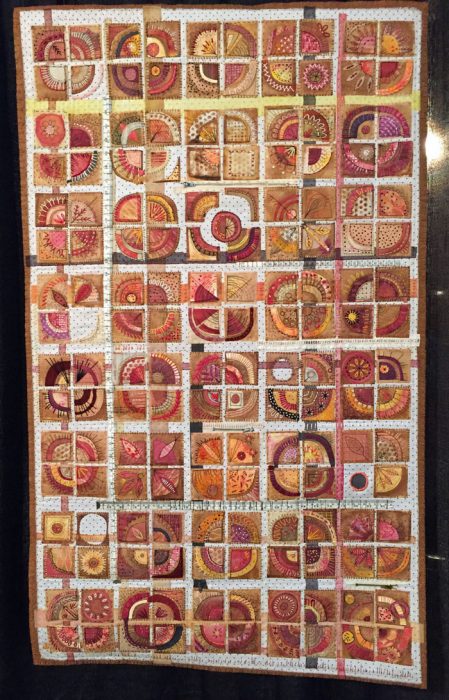
0

“When Fuchsia Came to Play” Complete

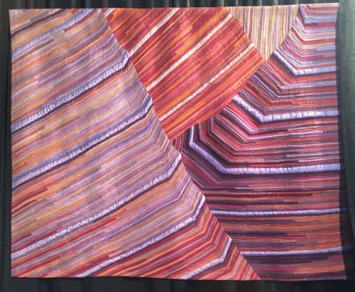
Well, after LOTS of trial and error, trouble shooting, and rearranging, I finally finished my latest abstract piece, When Fuchsia Came to Play.

When Fuchsia Came to Play, an art quilt by Ellen Lindner, AdventureQuilter.com

When Fuchsia Came to Play

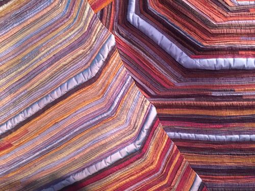
A detail shot of the fabrics – most of them dyed by me.

When Fuchsia Came to Play - detail, an art quilt by Ellen Lindner, AdventureQuilter.com

I showed you my plans for rearranging in an earlier post. As part of that, I whacked 7+” off the bottom! It’s okay. It needed it, and I’ve already found another use for that extra part.

When Fuchsia Came to Play  is available for purchase.

My friends joke that I’m the queen of cropping, and it’s pretty true. Need me to bring my rotary cutter over?

Ellen Lindner

2

“Three Cherries” Complete

My magazine paper collage, Three Cherries, is now complete and I’m very happy with it!

Three Cherries, a paper collage by Ellen Lindner. AdventureQuilter.com

Three Cherries

I love the texture that the text of the pages adds.

Three Cherries - detail, a paper collage by Ellen Lindner. AdventureQuilter.com

Cool, right?

This technique is super easy: spread/paint matte medium on your surface, add a little bit of torn paper, and smooth on another layer of medium. The only tricky part is the little tiny details. Of course, I should have thought of that when I decided to tackle this subject at this scale (16 x 20.)

Which brings me to the pros and cons of glued magazine pages vs. stitched fabric pieces. Magazine pages are super cheap and the medium is quite inexpensive, too. However, if I wanted to do this image again (and I don’t,) I’d make it out of fabric at a much larger scale.  More like this piece, Vine Ripened, which is 28 x 40. Much more manageable. (But the materials cost a lot more!)

Vine Ripened, an art quilt by Ellen Lindner. AdventureQuilter.com

Vine Ripened

The bottom line is that both techniques are fun and effective. Try your hand at the one which appeals to you.

Both Three Cherries and Vine Ripened are available for purchase.

Ellen Lindner
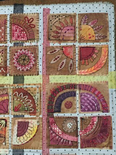
P.S. I also use torn paper collages to help me abstract things sometimes. Because I’m tearing paper for a small scale composition I have to leave out details. See more.
P.P.S. See some detail shots of Vine Ripened.

2

Special Places in Western NC

Don’t you enjoy finding little unique aspects of the places where you travel? If so, you’ll definitely want to visit the REAL, original Mast General Store  the next time you’re in the vicinity of Boone, NC.

Special Places in Western NC. Ellen Lindner, AdventureQuilter.com/blog

Although there are lots of retail shops called “Mast General Store” in the area, they can’t begin to compare to the original. It’s in a low spot called Valle Crucis in the middle of nowhere and it’s a wonderful gem of living history.

Much of the store hasn’t changed in decades. The wooden floors slope severely and everything creeks, but is a strong nostalgia rush!

The pot bellied stove still stands at the ready and a fire is kept going in the winter. It’s just around the corner from the checkers table.

Special Places in Western NC. Ellen Lindner, AdventureQuilter.com/blog
As the only store in the vicinity the original store sold a little bit of everything, from food to hardware. The nail bins are shown above and the revolving drawers shown below hold all manner of hardware in pie-shaped drawers.

Special Places in Western NC. Ellen Lindner, AdventureQuilter.com/blog

The food sold today still includes many southern offerings from days gone by. There are local soft drinks, moon pies, and “penny” candies.

Special Places in Western NC. Ellen Lindner, AdventureQuilter.com/blog

Perhaps one of the most amazing things about the store is that it still functions as the local post office. Can you imagine getting your mail here? I think it’s VERY unique and interesting.

Special Places in Western NC. Ellen Lindner, AdventureQuilter.com/blog

South of Boone is the lovely little village of Blowing Rock. It has a park in the center of everything where free music can often be heard during the summer. Plus, there are an abundance of shops, restaurants, and inns. And it’s all FILLED with beautiful flowers and landscaping.

There’s also something fairly new to Blowing Rock, a prayer tree. 

Special Places in Western NC. Ellen Lindner, AdventureQuilter.com/blog

A local shop set up a table with supplies and encouraged passersby to write prayers and to tie them to a tree right on the main sidewalk. Soon, white pieces of paper were fluttering in the breeze, in abundance. More recently, the prayer slips have been enclosed in clear plastic envelopes, which gives them an out-of-focus appearance.

It wasn’t long before the first tree was covered with white tags, so people started putting them all over the adjacent plants and such.

Special Places in Western NC. Ellen Lindner, AdventureQuilter.com/blog

Now there are over 13,000 messages on the tree and beyond!

Recently the store that initiated all of this had a major fire which destroyed the interior completely. Fortunately “not one prayer was lost,” as posted on a sign in the first tree picture. It’s definitely a source of local pride and interest.

If you time it right, you might even get to enjoy the weekly farmers market, which is known for it’s beautiful flowers.

Special Places in Western NC. Ellen Lindner, AdventureQuilter.com/blog

I hope you get to discover wonderful places on your travels and at home.

Ellen Lindner
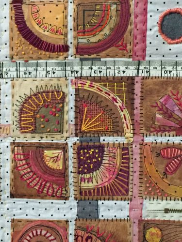
3

Working with Magazine Pages

Inspired by the work of Derek Gores, I decided to make a glued collage with magazine pages. I’ve done this before on a small scale. This time I moved up to a whopping 16 x 20.

This was my inspiration photo. It’s a combination of 3 photos which I manipulated and merged on my computer. Can you guess why I chose blue-green as the background (fabric) color? (Think near-complementary colors.)

Working with Magazine Pages. Ellen Lindner, AdventureQuilter.com/blog

I drew my design directly onto a wrapped canvas and got to work.

Working with Magazine Pages. Ellen Lindner, AdventureQuilter.com/blog

I was working with friends and we used undiluted matte medium just the way you would with decoupage. You remember that from the seventies right? Glue underneath and more glue on top.

As you might imagine, the largish pieces and the lack of accuracy needed made the background go pretty quickly.

Working with Magazine Pages. Ellen Lindner, AdventureQuilter.com/blog

But, hmm, I had a problem. The shadows seemed to almost disappear. Clearly, I’d need to make them darker. More paper and more glue!

Working with Magazine Pages. Ellen Lindner, AdventureQuilter.com/blog

That’s better.

I began working on the cherries in earnest and, as you can imagine, I soon had little bits of colored paper going in all directions. Finding papers was pretty fun, though.

Working with Magazine Pages. Ellen Lindner, AdventureQuilter.com/blog

The right cherry completed.

Working with Magazine Pages. Ellen Lindner, AdventureQuilter.com/blog

LOTS more tiny bits of paper as I worked on the other two.

Working with Magazine Pages. Ellen Lindner, AdventureQuilter.com/blog

I was getting there, but I was also getting rather tired of dealing with little fiddly pieces of paper. I decided that perfection was not needed and started to work more loosely. What a relief! (I should have done this from the get-go.)

Soon, I’ll show you the finished collage and also give you a rundown of the pros and cons, as I see them, of fabric collage versus paper collage.

Ellen Lindner
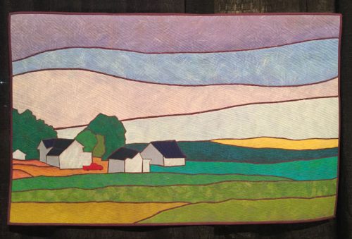
P.S. See some of my earlier magazine page collages: ONE, 

6

That Niggling Doubt

Have you ever finished a quilt and then began to have doubts about it? That happened to me with this quilt.

That Niggling Doubt. Ellen Lindner, AdventureQuilter.com/blog

I was happy with it and began to quilt it. But, you know, quilting is a slow thing and it gives you time to think. I slowly began to suspect that the quilt just didn’t have quite enough energy.

Hmm, how could I add some pizazz? What if I rearranged it (i.e. cut it) somehow?

First, I auditioned the idea by folding the actual quilt. Two vertical folds are shown here.  See how the lines now have a zigzag to them? And, of course, the proportions have changed.

That Niggling Doubt. Ellen Lindner, AdventureQuilter.com/blog

And two more folds.

That Niggling Doubt. Ellen Lindner, AdventureQuilter.com/blog

Energy yes. Greatness no. So, I worked on the computer rearranging things. First, 2 bottom cuts.

That Niggling Doubt. Ellen Lindner, AdventureQuilter.com/blog

Then , a few more.

That Niggling Doubt. Ellen Lindner, AdventureQuilter.com/blog

Next, I cut out some paper versions and cut them up.

That Niggling Doubt. Ellen Lindner, AdventureQuilter.com/blog

Well, that was certainly energetic. I kinda liked it – even with the jagged edges. But, I kept experimenting.

That Niggling Doubt. Ellen Lindner, AdventureQuilter.com/blog

I may have gone too far on the one above. But then I tried something very simple, just cutting the quilt into 3 vertical pieces. Then, I just swapped the two side pieces.

That Niggling Doubt. Ellen Lindner, AdventureQuilter.com/blog

I liked it! But, what if I put black lines in the gaps? I auditioned it on the computer and got this.

That Niggling Doubt. Ellen Lindner, AdventureQuilter.com/blog

Yes! I loved it! So, I finally had a plan.

I’m excited to move forward with this piece!

Ellen Lindner
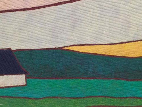
P.S. I have a little bit of a reputation for cutting things up.
2