The Artwork of Tanja Boudal

In conjunction with the “Forced to Flee” exhibit, there’s also a presentation of artwork by Tanja Boudal and it’s VERY interesting.

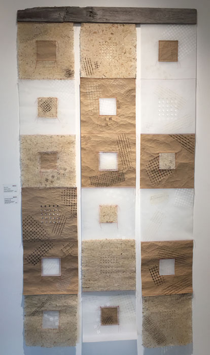
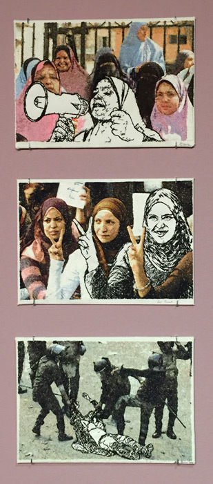
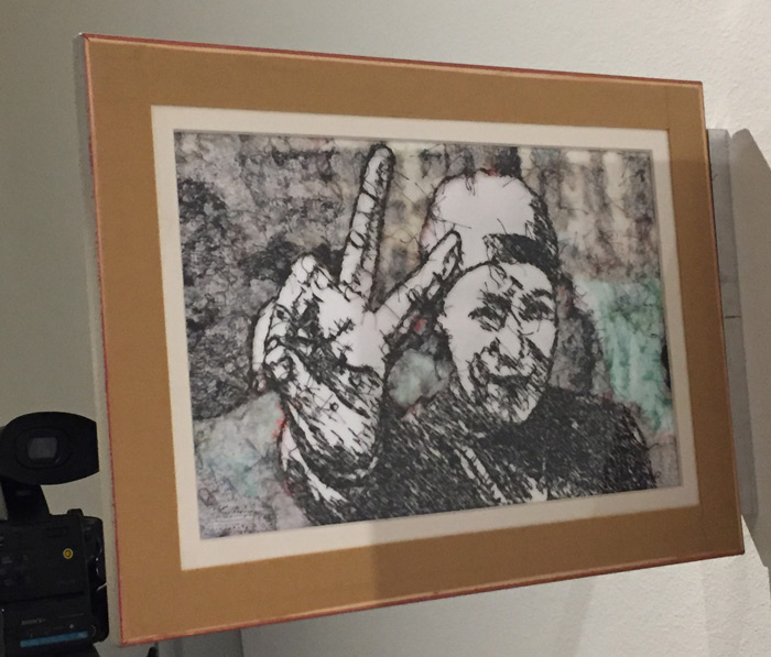
The majority of the pieces on display are like those shown here. As I understand it, she finds media pictures showing women in the midst of struggles and prints them on to fabric. She then alters one of the women using white fabric and black stitching. It’s a very striking effect.

The artwork of Tanja Boukal. Ellen Lindner, AdventureQuilter.com/blog

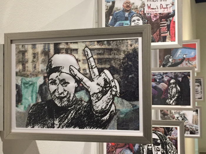
One wall featured these pieces mounted perpendicular to the wall. This gives an interesting perspective and also makes a visually intriguing presentation.

The artwork of Tanja Boukal. Ellen Lindner, AdventureQuilter.com/blog

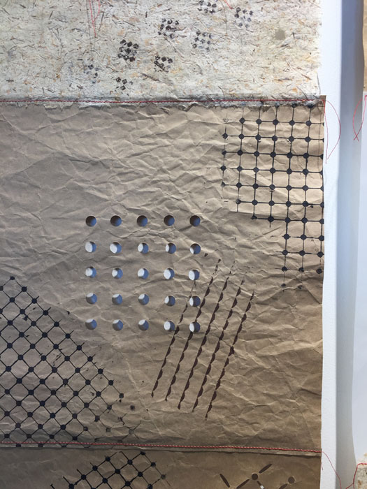
This is the back side of the piece shown above.

The artwork of Tanja Boukal. Ellen Lindner, AdventureQuilter.com/blog

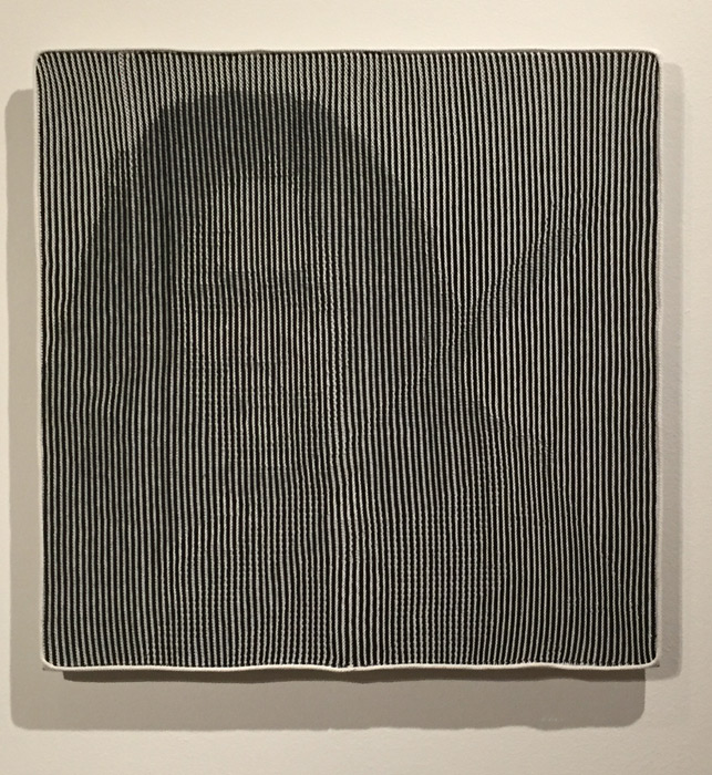
Most fascinating, however, are the pieces made with a technique Boukal calls shadow knitting.

This one is of an Indian activist named Phoolan Devi. VERY subtle, right?

The artwork of Tanja Boukal. Ellen Lindner, AdventureQuilter.com/blog

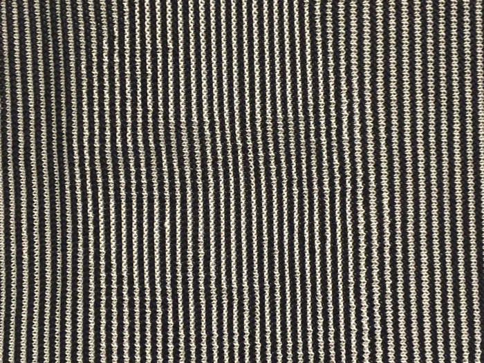
Now, check out this detail shot of the eyes. Invisible, I’d say.

The artwork of Tanja Boukal. Ellen Lindner, AdventureQuilter.com/blog

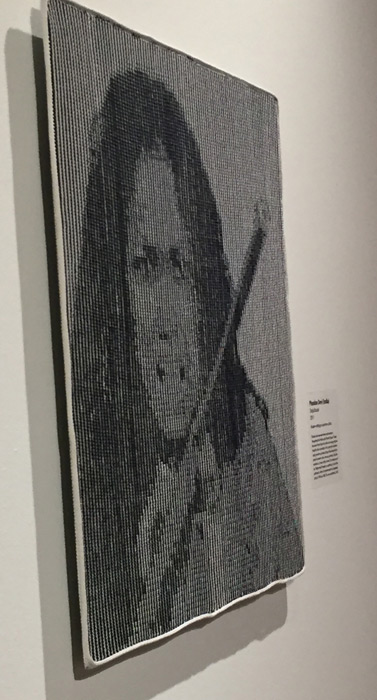
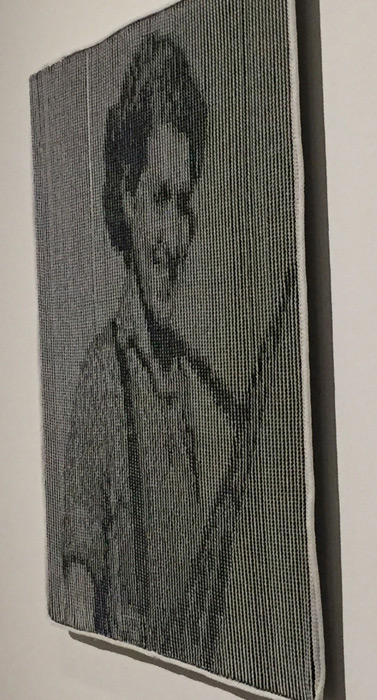
But, look what happens when you view the piece from the side.

The artwork of Tanja Boukal. Ellen Lindner, AdventureQuilter.com/blog

And here’s another, featuring Sarah-Ginaite.

The artwork of Tanja Boukal. Ellen Lindner, AdventureQuilter.com/blog

I have no idea how she does this! I need to go back and see these pieces again.

You can see them, too, through August 24th in Melbourne, FL. They’re at the Ruth Funk Center for Textile Arts, which is always free. Enjoy!

Ellen Lindner

6

A Tale of Two Extremes

Sometimes I dye specialty fabrics: those that are almost a full design and that will be big players in a future design. After a class with Pat Pauly, I’m now designing such fabrics to have larger patterns. (These are harder for me to use, but do wonderful things in a composition, once I get it figured out.)

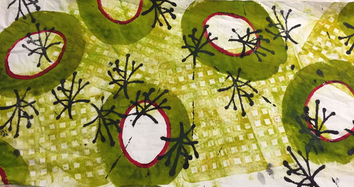
This is one of my favorite specialty fabrics, started in class with Pat and completed at home.

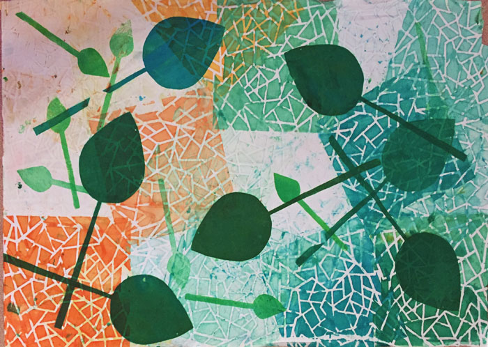
I’m not sure whether those shapes are spears, spades, or leaves, but I love them. AND the colors!

And this is my all-time favorite (so far.) I’m in love with it!

A Tale of Two Extremes

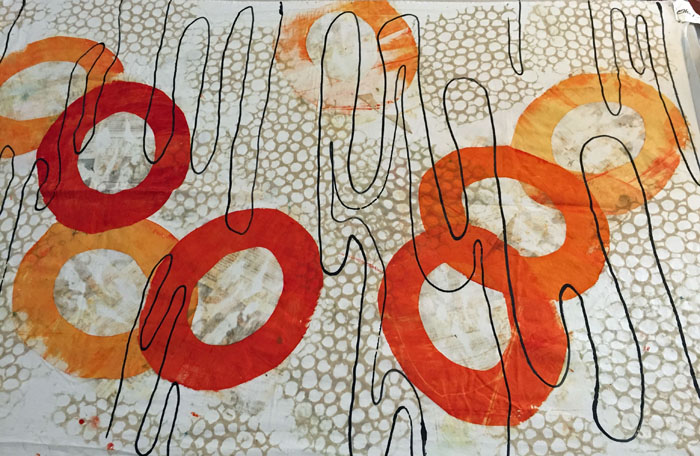
The open circles, above, were made with a 2 piece newspaper stencil. Surprisingly, the newspaper left an imprint in the center of the circles. Can you make it out? I liked it and decided to emulate it for the background. I was SO happy with the result. Some black lines finished it off, (although I need to give them more forethought next time.)

I have some other fabrics that are sorta specialty. That is, their designs are smaller in scale, meaning they can be cut up more easily. But, I’ll still need to be very thoughtful about how I use them

A Tale of Two Extremes

A Tale of Two Extremes

Don’t you love this one, above? It was initially monochromatic, but I added the hand-painted fuchsia to give it a pop. Definitely a good decision!

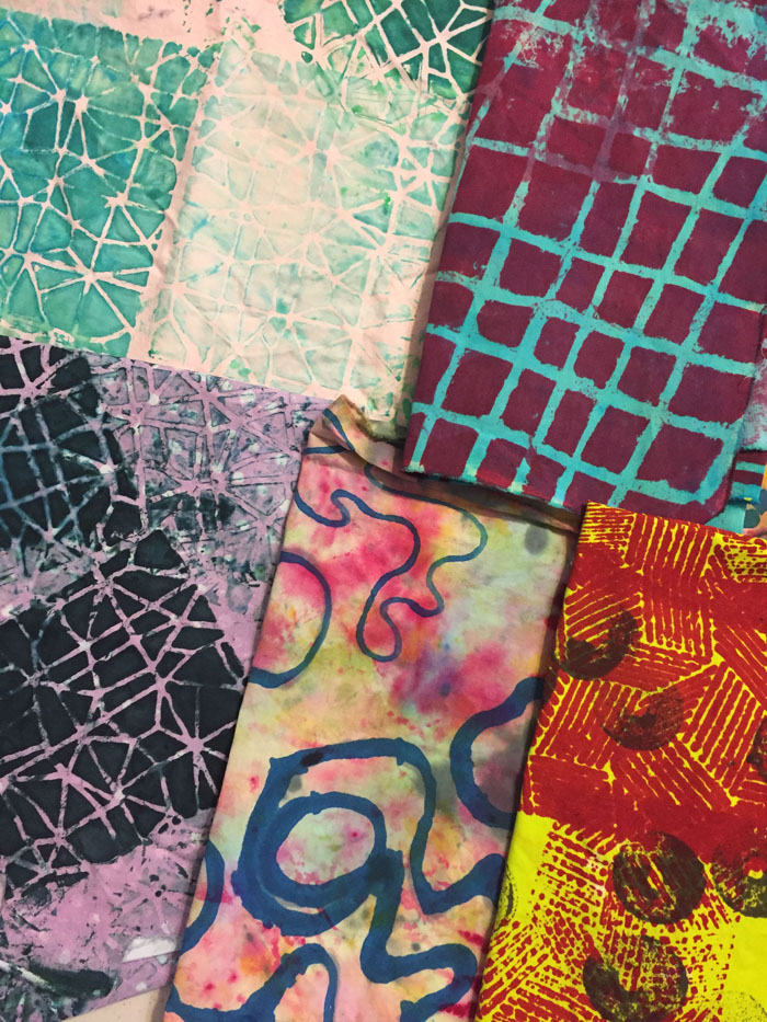
Then, there are those fabrics that fall on the other end of the spectrum: the ones that will be hard to use. Perhaps they have a strong contrast or unusual colors. Like these.

A Tale of Two Extremes

What would you do with that jarring fuchsia and bright yellow piece bottom right? I’m pretty sure I’ll
A) cut it in such a way so as to isolate a color or pattern, and
B) use very small amounts of it as an accent.

At some point I know that these oddball fabrics will be just the thing I’m looking for.

I’m having fun staring at these fabrics, plotting how I might use them, and finishing up some other stuff so I can get to it!

Ellen Lindner

0

Dying Yardage

When dying fabric there are two types I want to produce: yardage, and specialty. Yardage has a mostly all over pattern and can easily be cut up and used. Specialty looks almost like a whole cloth design, with thought given to composition and such.

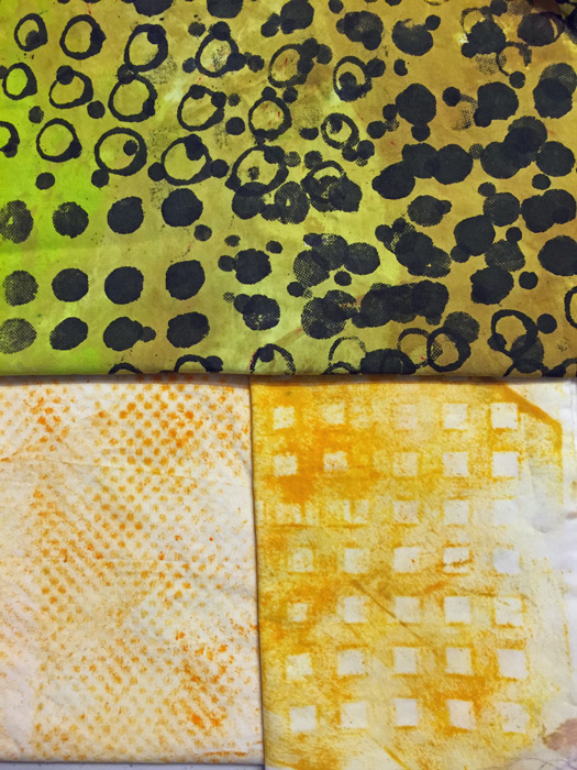
These yellow pieces fall firmly into the yardage camp. The top one had a white background initially. Can you see how such a high contrast fabric might be difficult to use? Changing the background to yellow/yellow-green makes it both more interesting and more usable.

The bottom two fabrics are both “rubbings,” (done with a foam roller.) The left texture was created by a piece of shelf liner and the right one was a plastic sink liner. I’ve discovered that I don’t like rubbings over isolated details, but these all-over ones are easy to do and they have a nice imperfection to them.

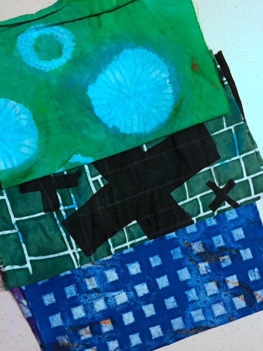
These next 3 fabrics are all re-dos. The top one was an imperfect shibori dyed fabric. The circular images were very subtle, so I played them up by painting green all around them.

The next one was large black crosses on a white background, with a few blue blotches. Again, very hard to use due to the contrast. So, screen printing the background a dark color helped minimize that.

Dying Yardage

The bottom one, above, was an ugly experiment. I rolled on some texture. Can you tell it’s the same sink liner from the yellow fabric before it? (I think this blue version is a little too perfect. I’ll aim for some sloppiness with future texture rolling.)

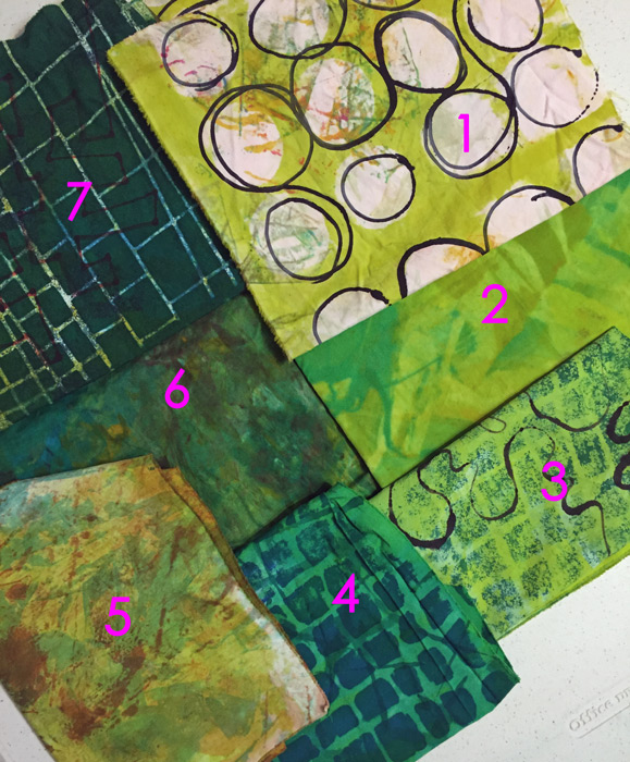
This next photo demonstrates a variety of techniques.
1- It started as a nearly white clean up rag, with some interesting marks. I screened on the yellow-green and then used a squirt bottle to add the black circles.
2-In a moment of laziness I tried to mix colors together directly on the fabric.
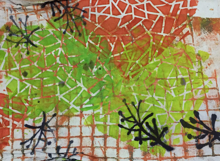
3 & 4- Both pieces originally had a white background. Again, too much contrast, so I added yellow-green to #3 and pure green to #4.
5-Some sort of ugly fabric with dull yellow-green added.
6 – A fun way to use up the last of the dye: smear on different colors and sorta smoosh them together with some clear paste.
7-A very ugly fabric was improved by the addition of a very dark screen printed design.

There’s so much to try and to learn!

Ellen Lindner

0

Accidental Learning

While dying fabric I’m learning a lot! Some of it comes from books and some of it I stumble upon.

Case in point, trying to mix thickened dye colors directly on the fabric. I had heard that they wouldn’t really mix in this way, but I was feeling lazy and had to give it a try. First, I tried it with a mixture of greens and some clear dye paste.

Accidental Learning. Ellen Lindner, AdventureQuilter.com/blog

As expected, the greens were blotchy. But what was that lighter squiggly pattern? It was the clear paste, which acted as a resist to the other colors.

Bingo! That looked like something fun to play with.

Accidental Learning. Ellen Lindner, AdventureQuilter.com/blog

So, I tried to repeat my results with a variety of colors and patterns. Red with circles, and pink with feathers.

Accidental Learning. Ellen Lindner, AdventureQuilter.com/blog

Brown circles and orange spears/leaves.

Accidental Learning. Ellen Lindner, AdventureQuilter.com/blog

Yummy! A quick and easy way to get a tone on tone pattern.

Ellen Lindner
 

2

“Forced to Flee”

SAQA’s “Forced to Flee” exhibit is very powerful. It recently opened in Melbourne, FL at the Ruth Funk Center for Textile Arts. As you might imagine, many of the pieces had to do with the refugee crisis, but others showcased the horrors of war, and the power of nature. There are 30+ pieces in the exhibit, so this is just a little taste.

This piece, by Eunhee Lee is called “They are Also Us.” It was chosen for the featured wall image, and rightly so. It’s a very moving piece.

Forced to Flee. Ellen Lindner, AdventureQuilter.com/blog

I remember seeing this quilt online and being very struck by it. But, what I didn’t notice until I saw it up close was the imagery of people fleeing in the background.

Forced to Flee. Ellen Lindner, AdventureQuilter.com/blog

Mary Palmer’s piece, “Prayer,” was about 8 feet tall. The shapes are the characters of a Muslim prayer.

Forced to Flee. Ellen Lindner, AdventureQuilter.com/blog

It’s made from life jacket fabric cut into squares and stitched in a very open pattern.

Forced to Flee. Ellen Lindner, AdventureQuilter.com/blog
Karen Tauber’s piece also featured heavy use of life jacket fabric and imagery. It’s called “Life Jacket Graveyard of Lesvos,” and it depicts the “Mountain of Misery” created as thousands of refugees discarded their jackets and rafts on this small Greek island.

Forced to Flee. Ellen Lindner, AdventureQuilter.com/blog

As you can tell by the shadows on the wall, the bottom portion is extremely three dimensional.

“Missing Migrants” is the name of Genevieve Attinger’s piece, shown below.

Forced to Flee. Ellen Lindner, AdventureQuilter.com/blog

As you can see in the detail shot below, she’s used tiny little “mummy” dolls to represent the people. Barbed wire depicts their final obstacle.

Forced to Flee. Ellen Lindner, AdventureQuilter.com/blog

Claire Passmore also shows the refugee’s journey, reading from bottom to top. Her title asks the question, “Lucky Ones?”

Forced to Flee. Ellen Lindner, AdventureQuilter.com/blog

She depicted those who died with sheer bodies, as seen below. Very moving.

Forced to Flee. Ellen Lindner, AdventureQuilter.com/blog

And here’s one of the few pieces that didn’t focus on refugees. It’s called “Firestorm,” by Grace H. Wever. It depicts the firestorms which raged in bombed cities during World War I.

Forced to Flee. Ellen Lindner, AdventureQuilter.com/blog

She depicted the fire very effectively with a variety of materials and techniques. It almost looked like it would burn you if you touched it.

Forced to Flee. Ellen Lindner, AdventureQuilter.com/blog

All the artists in this exhibit approached their subjects in very thoughtful ways. The layers of meaning and subtle details gave strength to their stories.

Although not a happy upbeat exhibit, it is WELL worth visiting. It’s on display until August 24th, so you’ve got plenty of time to see it. (And it’s free!)

Ellen Lindner
0

Scenic Details

I’ve heard it said that “God is in the details,” and I believe it. In addition to the HUGE scenery we saw on our trip to the American southwest, we also appreciated many smaller details.

Like the trees leafing out in a remote canyon.

Scenic Details. Ellen Lindner, AdventureQuilter.com/blog

The petroglyphs that are over 1000 years old.

Each motif is about a foot high.

Scenic Details. Ellen Lindner, AdventureQuilter.com/blog

BTW, I learned these definitions: petroglyphs are”pecked” or scratched into the rock’s surface, while hieroglyphs are painted on.

In the midst of very limited moisture and greenery, hearty cacti still managed to put on a show.

Scenic Details. Ellen Lindner, AdventureQuilter.com/blog

There were many visual delights.

But, wait a second. Surely, there’s also inspiration in my own neighborhood. And what about yours?

Ellen Lindner
Similar posts: Mountain Flowers, Door County, WI,
Tropical Flowers

0

Scenery on a GRAND Scale

Is it possible to take a bad photo of the Grand Canyon? I kinda think not. Especially when the sun is low, the shadows are long, and the weather is perfect.

Scenery on a GRAND Scale. Ellen Lindner, AdventureQuilter.com/blog

My husband and I were lucky enough to visit it on just such a day. The temperatures were perfect and the crowds were light, making it absolutely delightful AND awe inspiring!

Scenery on a GRAND Scale. Ellen Lindner, AdventureQuilter.com/blog

Gorgeous!

Scenery on a GRAND Scale. Ellen Lindner, AdventureQuilter.com/blog

We also visited Red Rock Canyons, west of Las Vegas. The rock formations there were quite varied, and very different from what we’d seen one state over.

Scenery on a GRAND Scale. Ellen Lindner, AdventureQuilter.com/blog

This is the first rock formation you see in the park, and the one it’s named for. I believe it’s called Castle Steps and this photo shows about half of it.

Now look at a closer shot of the far left end. Doesn’t it look like God was kneading together some red and yellow rocks? I think the smooth folded effect is very interesting.

Scenery on a GRAND Scale. Ellen Lindner, AdventureQuilter.com/blog

Of course, there’s also man-made majesty in the area. Like the Hoover Dam. We took a tour on the inside of the concrete structure and really enjoyed it.

Yes, it’s a LONG way down!

Scenery on a GRAND Scale. Ellen Lindner, AdventureQuilter.com/blog

I always feel more like I’ve gotten away from my routine when a trip includes scenery and seasons different from what I’m used to. Nevada and Arizona did not disappoint!

Ellen Lindner
Other travel posts with a view:
Captivating Colorado, 
Virginia’s Country Charm

0

Collage Springboard

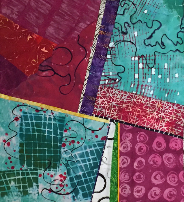
Remember when I posted about making small fabric collages and then cropping them to get abstract design ideas?  Well, I decided to use one of my examples as the springboard for a new quilt. I used this photo collage of tropical foliage.

Abstract Design from Scratch. Ellen Lindner, AdventureQuilter.com/blog

Using photo editing, I removed the color to focus on the design lines.

Collage Springboard. Ellen Lindner, AdventureQuilter.com/blog

I DID NOT plan to make a foliage quilt. Or a green one. Instead, I wanted to mimic this angled composition and, if I had the right fabric, try to copy the scale and shape of these patterns. Perhaps most importantly, I wanted to use hand dyed fabrics in a fairly large scale.

Step one: plow through my hand dyed fabrics and find ones that had large scale patterns, and patterns that hinted at those shown above. Oh, and I was working larger than usual so the fabrics needed to be in fairly large pieces. These are the ones I pulled.


Collage Springboard. Ellen Lindner, AdventureQuilter.com/blog

Kinda disparate, right? But, I was pretty much in love with the combination. And, after my recent class with Pat Pauly, I felt confident enough to try all of these together. Next, I needed to try them on the design wall and see if I had pieces large enough to work.

Collage Springboard. Ellen Lindner, AdventureQuilter.com/blog

So, I liked the general tilted composition and the colors. And I thought the large scale print in the top left emulated the palm fronds quite nicely. But, I could see that I would have difficulty finding enough fabrics  large enough to fill the large corner spaces. (This was 48″ square.) Therefore, I decided to downsize to 42″, and to rearrange the fabrics so that the largest pieces could fill the largest spots.

Collage Springboard. Ellen Lindner, AdventureQuilter.com/blog

The large scale print (top right corner, above) was one of the largest pieces of fabric I had, so I moved it to the largest spot. I used the same criteria with the bottom left spot. I wanted the top left and lower right corners to me almost solid, (like the sketch,) IF I could find fabrics to carry it off.

Notice the dark twig/berry fabric lower center above. Since it was not very big I knew I’d need to fill the gap above it with other fabrics. I could have moved the dark fabric up to center, but I liked the idea of having something that dark down low. Of course, it could all change easily!

I proceeded with plenty of trial and error: placing, studying, moving, and repeating. Most of the fabrics were folded at this point, rather than cut.

Collage Springboard. Ellen Lindner, AdventureQuilter.com/blog

MANY changes came after this, but I was beginning to get happy with the colors and shapes. I found it to be invigorating and challenging!

I’ll show you more progress soon.

Ellen Lindner
0

Lessons Learned: Dying and Designing

Pat Pauly is a WEALTH of knowledge, so I really learned a lot when I took a 5 day dyeing/printing class with her.

First up: colors look different when wet vs. dry. Leslie’s samples served as examples.

Lessons Learned: Dyeing and Designing. Ellen Lindner, AdventuereQuilter.com/blog

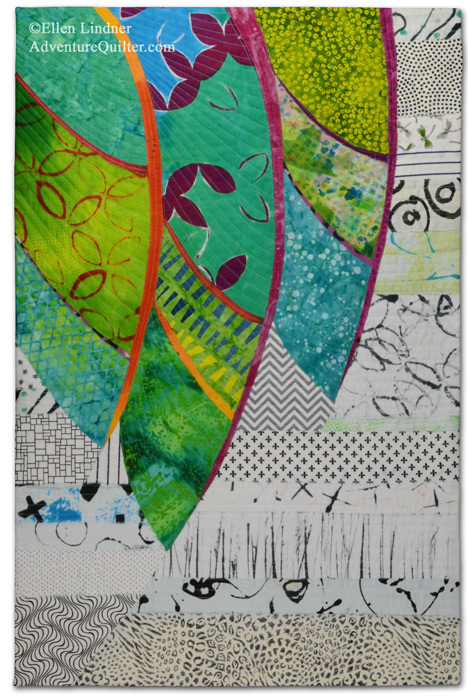
Bigger can be better. This piece, below, is about 31″ x 45″. So, Pat finally got me to work larger. And I have to say I love it.  I’ll be buying a big screen.

Dyeing with Pat Pauly. Ellen Lindner, AdventureQuilter.com/blog

Leftover dyes work well when just smeared on. Who knew? (This is Pat’s example, below.)

Dyeing with Pat Pauly. Ellen Lindner, AdventureQuilter.com/blog

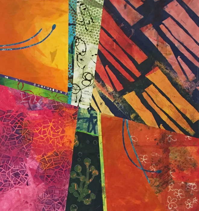
Everything goes with everything. These are my words, not Pat’s, but it seems to apply to the way she combined things. UH-mazing! To my eye, she seemed to purposely pick the most jarring fabrics to use together and then they looked good. What?

She demonstrated this over and over by folding fabrics so their disparate parts ended up playing together nicely. THIS is what I want to be able to do!

Dyeing with Pat Pauly. Ellen Lindner, AdventureQuilter.com/blog

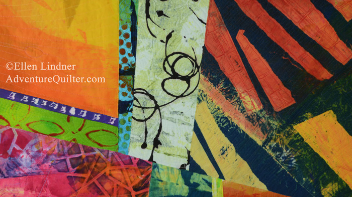
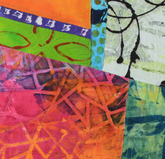
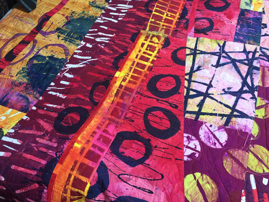
This detail shot of one of her quilts shows what I mean. I would have never used burgundy and fuchsia together, but with a little bright yellow (again, unexpected) mixed it in all works. The other thing I want to learn.

Dyeing with Pat Pauly. Ellen Lindner, AdventureQuilter.com/blog

As much as knowledge as I gained in this class it was also humbling as I realized how much I still need to explore and work on. I’m invigorated and excited to try it all!

Ellen Lindner
P.S. Pat also got me to wear long gloves, but not an apron!

0

Dying with Pat Pauly

My dyeing/print making class with Pat Pauly was amazing. She’s SO comfortable with thickened dyes and what she can do with them that it was almost hard to keep up.

This was the first demo, about using stencils. She doesn’t use them with a screen, but just hangs on to a corner and scrapes dye through. It’s fast!

Dyeing with Pat Pauly. Ellen Lindner, AdventureQuilter.com/blog

Next, she scrapes on background color. (See the berry and yellow streaks above.) Adding the background color does alter the previously stenciled areas some, but she’s not worried about it.

Pat picks up the perfect amount of dye for the perfect spread/scrape. I haven’t mastered that yet and it does make a difference. For instance, if it’s too wet and gloppy everything smears when you do the next thing.

Judy (I think) had good luck with stencils. Don’t you love the colors?

Dyeing with Pat Pauly. Ellen Lindner, AdventureQuilter.com/blog

I like these “open” stencils, like those used above. They allow lots of color to print, leaving a more delicate background peaking through.

Next, we learned about putting textured items below our fabric and lightly rolling on dye. Check out Jim’s piece: those large circles are toilet flanges! (Several people headed to the hardware store after learning this.)

Dyeing with Pat Pauly. Ellen Lindner, AdventureQuilter.com/blog

Pat also talked to us about having contrast within each piece of fabric: light/dark, large/small, busy/quiet. But, she said not to aim for a whole cloth quilt fabric. I think Jim hit all the marks.

We learned monoprinting next. It was very fun to do – almost like finger painting. But, I didn’t like my results. This was a very ugly bright green monoprint. I tried to resurrect it by painting over the majority of it with a dark blue (still wet here.) Better, for sure. I made the screen with soy wax, which was rather challenging with such a detailed design.

Dyeing with Pat Pauly. Ellen Lindner, AdventureQuilter.com/blog

On day 2 we washed the day 1 fabrics and at the end of the day we had SUCH fun pulling that stuff out of the dryer! As you can see, Pat was pretty happy with them, too.

Dyeing with Pat Pauly. Ellen Lindner, AdventureQuilter.com/blog

I don’t have many photos of my own fabrics. This is my favorite one, in-progress.

Dyeing with Pat Pauly. Ellen Lindner, AdventureQuilter.com/blog

Here’s some more work from around the room. This large piece was created by Sandy, who is an experienced dyer. It shows! She worked a lot with newspaper stencils. That’s how she made the large circles.

Dyeing with Pat Pauly. Ellen Lindner, AdventureQuilter.com/blog

This one, by Melinda, featured rolling over textures, stenciling and scraping color on. That scraping is really fun!

Dyeing with Pat Pauly. Ellen Lindner, AdventureQuilter.com/blog

I can’t wait till I have more time to finish up my class fabrics (~8 yards,) and then to USE these puppies!

Ellen Lindner
0