“Florida Native #1”
You remember the leaf quilt I made, right? Well, it has a companion piece which I recently finished.
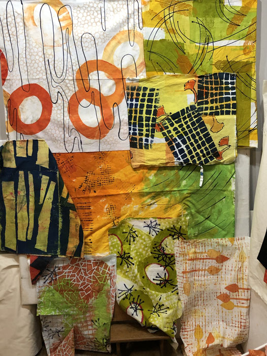
Here it is, underway, as I was auditioning fabrics. You can see I placed the red squiggles of my feature fabric on a “sweet spot” and built everything around that.
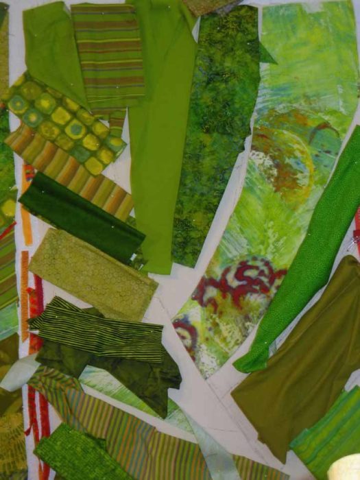
Of course, the fabrics changed a good bit along the way.
Here’s the finished version of Florida Native #1
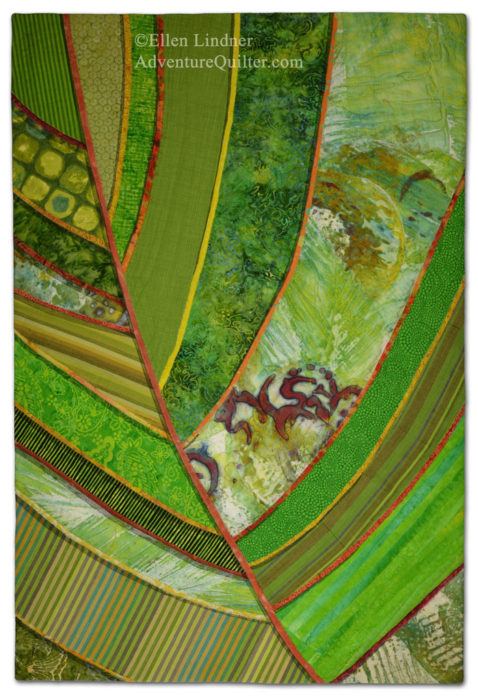
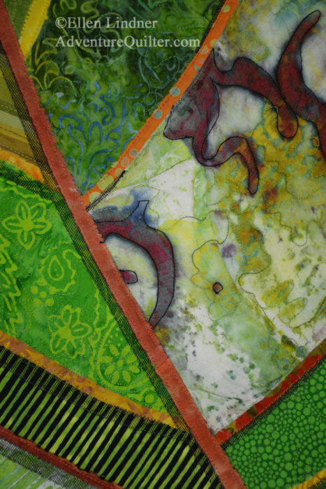
And a detail shot:
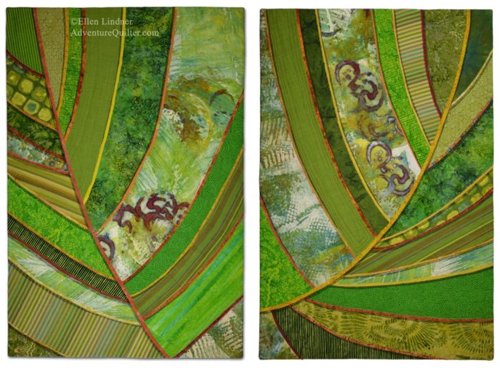
Why did the second quilt get named #1 and vice versa? Because I thought they might hang together with this second one on the left, so I named them accordingly. Here’s how they look together.
I’m happy with them, but READY to move away from green!!! (It takes a long time to make TWO quilts!)
BTW, I may have occasion to enter only one of these in an exhibit. In that case, which one should it be and why?
Ellen Lindner


Beautiful work, Ellen! I prefer the one on the left. I think the focal point is better defined and the balance of colors is more pleasing to me. I can see how working with one color is definitely a challenge.
Thanks, Mary Frances. I’m partial to the left one, too.
I like the focal point on the one on the left but I think there is more interesting movement in the one on the right- more curve to the diagonal vein.
I prefer the one on the left. Love it! Why not give us a class? If live to make one but not clever enough to figure out how to do it.
Thanks, Degen. The left one is my favorite, too.
The technique was very straight forward: raw edge collage on a muslin base, with 2 layers of black tulle used to create shadows.
I think the one on the left, but this is a difficult decision. They are both so beautiful! I like parts of each, but I tend to agree about the focal point being better defined on the one on the left. Go for it! 😉
Thanks, Maeve. I like the colors best on the left one, but the curve of the main stem best on the right one. Thanks for your opinion! (It’s unanimous so far.)
I love all your designs! have already see the previous comments, but I like the the one on the right better. I like the curve of the stem, the rhythm and texture of the colors, and the depth that the repetition of the darker green provides. It’s an awesome Florida palm! At least on my computer, the quilt on the left seems to have the illusion of the large section in front of the right section, while in the picture on the left the strips all seem to radiate from the stem.
Somewhere over the years I picked up a little trick you might try – hold the quilts in front of the mirror to see if anything looks out of balance (they look balanced to me.)
I started a small design group a couple years ago and we worked through the book “Fearless Design for Every Quilter…by Lorraine Torrence, Jean B. Mills. The book and my design group really have made me a better quilter.
Thanks for your comments, Michele. I’m glad to know the right leaf has appeal, too.
Like you, I learn a lot from good books. Most recently, my local SAQA group and I worked through Elizabeth Barton’s “Inspired to Design.”
I love both of them, but if you can only enter one, I would recommend the one on the right, because the eye moves from left to right and that one sweeps the eye up from left to right with the center vein.
Good point, Kristin. That curvy vein is my favorite part of that leaf.