Learning to Like Vinegar
I don’t like the flavor of vinegar but I know that it adds a needed tartness to a variety of dishes.
However I’m starting to like the idea of “vinegar” colors. That is, those colors that are jarring in combination with others, but which also add an interesting bit of “sour.”
My interest began several years ago when I read a quote from art quilter Sally Sellers. She said “It only takes a little ugly to make the other colors sing.” Wow! The idea of using something you considered ugly was very shocking to me. But, somehow it sounded legit.
So I worked up my courage and challenged myself to use a hideous color in my next quilt. The hideous color? Lime green. At the time I HATED it!!!
This is the result, Solar Tide.
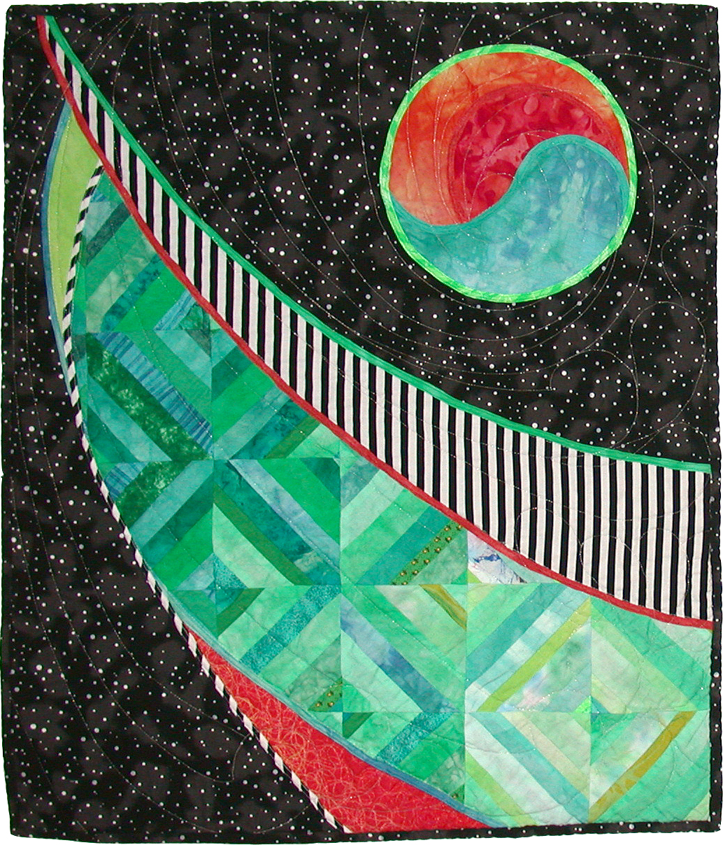
Surprisingly, I really like the results. And even back in the day of still hating lime green I could see the quilt was better because of its inclusion. Shocking!
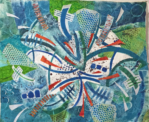
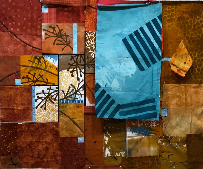
More recently, I sought out a little ugly for this quilt, Palm Fronds.
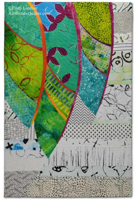
In this case yellow-orange serves the purpose. What do you think? It adds some pop, right?
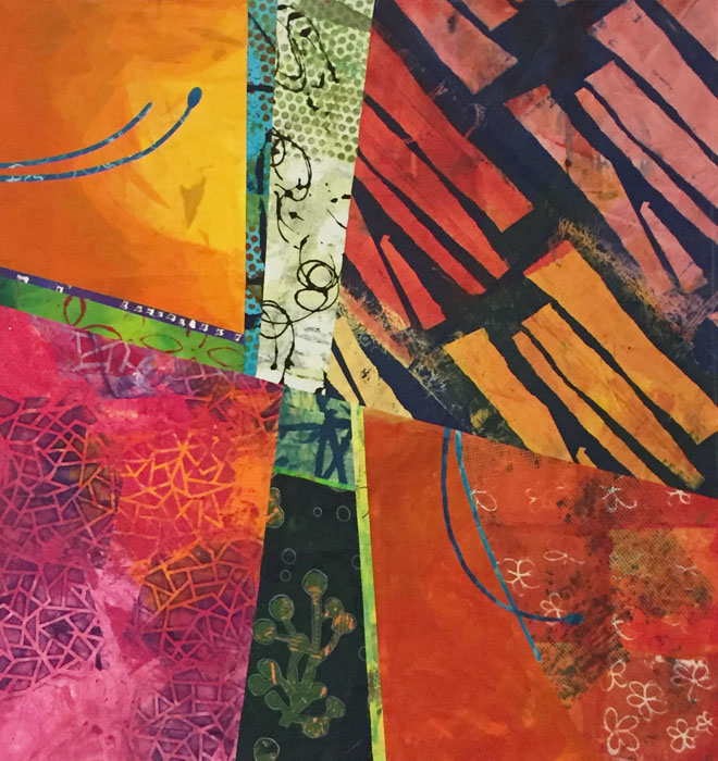
Then I took a class with Pat Pauly and saw through her examples that she fully embraces this concept.
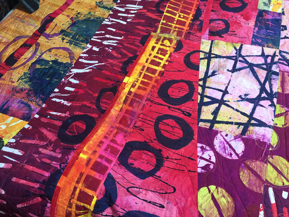
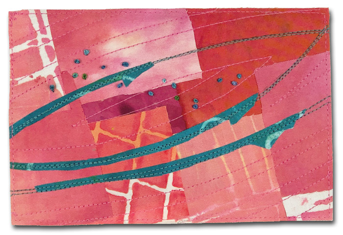
Since then I’ve been trying to use it more. I find it somewhat challenging, but very exhilarating. This piece is almost finished, Segue into Summer.
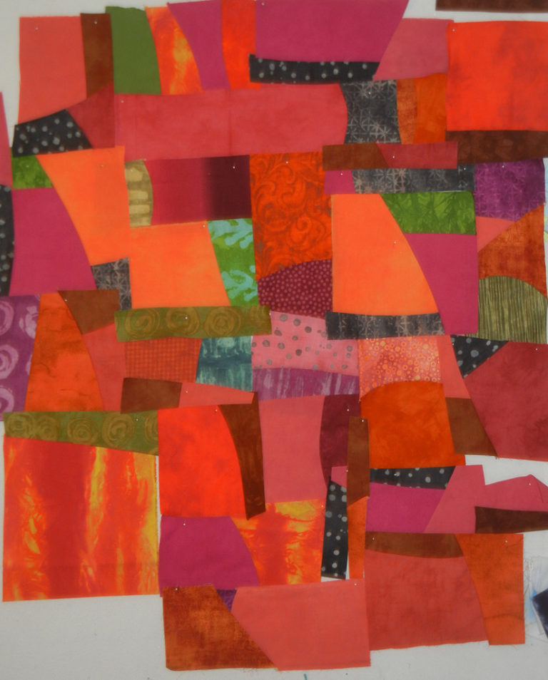
And this yet un-named piece is currently in-progress.
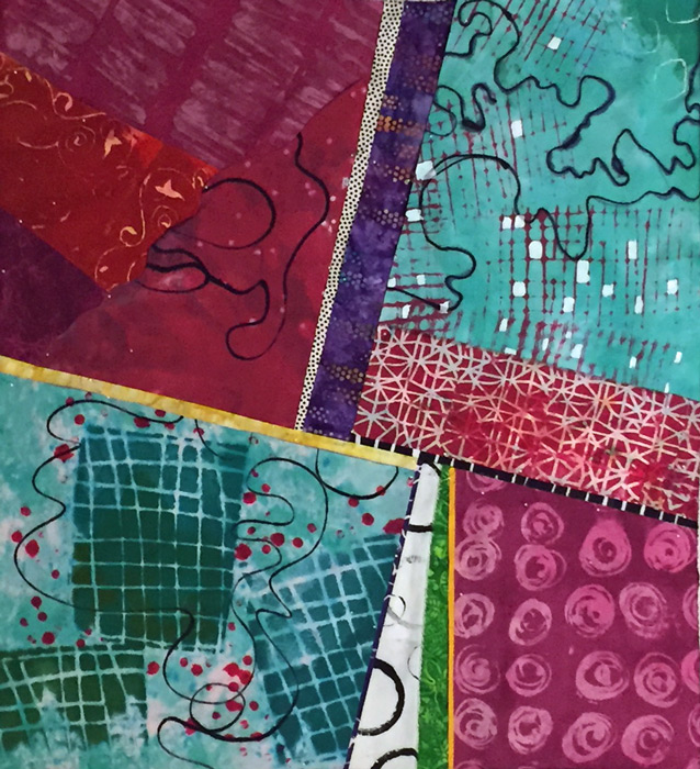
I would GREATLY appreciate your feedback on this concept. Although I’m enjoying adding this vinegar, I know that many people may not care for it. What’s your preference? I truly want to know (and I won’t be offended!)
But, for the record, you still won’t get me to eat a pickle! A girl’s gotta have standards, after all.
Ellen Lindner


I have been reading your blog for a couple of years and I usually do not respond to blogs I read. But I want you to know that I really appreciate your willingness to share what you learn. I have in turn learned a lot from you. I like vinegar and also pickles. I have a hard time incorporating a color that i do not care for. Orange has always been difficult for me to use in a piece. Thanks.
Hi Carol,
I’m glad to know that you’re learning things along with me. Yes, “ugly” colors definitely require courage! I hope you’ll try a little and see what you think.
I love the idea and your implementation of it is well done. The “ugly” color makes the other colors sing and gives a dash of the unexpected for the viewer to enjoy. It’s like adding a dash of something to a recipe. You may not be able to identify it, but if you leave the ingredient out, the recipe is the poorer for it.
Yes, Mary Ann, it’s exactly like that recipe ingredient!
When I reach for that “ugly” it’s kinda fun, but scary at the same time!
Or as I’ve always thought of it – the zinger. Love the unnamed quilt above after Segue Into Summer.
Yes, Peg, it IS a zinger.
I’m glad you like that bottom quilt. I need a name for it. Any ideas?
But, hold onto your hat: I’m considering cutting up this piece and rearranging it. Don’t worry: I’ll do some computer auditioning before slicing into it.
When my sewing revolved around making apparel it was definitely matchy-matchy with respect to color selection. In my own defense I will say that I was good at using value incorporating tints and tones.. Then I ventured into quilting and continue to be challenged with every project. Along the way I stumbled onto zingers and using ugly fabric so reading about “learning to like vinegar” truly resonated with me. Thanks for sharing your work and knowledge, you are a true educator. I really liked your finished pieces in this grouping except for the un-named one.; so I eagerly await seeing its completion. If possible, you might include photos of its different stages. Kudos for your years of generosity to the field of quilting.
Hi Luanne. Thanks for your nice comments.
I’m with you on the un-named quilt and have since cut it up and rearranged it! Check my recent posts for more on that. (For Instagram I created a hashtag called “designing with my rotary cutter.”)