Tag Archives | Collage

A Nice Award

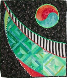
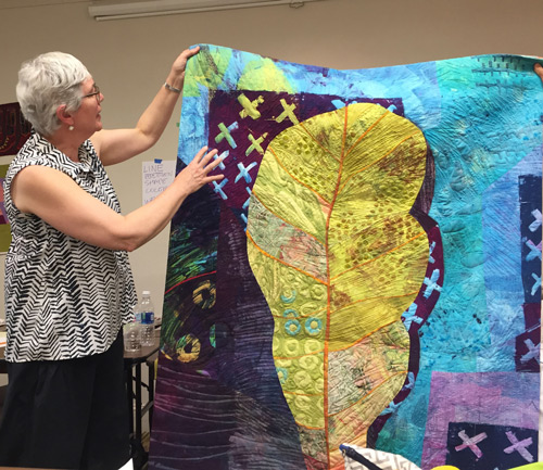
It’s always nice to win an award and my quilt, Vine Ripened, has recently done so.

Vine Ripened, an art quilt by Ellen Lindner. AdventureQuilter.com

Vine Ripened

It won 3rd place in a show called “National Juried Fiber Arts.” The exhibit was held at the Bower Center for the Arts, in Bedford, VA.

My piece won 3rd place. You can see my ribbon and award certificate below.

This exhibit runs through August 17th, so you’ve still got a little time to see it.

I really like entering my quilts into exhibits which include objects other than quilts. I also like to send them to places where I’d like to teach, in hopes of attracting a little attention. (My folks live in VA, so I’d like to add it to my teaching resume.)

Ellen Lindner

1

Learning to Like Vinegar

I don’t like the flavor of vinegar but I know that it adds a needed tartness to a variety of dishes.

However I’m starting to like the idea of “vinegar” colors. That is, those colors that are jarring in combination with others, but which also add an interesting bit of “sour.”

My interest began several years ago when I read a quote from art quilter Sally Sellers. She said “It only takes a little ugly to make the other colors sing.” Wow! The idea of using something you considered ugly was very shocking to me. But, somehow it sounded legit.

So I worked up my courage and challenged myself to use a hideous color in my next quilt. The hideous color? Lime green. At the time I HATED it!!!

This is the result, Solar Tide.

Solar Tide, an art quilt by Ellen Lindner. AdventureQuilter.com/blog

Solar Tide

Surprisingly, I really like the results. And even back in the day of still hating lime green I could see the quilt was better because of its inclusion. Shocking!

More recently, I sought out a little ugly for this quilt, Palm Fronds.

Palm Fronds, an art quilt by Ellen Lindner. AdventureQuilter.com

Palm Fronds

In this case yellow-orange serves the purpose. What do you think? It adds some pop, right?

Then I took a class with Pat Pauly and saw through her examples that she fully embraces this concept.

Dying with Pat Pauly. Ellen Lindner, AdventureQuilter.com/blog
Since then I’ve been trying to use it more. I find it somewhat challenging, but very exhilarating. This piece is almost finished, Segue into Summer.

And this yet un-named piece is currently in-progress.


I would GREATLY appreciate your feedback on this concept. Although I’m enjoying adding this vinegar, I know that many people may not care for it. What’s your preference? I truly want to know (and I won’t be offended!)

But, for the record, you still won’t get me to eat a pickle! A girl’s gotta have standards, after all.

Ellen Lindner

8

Abstract Design from Scratch

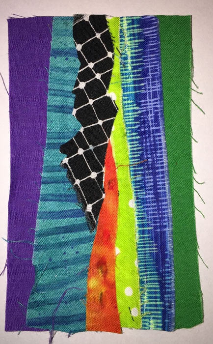
Have you done any abstract work? I have and I often find it difficult to come up with the original design. One exercise that’s been floating around via Pat Pauly and others it to randomly cover an index card with fabric scraps and let that become your design. So I tried a few.

Abstract Design from Scratch. Ellen Lindner, AdventureQuilter.com/blog

Abstract Design from Scratch. Ellen Lindner, AdventureQuilter.com/blog

Abstract Design from Scratch. Ellen Lindner, AdventureQuilter.com/blog

Some of these (like that last one) were real dogs, so I tried a more deliberate one.

Abstract Design from Scratch. Ellen Lindner, AdventureQuilter.com/blog

It was only slightly better.

But wait, there’s more! If a composition isn’t appealing try visually cropping it to see if you can find a more pleasing design. Like this.

Abstract Design from Scratch. Ellen Lindner, AdventureQuilter.com/blog

I do this with paper or cardboard L shapes. With them you can easily crop the image much smaller.  It’s important to rotate it, too, as this often helps the design quite a bit.

Here are a few more crops.

Abstract Design from Scratch. Ellen Lindner, AdventureQuilter.com/blog

Abstract Design from Scratch. Ellen Lindner, AdventureQuilter.com/blog

I think these are much more dramatic than the originals (although they may still require some editing!)

You can also do the same exercise with printed photos. I had several vegetation photos which I stacked and cut into mostly squarish pieces. This was my first arrangement.

Abstract Design from Scratch. Ellen Lindner, AdventureQuilter.com/blog

It already had good contrast and interest, but there was a lot going on.  I rearranged a bit more, now confident in the results I knew I could eventually get. This was that second arrangement slightly cropped.

Abstract Design from Scratch. Ellen Lindner, AdventureQuilter.com/blog

But, I took it even further.

Abstract Design from Scratch. Ellen Lindner, AdventureQuilter.com/blog

That would make a pretty great quilt, don’t you think?

I’ve found this technique to be useful and have just finished an abstract quilt designed in this way.  I’ll get it photographed and show it to you soon.

What tips do you have for designing abstractly?

Ellen Lindner
P.S. This is one of the tools Pat teaches in her “A Dozen Ways: Design for Art Quilts,” a class which I recommend.

2

Derek Gores at Foosaner Art Museum

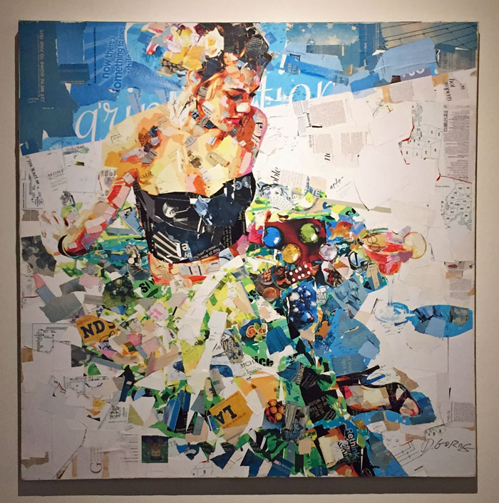
There’s a fascinating exhibit at my local art museum right now. It features the work of Derek Gores, who makes collages from magazine pages.

Like this.

Derek Gores at Foosaner Art Museum. Ellen Lindner, AdventureQuilter.com/blog

Isn’t it wonderful? As you can see, he interprets things in a somewhat abstracted way, which I think is VERY compelling. Check out this detail shot.

Derek Gores at Foosaner Art Museum. Ellen Lindner, AdventureQuilter.com/blog

Don’t you love it? Here’s another one, about 12 x 12.

Derek Gores at Foosaner Art Museum. Ellen Lindner, AdventureQuilter.com/blog

And the detail shots. The eye:

Derek Gores at Foosaner Art Museum. Ellen Lindner, AdventureQuilter.com/blog

And the mouth.Derek Gores at Foosaner Art Museum. Ellen Lindner, AdventureQuilter.com/blog

Are you blown away yet? How about this?

In his collage, Gores let the woman’s dress disappear into the background. The museum curator took it one step further, finding matching wallpaper to add to this one wall.  Brilliant!

Derek Gores at Foosaner Art Museum. Ellen Lindner, AdventureQuilter.com/blog

By the way, several of Gore’s pieces have a high fashion sensibility. In them, he often adds a cat, which is a whimsical nod to the cat walk. I love that!

Probably the most memorable piece in the installation is, in itself, an installation. It’s a 3D collage filling an entire room with hanging pieces of paper.  You can walk all the way around it, but the image is only discernible when viewed from front and center.

Can you tell what it is?

Derek Gores at Foosaner Art Museum. Ellen Lindner, AdventureQuilter.com/blog

Here’s the reference photo.
Derek Gores at Foosaner Art Museum. Ellen Lindner, AdventureQuilter.com/blog

This is just a taste of this amazing exhibit. I’ve seen it three times and I’ll be going again this week, because I keep taking people to see it. If you’re in the Melbourne, FL area, you’ll WANT to see this exhibit! It’s at the Foosaner Art Museum, which is free, through March 23rd. If you can’t make it to the museum, I encourage you to check the collages on his website.

Now, I want to grab some paper and a glue stick!

Ellen Lindner

6

“Ahead of the Storm” Completed

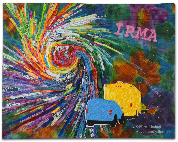
In the fall of 2017, hurricane Irma set its sights on Florida. Although Floridians don’t get too excited about most hurricanes, this one was a category 5, the strongest possible.  It’s path was hard to predict, so ALL of the Florida peninsula was in the strike zone.  As a result, widespread evacuations were ordered and everyone took the storm very seriously. The outcome was over 6.5 million people evacuating, over one-quarter of the state’s population!

As you might imagine, this mass exodus created a new set of problems: huge traffic jams, gas shortages, and a lack of available hotel rooms.  All of this factored in as I (a Floridian) designed this piece.

Ahead of the StormAhead of the Storm, an art quilt by Ellen Lindner. AdventureQuilter.com/blog

The swirl of fabric strips was a bit of play that I had done a couple of years before. It served as the perfect starting point for the composition.

I hand stitched the name of the hurricane, as well as some text about the evacuation issues.

Ahead of the Storm - detail, an art quilt by Ellen Lindner. AdventureQuilter.com/blog

I made this quilt for a call for art named “Forced to Flee.” However, I sold it right away, so I won’t be entering it after all.

My best patron, my mom, was the buyer. Shortly after purchasing it, she meekly asked, “How much trouble would it be to remove the word ‘Irma’?” What? That’s the main point, right?  But, I got it: she had no relationship to that particular hurricane and preferred something generic.  Now, I wouldn’t do this for anyone else, but for my mother, what could I say?  Of course, I removed it.

Afterwards, I thought it looked a little empty in that corner, so I added “Category 5,” much smaller. I forgot to take a picture of the revised version, but this computer edited photo will give you a pretty good idea.

Ahead of the Storm, an art quilt by Ellen Lindner. AdventureQuilter.com/blog

I have to admit I think it looks better and my mom loves it.

Have you ever altered a piece of art after finishing it?  Or after SELLING it?

Ellen Lindner
P.S. We didn’t evacuate for Irma only because there’s a shelter just down the road.  We knew we could get there quickly if needed. Fortunately for us, it only side swiped us as a much weaker storm. We tend to measure the strength of storms in the number of days the power was out.  This one was only a few hours!

0

Two Days with Pat Pauly

I was lucky enough to take a two day class with Pat Pauly. Fabric was flying and Adrenalin was flowing as she challenged us to work without a lot of planning.

Two Days with Pat Pauly. Ellen Lindner, AdventureQuilter.com/blog

Pat talking about the inspiration for this quilt.

The purpose of the class was to teach us various ways to jump start an abstract design.  One way Pat does that is by making small collaged “postcards.”  These can later serve as quilt sketches.

Like this, with the sketch on the left and the quilt on the right.

Two Days with Pat Pauly. Ellen Lindner, AdventureQuilter.com/blog

And then the students tried it. Anita Krug had especially good results. Wouldn’t these make great quilt designs?

Two Days with Pat Pauly. Ellen Lindner, AdventureQuilter.com/blog

And Karol Kusmaul made a very interesting composition by cutting up and rearranging calendar pages.

Two Days with Pat Pauly. Ellen Lindner, AdventureQuilter.com/blog

Doesn’t this look like fun?

I’d say everyone in the room pushed well beyond their comfort zone.  And we learned a lot!

If you ever get a chance to take a class with Pat Pauly, I highly recommend it.

Ellen Lindner

4

Sally and Pam’s Art Demo

At the recent SAQA retreat, you could work on your own projects or take time out for one of the many excellent demos.  One of the first I attended was put on by Sally Dutko and Pam Richardson, as they explained their process to us.

Sally’s work was used for most of the in-progress examples. As you can see, she collages paper and fabrics onto a base support.

Sally and Pam's art demo. Ellen Lindner, AdventureQuilter.com/blog

Then, she stitches a grid and coats everything with a clear medium.  (This gives it “tooth” for other media.)

Sally and Pam's art demo. Ellen Lindner, AdventureQuilter.com/blog

Finally, she adds paint, stitching, more collage…whatever she thinks it needs.

Sally and Pam's art demo. Ellen Lindner, AdventureQuilter.com/blog

On the one above, she finished the edge with satin stitching, and mounted it on to an artist canvas.  An intriguing process, great work, and a professional presentation!

Pam’s work provided most of the completed samples.  This small piece was created in the same fashion as Sally’s, but mounted slightly differently.  Here, a canvas was wrapped in fabric and the artwork was applied.

Sally and Pam's art demo. Ellen Lindner, AdventureQuilter.com/blog

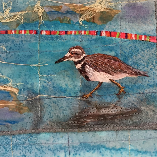
I especially loved this beach scene of Pam’s. She used a variety of techniques and media to achieve her desired result.

Sally and Pam's art demo. Ellen Lindner, AdventureQuilter.com/blog

Can you find the tea bags she used? And look at that reflection.  Isn’t it effective?

Sally and Pam's art demo. Ellen Lindner, AdventureQuilter.com/blog

“Stray” threads and an unexpected bright bit of fabric complete the composition.

Sally and Pam's art demo. Ellen Lindner, AdventureQuilter.com/blog

What talented women!  I got an Adrenalin surge from seeing their work!

Ellen Lindner


0

Quilting and Cording

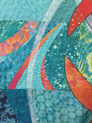
When quilting my latest piece I decided to mimic the swirls/curves in the background.

Quilting and Cording. Ellen Lindner, AdventureQuilter.com/blog

Quilting and Cording. Ellen Lindner, AdventureQuilter.com/blog

In addition to machine quilting, I also added some hand stitching around several of the curved shapes.

Quilting and Cording. Ellen Lindner, AdventureQuilter.com/blog

My main reason for doing so was to add contrast to the white curves in the light areas. I intended to stitch around all the curved shapes, but the effect was so subtle I changed my mind and used it only in the lightest areas.

Next, I turned my attention to the main motif.  I thought it needed to be set off from the background somewhat.  I considered:
– Lightening the background around the motif with colored pencils, chalk, etc.
– Using tulle to add a dark shadow around parts of the motif.
– Adding a dark line around the motif, by adding cording.

I was leaning toward the cording idea, since I had used it previously. I did some auditioning and started in.  I hand stitched a black cord in place.  That is, I used a cording stitch to capture the cord and secure it to the top of the quilt.  I did not pierce the fabric with the cord.

Here you can see the effect before and after the cording.

Quilting and Cording. Ellen Lindner, AdventureQuilter.com/blog

I think it set it off perfectly.

Quilting and Cording. Ellen Lindner, AdventureQuilter.com/blog

Quilting and Cording. Ellen Lindner, AdventureQuilter.com/blog

And here’s the entire quilt, ready for facing.  Almost finished!

Quilting and Cording. Ellen Lindner, AdventureQuilter.com/blog

Have you got any suggestions for a name?  I’ve got one in mind, but am still slightly undecided.

Ellen Lindner
P.S. Here’s what a hard/precise tulle shadow looks like.  It’s very effective in adding definition, but only if you want to show the top element just slightly above the background.  I wanted this motif to float, so it wasn’t appropriate here.

12

Corn Fields and Such

After separately creating the two men for my “brothers quilt,” it was time to work on the background.

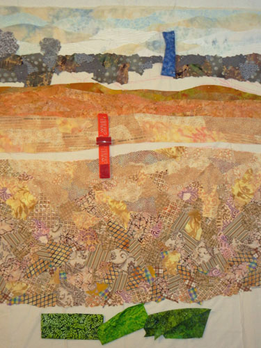
I finished up the rough draft of the sky and added the far tree line, (with a piece of blue fabric marking a future silo.).

Corn Fields and Such. Ellen Lindner, AdventureQuilter.com/blog

Next it was on to the corn field in the foreground. Since the reference photo was taken in November, the corn had already been harvested and the short golden stalks were all that was left.

My Brothers - making faces. Ellen Lindner, AdventureQuilter.com/blog

I wanted to create the texture of the messy corn stalks, but not too exactly.  So, I used lots of print fabrics to convey the vegetation.  My plan was to use large scale prints in the foreground, like those shown below, and smaller scaled ones in the background.  I hoped this would add a sense of depth.

Corn Fields and Such. Ellen Lindner, AdventureQuilter.com/blog

It worked, but required a good bit of tweaking. (And a lot of pins!) Here is what I think will be the final corn field, below.

Corn Fields and Such. Ellen Lindner, AdventureQuilter.com/blog

Distant fields had much more subtle texture, so I auditioned near-solid fabrics for them.

Corn Fields and Such. Ellen Lindner, AdventureQuilter.com/blog

Here they are, complete.  I’m happy with the sense of depth.  That will be enhanced when I add the small buildings in the distance.

Corn Fields and Such. Ellen Lindner, AdventureQuilter.com/blog

Next it was time to start adding the green fields and grasses. Here it is, in-progress.

Corn Fields and Such. Ellen Lindner, AdventureQuilter.com/blog

I’m getting close to completing the design of this background.  I still need to add the foreground grass and the buildings.  Then, I’ll have to glue it all in place.

FYI, here’s another quilt where I used the scale of fabrics to add to the sense of depth.

Ellen Lindner

6

My Brothers: Clothing

I’m happy with the way the quilt featuring my two brothers is developing.  Here’s my brother Ricky almost complete.

Clothing in-progress. Ellen Lindner, AdventureQuilter.com/blog

After making the face of my other brother, Todd, it was time to work on his jacket.  First, auditioning fabric.

Clothing in-progress. Ellen Lindner, AdventureQuilter.com/blog

Here it is, in-progress.

Clothing in-progress. Ellen Lindner, AdventureQuilter.com/blog

All these little pieces were eventually glued to the muslin base and to each other.

Selecting fabrics for Todd’s pants was more challenging. They were sort of Army green; not a color I tend to stock.  My first attempt:

Clothing in-progress. Ellen Lindner, AdventureQuilter.com/blog

No.  I decided the color was too bright.  This was my solution.  Much better, I think.

Clothing in-progress. Ellen Lindner, AdventureQuilter.com/blog

Now that I’ve completed the two men I’m just getting started on the background.  I’ll make it much looser, which I’m looking forward to.

So far, I’ve just worked on the sky. Some of it looks a little strong to me, but I’ve learned not to cast judgement until I can see everything together.

Clothing in-progress. Ellen Lindner, AdventureQuilter.com/blog

As you can see in the photo above, I’ve drawn the background fields and barns onto the muslin base.  I’ll reference these as I continue.

Ellen Lindner

11