Tag Archives | Design

A Splash of Orange

You readers are really great!  When I posted my quilt at this stage several of you had good suggestions about how I might improve it.

A Splash of Orange. Ellen Lindner, AdventureQuilter.com/blog

The most common suggestion was to add some orange back in.  Something I had considered but rejected.  Another tip was to break up the white and to extend the “splashing” out toward the edges more. Since I had mentally given this quilt a “7,” I knew it needed something and I decided to give these ideas a try.

First, I added some white “splashes” closer to the edges and put some of the orange stripes back.  I also tapered the ends of many of the motifs.

A Splash of Orange. Ellen Lindner, AdventureQuilter.com/blog

Clearly, the orange needed to be more dramatic.  So, I tried a few little splashes, (which look red in this photo.)  Yes!  I could see that this would add the drama the quilt needed.

A Splash of Orange. Ellen Lindner, AdventureQuilter.com/blog

I added more.

A Splash of Orange. Ellen Lindner, AdventureQuilter.com/blog

Yeah, that was working pretty well.  My brain said, “Let’s add more!”  And I obliged.

A Splash of Orange. Ellen Lindner, AdventureQuilter.com/blog

But, wait a second.  This was beginning to look like I had added the kitchen sink!  Some editing was needed. I removed the white splashes and auditioned changes to the orange stripes.  (Below, those fabrics are folded, rather than cut, for audition purposes.)

A Splash of Orange. Ellen Lindner, AdventureQuilter.com/blog

And this is where I ended up. As you can see I completely removed the orange stripes.

A Splash of Orange. Ellen Lindner, AdventureQuilter.com/blog

Have you heard the saying that goes, “If your composition is not working, remove your favorite thing?”  I think that sort of applied here.  At this point, I thought it was a solid 8.5 and I was quite happy with it.  On to quilting.

(Did you remember that this piece is composed of painted fabric, some of which is stiff?  That may be an issue for the quilting.)

Ellen Lindner

20

And Then I Threw Paint on It

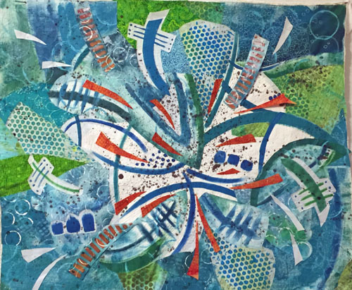
I got this far on my current quilt, before I knew it needed something more.

A Wacky Composition. Ellen Lindner, AdventureQuilter.com/blog

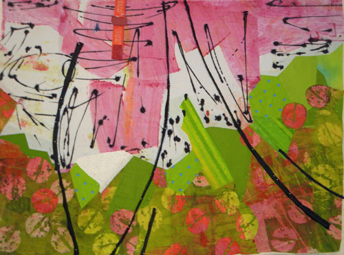
Clearly, the white needed some texture.  So, I decided to fling some paint onto it!

I practiced first on a piece of muslin, then I just went for it.

And Then I Threw Paint on It. Ellen Lindner, AdventureQuilter.com/blog

Amazingly, I did this without any fear!  I was READY to break things up and to add some interest.

Doesn’t it look better?

And Then I Threw Paint on It. Ellen Lindner, AdventureQuilter.com/blog

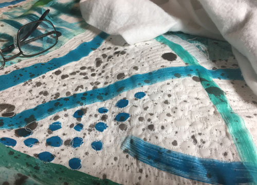
After that I considered it finished and began quilting it.  My initial idea was to stitch around each little drop of black paint.  And I actually stuck with it until I got to the very edges.

And Then I Threw Paint on It. Ellen Lindner, AdventureQuilter.com/blog

But, wait.  Is it really finished it?  After my post on August 4th, I got some very good comments and suggestions from you readers. I decided to reconsider a few things and to audition some changes.  I’ll show you those in the next post.

Ellen Lindner

4

A Wacky Composition

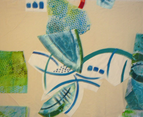
Well, after painting those (challenging) fabrics I had to figure out what to do with them.

Challenging Fabric Painting. Ellen Lindner, AdventureQuilter.com/blog

Since I wasn’t crazy about some of them, I knew I’d need to cut isolated portions and motifs for use. I had NO IDEA what my composition might look like, but I started cutting out sections and MINDLESSLY sticking them up on my design wall.

Apparently my brain likes order because I soon found myself adding each piece so that it filled the space left by previous pieces. Soon, a design was emerging.

A Wacky Composition. Ellen Lindner, AdventureQuilter.com/blog

I did make one very conscious decision at this point: I decided to place the pieces with the white background near center, since I knew these high contrast pieces would attract attention.

And so it went. I had found a dotted piece of blue and green and added it to the mix.  It worked well and expanded the color palette.

A Wacky Composition. Ellen Lindner, AdventureQuilter.com/blog

I threw in a little of the orange, too, of course.  It was looking wild and I was trying hard not to over think it!

A Wacky Composition. Ellen Lindner, AdventureQuilter.com/blog

I had some gaps and auditioned commercial fabrics to fill in.

A Wacky Composition. Ellen Lindner, AdventureQuilter.com/blog

Before long I had the base muslin fabric covered.  Now, it was time to examine what I had with a very critical eye.  Was this wacky combination heading in a usable direction?  Should I start all over with something calmer?  If I continued,  I knew some editing/deleting would be in order.

A Wacky Composition. Ellen Lindner, AdventureQuilter.com/blog

I removed (temporarily???) the orange, replaced the too bright blue lower left, and moved things a little. I felt like I was getting close.

A Wacky Composition. Ellen Lindner, AdventureQuilter.com/blog

Future questions:
– The white areas seem so blank.  Should I add something small scale in that area?
– Does it need something lower right?
– I’d like to add the orange back, but how can I best do that?
– Does it need something darker?  Black, even?

About this time I decided on a tentative name, “Splash.”  That would certainly affect some  future decisions.

Thanks for joining me on this wild ride!

Ellen Lindner

16

MORE Trial and Error

After doing LOTS of trial and error on my current quilt, I finally decided to cut it into pieces and to reassemble it.  My goal was to add some skinny or small pieces of black, to move the black around the piece more, and to add interest to the composition.

Of course, I could cut the piece into equal panels, but I decided to audition more radical solutions first.  (As you may have guessed, my experimentation was done on the computer.)

What if I cut it into curved shapes and then rejoined them?MORE Trial and Error. Ellen Lindner, AdventureQuilter.com/blog

And added black between the pieces.MORE Trial and Error. Ellen Lindner, AdventureQuilter.com/blog

Interesting, but sorta…hmm, awkward.

What if I cut it into angled shapes and reassembled them?MORE Trial and Error. Ellen Lindner, AdventureQuilter.com/blog

This time (above) I also rotated some of the pieces 180 degrees and I rearranged the position of the panels.  That added a lot of energy, I thought.

Next, I added black between.MORE Trial and Error. Ellen Lindner, AdventureQuilter.com/blog

I was pretty happy with this. But, it was time to also consider more predictable arrangements.  Here, I’ve “cut” my composition into 4 panels.MORE Trial and Error. Ellen Lindner, AdventureQuilter.com/blogIt looked a little boring after some of the earlier arrangements.  What if I flipped some of the panels?

MORE Trial and Error. Ellen Lindner, AdventureQuilter.com/blog

Ah, yes.  This has much more energy. Should I move the panels around?  And maybe scoot things out of alignment a bit?

MORE Trial and Error. Ellen Lindner, AdventureQuilter.com/blog

That’s pretty cool.  But, I eventually decided the irregular shape didn’t really add to the composition.

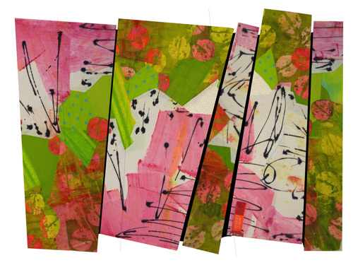
So, here it is: my final plan.

MORE Trial and Error. Ellen Lindner, AdventureQuilter.com/blog

I’m kinda in love with it.  To me, it has the right amount of energy and the black lines help pull it all together.  Time to quilt!

Oh yeah, have you got any ideas about a title for this piece?  I’d love to hear your suggestions.

Ellen Lindner
P.S. THANKS to so many readers who offered their thoughts and suggestions on my earlier post. I had more comments than almost any other post.  I hope you’ll also chime in on this one!

18

LOTS of Trial and Error

Good grief.  I’ve about worn out my brain cells trying out different ways to proceed with my current project.

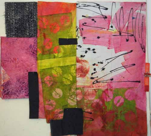
I was really thrilled with the background composition but felt like it needed to have some more black added.

To Start: Fabulous Fabrics. Ellen Lindner, AdventureQuilter.com/blog

But nothing that would detract from the black already there.  Maybe something loose and organic that would play up the chunky diagonal line between the white and green?  With that idea in mind I began to experiment.

Maybe a wild heavy line?

Or maybe little jagged black pieces to create the line.

Or a thinner more controlled black line?

Or maybe the line should be created with the same shapes showing in the green and pink fabric at the bottom.

You can’t say I didn’t try! Finally I gave up on the idea of playing up the diagonal line and looked for other ways to add black.  Something like this, maybe?

Well, I liked that better, but felt like I was till far away from the right solution.

At about this time one of my readers. Eleanor Levie, suggested adding black vertical strips. That got me thinking.  I began to consider the idea of cutting the piece into sections and reassembling it, along with the addition of black. But, should the sections be vertical?  Or maybe slanted?  Or even curved?  And should I put them back in their original locations or mix them up a bit?  If the latter, what kind of shape might I create?  And what about inverting or rotating some of the sections?

Well, as you can tell, that took me down quite another rabbit hole.  I’ll show you those experiments next time.

Ellen Lindner


25

To Start: Some Fabulous Fabrics

I’m working on a new project, inspired by some great new fabrics. The bulk of these were painted by Pat Pauly. I purchased them to use together and they make my mouth water!

To Start: Fabulous Fabrics. Ellen Lindner, AdventureQuilter.com/blog

In the photo above I’ve folded each one to reveal the parts I intend to work with. I think a good dose of black will also be needed.

And maybe some other fabrics.  Yellow-green, orange-red, blue-green?

To Start: Fabulous Fabrics. Ellen Lindner, AdventureQuilter.com/blog

Uh, no.

The hand drawn lines in the pink and white fabric got me thinking about lines so I spent some time doodling.  One of my sketches resulted in a very irregular diagonal line.  I thought that would be a good starting point for what would basically be a two-color quilt.  I cut out my favorite parts and began to place things on the design wall.

To Start: Fabulous Fabrics. Ellen Lindner, AdventureQuilter.com/blog

Because the pink fabric is painted in broad chunky shapes, I thought I could use a chunky composition elsewhere. Eventually, I got this:

To Start: Fabulous Fabrics. Ellen Lindner, AdventureQuilter.com/blog

My scraps  yielded a few of the painted circles, so I added them back in judiciously.

To Start: Fabulous Fabrics. Ellen Lindner, AdventureQuilter.com/blog

I was pretty happy with this.  Still, I knew I needed to add some black.  Just how should I do that without competing with the wonderful black lines already there?  A quandary. (Hopefully, I’ll have a solution for the next post.)

Ellen Lindner

4

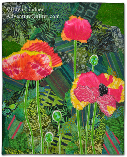
“Poppies Ablaze” Complete

My latest quilt, Poppies Ablaze,  is now complete.

Poppies Ablaze, an art quilt by Ellen Lindner. AdventureQuilter.com

I’m very happy with it, plus I had a lot of fun working on it!

Poppies Ablaze, an art quilt by Ellen Lindner. AdventureQuilter.com

This very close detail shot shows the double black outline stitching which I love to use.

Poppies Ablaze, an art quilt by Ellen Lindner. AdventureQuilter.com

This piece is the newest sample for my class “Design Your Own Nature Quilt.”  (This class is currently underway online and it’s not too late to join in.)

I can’t wait to make another class sample!  These are fast and fun. See more class samples here.

Poppies Ablaze is 21″ x 17″ and is available for 325.

Ellen Lindner


10

Instant Art Quilt again

I used to teach a class called Instant Art Quilt.  In it, students started with a gorgeous piece of hand dyed fabric, (the kind you’re afraid to cut up,) and I lead them through tearing it up and rearranging the pieces.

Learn with Ellen Lindner. AdventureQuilter.com

After Image, a class sample

The results were always beautiful and my students really enjoyed the class.

Carole Grant's results from Ellen Lindner's Instant Art Quilt class. AdventureQuilter.com

By A. Carole Grant

“This has been such a fabulous class…can’t remember when I
have enjoyed one so much!” A. Carole Grant

You can see many examples of the technique in the IAQ Gallery.

Vivan Milholen's results from Ellen Lindner's Instant Art Quilt class. AdventureQuilter.com

By Vivan Milholen

In the busy-ness of my latest website redo I never got around to adding this class to my website.  I’ve finally remedied that and am looking forward to teaching it again. Find all the info here.

I’d love to come teach this class for your guild!

Ellen Lindner
P.S. See older blog posts about teaching this class in various places: Mt. Dora, FLThe Villages, FL, Orlando, FL

0

Planning a New Class Sample

I really enjoy teaching my class “Design Your Own Nature Quilt!”  In it, students learn about design and composition, then use their own photos to create a quilt.  The results are always great and the process is exhilarating. (Actually, the process can also be a little intimidating but the students are told to pack their artistic courage, so it works out well.)

The only downside to this class is that I keep selling the class samples.  Finding myself in that situation, once again, I’m about to make a new one.  I thought you’d like to see a little about my process, so I’ll be posting about it here on my blog.

This is my inspiration photo.

Planning a New Class Sample. Ellen Lindner, AdventureQuilter.com/blog

Don’t you love the bright colors and back lighting?  It’s great, but is this the best composition for a small quilt?  Since the flowers are vertical, would a vertical composition be better?  And, do I really want to create ALL those flowers in a small scale?  Maybe I’d prefer something like this.

Planning a New Class Sample. Ellen Lindner, AdventureQuilter.com/blog

Look closely.  This is more than just a crop.  Things have been moved around a little. When doing so, I thought about focal points, sweet spots, balance, weight, and contrast, all things students learn in this class.

And this is my loose sketch. (copyrighted)

Planning a New Class Sample. Ellen Lindner, AdventureQuilter.com/blog

I like it.  Soon, I’ll be composing the background with a variety of green and blue-green fabrics. Keep watching and send me your questions.

Also, I’ll be teaching this class online soon. See full details.

Ellen Lindner

12

Composing with Indigo

Being blessed with a bunch of indigo fabrics, I was ready to make an art piece with them.  I knew I’d like to add an accent color, but which one?  After some auditioning, I decided on the pink/orange family.

Composing with Indigo. Ellen Lindner, AdventureQuilter.com/blog

But, how to best use these wonderful designs?  I didn’t really want to cut into them, and several were in squarish proportions.  I decided on a gridded composition with three vertical columns. This shows an early arrangement, incomplete.

Composing with Indigo. Ellen Lindner, AdventureQuilter.com/blog

I added in some dull pink.  (Dull, because I didn’t want it to shine more than the indigo fabrics.)

Composing with Indigo. Ellen Lindner, AdventureQuilter.com/blog

And the almost-finished composition, pinned.  I was happy with it. But, maybe the pink had too many dull spots?

Composing with Indigo. Ellen Lindner, AdventureQuilter.com/blog

I auditioned a brighter pink.

Composing with Indigo. Ellen Lindner, AdventureQuilter.com/blog

I liked it much better EXCEPT I thought it probably needed to be thinner. I auditioned the idea.

Composing with Indigo. Ellen Lindner, AdventureQuilter.com/blog

Yep.  Much better. But, I had a problem.  Most of this was already glued, so I couldn’t easily rearrange things.  How could I make the pink stripes thinner? I decided to sew a tuck in the back of each, through the muslin support and all. Can you see the seam below?

Composing with Indigo. Ellen Lindner, AdventureQuilter.com/blog

That worked.  As you can see, I also added some hand embroidery.  I’ll have more detail shots of that in the next post.

Ellen Lindner

8