Tag Archives | Design

Trees or Skyscrapers?

After trying a pastel blue sky on my piece inspired by fall trees, I tried it with dark blue instead.

Trees or Skyscrapers? Ellen Lindner, AdventureQuilter.com/blog

I actually liked it pretty well, but I didn’t have enough bright blue to do it justice. So, I tried white. And also auditioned the idea of more twigs.

Trees or Skyscrapers? Ellen Lindner, AdventureQuilter.com/blog

The verdict: YES to the white sky, NO to the chunky twigs.

Trees or Skyscrapers? Ellen Lindner, AdventureQuilter.com/blog

But, what about those vertical shapes? Were they starting to imply skyscrapers, rather than trees? Yes, clearly they were. Well, that’s not really what I wanted, but I decided it could be trees in an urban setting. (Plus, I didn’t really care if the shapes read like trees, skyscrapers, or anything real.) I added a few twigs to add contrast and play up the tree idea.

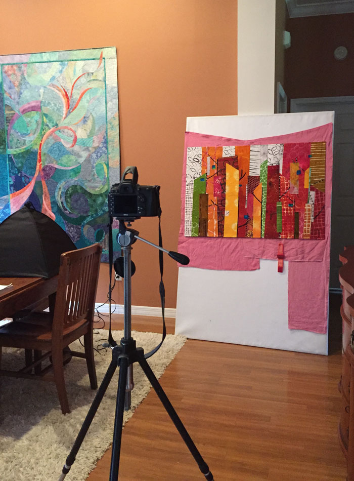
After much quilting I was ready to photograph this piece.

Trees or Skyscrapers? Ellen Lindner, AdventureQuilter.com/blog

Why use a pink backdrop, you ask? It has to do with the digital editing I’ll be doing later. I’ll “pick” the quilt away from the background and it’s easier for the computer to do that if there’s a contrast between the two. Can you see how the left side would blend into the backdrop if I left it white?

Finished photos coming soon.

Ellen Lindner

2

Retreat Project

What do you get when you add a beautiful setting, great friends, and time to make quilts? Well, fun productivity, of course!

At a recent SAQA (Studio Art Quilt Associates) retreat I took my portable design wall, my easel, and ALL of my hand dyed fabrics. I didn’t have an idea when I left home, but I got one along the way. I decided to be inspired by the colors of fall trees (which we miss here in Florida,) and to use tall vertical shapes.

First, I auditioned A BUNCH of fabric to see if I had what I needed.

Retreat Project. Ellen Lindner, AdventureQuilter.com/blog

Well, um, yes I did. Too many fabrics, as a matter of fact. (Or as Tim Gunn might say, “That’s a whole lot of look.”)

I quickly edited and started putting fabrics in place.

Retreat Project. Ellen Lindner, AdventureQuilter.com/blog

I wasn’t sure what I wanted for the “sky,” but I put some light fabrics there as place holders.

Next, I auditioned some yellow. Would one piece stand out too much? Did I need more? Could I use yellow in the sky too?

Retreat Project. Ellen Lindner, AdventureQuilter.com/blog

I settled on the arrangement below. In this photo many of the fabrics are still folded. I don’t cut until I’m pretty sure. (But, by the end of the 2 day retreat I had all these shapes cut, pinned in place, and a few glued.)

Retreat Project. Ellen Lindner, AdventureQuilter.com/blog

I knew I’d need some black to break up the bright colors, so vertical trunks and branches filled the bill nicely. And you can also see that I added more yellow/yellow-orange.

Retreat Project. Ellen Lindner, AdventureQuilter.com/blog

I also began to consider that sky. Someone at the retreat suggested a pale sky, so I tried it out. It didn’t excite me, though.

In future posts I’ll show you other options I auditioned and where I ended up.

Ellen Lindner

0

Bedroom Redo

I recently redecorated my bedroom and I’m LOVING the results!

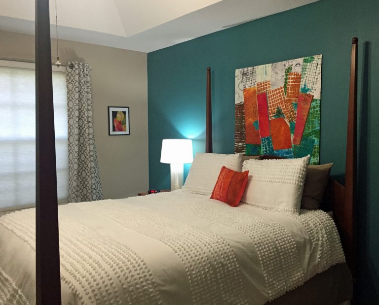
Here’s the bed wall, with my quilt Rhythm of the City prominently displayed.

Ellen Lindner's Bedroom Redo. AdventureQuilter.com/blog
More of my work moving across the window wall. This is Croton Leaves 3.

Ellen Lindner's Bedroom Redo. AdventureQuilter.com/blog

Continuing to look left, a corner featuring my paper collage Three Cherries.

Ellen Lindner's Bedroom Redo. AdventureQuilter.com/blog

And, to complete the artwork roundup, at the foot of the bed I have Brainstorm.

Ellen Lindner's Bedroom Redo. AdventureQuilter.com/blog

My tilt mirror was originally painted gold but I switched it up to “dark steel.” Although my technique was lacking it still looks good at first glance.

Ellen Lindner's Bedroom Redo. AdventureQuilter.com/blog

I wanted a taupe bed skirt, but I couldn’t find one to fit my tall bed. White was the only color available in that length. So, my friend suggested combining the two and I think it works.

It was fun to use a variety of surfaces and textures. Shiny and dull, smooth and rough, modern and vintage. I love the tufted look of the bedspread.

Ellen Lindner's Bedroom Redo. AdventureQuilter.com/blog

And these fuzzy white pom-pom flowers are the perfect contrast to my grandmother’s vintage water pitcher.

Ellen Lindner's Bedroom Redo. AdventureQuilter.com/blog

It sure was fun to put this all together and I’m SO delighted with the vibrant colors throughout!

Ellen Lindner
P.S. How do you like the way I’ve presented Croton Leaves 3, above? (2nd photo.) I bought a frame with glass and a white mat and I mounted the little quilt right on to the FRONT of the glass. I love presenting small pieces this way. They need something to give them more substance, but I don’t want to cover the texture of the piece. Lots of double-sided tape does the trick.

23

“When Fuchsia Came to Play” Complete

Well, after LOTS of trial and error, trouble shooting, and rearranging, I finally finished my latest abstract piece, When Fuchsia Came to Play.

When Fuchsia Came to Play, an art quilt by Ellen Lindner, AdventureQuilter.com

When Fuchsia Came to Play

A detail shot of the fabrics – most of them dyed by me.

When Fuchsia Came to Play - detail, an art quilt by Ellen Lindner, AdventureQuilter.com

I showed you my plans for rearranging in an earlier post. As part of that, I whacked 7+” off the bottom! It’s okay. It needed it, and I’ve already found another use for that extra part.

When Fuchsia Came to Play  is available for purchase.

My friends joke that I’m the queen of cropping, and it’s pretty true. Need me to bring my rotary cutter over?

Ellen Lindner

2

Another “Intersection” Abstract

After success creating Segue into Summer, I decided to use it as a loose template for some additional quilts made with hand dyed fabrics.

I’m calling this my “Intersection” series. I plan to use tilted straight lines as the “skeleton” for each one.

First, I pulled out the large scaled hand dyes I wanted to use, plus pretty much everything hand dyed that matched them. What a collection!

An "Intersection" Abstract. Ellen Lindner, AdventureQuilter.com/blog

Clearly, some editing was called for, so I pared it down somewhat.

An "Intersection" Abstract. Ellen Lindner, AdventureQuilter.com/blog

And, since I’ve been “learning to like vinegar” (colors, that is,) I added in a few “ugly” colors. I knew they’d add quite a bit of pop, but would need to be used carefully. Can you see them?

An "Intersection" Abstract. Ellen Lindner, AdventureQuilter.com/blog

These are the two fabrics I expected to be the stars of this piece. I dyed and painted them to go together. I  knew I’d need to add additional colors, as well as lights and darks.

An "Intersection" Abstract. Ellen Lindner, AdventureQuilter.com/blog

I started in my usual fashion: creating a muslin base for my composition. I drew on the perimeter lines, as well as the proposed skeletal lines for the design. I’ve make them darker here, so you can see.

An "Intersection" Abstract. Ellen Lindner, AdventureQuilter.com/blog

As you can see, I got my two star fabrics in there right away, using them in the largest sections where they would fit.

Right away, I had to redesign the size of the top right piece, to accommodate the fabric size. The line shows the size I intended that shape to be, but the fabric wasn’t large enough, so that design line got moved higher. That would be change #1 of about 100!

I was off and running. I’ll show you LOTS of trial and error in the next post.

Ellen Lindner


0

“Segue Into Summer” Complete

If you’ve been following my blog you know I’ve been learning about printing fabric with thickened dye. And, of course, I was anxious to use them! Plus, I also wanted to try larger scaled abstract pieces, as well as the idea of using a little bit of “ugly” color. All those goals came together in this quilt and I love the result!

Here it is: Segue Into Summer

Seque Into Summer, an art quilt by Ellen Lindner. AdventureQuilter.com

Segue Into Summer

At 44″h x 41″w, it’s larger than most of my quilts.
Here are a couple of detail shots.

Seque into Summer - detail, an art quilt by Ellen Lindner. AdventureQuilter.com

Segue Into Summer - detail, an art quilt by Ellen Lindner. AdventureQuilter.com

Although I started this quilt in April, progress was delayed by several other projects. I’m really glad to have it finished!

Find more information here, including how you can audition this piece in your home.

Ellen Lindner
P.S. I printed/dyed about half of these fabrics. The others were done by Pat Pauly.

0

Learning to Like Vinegar

I don’t like the flavor of vinegar but I know that it adds a needed tartness to a variety of dishes.

However I’m starting to like the idea of “vinegar” colors. That is, those colors that are jarring in combination with others, but which also add an interesting bit of “sour.”

My interest began several years ago when I read a quote from art quilter Sally Sellers. She said “It only takes a little ugly to make the other colors sing.” Wow! The idea of using something you considered ugly was very shocking to me. But, somehow it sounded legit.

So I worked up my courage and challenged myself to use a hideous color in my next quilt. The hideous color? Lime green. At the time I HATED it!!!

This is the result, Solar Tide.

Solar Tide, an art quilt by Ellen Lindner. AdventureQuilter.com/blog

Solar Tide

Surprisingly, I really like the results. And even back in the day of still hating lime green I could see the quilt was better because of its inclusion. Shocking!

More recently, I sought out a little ugly for this quilt, Palm Fronds.

Palm Fronds, an art quilt by Ellen Lindner. AdventureQuilter.com

Palm Fronds

In this case yellow-orange serves the purpose. What do you think? It adds some pop, right?

Then I took a class with Pat Pauly and saw through her examples that she fully embraces this concept.

Dying with Pat Pauly. Ellen Lindner, AdventureQuilter.com/blog
Since then I’ve been trying to use it more. I find it somewhat challenging, but very exhilarating. This piece is almost finished, Segue into Summer.

And this yet un-named piece is currently in-progress.


I would GREATLY appreciate your feedback on this concept. Although I’m enjoying adding this vinegar, I know that many people may not care for it. What’s your preference? I truly want to know (and I won’t be offended!)

But, for the record, you still won’t get me to eat a pickle! A girl’s gotta have standards, after all.

Ellen Lindner

8

Lessons Learned: Dying and Designing

Pat Pauly is a WEALTH of knowledge, so I really learned a lot when I took a 5 day dyeing/printing class with her.

First up: colors look different when wet vs. dry. Leslie’s samples served as examples.

Lessons Learned: Dyeing and Designing. Ellen Lindner, AdventuereQuilter.com/blog

Bigger can be better. This piece, below, is about 31″ x 45″. So, Pat finally got me to work larger. And I have to say I love it.  I’ll be buying a big screen.

Dyeing with Pat Pauly. Ellen Lindner, AdventureQuilter.com/blog

Leftover dyes work well when just smeared on. Who knew? (This is Pat’s example, below.)

Dyeing with Pat Pauly. Ellen Lindner, AdventureQuilter.com/blog

Everything goes with everything. These are my words, not Pat’s, but it seems to apply to the way she combined things. UH-mazing! To my eye, she seemed to purposely pick the most jarring fabrics to use together and then they looked good. What?

She demonstrated this over and over by folding fabrics so their disparate parts ended up playing together nicely. THIS is what I want to be able to do!

Dyeing with Pat Pauly. Ellen Lindner, AdventureQuilter.com/blog

This detail shot of one of her quilts shows what I mean. I would have never used burgundy and fuchsia together, but with a little bright yellow (again, unexpected) mixed it in all works. The other thing I want to learn.

Dyeing with Pat Pauly. Ellen Lindner, AdventureQuilter.com/blog

As much as knowledge as I gained in this class it was also humbling as I realized how much I still need to explore and work on. I’m invigorated and excited to try it all!

Ellen Lindner
P.S. Pat also got me to wear long gloves, but not an apron!

0

“Slightly Unexpected” Complete

In my last post, I showed you my latest abstract quilt in-progress.

Here it is finished: Slightly Unexpected.

Slightly Unexpected, an art quilt. Ellen Lindner, Adventurequilter.comI added hand stitched and padded black circles to keep the white one company. The rest of the background is pretty densely stitched.

Slightly Unexpected - detail, an art quilt. Ellen Lindner, Adventurequilter.com

I’m happy with this quilt and anxious to try out some more abstract design.

Ellen Lindner

0

Abstract Design from Scratch

Have you done any abstract work? I have and I often find it difficult to come up with the original design. One exercise that’s been floating around via Pat Pauly and others it to randomly cover an index card with fabric scraps and let that become your design. So I tried a few.

Abstract Design from Scratch. Ellen Lindner, AdventureQuilter.com/blog

Abstract Design from Scratch. Ellen Lindner, AdventureQuilter.com/blog

Abstract Design from Scratch. Ellen Lindner, AdventureQuilter.com/blog

Some of these (like that last one) were real dogs, so I tried a more deliberate one.

Abstract Design from Scratch. Ellen Lindner, AdventureQuilter.com/blog

It was only slightly better.

But wait, there’s more! If a composition isn’t appealing try visually cropping it to see if you can find a more pleasing design. Like this.

Abstract Design from Scratch. Ellen Lindner, AdventureQuilter.com/blog

I do this with paper or cardboard L shapes. With them you can easily crop the image much smaller.  It’s important to rotate it, too, as this often helps the design quite a bit.

Here are a few more crops.

Abstract Design from Scratch. Ellen Lindner, AdventureQuilter.com/blog

Abstract Design from Scratch. Ellen Lindner, AdventureQuilter.com/blog

I think these are much more dramatic than the originals (although they may still require some editing!)

You can also do the same exercise with printed photos. I had several vegetation photos which I stacked and cut into mostly squarish pieces. This was my first arrangement.

Abstract Design from Scratch. Ellen Lindner, AdventureQuilter.com/blog

It already had good contrast and interest, but there was a lot going on.  I rearranged a bit more, now confident in the results I knew I could eventually get. This was that second arrangement slightly cropped.

Abstract Design from Scratch. Ellen Lindner, AdventureQuilter.com/blog

But, I took it even further.

Abstract Design from Scratch. Ellen Lindner, AdventureQuilter.com/blog

That would make a pretty great quilt, don’t you think?

I’ve found this technique to be useful and have just finished an abstract quilt designed in this way.  I’ll get it photographed and show it to you soon.

What tips do you have for designing abstractly?

Ellen Lindner
P.S. This is one of the tools Pat teaches in her “A Dozen Ways: Design for Art Quilts,” a class which I recommend.

2