Those circles! Ellen Lindner, AdventureQuilter.com/blog

Those Circles!

Jeepers! I feel like the poster child for trial and error! While working on my latest quilt I had quite a difficult time deciding on what color to make one of the design elements.

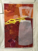
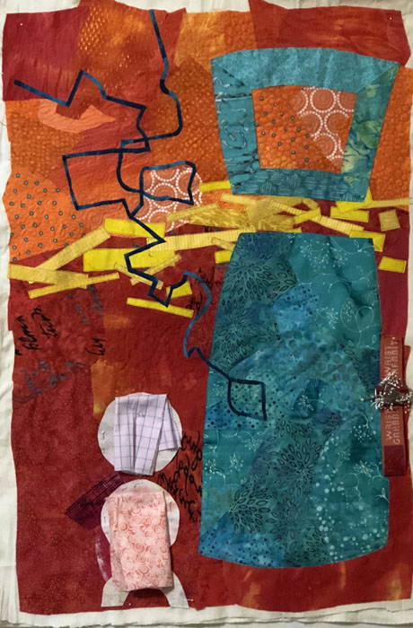
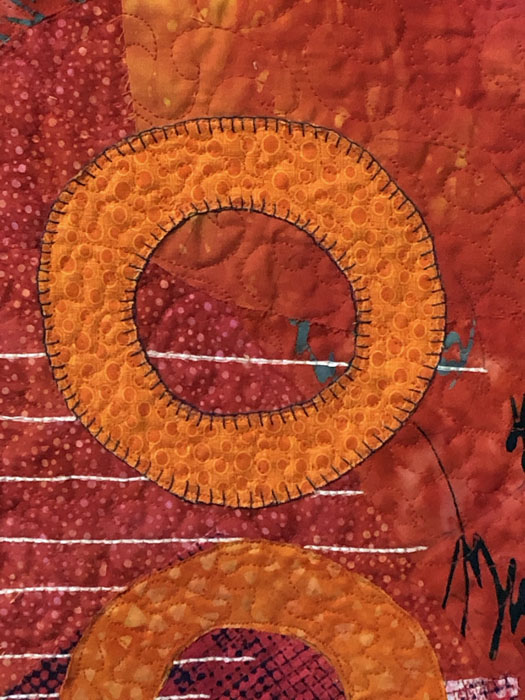
The issue was the white circles, as seen below. I loved their shape and placement, but I could see that they attracted too much attention. I needed to tone down the contrast.

Those circles! Ellen Lindner, AdventureQuilter.com/blog

So, I started auditioning a variety of other colors. Yellow?

Those circles! Ellen Lindner, AdventureQuilter.com/blog

No. I figured it should be a lighter or darker version of one of the colors already in the quilt. Pink?

Those circles! Ellen Lindner, AdventureQuilter.com/blog

Nope. Pale aqua?

Those circles! Ellen Lindner, AdventureQuilter.com/blog

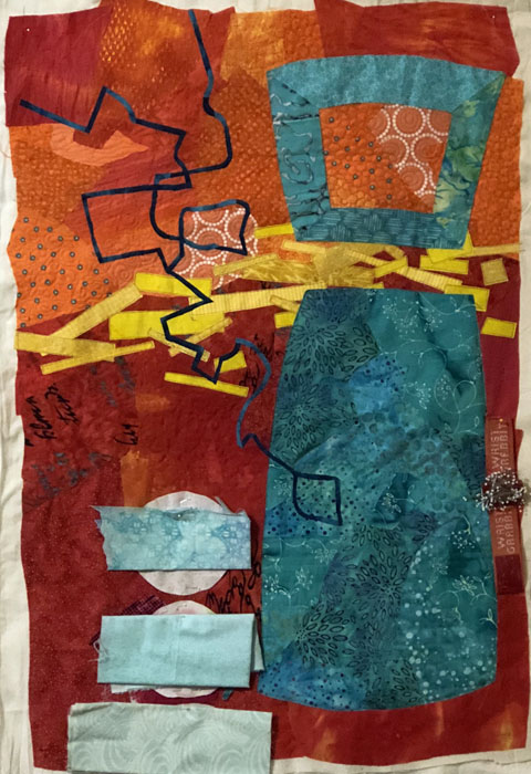
Uh-uh. Enough of  these pastels. What about something bright?

Those circles! Ellen Lindner, AdventureQuilter.com/blog

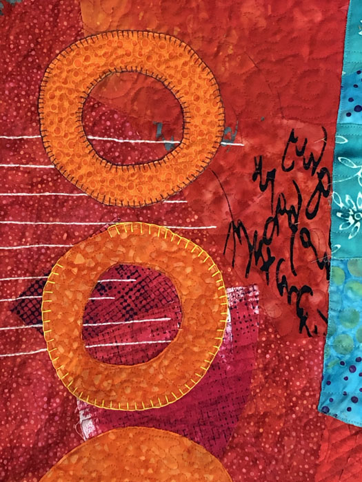
Hmm. Not too bad. (Actually, I tried brighter orange fabrics and they seemed a little too much to me.) How about dark red?

Those circles! Ellen Lindner, AdventureQuilter.com/blog

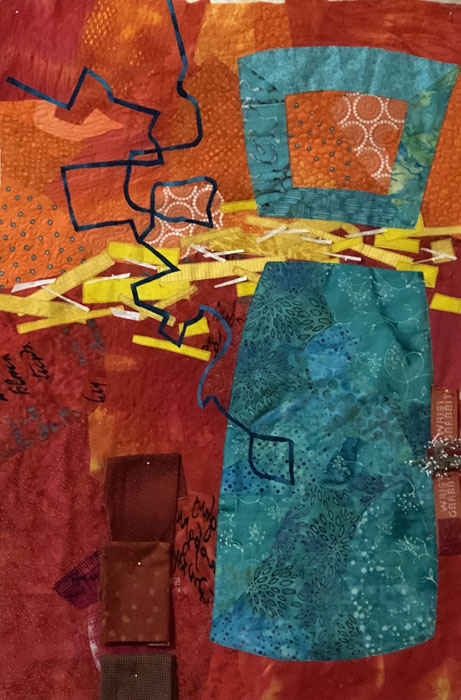
I like this well enough to cut out the shapes.

Those circles! Ellen Lindner, AdventureQuilter.com/blog

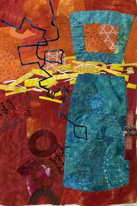
Well, they were no longer attracting attention, but now I wondered if they showed up enough!

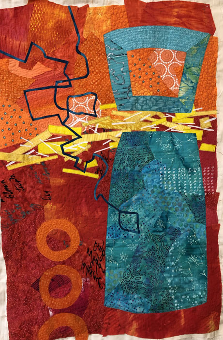
I FINALLY went back to orange, now in more subdued versions.

Those circles! Ellen Lindner, AdventureQuilter.com/blog

Would you believe it? I now thought the orange didn’t show up enough. Maybe I should add some darker hand stitching around each one.

Those circles! Ellen Lindner, AdventureQuilter.com/blog

Maybe. Or would lighter thread provide more contrast?

Those circles! Ellen Lindner, AdventureQuilter.com/blog

Never one to make life easy for myself, I ripped out the dark stitching and redid it with yellow. I was FINALLY happy with it.

Whew! I’m giving myself a gold star!

A Gold Star for My Students. Ellen Lindner, AdventureQuilter.com/blog

What do you deserve a gold star for? Let me know and I’ll email you one.

Ellen Lindner


Similar Posts

  • Color Combos

    This post is a continuation of things we did in a color class I taught. This one didn’t publish promptly, so you might want to read the other (June 11th) post first. After learning about warm and cool colors, we learned about opposite colors and similar colors. These are easy to identify by looking at…

  • Crazy Rapid Portraits

    The retreat I attended recently had a very interesting and fun ice breaker activity.  Karol Kusmaul led us on a HIGH SPEED collaborative portrait making exercise. Since she works exclusively with recycled clothing that’s what she provided for us.  Each table of about 8 people had a bag on monochromatic selections, with buttons, cuffs, etc….

  • Dirty Dozen Fiber Artists: “In the Style of…”

    For our second self-portrait challenge, the Dirty Dozen Fiber Artists made quilts in the style of their favorite artists. These included abstract, pop, impressionist, and whimsical styles, to name a few. These were made by Marilyn Seibring and Andrea Luliak. These were made by me, (Ellen Lindner,) Sandy Shenker, and Becky Stack. Jill Brown, Dij…

  • Swapping ATCs

    Of course, the reason for making artist trading cards it to swap them!  And that’s just what I did with a talented group of SAQA (Studio Art Quilt Associates) members  from south Florida. These are the nine cards I received. What a collection!  These women are pretty fearless.  They used a lot of surface design techniques, including…

  • Dirty Prints

    My recent dye session was devoted almost exclusively to improving ugly prints. That generally meant over dying with a solid color, or stenciling on a new one. Take this little piece, for instance. It was originally an ugly yellow-green that I didn’t think I’d use. But, I knew that if I mostly obscured that color,…

Leave a Reply

Your email address will not be published. Required fields are marked *