Border Considerations - Part One
Borders can add a lot of beauty to art quilts, but they're also useful in other ways. They can help draw attention to the quilt interior, add balance, help with technical challenges, and more. Still, not every quilt needs a border. In this article, I'll share my thoughts on when to add a border, as well as some ideas for designing effective ones.
The most obvious aspect of a border is that it increases the overall size of the quilt. This is often important for small quilts. The addition of a border gives these quilts more presence, which attracts more attention. Happy Anniversary clearly benefits from having a border. Imagine how plain it would be without it!
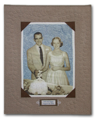 Happy Anniversary, ©2005 |
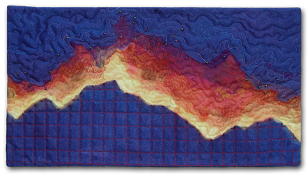
However, not all small quilts need a border. An example is Fire at Night. This tiny quilt makes a big impact. The high contrast imagery fills the space well and the dark colors add to its sense of presence.
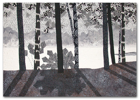
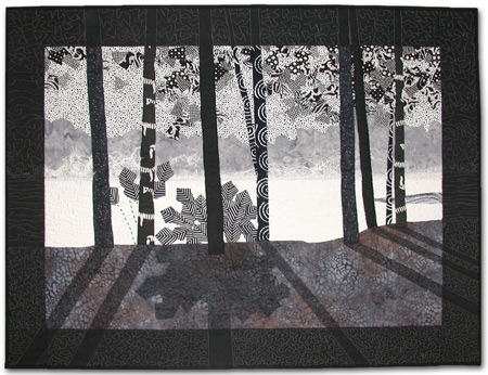
As you can see at left, a border emphasizes the imagery that's contained within it. This is one of the primary benefits of a border, regardless of the size of the quilt. Another example can be seen in Misty Morn. |
 |
 Misty Morn, ©2003 |
Misty Morn is shown both with and without its border. Can you see how the border draws your attention to the interior portion? It' s almost like circling a paragraph on a page of text.
In this case, the dark border is serving an additional function: it's creating a contrast between the image and the light background. Since most interior walls are light, quilts with lots of light colors will often benefit from having a darker border added. (Of course, the border color and value must relate to the rest of the quilt.)
Have you ever made a quilt with an usual shape? If so, you know that it can be quite challenging to finish the outside edge. One way to address this is to add a border, like I've done with Cosmo Boogie. I wanted to preserve the irregular edge of the center portion. I could have finished the quilt with that shape, but adding a border was a much easier option. (Note: since the border was white, I added a black binding to create contrast with potentially light walls.)
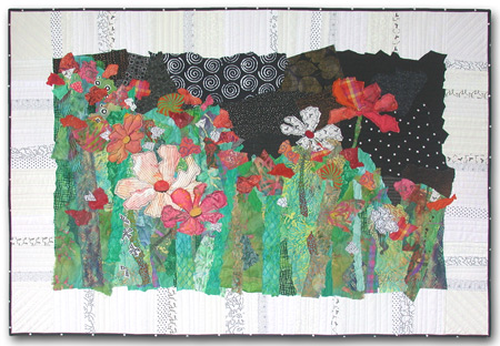 Cosmo Boogie, ©2007 |
|
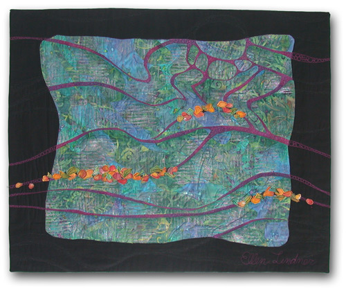
In Crevice Bloom adding a border also helped to preserve the irregular edges of my composition. That wasn't the primary reason for the border, however, since it's an integral part of the design. Borders can often be major players in the overall design. They can also be used to solve certain design dilemmas.
Partial borders can be used to shift the balance or the focal point of a quilt. In Lakeside Citrus the original composition was very left-heavy. Adding a weighty border, on the right and bottom only, took care of the problem.
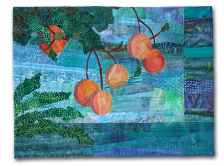 Lakeside Citrus, ©2007 |
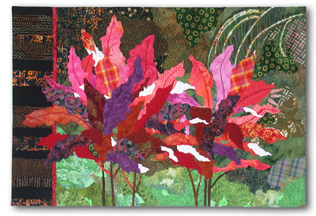 Ti Plants A-Glow-Glow, ©2008 |
The location of the focal point was an issue for Ti Plants A-Glow-Glow. Initially, the focal point (left plant) seemed too far left. Enlarging the quilt with a border on the left only shifted the focal point into a more pleasing position. This new border also allowed the irregular leaf shapes to spill over the original edge, and the dark color helped to set off the bright leaves.
A partial border can also be used to add color in a particular area. This was the case with Cosmo Duet. When considering the design of a quilt border, I believe that it MUST relate to the interior portion. This can be accomplished with color, imagery, technique, and quilting. In no case should the border attract more attention than the interior. This can happen if the border fabric has an especially high contrast, or very bright colors. Sometimes a quilter identifies a "perfect" fabric for the border. However, that fabric might actually overpower the rest of the quilt. For instance, suppose the quilt at right had a border made from a lively high contrast lime green and fuscia print? Although such a fabric might seem like a perfect match for the floral portion, it would actually distract from it. Care should be taken to avoid this. Color is probably the strongest connection between a quilt image and its border. Look back at some of my examples to see how I've used it. |
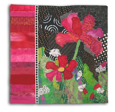 Cosmo Duet, ©2007 |
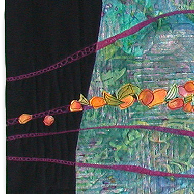
Selecting a border color for Crevice Bloom was quite challenging. At the time, there was no black in the interior portion, so I was reluctant to add a black border. However, other dark fabrics didn't work, so I looked for other ways to relate the black border and the interior. I found two. First, I added little bits of black in the floral areas, with both "fabric" and thread. (Actually, the flowers in this quilt are made from paper.) Next, I designed the quilting to continue the interior lines into the border. (See detail.)
|
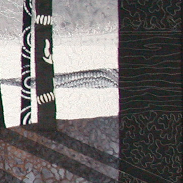 Misty Morn, right border detail |
In Misty Morn, quilting was again used to unite the border and the interior. A contrasting thread made it more visible.
Part Two
More border design information, including examples from other art quilters.
If you found this information useful, you may be interested in my other free articles, online classes, and e-books. You'll find a full directory here.
©2007-2012 Ellen
Lindner
|
