Border Considerations- Part Two
Part One
It's generally a good idea to construct the border using the same technique(s) as the interior. Hopes and Daydreams was created with a technique similar to machine applique, and this was continued with the border. In addition, some of the major seam lines were visually extended into the border.
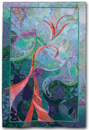 Hopes and Daydreams, ©2001 |
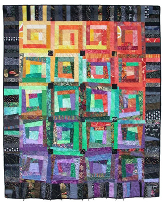 REcall Unraveled, ©2000 |
REcall Unraveled is about dementia, as represented by the color shift and the skewing of the blocks. This visual imagery was repeated in the border, with both angled seam lines and with colors. The black from the border was also used in the interior portion, to help unite the two parts.
Cosmo Boogie was constructed with a raw edge collage technique. Therefore, the border was done in the same fashion, with many pieces of white printed fabric.
One of the best ways to make the border and center portion act as one is to carry the image or pattern into the border. You've seen touches of this throughout this article. However, it can be done even more deliberately, as shown in the next two quilts. The berries of Ripening were continued into the border, but with much darker fabrics. The darker color acts as a frame, while the imagery continues the idea of the main part.
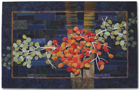 Ripening, ©2008 |
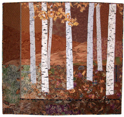 Autumn Breeze, ©2001 |
In Autumn Breeze, the interior portion literally continues into the border. The darker border was created by adding black tulle over the edges of the original image.
The width of your border should be enough to frame and support the main portion, without overpowering it. There's no exact formula for that. I generally make the border wider than I think it needs to be. Then, I trim it until I'm happy with the proportions.
The widest border I've ever used is the left one seen in Autumn Breeze. It's 7 1/4" wide, and the entire quilt is 48" wide. However, this is a much wider border than usual. I like it here, but I think you can see that a border this wide on all four sides would be too much. I find that some experimentation is required to arrive at the correct width.
It can sometimes be difficult to visualize what a border might look like. I strongly recommend taking the time to sketch and/or photograph, in order to get an image that accurately represents your border idea. I used to work with a hard copy photo of the main quilt, and create a variety of potential border frames, with colored pencils. I auditioned the options with these frames, in order to make my decision.
Now, I do something similar at my computer, with photo editing software. However, I always make my final decisions standing at the design wall, with the fabrics in front of me. Ti-Plants-A-Glow-Glow is a case in point. After photo manipulating, I decided on a dark green partial border for it. However, when I auditioned my actual fabrics, I didn't care for them. After some trial and error, I decided on black fabrics, instead.
A digital camera is very useful for auditioning design options (for both borders and interiors.) Photographing several options and then viewing them on the camera's screen is a great way to visually "step away" from the quilt, and to properly consider your choices.
Certainly, many quilts can stand on their own without borders. These quilts often have dark or strong colors, and may also be medium to large. They might be either representational or abstract. Here are a few of my quilts which I think work well without borders. I've included the dimensions, as a reference.
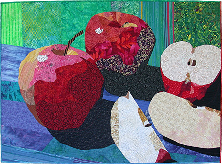 Apple Still Life, ©2004 51" x 37" |
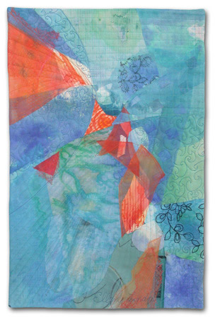 Out of the Blue, ©2006 13.5" x 20.5" |
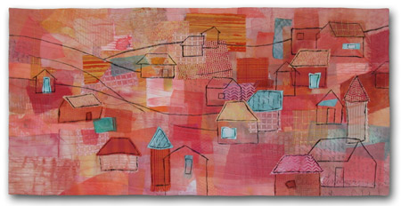 By the Baltic Sea, ©2008 29.5" x 14.5" |
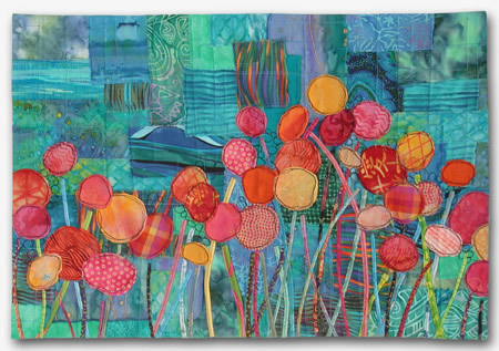 Blossom Boogie, ©2008 22" x 15" |
Of course, it wouldn't hurt the above quilts to have a border added. Take a minute to study them. What border options might you consider for these four? Any partial borders? Darker ones? Or ones with the images continuing into the border in some way? If in doubt as to whether a border is needed, I recommend adding one. I've never seen a quilt that made me think, "That quilt would look better without a border." However, I've sometimes had the opposite thought. So, I say "If in doubt, bring the fabric out!"
Thus far, I've told you how I personally handle borders. Other art quilters tackle them in entirely different ways. Unlike me, Ann Fahl starts with her border, and then creates the design that goes inside it. She pieces the entire background, adds an inner border, and begins composing. Often, her design reaches into the outer border. Ann likes working this way, because the proportions are in place from the beginning. Her quilt, A Brighter Day, demonstrates her results.
|
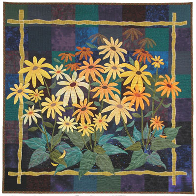 A Brighter Day, ©2002 Ann Fahl Ruth Powers considers her borders to be an integral part of the design. She plans them from the start, but fine tunes her ideas, after the main portion has taken shape. Ruth often uses a variety of fabrics, angles, and dimensions, all in one border. Like me, she uses them to handle design issues, adding color and visual weight where needed. Packrat Palace is an example. |
It's clear that borders can greatly enhance many quilts. Just remember to make sure they compliment the overall designs, rather than fighting them.
Add a border to:
- Increase a quilt's size.
- Increase the quilt's "presence".
- Emphasize the main composition.
- Add a darker edge to a light quilt. (In order to create contrast with the wall color.)
- More easily handle unusual shapes.
- Complete a design.
- Correct a design issue.
Be sure:
- The border relates to the main part of the quilt.
- To repeat colors, materials, and/or techniques throughout.
Avoid a border if:
- It will interfere with the main portion of the quilt.
- It will attract more attention than the primary imagery.
Resources:
Ann Fahl's website
Ruth Power's website
Ruth Power's blog - (Ruth discusses border options in her 12-13-08 entry.)
Thanks to Ann Fahl and Ruth Powers for agreeing to have their quilts included as part of this article.
If you found this information useful, you may be interested in my other free articles, online classes, and e-books. You'll find a full directory here.
©2007-2012 Ellen
Lindner
|
