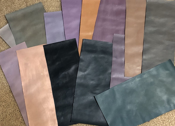
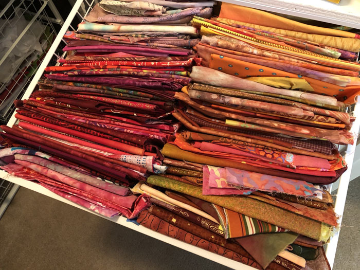
Using Large Scale Fabrics

I’ve finally done it: I’ve cut into some of my favorite fabrics.

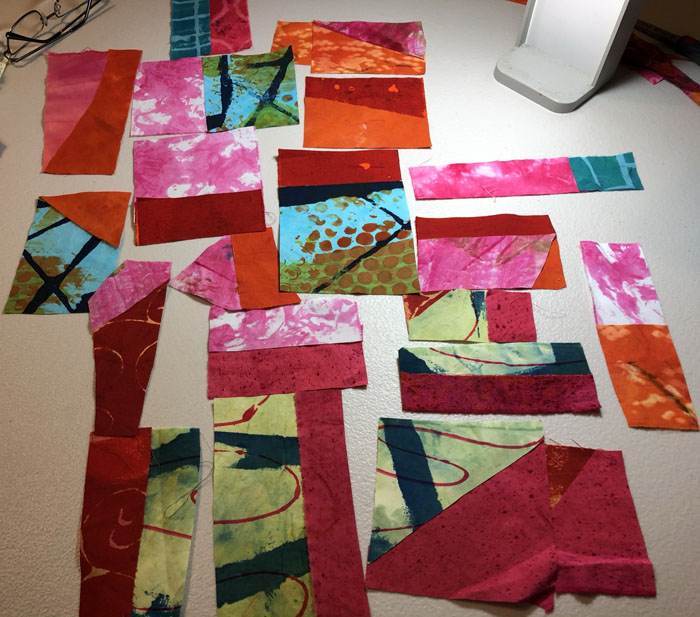
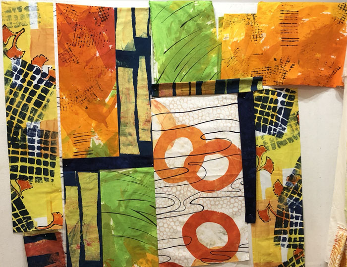
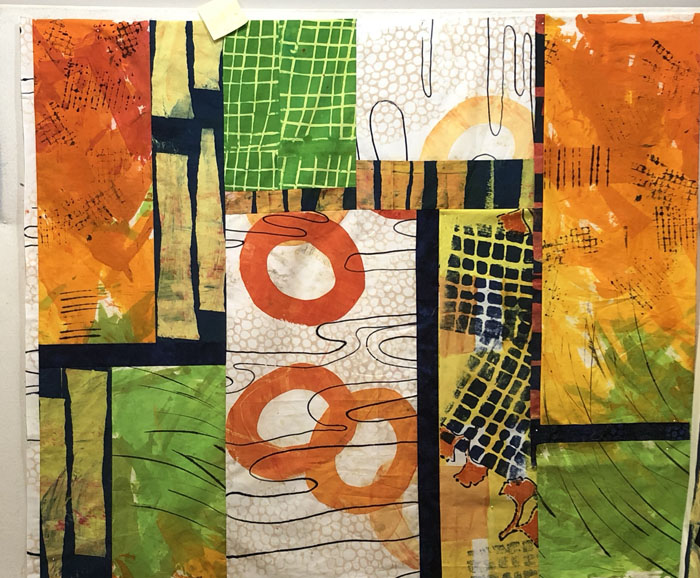
This is where it all started. I wondered if I could successfully use some/all of these hand-dyed fabrics together.

Using Large Scale Prints. Ellen Lindner, AdventureQuilter.com/blog

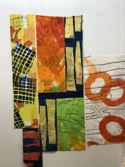
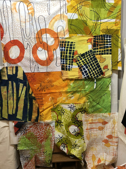
The one with the large orange circles is my favorites. Because of it’s scale I knew it would have to be used very purposefully. I looked for other fabrics with the same colors and threw them up on the design wall. I could see that the top fabrics provided nice “clean” lines and could probably add the needed contrast. I was less sure about the busy ones a the bottom.

(These fabrics are mostly 44″ long, larger than I’m used to working with. As you can see, they pretty well took over my 5′ x 4′ design wall.)

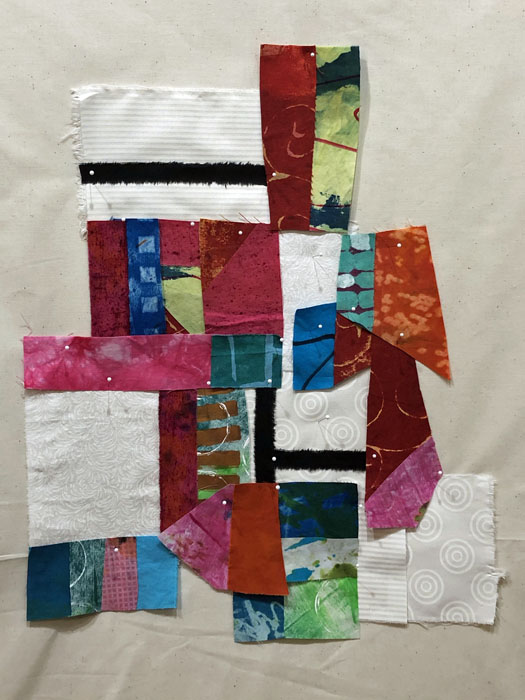
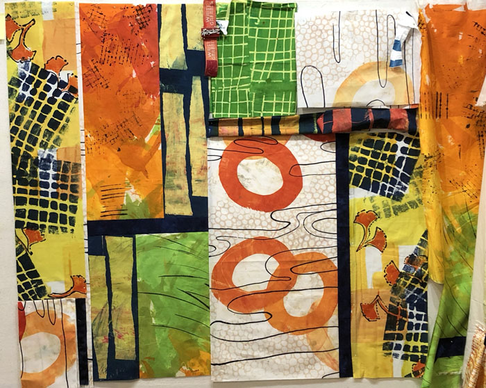
At any rate, I was confident enough to make the first few cuts, and to begin arranging things on the design wall.

Using Large Scale Prints. Ellen Lindner, AdventureQuilter.com/blog

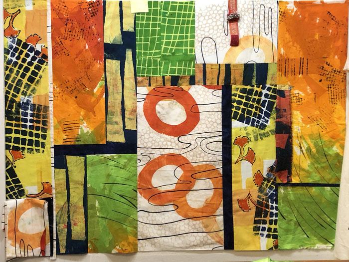
Ooh, I was immediately loving it! The central fabric with the navy (by Pat Pauly) added needed value contrast. I knew I’d need more of that, but I didn’t have any other dyed navy. No worries: I own A LOT of commercial fabric!

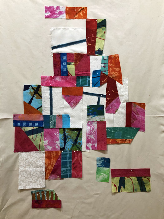
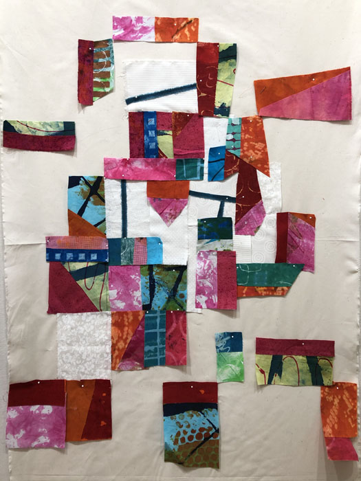
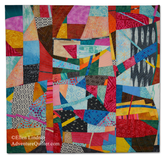
Gee, I’ve been having fun with this. Stumped on what the name might be, though. Any ideas?

Ellen Lindner
0

Cropping and Negative Space

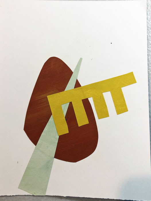
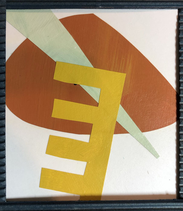
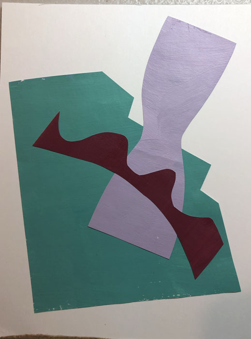
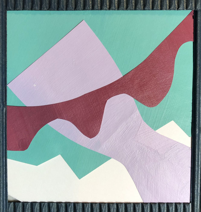
After making small collages our online instructor, Jane Davies, asked us to visually crop them and to pay attention to negative space. Well, I’m sort of “known” for cropping things, so I was right in my comfort zone!

Before:

Cropping and Negative Space. Ellen Lindner, AdventureQuilter.com/blog

After:

Cropping and Negative Space. Ellen Lindner, AdventureQuilter.com/blog

As expected, everything looked better when cropped. There were several reasons for this:
– Due to the sizes of the backgrounds and the added shapes, there was just too much blank background in some of these.
– When an element runs off the edge of a composition, it engages the viewer more. The viewer subconsciously realizes that the shape continues and this holds their interest.
– *The background (negative) space becomes more interesting. Look at the example above. Initially the background was one large sort of doughnut-shaped piece of white. After cropping, it became 4 different, and more interesting shapes.

Here are some more examples:

Cropping and Negative Space. Ellen Lindner, AdventureQuilter.com/blog

Cropping and Negative Space. Ellen Lindner, AdventureQuilter.com/blog

Cropping and Negative Space. Ellen Lindner, AdventureQuilter.com/blog

Cropping and Negative Space. Ellen Lindner, AdventureQuilter.com/blog

Cropping and Negative Space. Ellen Lindner, AdventureQuilter.com/blog

Cropping and Negative Space. Ellen Lindner, AdventureQuilter.com/blog

They’re all better after cropping, right?

As a painter, Jane advised us NOT to physically crop our work, but to get comfortable with filling the size of the canvas, instead. As a fabric artist, I think I can safely ignore that advice. (Let’s hope so, because I’ve been cropping for years!)

Have you ever considered cropping your work? I find it to be a very useful design tool.

Ellen Lindner
P.S. See my most dramatic crop.
P.P.S. If you liked that article, you may be interested in others.

0

Playing with Colored Pieces of Paper

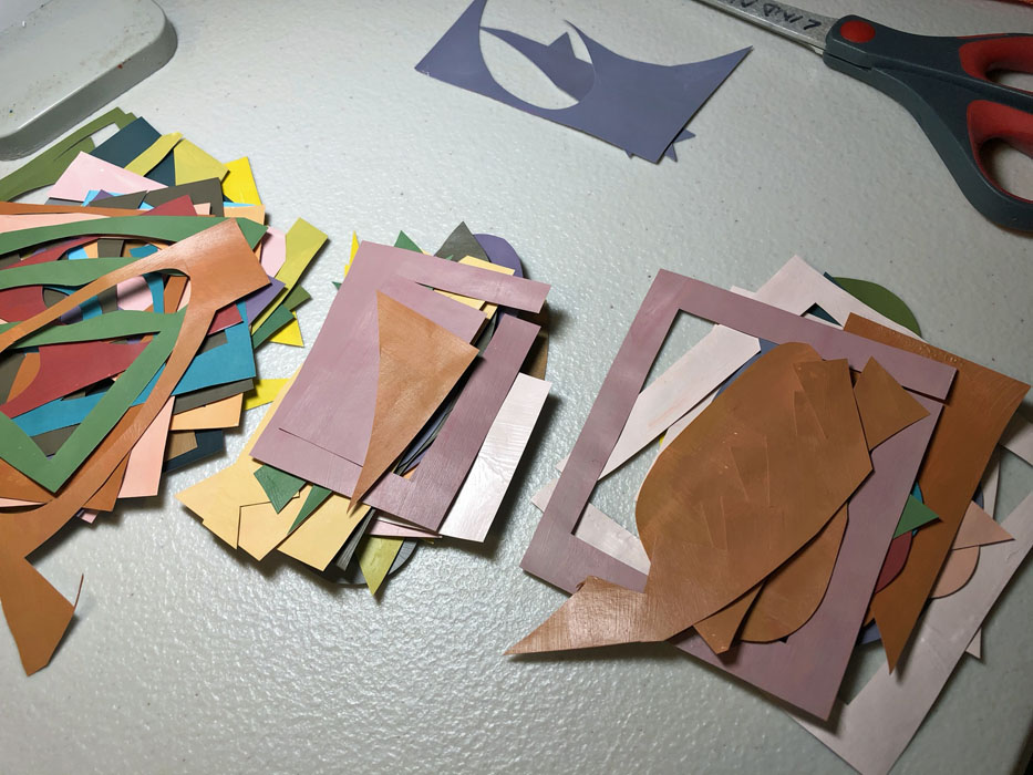
You can’t work with a bunch of pieces of colored paper without seeing some design possibilities!

As part of my online class with Jane Davies, I was arranging, and rearranging, and rearranging again a wide array of colors and shapes.

Playing with Colored Pieces of Paper. Ellen Lindner, AdventureQuilter.com

Our first assignment was to make a largish collage with multiple pieces. Mine missed the mark (although I had fun doing it.)

Playing with Colored Pieces of Paper. Ellen Lindner, AdventureQuilter.com

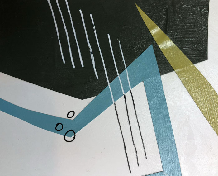
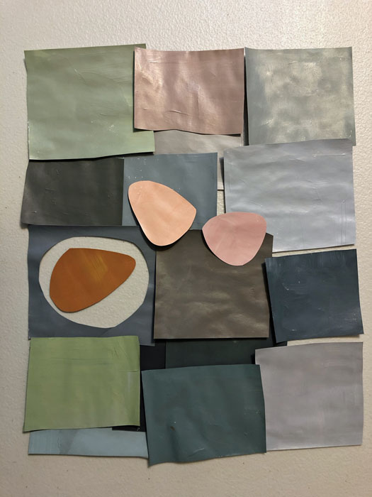
Along the way, I was seduced by all the colors and I just HAD to play with them outside the scope of the class exercises. I played with monochromatic greys. Look how nicely they set off soft colors. Could I use enough restraint to create with these colors in fabric? I’m not sure.

Playing with Colored Pieces of Paper. Ellen Lindner, AdventureQuilter.com

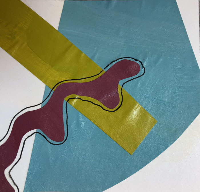
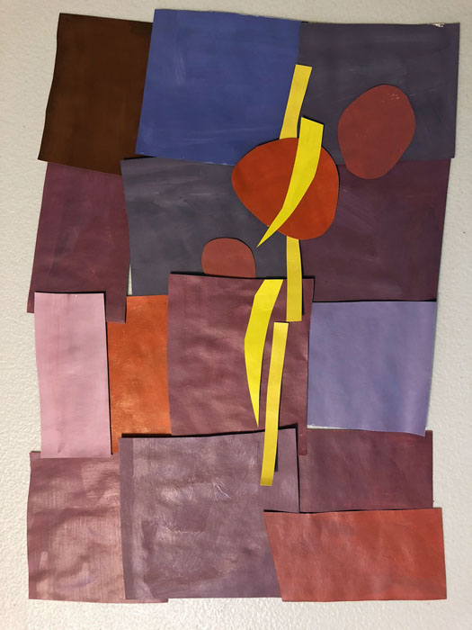
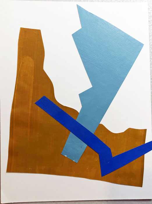
Then, I saw a photo of a red beet and a gold beet. So, I had to play with those colors a little. A little sharp, perhaps, but still something I may want to explore in the future.

Playing with Colored Pieces of Paper. Ellen Lindner, AdventureQuilter.com

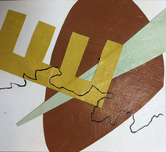
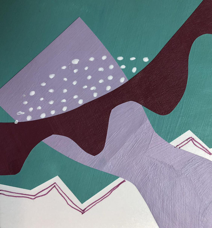
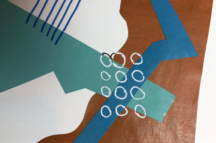
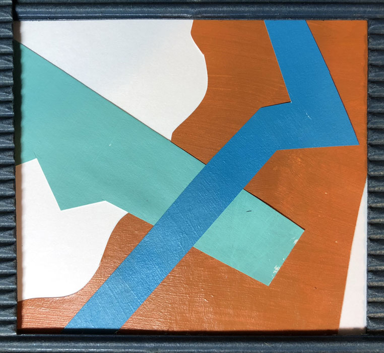
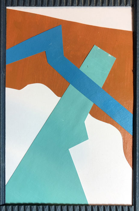
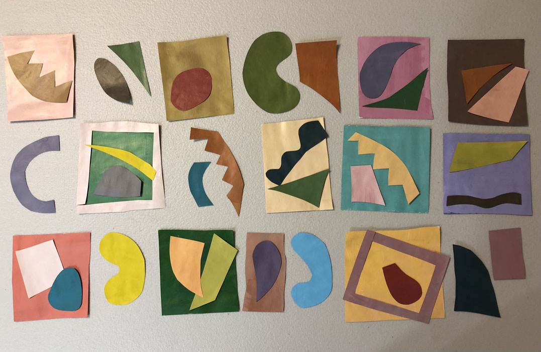
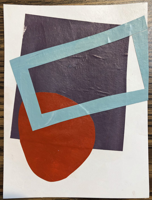
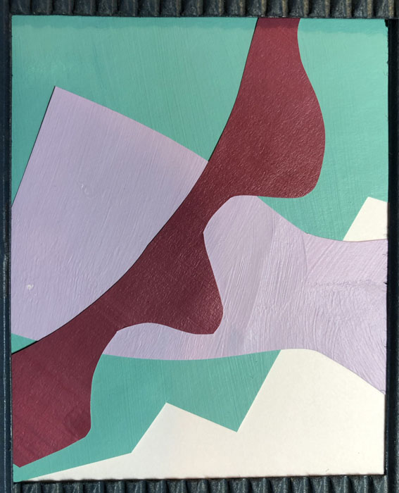
Eventually, we got to make collages with just three pieces and I was swimming back in more comfortable waters. Quite a few of these were successful, but I know Jane will have us alter them in the next step. I’m very interested to see what we’ll do with them.

Playing with Colored Pieces of Paper. Ellen Lindner, AdventureQuilter.com

When was the last time you took a class that didn’t involve fabric? I think it’s a really good way to explore new ideas and I feel confident some of these will find their way into my fabric  collages.

Ellen Lindner
0

Painting Sophisticated Colors

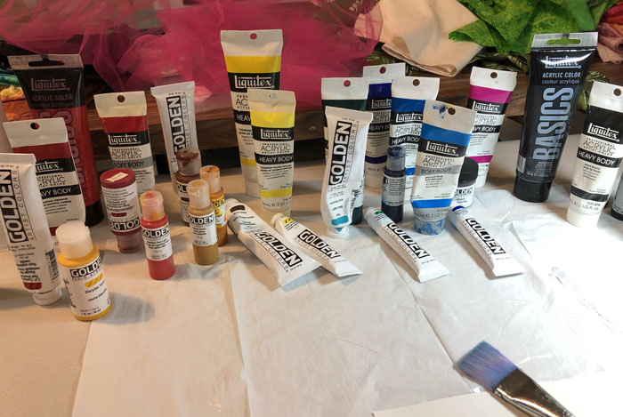
I’m currently enrolled in a mini-collage class with Jane Davies. For week one, she had us paint A LOT of swatches. Surprisingly, I didn’t need to buy any paint. I guess I’ve done more of this over the years than I realized.

Painting Sophisticated Colors. Ellen Lindner, AdventureQuilter.com/blog
I’m pretty good at mixing colors, but I still gets streaks sometimes.

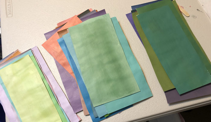
Jane asked us to paint only what she calls sophisticated colors. These are colors with both some black and white in them. In other words, they’re somewhat subdued. More like the colors you might paint your home than the bright colors children like. Of course, I like the bright colors, so their omission has already piqued my interest. After quite a few swatches, I checked my collection for light, medium, and dark. I thought I was on track.

Painting Sophisticated Colors. Ellen Lindner, AdventureQuilter.com/blog

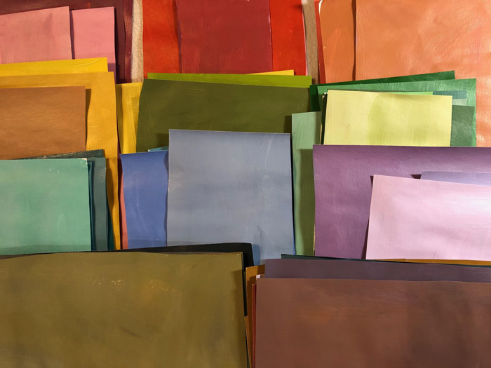
After about 80 swatches over all this is what I had. Not bad, I thought.

Painting Sophisticated Colors. Ellen Lindner, AdventureQuilter.com/blog

But, Jane, asked for more lights and neutrals, so I painted up another 20 or so.

She also encouraged us to paint Chromatic Grays. I’d never heard this term a couple of months ago, but now it seems that I can’t get away from it. As the name implies, these are grays that have a significant undertone of a particular color. These are the colors I initially identified as being chromatic grays.

Painting Sophisticated Colors. Ellen Lindner, AdventureQuilter.com/blog

Now I can see that at least two of these are too colorful. I guess I’m learning.

Again, the idea of using these duller colors is piquing my interest. Since I plan  to eventually do some of the class exercises in fabric, I pulled out a few drawers to see if I even owned any chromatic grays.

Painting Sophisticated Colors. Ellen Lindner, AdventureQuilter.com/blog

Hmm. I think probably not. Maybe this will be a future fabric dyeing project for me.

How about you? Do you ever dabble in other media? I think it’s a good creative exercise and I’m excited about it.

Ellen Lindner
0

Christmas Cactus Abstracted

Inspired by a Christmas cactus. Ellen Lindner, AdventureQuilter.com
After studying my photo of a Christmas cactus, I decided to try abstracting it with one repeated shape. Maybe something like these “spike” shapes. Christmas Cactus Abstraction. Ellen Lindner, AdventureQuilter.com
Yes, I thought they worked well.

My original idea was to fill the entire space with this shape, just changing the color for background grass, brick, etc. But, when I tried that for grass I didn’t like it at all. Especially since just a few shapes were so effective.

Christmas Cactus Abstraction. Ellen Lindner, AdventureQuilter.com

So, I decided to depict the actual plant only.

Here it’s shown as a square. I thought it would probably be better if I cropped off some of the left area.

Christmas Cactus Abstraction. Ellen Lindner, AdventureQuilter.com

From there things fell together easily. Here it is, well under way.

Christmas Cactus Abstraction. Ellen Lindner, AdventureQuilter.com

I was loving how it was coming together and I didn’t want to over work it. Audition. Edit. Repeat.

I think I’ll have this one finished quickly. Stay tuned.

Ellen Lindner
P.S. I’m not sure how to quilt the background. I’ll have to give that a good bit of thought.

6

Inspired by a Christmas Cactus

Once again, my Christmas cactus was beautiful this year. (Here in Florida it lives outside year round.)

Inspired by a Christmas cactus. Ellen Lindner, AdventureQuilter.com

I began to imagine what an abstracted version might look like in fabric. Can’t you envision some bright, spiky red shapes? I was especially enamored with the cascading blossoms on the right side.

Just to jump start some ideas, I played with the photo on my computer. This pointillist version really got my attention.

Inspired by a Christmas cactus. Ellen Lindner, AdventureQuilter.com

Whoa! I was pretty much blown away by these bright spots of color and the black background.

I began to ask questions and to make plans. I knew I wanted to include some black and to use shards of bright colors. I didn’t think I wanted to use little circular blobs, though.

What would be a better shape? Maybe a rectangle with a point cut off? (A shape I had just used in my most recent quilt.) Would I want to cover the entire surface with such shapes? I didn’t think so.

I bought some solid black fabric and began to audition colors and shapes. I’ll show you soon.

Ellen Lindner
2

Double Reverse Appliqué at Road at Home

Last month I taught three classes for Road at  Home, a large quilt show type online event. The first was the ever popular Double Reverse Appliqué. We had fun and the students did excellent work!

Students in Double Reverse Applique class with Ellen Lindner, AdventureQuilter.com/blog

First I’ll show you Cindy’s apple, because she was my college roommate! How cool is that? She lives in Minnesota and I’m in Florida, so this was rare interaction. She’s very new to art quilting, but she had no trouble at all.

Student results from Double Reverse Applique class with Ellen Lindner, AdventureQuilter.com/blog

Trudy’s bright colors pop nicely! Student results from Double Reverse Applique class with Ellen Lindner, AdventureQuilter.com/blog

Susan used more muted colors, which gave a completely different effect. (These photos are via Zoom, so the stripey computer effect isn’t really there on her fabrics.)

Student results from Double Reverse Applique class with Ellen Lindner, AdventureQuilter.com/blog

Kami made very bright and colorful choices!

Student results from Double Reverse Applique class with Ellen Lindner, AdventureQuilter.com/blog

Of course, not everyone chose a red apple. Doesn’t Chris’ green one look great? And the purple background color is perfect!

Student results from Double Reverse Applique class with Ellen Lindner, AdventureQuilter.com/blog

Irene’s green apple was almost complete. (Yes, we do the background last with this technique.)

Student results from Double Reverse Applique class with Ellen Lindner, AdventureQuilter.com/blog

Keitha’s near-solid fabrics really let the value changes do the work. This is what makes it look 3D.

Student results from Double Reverse Applique class with Ellen Lindner, AdventureQuilter.com/blog

C.J. won a free seat in class and put it to good use. I love the way her apple stands out against her blue-green background fabrics.

Student results from Double Reverse Applique class with Ellen Lindner, AdventureQuilter.com/blog

Bonnie worked all day with power from a generator. That was a new one for me. As you can see, it didn’t slow her down at all. Nice, right?

Grace missed a large part of the day but still managed to make a good start on her apple.

Student results from Double Reverse Applique class with Ellen Lindner, AdventureQuilter.com/blog

The class also includes a pattern for a pear. After finishing their apples a couple of students made a good start on their pears. Check out Kami’s BRIGHT colors.

Student results from Double Reverse Applique class with Ellen Lindner, AdventureQuilter.com/blog

And Cindy made good progress on a gold pear. We worked from light to dark, so we started with the highlight spots: not too exciting. It doesn’t look much like fruit until after about 8 pieces are added.

Student results from Double Reverse Applique class with Ellen Lindner, AdventureQuilter.com/blog

Another fun and productive class!

Ellen Lindner
P.S. Would your guild like this class? Find out more here.


2

Designing in Venice, FL

The supply list for my class, Design Your Own Nature Quilt, includes artistic couraage, and the ladies in Venice, FL brought it in spades! During our two day class they didn’t even whimper. 😉 But, they DID make some extraordinary quilts.

Let’s start with Helen, who was taking her first ever quilt class. (These images were taken at the end of class, as seen on my computer screen.)

Student work from Ellen Lindner's Design Your Own Nature Quilt class. AdventureQuilter.com/blog

Didn’t she do a great job? Everything is constructed onto a muslin base. Helen has decided to preserve the raggedy uneven edge of her composition, so she’ll tuck her border fabric(s) under the edge of the composition fabrics, where they’ll also be supported by the muslin.

Joan C. rearranged her flowers and cropped the composition to get a really pleasing arrangement. And, after a brief consultation, she had the skills she needed to make a second piece in the next few days. I love that!

Student work from Ellen Lindner's Design Your Own Nature Quilt class. AdventureQuilter.com/blog

Elaine’s poppies live up to their name, since they seem to pop off the background! Her inspiration photo had MANY more flowers in it, but she wisely edited it down to just a few. This gave her the ability to enlarge them and show them off. And what about that black stitching? Doesn’t it add wonderful detail?

Student work from Ellen Lindner's Design Your Own Nature Quilt class. AdventureQuilter.com/blog

Joan D. depicted the best parts of several photos of sea grape leaves. She created tiny lines by adding slits to her leaf fabrics, so the underneath vein fabric could show. Here she’s auditioning the position of the sea grapes. I think she’s about got it.

Student work from Ellen Lindner's Design Your Own Nature Quilt class. AdventureQuilter.com/blog

Did you notice Joan’s background fabric above? No? Good. That means it did it’s job of showing off the leaves. Brava!

Teaching via computer means I can’t easily see the student’s quilts as they’re working. There are ways for them to show me, but if they’re confidently working away, I don’t ask to see their progress. Such was the case with Nancy. Therefore, I was floored when she showed us this at the end of day one. She did a great job of playing up the contrast and adding depth.

Student work from Ellen Lindner's Design Your Own Nature Quilt class. AdventureQuilter.com/blog

Then, on day two, she did this. Whoa, Nancy, you’re making me look good!

Student work from Ellen Lindner's Design Your Own Nature Quilt class. AdventureQuilter.com/blog

Unfortunately, I didn’t get a photo of Pat’s project. She had a lively yellow flower well underway.

I always say that this is my favorite class to teach because the students learn so much. That definitely held true with this group and I’m itching to teach it again! (Hint, hint: here’s the info if you think your guild might be interested.)

Ellen Lindner, proud teacher

2

“Water Dance” Complete

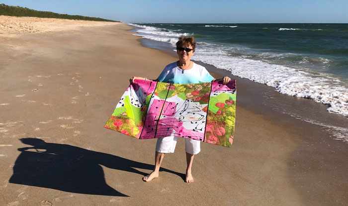
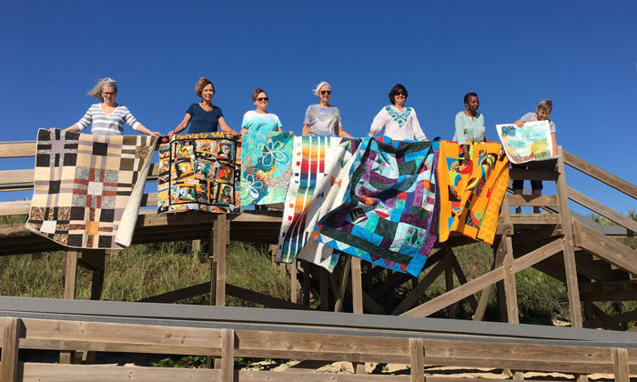
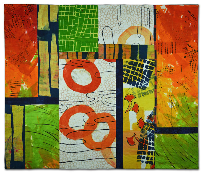
I’m really happy with my latest quilt, Water Dance.

Water Dance, an art quilt by Ellen Lindner. AdventureQuilter.com

Water Dance

I wanted a lot of energy in the piece, and I think I achieved it.

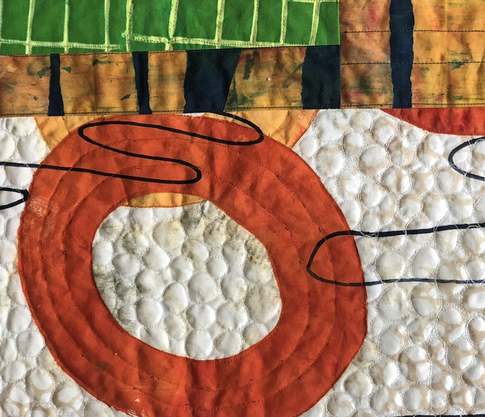
The detail shot shows how I added double black stitching for emphasis. I use this technique quite a bit and I think it’s effective. I always do it in a rather loose sketchy sort of way.

Water Dance - detail, an art quilt by Ellen Lindner. AdventureQuilter.com

For this quilt I used exclusively fabrics that I dyed myself.

See more information about Water Dance here. And see it in progress here and here.

Ellen Lindner
 

2

FacebookPinterest Instagram