My latest quilt, Autumn Skyline, exclusively uses fabrics dyed by me.
Initially inspired by fall trees, it evolved into an urban park.
It has extensive quilting throughout.
Isn’t it amazing what quilting adds to the final product?
Ellen Lindner

My latest quilt, Autumn Skyline, exclusively uses fabrics dyed by me.
Initially inspired by fall trees, it evolved into an urban park.
It has extensive quilting throughout.
Isn’t it amazing what quilting adds to the final product?
Ellen Lindner
After trying a pastel blue sky on my piece inspired by fall trees, I tried it with dark blue instead.
I actually liked it pretty well, but I didn’t have enough bright blue to do it justice. So, I tried white. And also auditioned the idea of more twigs.
The verdict: YES to the white sky, NO to the chunky twigs.
But, what about those vertical shapes? Were they starting to imply skyscrapers, rather than trees? Yes, clearly they were. Well, that’s not really what I wanted, but I decided it could be trees in an urban setting. (Plus, I didn’t really care if the shapes read like trees, skyscrapers, or anything real.) I added a few twigs to add contrast and play up the tree idea.
After much quilting I was ready to photograph this piece.
Why use a pink backdrop, you ask? It has to do with the digital editing I’ll be doing later. I’ll “pick” the quilt away from the background and it’s easier for the computer to do that if there’s a contrast between the two. Can you see how the left side would blend into the backdrop if I left it white?
Finished photos coming soon.
Ellen Lindner
After seeing the post about my bedroom redo, Sandy asked how I hang my quilts. Here’s the photo that piqued her interest.
And here’s the scoop.
(If you purchase a quilt from me it will come ready to hang and you don’t need to read any of this.)
Making and attaching a hanging sleeve
First, I make a 4″ hanging sleeve. There are quite a few variations out there and this is my version.
– Cut a piece of fabric with the following dimensions:
– Length = the width of the trimmed quilt minus 1 1/2″ inches.
– Width 9″.
Stitch the sleeve together as follows:
– Hem each short end by pressing up 1/4″, then folding and pressing up an additional 1/4″, and stitching.
– Fold the fabric in half, WRONG SIDES TOGETHER, matching up the long cut edges.
– Press the long folded edge on the opposite side.
– Using a 1/4″ seam allowance, stitch along the long raw edges, creating a tube.
– Create a tuck by stitching with a long basting stitch along the opposing folded crease, again with 1/4″ seam allowance.
– Repress, so the seam allowance is pressed open and is at the center of the back. The tuck will be on the center of the other side.
Next, the sleeve needs to be attached to the back of the quilt. Leave the tuck in place and position the seam side down.
If you’re facing your quilt you can attach the sleeve to the facing before attaching it to the quilt. To do so pin the sleeve to the right side of the cut facing, seam side down, positioning it 1″ below the top. Then top stitch close to each long edge. See this article on how to face a quilt.
If binding your quilt, stitch the top edge of the sleeve into the binding as you go. Hand stitch the bottom edge in place.
– Pick out the basting stitches. The fullness from the tuck will provide room for the depth of a hanging rod or slat.
The completed sleeve will be 4″ wide, from creased edged to creased edge.
Learn how to make a slat and use it to hang your quilt.
Ellen Lindner
Remember the ornament I showed you in the last post? The one I made for my sister?
I made several others, each using my hand dyed scraps.
This one is for my husband. He’s a big Florida Gators fan and their colors are orange and blue.
Bonus content: We have a prankster friend who loves to leave Florida State paraphernalia around our house. As you might guess, Florida and Florida State are BIG rivals! Recently this friend left FSU ornaments all around our house and yard.
And guess what I did with them?
Yep.
I obliterated the FSU logo with fabric! Go Gators!
Merry Christmas,
Ellen Lindner
This year I’ve been making some fabric wrapped balls as Christmas ornaments. My hand dyed scraps have been perfect for this.
I made one for my sister, to go in her home of soft blues, greens, and greys.
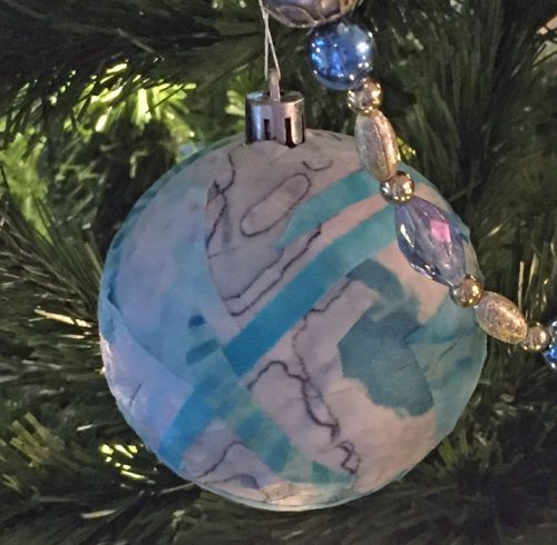
Her home is beautifully decorated for the holiday. Here’s just a sampling.
She and I both have these out-of-date ceramic nativity sets.
They’re certainly not what either of us would choose now, but we love them. Not because of their appearance so much, but because we’ve each had them for nearly 40 years. I smile as I arrange mine, enjoying the feel of slick ceramic beneath my hands. Remembering a simpler time. And thanking God for the gift of His son.
Isn’t it amazing how deeply such attachments bury themselves into our hearts? I know we all have special Christmas decorations and traditions. I’d love to hear about yours.
Merry Christmas,
Ellen Lindner
Did you notice anything different about my newsletter and blog? Both have new headers, each with a new head shot. Yippee! (It was WAY overdue.)
I had the photo taken by Bonnie McCaffery, while in Houston. She took about 100 and I picked this one, (even though I wasn’t sold on the background.)
So, I changed the background to grey and cropped it way in. Better, I think.
Then, for the web headers I cropped it even more.
See the header above. Did I go too far? I’m not sure.
Bonnie was great to work with and I definitely recommend her. She let me turn the tables on her at the end. (My out of focus photo reminded me why I paid a professional.)
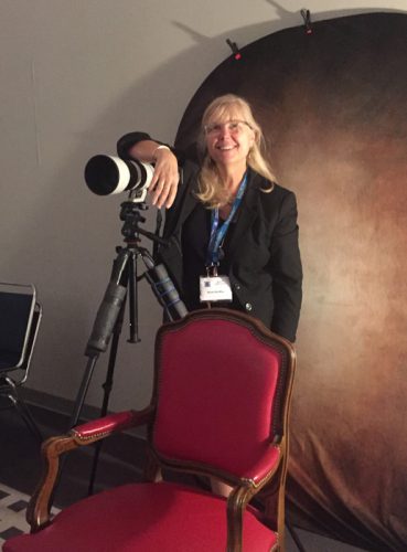
All in all, a very good experience.
Ellen Lindner
What do you get when you add a beautiful setting, great friends, and time to make quilts? Well, fun productivity, of course!
At a recent SAQA (Studio Art Quilt Associates) retreat I took my portable design wall, my easel, and ALL of my hand dyed fabrics. I didn’t have an idea when I left home, but I got one along the way. I decided to be inspired by the colors of fall trees (which we miss here in Florida,) and to use tall vertical shapes.
First, I auditioned A BUNCH of fabric to see if I had what I needed.
Well, um, yes I did. Too many fabrics, as a matter of fact. (Or as Tim Gunn might say, “That’s a whole lot of look.”)
I quickly edited and started putting fabrics in place.
I wasn’t sure what I wanted for the “sky,” but I put some light fabrics there as place holders.
Next, I auditioned some yellow. Would one piece stand out too much? Did I need more? Could I use yellow in the sky too?
I settled on the arrangement below. In this photo many of the fabrics are still folded. I don’t cut until I’m pretty sure. (But, by the end of the 2 day retreat I had all these shapes cut, pinned in place, and a few glued.)
I knew I’d need some black to break up the bright colors, so vertical trunks and branches filled the bill nicely. And you can also see that I added more yellow/yellow-orange.
I also began to consider that sky. Someone at the retreat suggested a pale sky, so I tried it out. It didn’t excite me, though.
In future posts I’ll show you other options I auditioned and where I ended up.
Ellen Lindner
I’ve really had fun working on my latest quilt, Cantilever.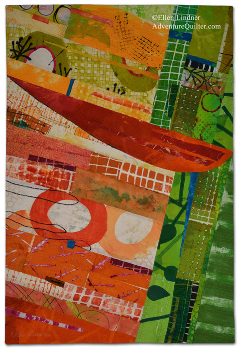
It was exciting to exclusively use fabrics I’ve printed/dyed myself. I was very happy with the way they worked together.
Here’s a detail shot.
I love the imperfection and irregularity of these hand dyed fabrics!
This piece is available for purchase. See details here.
I’m already working on the next piece!
Ellen Lindner
There’s a VERY intriguing exhibit at my local textile museum right now. The word basket really sells these pieces short! Some are utilitarian and beautiful in their simplicity. But others are large and sculptural and amazingly creative.
The details to these pieces are extraordinary, so I’m going to show you only one piece.
Here it is. An installation by Ann Coddington, called Mother/Memory.
As you can see, the lighting cast strong shadows and really added to the piece.
Just check out these details.
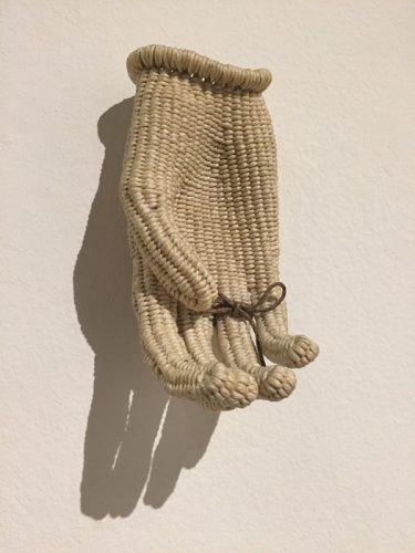 I didn’t notice the thread around the finger above, at first. Certainly that ties into the memory aspect of the title.
Coddington listed her materials as mixed fibers and found objects. And her techniques as twining, knotless netting, lashing, random weaving, knitting, wrapping, and felting.
I couldn’t quite identify all the materials, but I sure love the combination, as well as the composition.
What do you think? Did that whet your appetite for the rest of the exhibit? Me too! I had only a few minutes when I was there and I saw only about one third of the pieces. I’m anxious to go again and see the rest of it. But, I’ll need to hurry as the last day of the exhibit is December 14th. I hope you can catch it, too, at the Ruth Funk Center for Textile Art in Melbourne, FL.
Ellen Lindner
Once, at a retreat, I was working on a horizontal piece about 11″ x 22.” When the public was allowed to wander through one person asked me “How much do you charge for a place mat like that?” That’s when I realized that people unfamiliar with art quilts will often interpret small textiles pieces as utilitarian. Since then I’ve tried to mount or frame my smallest pieces in a way that gives them more presence.
My favorite way to do that was shown in my previous post. Many of you asked for more details, so here you go.
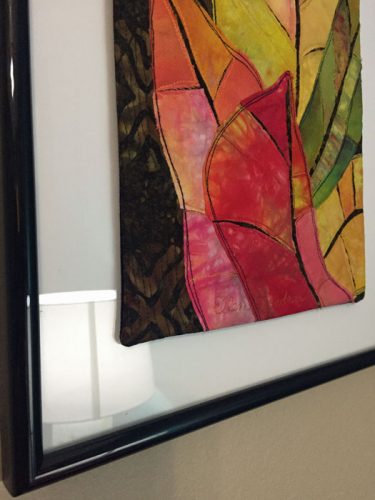
This piece, Croton Leaves #3, is mounted on the front of a piece of framed glass. I purchased the frame, glass, and white mat as a set. I used multiple strips of double-sided tape to secure the quilt to the glass.
I took the above photo with a flash, hoping to create a reflection that would identify the glass for you. That didn’t work so I turned on the adjacent lamp and tried again.
Now you can see what I mean. There’s glass there that’s reflecting the lamp, except where the quilt is. That’s because the quilt is in front of the glass.
Here’s a closer view, from another angle. As you can see, the quilt edges are completely finished.
And here’s an extreme side view showing you a little bit of the depth.
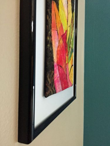
Make sense? Can you see how much significance it adds to the piece?
I’ve mounted small pieces in other ways:
– Same as above, but without the glass. (Mounting onto mat board that fills the frame.)
– Mounted to the front of a “floating” frame: one that has no mat or backing, and is see through.
– If unquilted, mounted behind a mat, framed and with or without glass.
– Hand stitched onto a larger panel or artist’s canvas.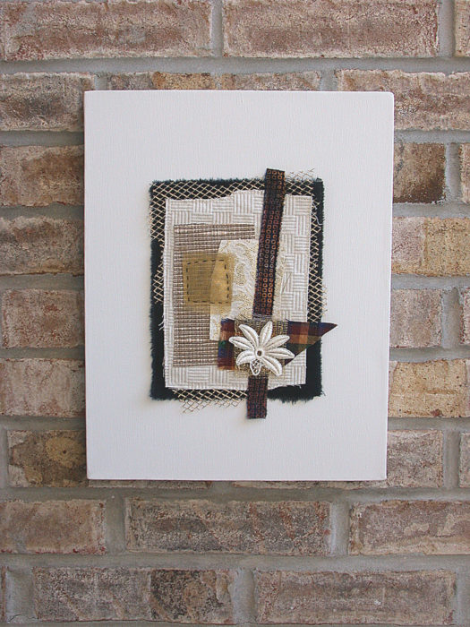
– Glued to a smaller panel or canvas so the work invisibly floats away from the wall.
Here’s a big tip: if you want to try this I strongly suggest planning the size of your artwork beforehand. Pick a standard sized canvas or frame and then size your artwork to look good with it.
What’s your favorite tip for showcasing small pieces?
Ellen Lindner
P.S. Check out this earlier post with additional examples.