Fabric Dyeing Results

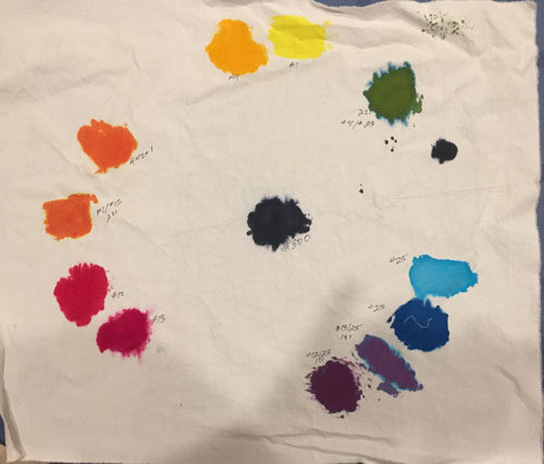
I spent all of last week learning about dye painting and other dying techniques.  Once I used fabric that was properly treated, my color wheel turned out as I expected.

Fabric Dying Results. Ellen Lindner, AdventureQuilter.com/blog

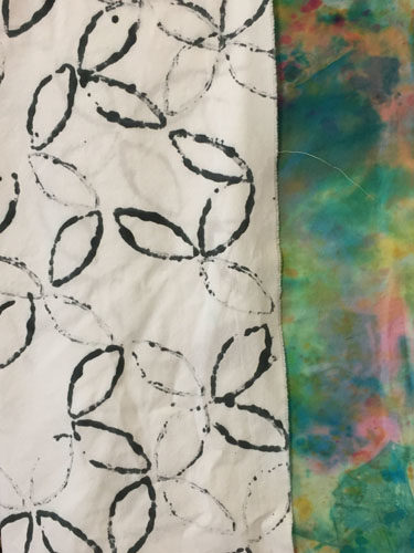
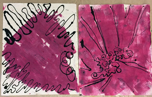
One of the things I was anxious to try was drawing a black line with a syringe.  Here, I’ve done it on berry colored (fuchsia + black) fabrics. Kinda cool, right?

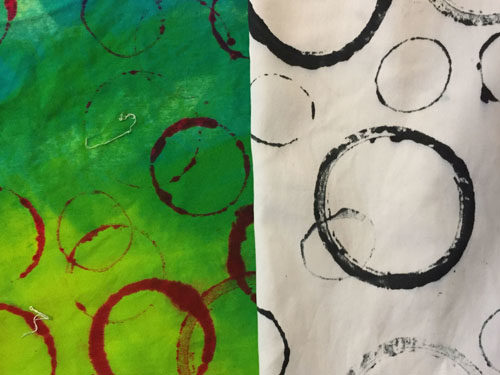
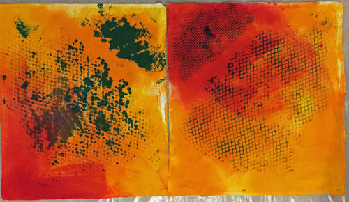
I was also experimenting with different ways to apply paint to fabric.  The one on the left was done with a putty knife and the right one was done with a sponge brush.  As you can see, I’m aiming for imperfection.

Fabric Dying Results. Ellen Lindner, AdventureQuilter.com/blog

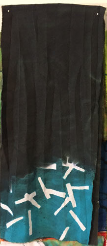
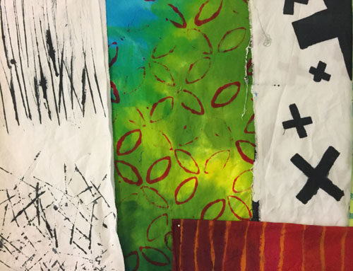
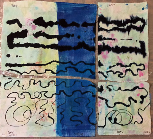
I experimented with the syringe line some more to see how much it would spread on dry fabric, vs. fabric with thickened dye, and fabric with thin dye. As you can see, my dye in the syringe was too thin at the top. But, once I thickened it up (about double) I was happy with all the bottom versions.  I love this effect and will definitely be doing some more of it.

Fabric Dying Results. Ellen Lindner, AdventureQuilter.com/blog

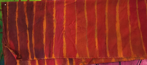
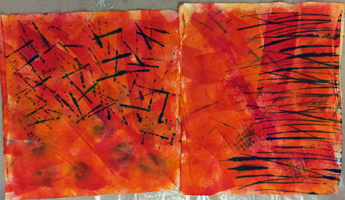
These two orange pieces started out as peach colored duds from Batch #1.  I added a bunch of dye and then made marks with a credit card.  I like the design a lot.

Fabric Dying Results. Ellen Lindner, AdventureQuilter.com/blog

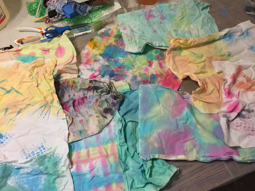
These next two pieces are actually sisters. I started with the left one, trying to do some stenciling.  The bottom left blobby area was done with a piece of thickly crocheted “lace.”  I tried to stencil through it with a sea sponge, but the fabric nature of the lace wiggled around too much and I just got a mess. The top right blog was a piece of shelf liner, through which I also tried to stencil.  Two big fails.

Fabric Dying Results. Ellen Lindner, AdventureQuilter.com/blog

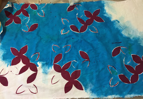
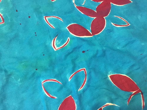
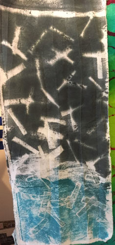
But, then I noticed all the paint sitting on top of my two “stencils” and wondered if I could get a monoprint from them.  So, I laid on a plain piece of white and got the resulting print.  MUCH better! I painted the background after the print was dry.

As you can see, I was learning from both my successes and my failures.  And I was just getting started.

Ellen Lindner


8

Preparing to Dye. Fabric, that is.

After painting fabric and seeing how much it stiffened the fabric, I knew I wanted to learn about painting with dyes instead.  In anticipation I got a good tutorial book and asked for dyes for my just-around-the-corner birthday.

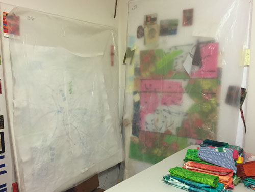
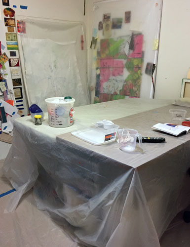
Living in Florida, I KNEW I wanted to dye inside, something that very few people do.  I began to dye proof my studio. I didn’t want to put away everything that was pinned to my design walls, so I covered them with plastic.

Preparing to Dye: Fabric, that is. Ellen Lindner, AdventureQuilter.com/blog

Next, came the floor and table.

Preparing to Dye: Fabric, that is. Ellen Lindner, AdventureQuilter.com/blog

Maybe this seems like a lot of work, but I found that it really wasn’t too bad.  As a matter of fact, putting away everything else was a bigger job.

I started with some simple experiments, getting to know my dye colors and techniques.  I had a bunch of fabric (from YEARS ago) labeled “Treated with soda ash.”  Just what I needed, so I did my first few experiments with that fabric.  I couldn’t wait to wash it out and see what I got!

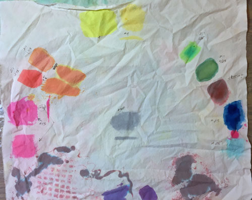
But, all my dark vibrant colors turned into wimpy pastels!  Yuck!

Preparing to Dye: Fabric, that is. Ellen Lindner, AdventureQuilter.com/blog

Just look at my pathetic color wheel.  Even the black in the center was major washed out!

Preparing to Dye: Fabric, that is. Ellen Lindner, AdventureQuilter.com/blog

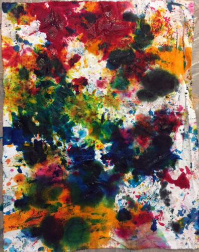
Here’s another example: my clean up rag before washing.

Preparing to Dye: Fabric, that is. Ellen Lindner, AdventureQuilter.com/blog

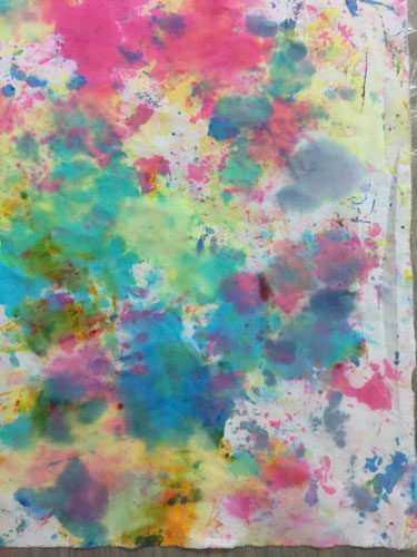
And after. I guess it’s not actually ugly, but it’s sure not what I expected, or wanted!

Preparing to Dye: Fabric, that is. Ellen Lindner, AdventureQuilter.com/blog

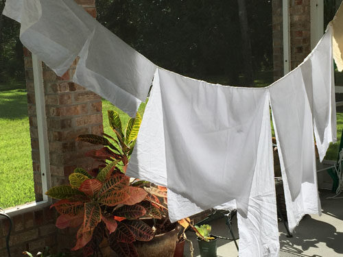
Clearly, the long-ago treatment to the fabric was the problem. I soaked the remaining fabric with soda ash, rigged up a clothesline, and hung it out to dry.

As an aside, do you have any idea how long it takes fabric to dry in humid Florida?  It won’t even dry overnight! Well, that’s because the evening humidity is super high.  In contrast, if I put it in direct sunlight it dries in about 15 minutes.  Which means a little planning is required.

After all that, I was ready for Batch 2. I mixed a good bit of dye and thickener, so stay tuned for quite a few more examples.

Ellen Lindner
P.S. I’ve been using Ann Johnston’s book “Color by Design” as my reference.  It’s super detailed and I recommend it.
P.P.S. My sewing machine died shortly before my dyes arrived, so the timing was good for a non-sewing distraction.

8

A Splash of Orange

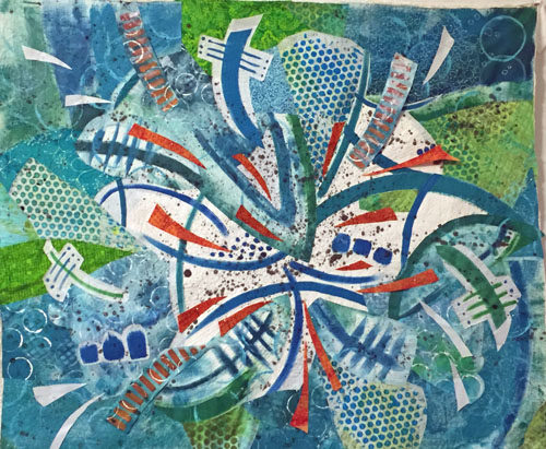
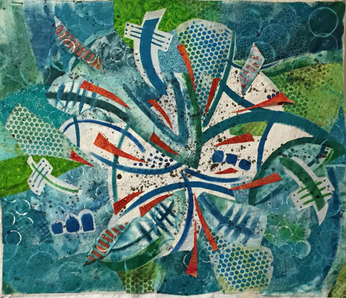
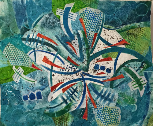
You readers are really great!  When I posted my quilt at this stage several of you had good suggestions about how I might improve it.

A Splash of Orange. Ellen Lindner, AdventureQuilter.com/blog

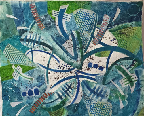
The most common suggestion was to add some orange back in.  Something I had considered but rejected.  Another tip was to break up the white and to extend the “splashing” out toward the edges more. Since I had mentally given this quilt a “7,” I knew it needed something and I decided to give these ideas a try.

First, I added some white “splashes” closer to the edges and put some of the orange stripes back.  I also tapered the ends of many of the motifs.

A Splash of Orange. Ellen Lindner, AdventureQuilter.com/blog

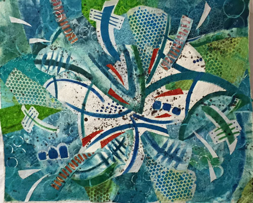
Clearly, the orange needed to be more dramatic.  So, I tried a few little splashes, (which look red in this photo.)  Yes!  I could see that this would add the drama the quilt needed.

A Splash of Orange. Ellen Lindner, AdventureQuilter.com/blog

I added more.

A Splash of Orange. Ellen Lindner, AdventureQuilter.com/blog

Yeah, that was working pretty well.  My brain said, “Let’s add more!”  And I obliged.

A Splash of Orange. Ellen Lindner, AdventureQuilter.com/blog

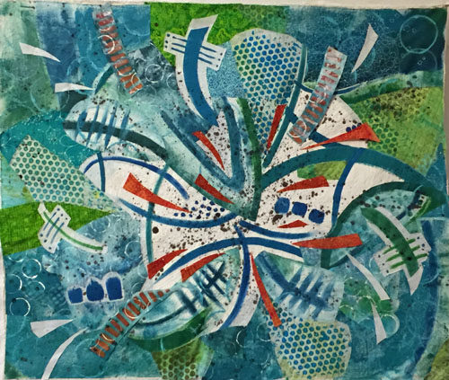
But, wait a second.  This was beginning to look like I had added the kitchen sink!  Some editing was needed. I removed the white splashes and auditioned changes to the orange stripes.  (Below, those fabrics are folded, rather than cut, for audition purposes.)

A Splash of Orange. Ellen Lindner, AdventureQuilter.com/blog

And this is where I ended up. As you can see I completely removed the orange stripes.

A Splash of Orange. Ellen Lindner, AdventureQuilter.com/blog

Have you heard the saying that goes, “If your composition is not working, remove your favorite thing?”  I think that sort of applied here.  At this point, I thought it was a solid 8.5 and I was quite happy with it.  On to quilting.

(Did you remember that this piece is composed of painted fabric, some of which is stiff?  That may be an issue for the quilting.)

Ellen Lindner

20

And Then I Threw Paint on It

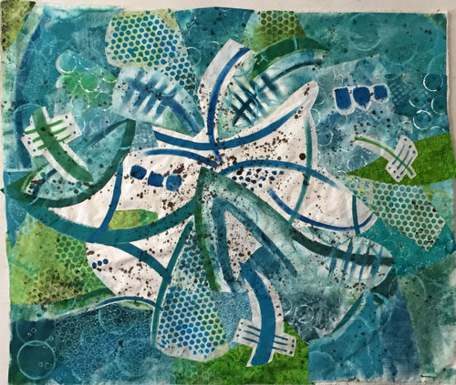
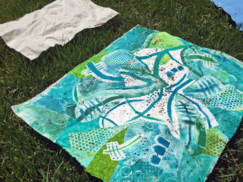
I got this far on my current quilt, before I knew it needed something more.

A Wacky Composition. Ellen Lindner, AdventureQuilter.com/blog

Clearly, the white needed some texture.  So, I decided to fling some paint onto it!

I practiced first on a piece of muslin, then I just went for it.

And Then I Threw Paint on It. Ellen Lindner, AdventureQuilter.com/blog

Amazingly, I did this without any fear!  I was READY to break things up and to add some interest.

Doesn’t it look better?

And Then I Threw Paint on It. Ellen Lindner, AdventureQuilter.com/blog

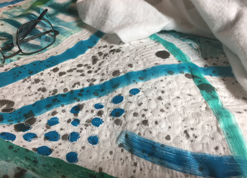
After that I considered it finished and began quilting it.  My initial idea was to stitch around each little drop of black paint.  And I actually stuck with it until I got to the very edges.

And Then I Threw Paint on It. Ellen Lindner, AdventureQuilter.com/blog

But, wait.  Is it really finished it?  After my post on August 4th, I got some very good comments and suggestions from you readers. I decided to reconsider a few things and to audition some changes.  I’ll show you those in the next post.

Ellen Lindner

4

A Wacky Composition

Well, after painting those (challenging) fabrics I had to figure out what to do with them.

Challenging Fabric Painting. Ellen Lindner, AdventureQuilter.com/blog

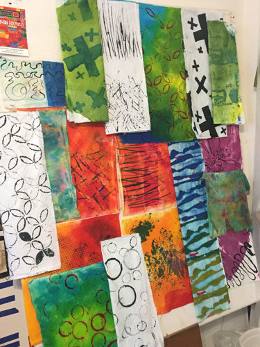
Since I wasn’t crazy about some of them, I knew I’d need to cut isolated portions and motifs for use. I had NO IDEA what my composition might look like, but I started cutting out sections and MINDLESSLY sticking them up on my design wall.

Apparently my brain likes order because I soon found myself adding each piece so that it filled the space left by previous pieces. Soon, a design was emerging.

A Wacky Composition. Ellen Lindner, AdventureQuilter.com/blog

I did make one very conscious decision at this point: I decided to place the pieces with the white background near center, since I knew these high contrast pieces would attract attention.

And so it went. I had found a dotted piece of blue and green and added it to the mix.  It worked well and expanded the color palette.

A Wacky Composition. Ellen Lindner, AdventureQuilter.com/blog

I threw in a little of the orange, too, of course.  It was looking wild and I was trying hard not to over think it!

A Wacky Composition. Ellen Lindner, AdventureQuilter.com/blog

I had some gaps and auditioned commercial fabrics to fill in.

A Wacky Composition. Ellen Lindner, AdventureQuilter.com/blog

Before long I had the base muslin fabric covered.  Now, it was time to examine what I had with a very critical eye.  Was this wacky combination heading in a usable direction?  Should I start all over with something calmer?  If I continued,  I knew some editing/deleting would be in order.

A Wacky Composition. Ellen Lindner, AdventureQuilter.com/blog

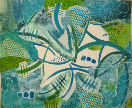
I removed (temporarily???) the orange, replaced the too bright blue lower left, and moved things a little. I felt like I was getting close.

A Wacky Composition. Ellen Lindner, AdventureQuilter.com/blog

Future questions:
– The white areas seem so blank.  Should I add something small scale in that area?
– Does it need something lower right?
– I’d like to add the orange back, but how can I best do that?
– Does it need something darker?  Black, even?

About this time I decided on a tentative name, “Splash.”  That would certainly affect some  future decisions.

Thanks for joining me on this wild ride!

Ellen Lindner
16

Choosing a Palette

Challenging Fabric Painting. Ellen Lindner, AdventureQuilter.com/blog

Once I had my fabrics painted, it was time to select the colors I would use with them. Orange was a given since it was in one of the fabrics.

So what about blue-green with orange?

Choosing a Palette. Ellen Lindner, AdventureQuilter.com/blog

Although this is one of my favorite color combinations I immediately thought “no.”  I guess because I’ve used it so much. 

But, what if I expanded the palette to include yellow-orange and red-orange? And expanded the blue-green to include pure blue and pure green? That was better.  (Except for that one overly bright orange fabric top right.)

Choosing a Palette. Ellen Lindner, AdventureQuilter.com/blog

It needs some value contrast, right?  Let’s see what the addition of black looks like.

Choosing a Palette. Ellen Lindner, AdventureQuilter.com/blog

Yes, that works better. But, do I really need ALL these colors?  Would it be better to simplify?

Choosing a Palette. Ellen Lindner, AdventureQuilter.com/blog

I eventually settled on the palette above, with both orange and black as accents.  Of course, this is just the starting point. There’s no telling where I might go from here.

Do you audition your colors before designing or do you wing it as you go? Do you use the same colors a lot?

Ellen Lindner

12

Challenging Fabric Painting

Like I said, painting fabric is more challenging than it looks.  Especially if you use sort of thick paint to get hard edges, as I did. I wanted to create two coordinating fabrics: one with an allover pattern of sorts, and the other with large scale high contrast patterning. It was this second one that really humbled me.

I started out with some large sweeps of my brush and I liked them pretty well.

Challenging Fabric Painting. Ellen Lindner, AdventureQuilter.com/blog

But, I wanted to add color to the background. And that’s where I went wrong.

Challenging Fabric Painting. Ellen Lindner, AdventureQuilter.com/blog

Can you say “ugly” boys and girls?  I wasn’t sure if I could salvage this and I allowed myself a few hours of discouragement.

Clearly, it needed some unifying elements, so I started adding stuff.

Challenging Fabric Painting. Ellen Lindner, AdventureQuilter.com/blog

That helped.  But, do you know how long it took to draw all those little shapes?  Enough to dissuade me from using it all over.  I did like that one area, however.

In the photo below you can see both fabrics.  For the one on the right, I added large aqua circles, which also helped. I certainly didn’t love that fabric at this point, but I felt like I could judiciously use selected parts.

Challenging Fabric Painting. Ellen Lindner, AdventureQuilter.com/blog

Then, I tried again with my desire for a high contrast, large scale pattern.

Challenging Fabric Painting. Ellen Lindner, AdventureQuilter.com/blog

Challenging Fabric Painting. Ellen Lindner, AdventureQuilter.com/blog

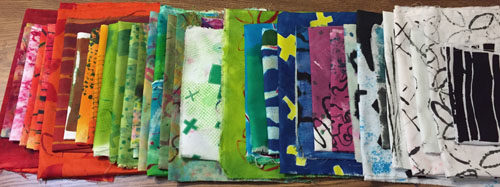
This time I left it alone!  This was my final collection of fabrics, some of which are folded in this photo.

Challenging Fabric Painting. Ellen Lindner, AdventureQuilter.com/blog

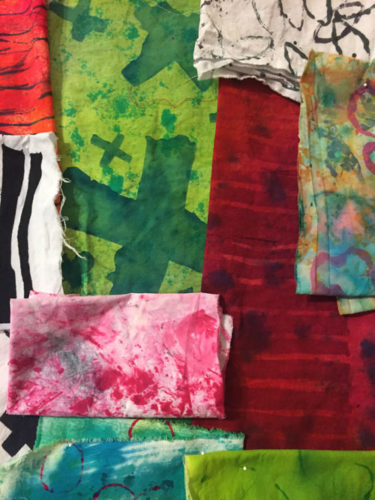
I can’t say I was elated with this menagerie, but I felt like I could do something with them. What, I wasn’t sure! Maybe I’ll figure it out by the next post.

Ellen Lindner


8

Cindy and Her Amazing Shibori-Colored Dreamcoat

Meet my friend Cindy Michaud.  She’s a very talented artist who paints gorgeous landscapes and still lifes.  Since she loves bright colors and strong contrasts, just like me, I LOVE her work!

Cindy Michaud's art. Ellen Lindner, AdventureQuilter.com/blog

Still Standing, by Cindy Michaud

But Cindy is more than a painter.  She’s an artist in the truest sense of the word: always trying new things and exploring options.  She has a very adventurous spirt.  One week she might be making mosaics for her garden and the next she’s creating bird houses from gourds. And, since she has a local fiber art friend (not me) she’s even dabbled in dying fabric.

But what does a non-sewer do with hemmed napkins that have been dyed with tumeric and indigo?  Why, she puzzles them together and makes an amazing coat.

Amazing Shibori-Colored Dream coat. Ellen Lindner, AdventureQuilter.com/blog

Amazing Shibori-Colored Dream coat. Ellen Lindner, AdventureQuilter.com/blog

See what I mean?  She even used some pieces in the lining.

Amazing Shibori-Colored Dream coat. Ellen Lindner, AdventureQuilter.com/blog

She did a lot of hand stitching on the coat, which added a wonderful layer of interest.

Amazing Shibori-Colored Dream coat. Ellen Lindner, AdventureQuilter.com/blog

Amazing Shibori-Colored Dream coat. Ellen Lindner, AdventureQuilter.com/blog

Amazing Shibori-Colored Dream coat. Ellen Lindner, AdventureQuilter.com/blog

Don’t you love that accent of yellow?

Amazing Shibori-Colored Dream coat. Ellen Lindner, AdventureQuilter.com/blog

Amazing Shibori-Colored Dream coat. Ellen Lindner, AdventureQuilter.com/blog

I’ll bet Cindy’s going to get lots of attention when she wears this!

I hope you’ll check out Cindy’s website and blog.  I subscribe to her blog and really enjoy reading about her adventures and seeing her art.  I think  you’ll like it, too.

Ellen Lindner

11

Painting Fabric: Not as Easy as I Thought

After working with some beautiful hand-painted fabrics recently, I decided to try my hand at creating some of my own.  Although I had painted fabric before, I had never done so with a really specific purpose. This time I wanted to:
– Paint at least 2 large pieces of fabric that would coordinate,
– Paint at least one of them with large scale high contrast designs.
That second one turned out to be the most difficult, so I’ll show you the easier one first.

I was working with a variety of blue-greens, greens, and blues and wet this piece of fabric before painting it very loosely.

Painting Fabric: Not as Easy as I Thought. Ellen Lindner, AdventureQuilter.com/blog

I hoped the wetness would cause the colors to move and shift a little and I think maybe it did.

Next, I wanted to add some low contrast texture.  I did so by stenciling soft blue-green paint through a scrap of gridding.

Painting Fabric: Not as Easy as I Thought. Ellen Lindner, AdventureQuilter.com/blog

I really liked the effect.

Painting Fabric: Not as Easy as I Thought. Ellen Lindner, AdventureQuilter.com/blog

I also wanted to add a contrasting color and selected a dull orange.  The complement of blue, I thought this would work well.  Again, I stenciled it on; this time with a commercial stencil left over from my scrapbooking days.

Painting Fabric: Not as Easy as I Thought. Ellen Lindner, AdventureQuilter.com/blog

Not bad, I thought.

Painting Fabric: Not as Easy as I Thought. Ellen Lindner, AdventureQuilter.com/blog

But, as the orange paint dried it turned much darker, to more of a rust color. I decided to overpaint with brighter oranges, which helped.

I tried 3 more things that I forgot to photograph:
– Drawing with a syringe.  A big fail!  I wet it down and wiped it nearly all the way off.
– Adding small dots.  Okay, but not exciting.
– Smearing on white paint over everything.  This was pretty interesting, but heavier than I wanted.  Again, I sprayed it down and wiped much of it off.  That left a faint film which was unifying.  I liked it.

Finally, I added white rings stamped with a nearby roll of painters tape.

Painting Fabric: Not as Easy as I Thought. Ellen Lindner, AdventureQuilter.com/blog

Painting Fabric: Not as Easy as I Thought. Ellen Lindner, AdventureQuilter.com/blog

I think that was pretty successful.

A few observations and lessons learned:
– This takes a lot longer than I had imagined.  It’s worth the purchase price of gorgeous fabric created by OTHER people, when I can find it.
– I’ll definitely do more of this.
– I have a lot to learn.  Chief among my questions is how to get saturated colors without making the fabric stiff and without using lots of paint.  I’ll need to do some research.

The bottom line is that I can definitely use this fabric and I met my goals with it. Yippee!

Ellen Lindner
P.S. I used mostly Pebeo Setacolor Transparent, along with some artists acrylic paints.


10

“Jubilation” Complete

My latest quilt, Jubilation, is now complete and I’m really excited by the way it turned out.

Jubilation, an art quilt by Ellen Lindner. AdventureQuilter.com

Jubilation

I had fun quilting this, especially in the white and pink areas where I followed the curves of the paint squiggles. Here it is in-progress.

Jubilation - detail, an art quilt by Ellen Lindner. AdventureQuilter.com

In the green areas I contrasted that curvy quilting with sharp angular lines, leaving the circles unstitched.

Jubilation - detail, an art quilt by Ellen Lindner. AdventureQuilter.com

Of course, the star of this quilt is the wonderful Pat Pauly fabric which I used very selectively.

You’ll find more information on this piece, including how to audition it in your home here.  I’d love to hear your thoughts on this quilt.

Hmm.  Now what?

Ellen Lindner
4