For the SAQA “Trunk Show”

I belong to a wonderful organization called SAQA,  Studio Art Quilt Associates.  One of the goals of the group is to promote art quilts.  With that in mind, the group orchestrates trunk shows of very small quilts.  These travel, free of charge, to any group that asks.  Isn’t that cool?

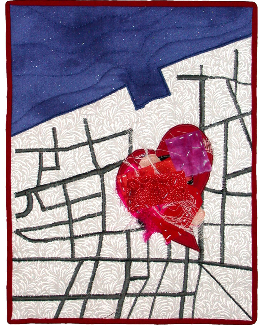
This year’s call for trunk show art asks for tiny quilts measuring 10″ high and 7″ wide.  They must be completely finished, and should represent the artist’s usual style.  That last part is something of a challenge, due to the scale!

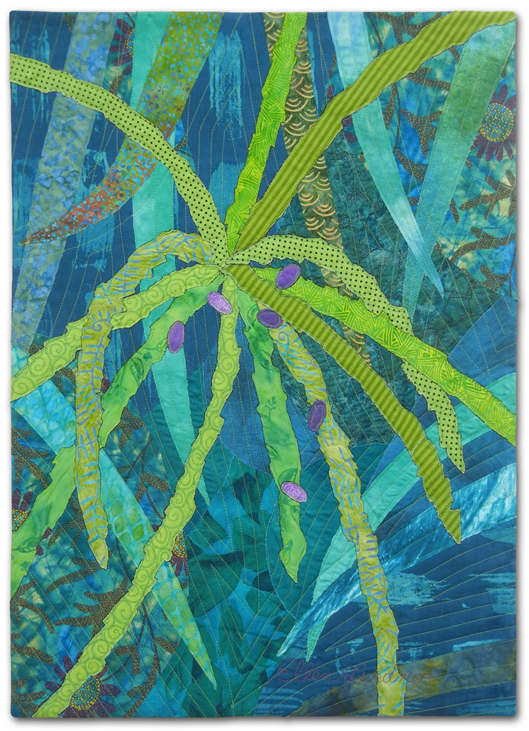
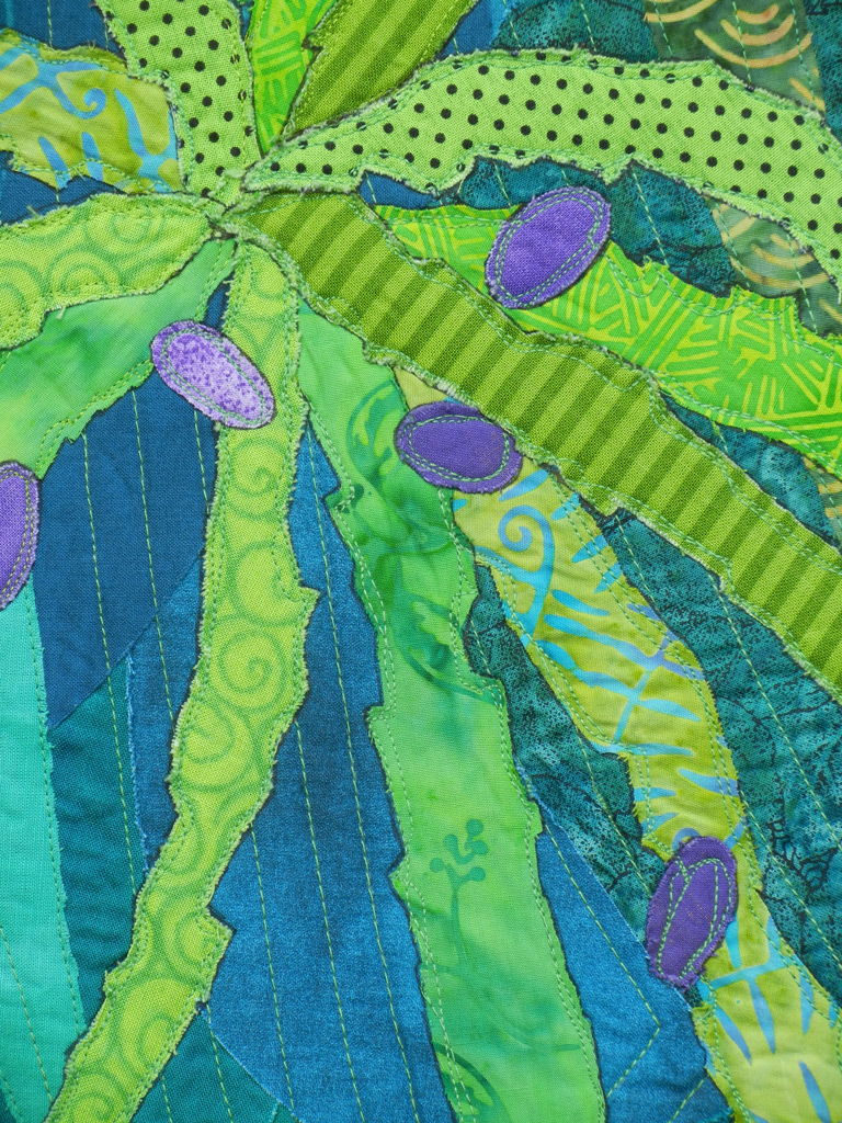
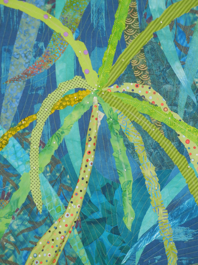
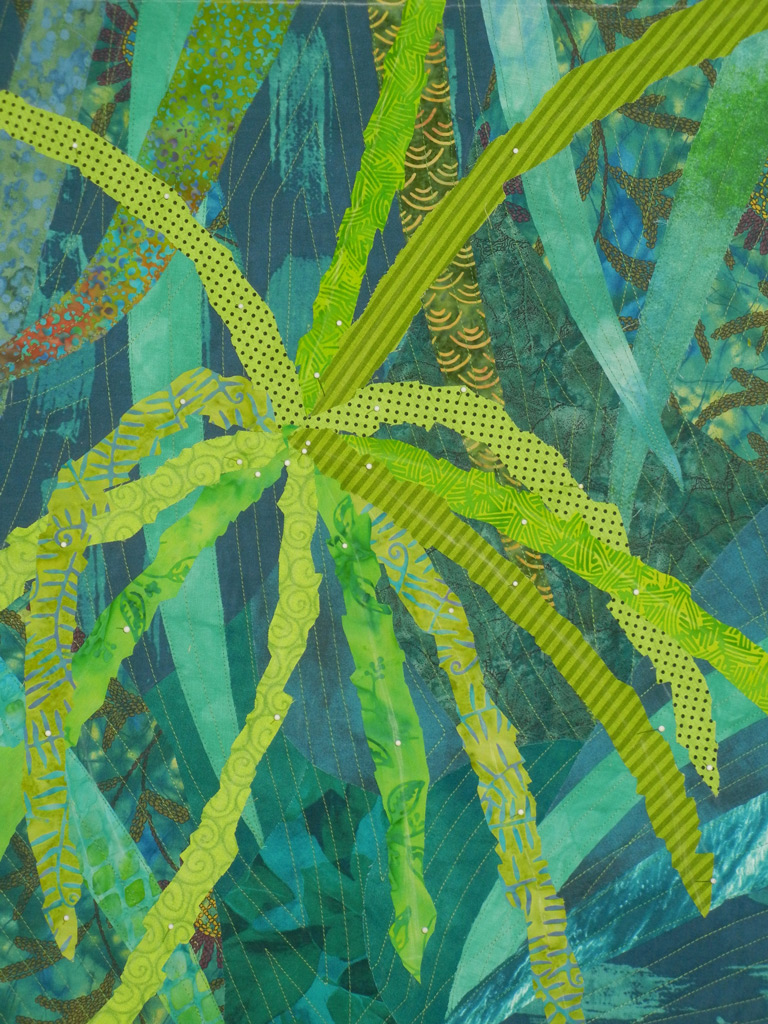
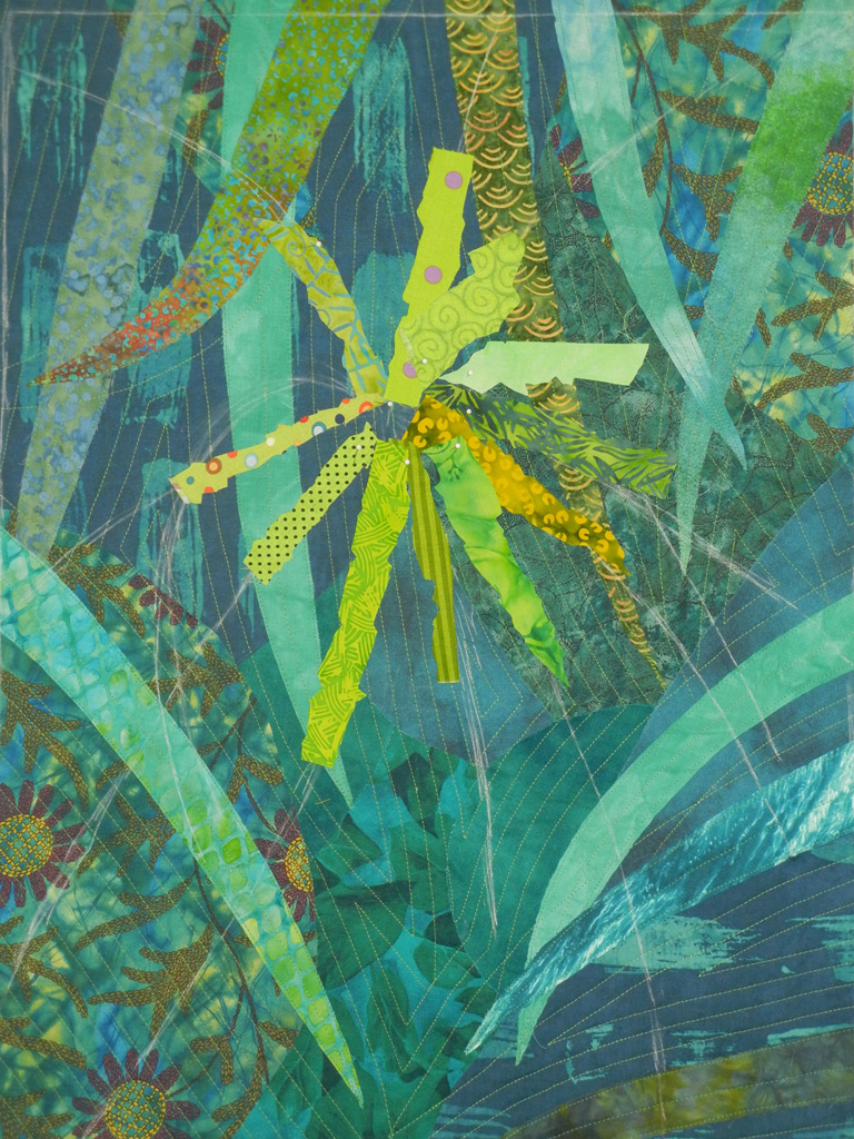
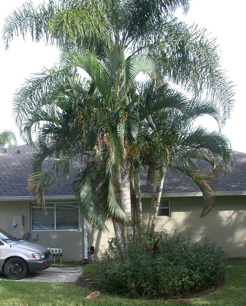
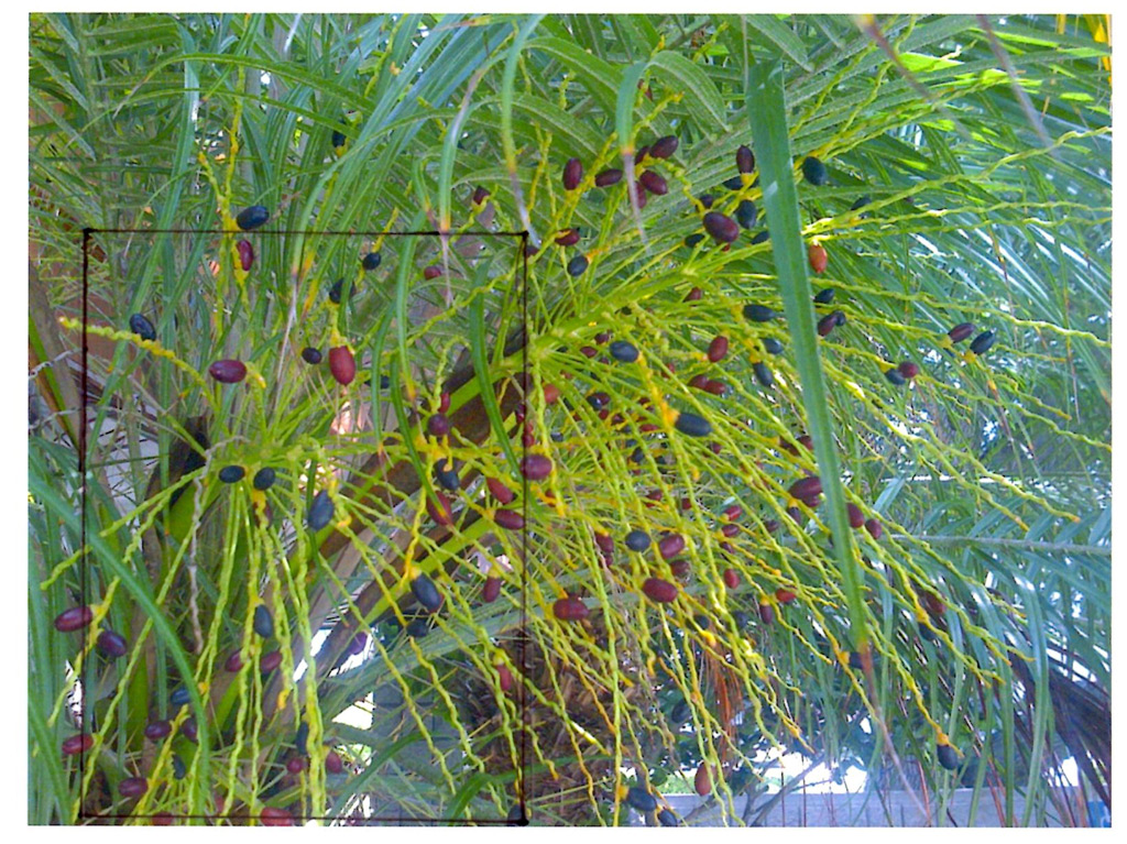
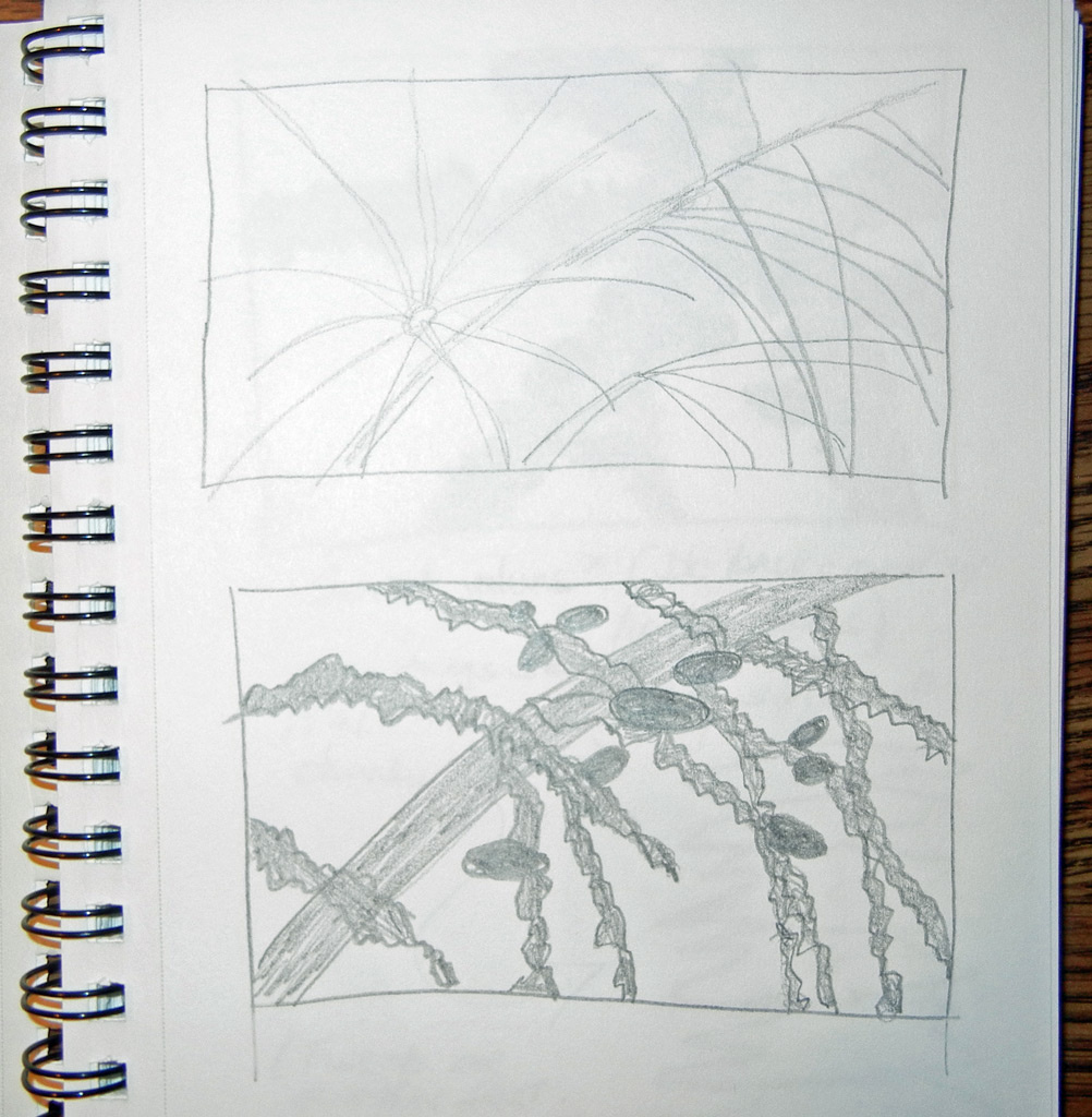
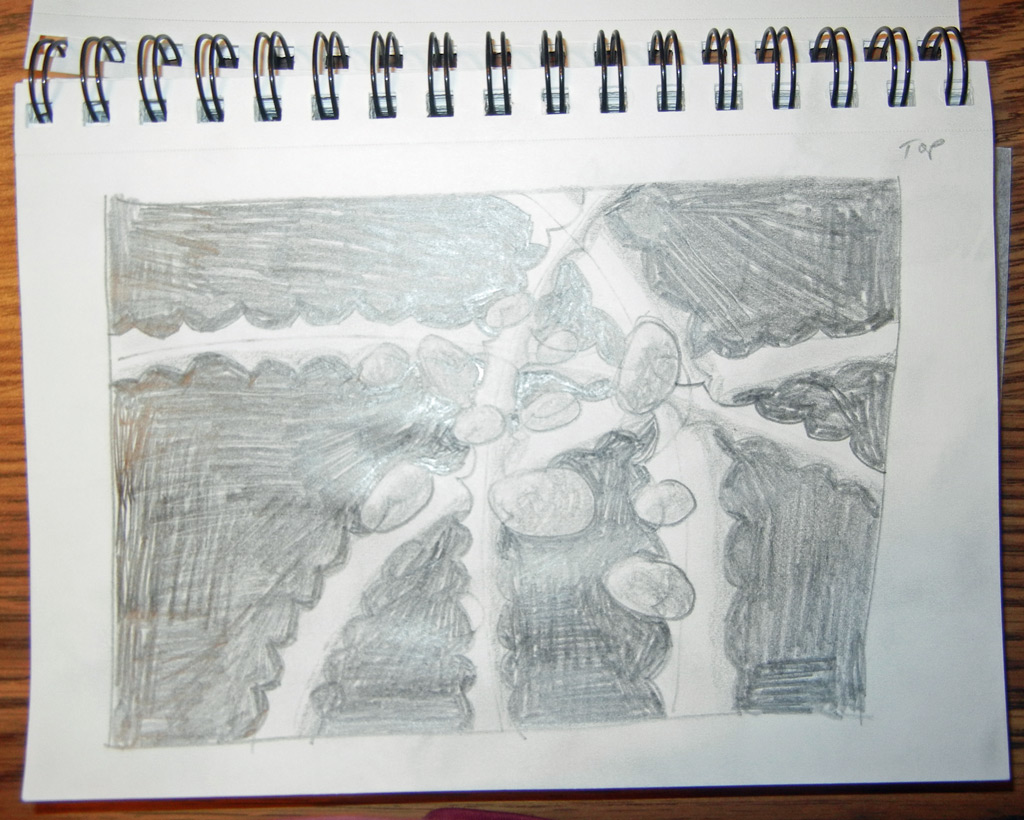
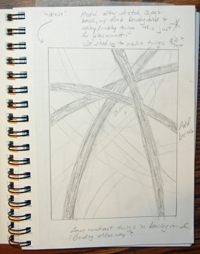
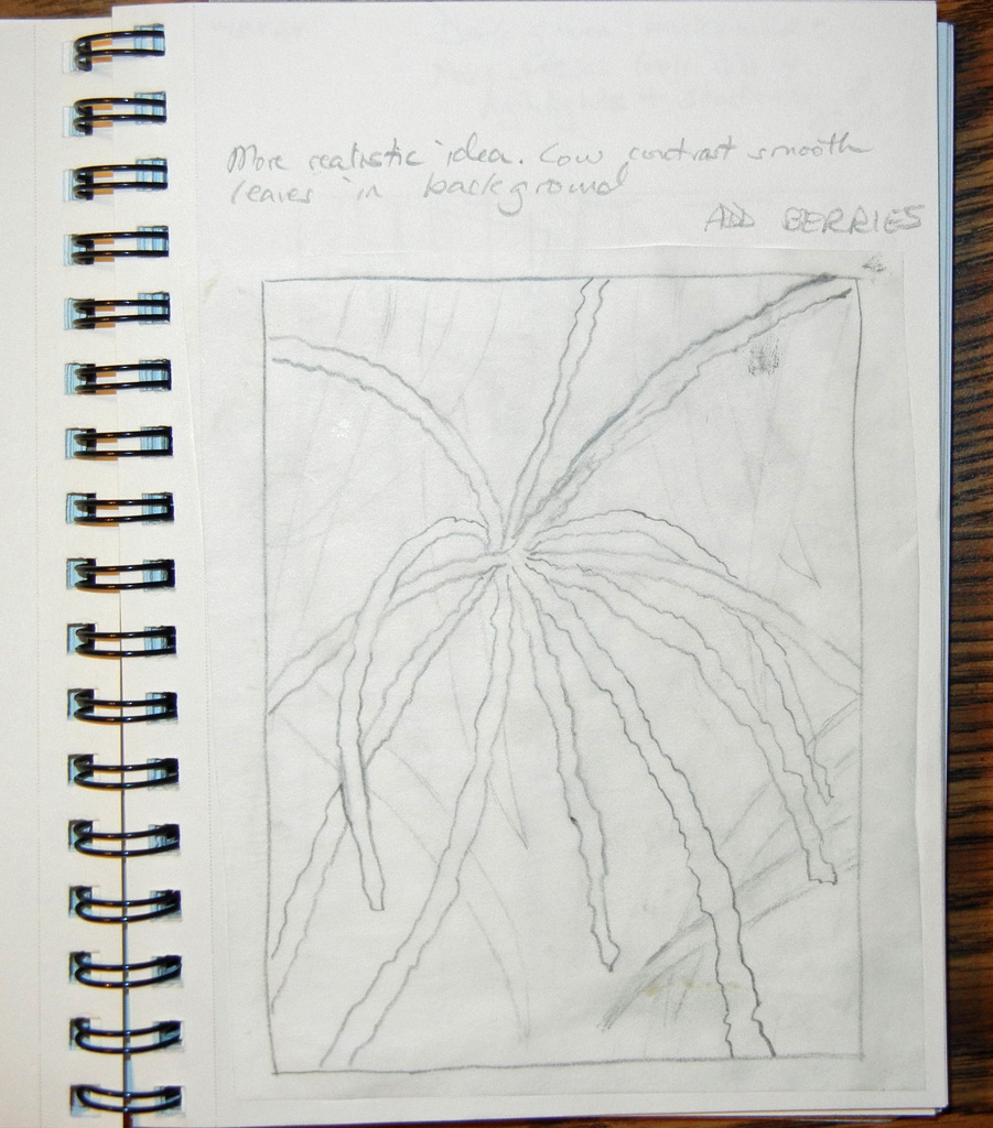
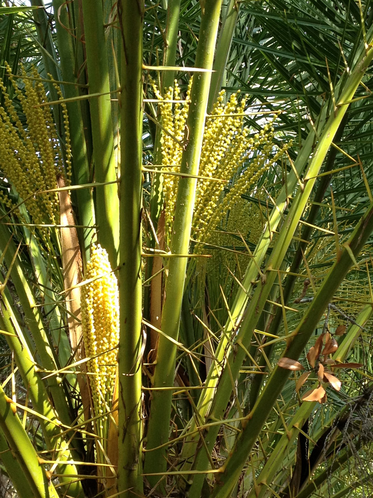
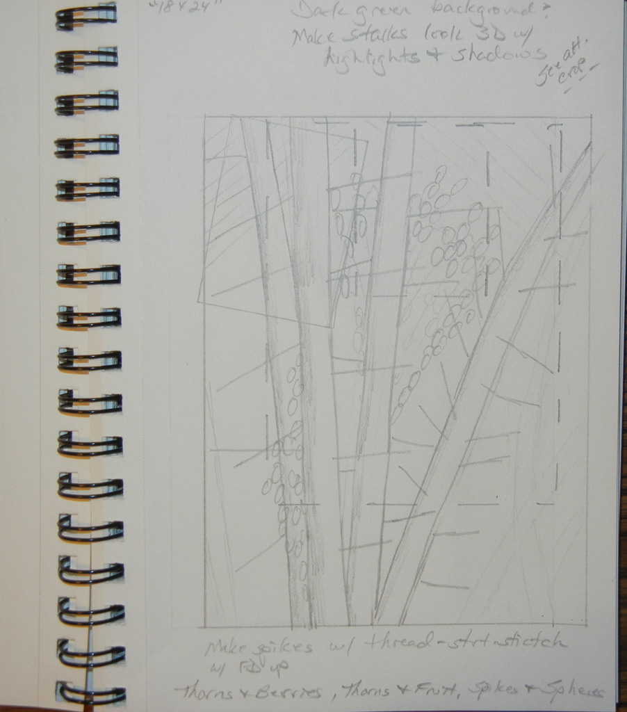
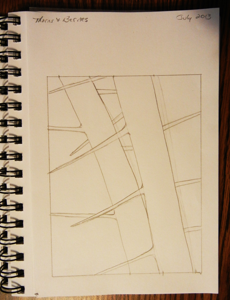
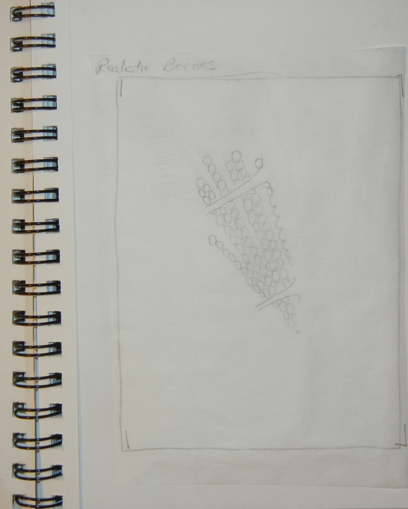
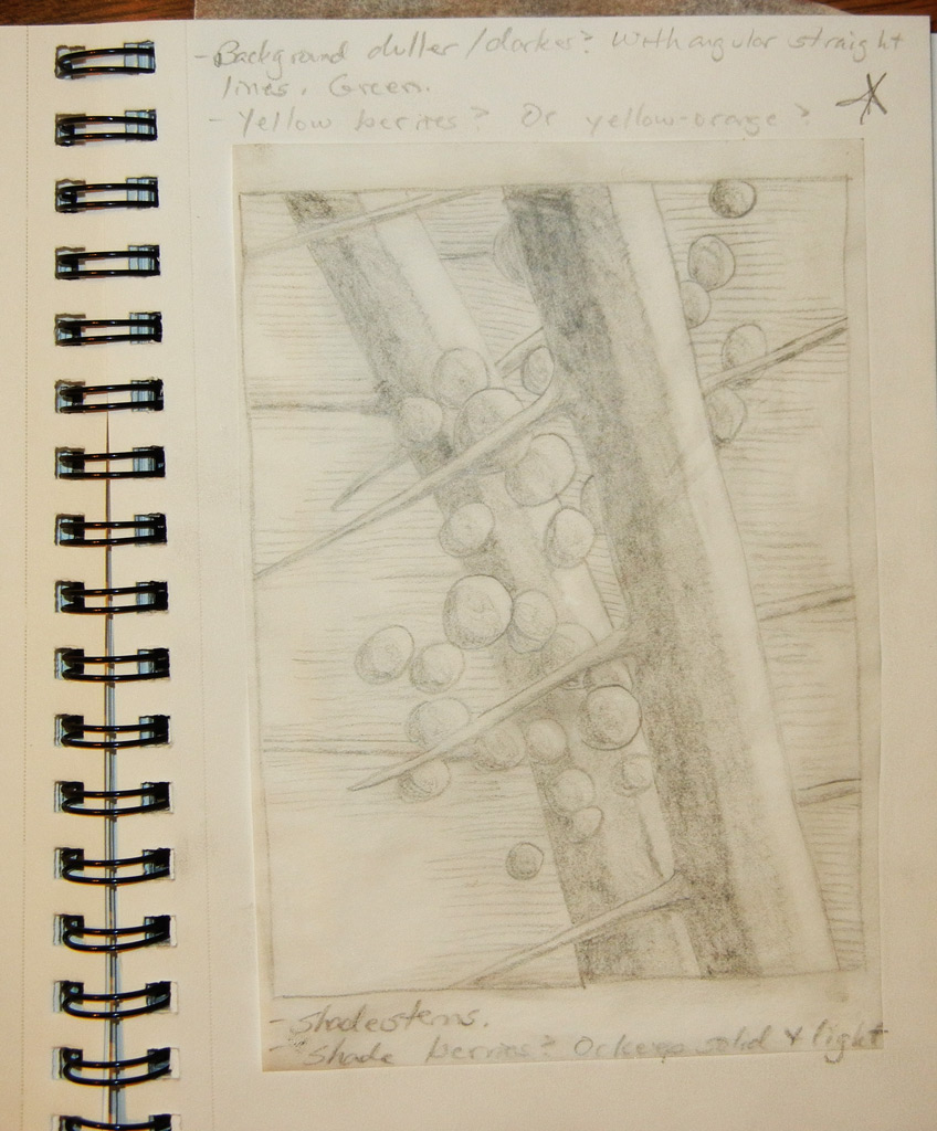
Of course, I decided to depict one of my favorite subjects, crotons.  I started by looking at a ton of my photos and then began to sketch with the computer.  This is what I came up with.

Click any image for a larger view SAQA-computer-sketch

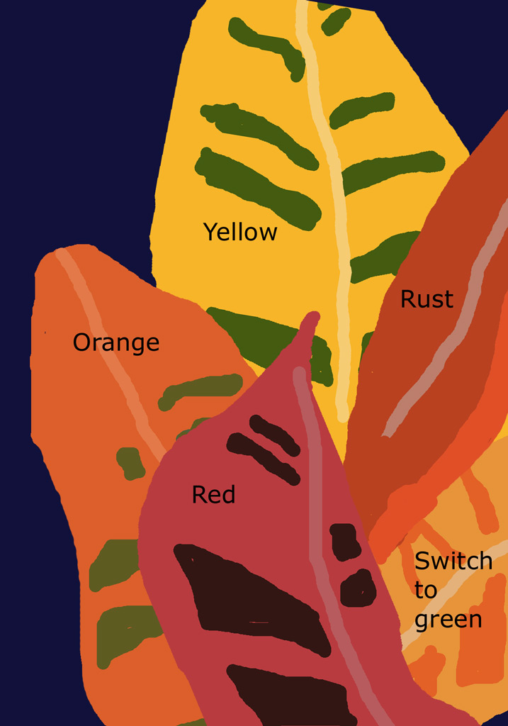
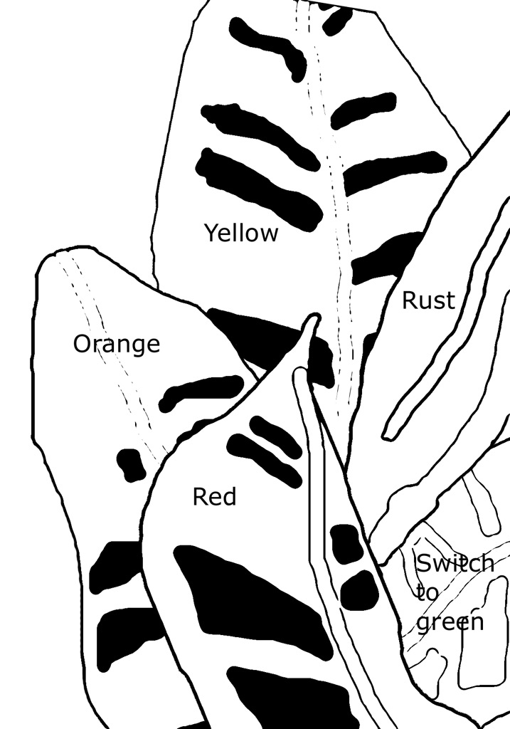
I converted it to black and white and printed it out.  Due to the small size, I was able to use it as my pattern.  Very easy!

SAQA-comp-sketch-bnw

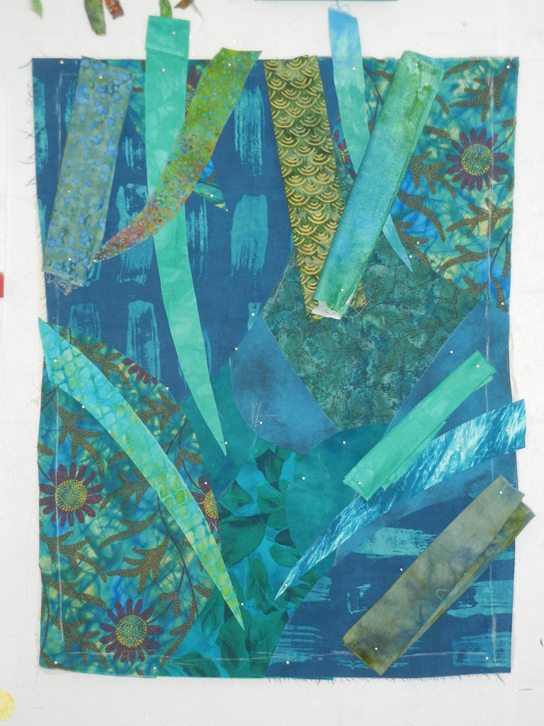
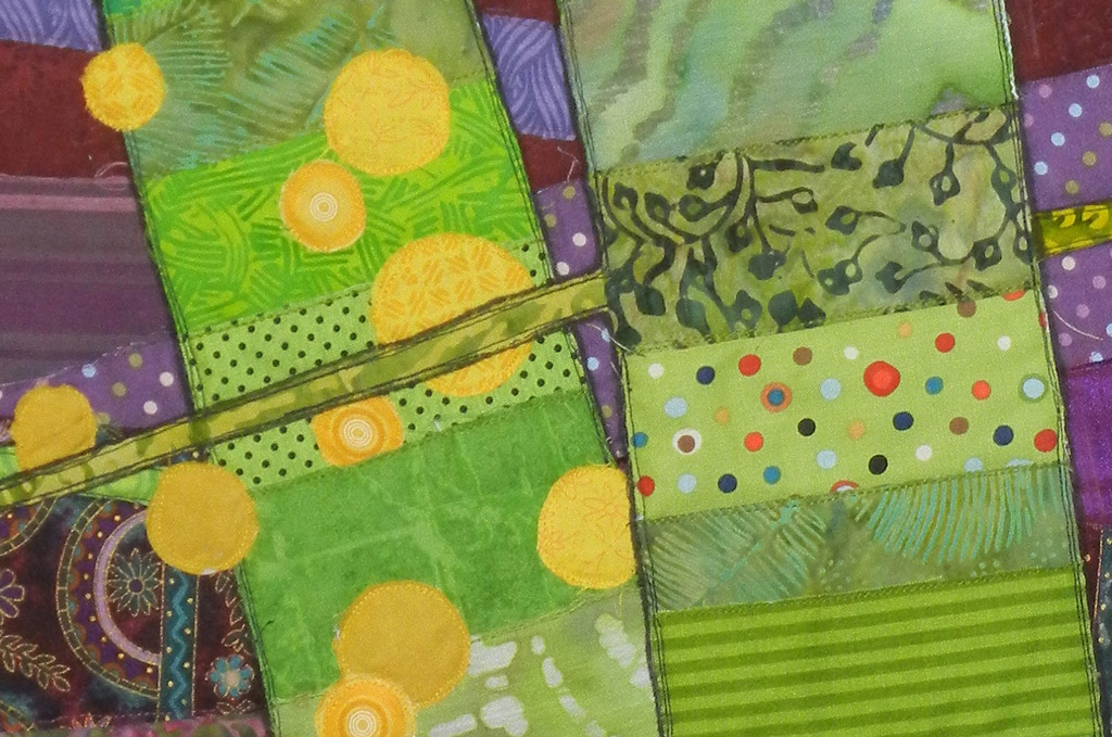
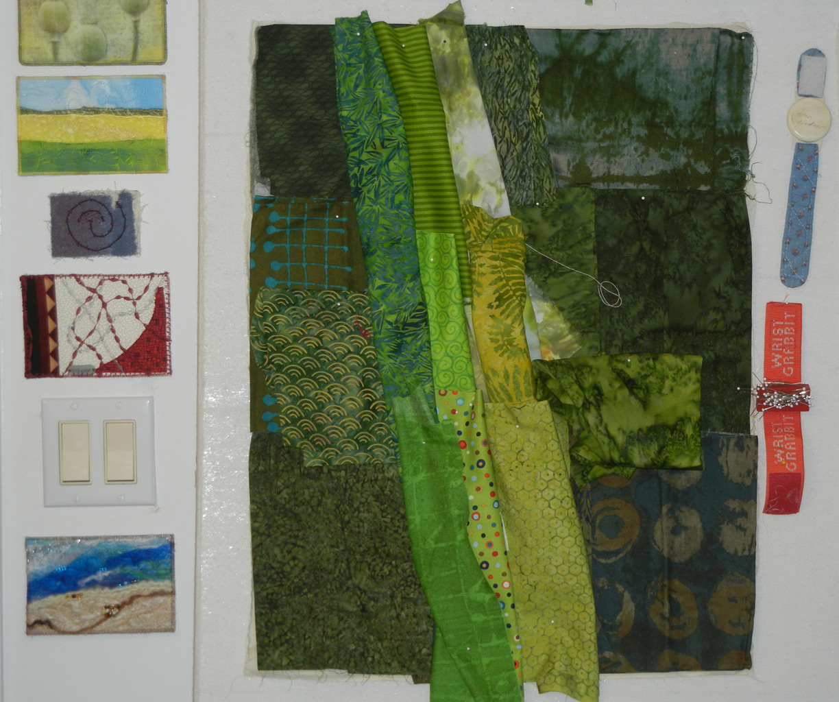
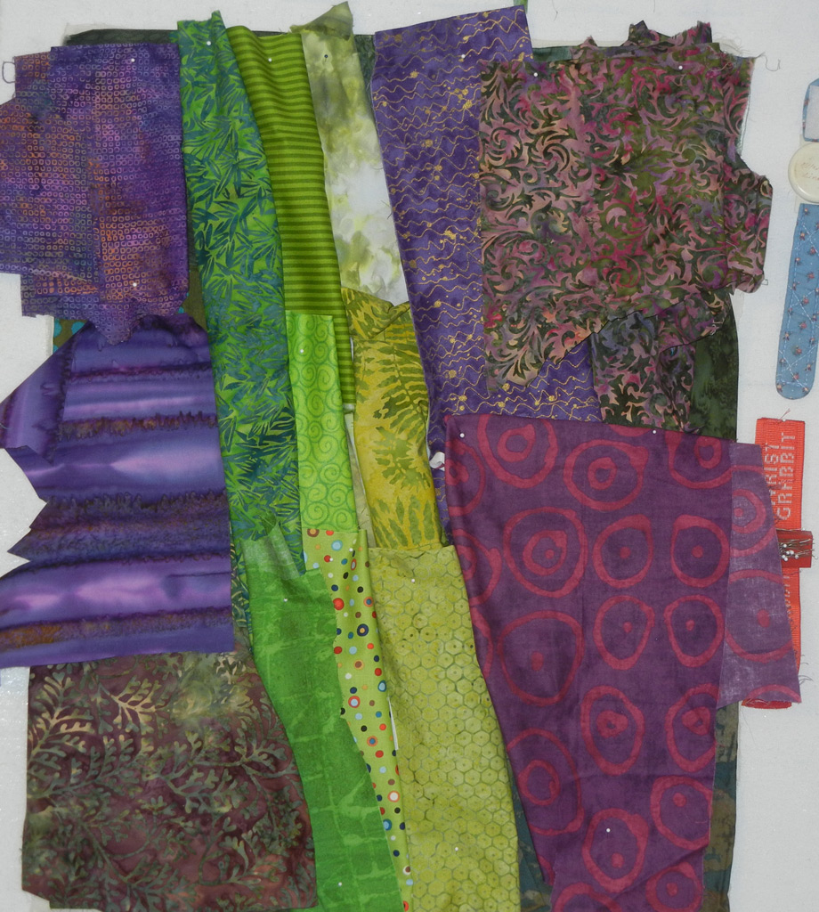
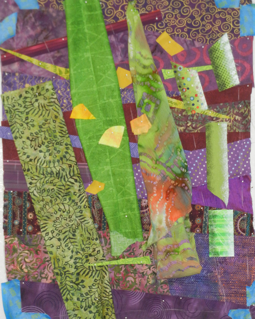
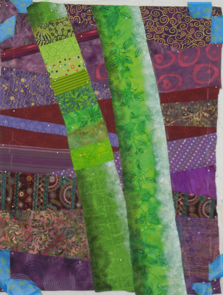
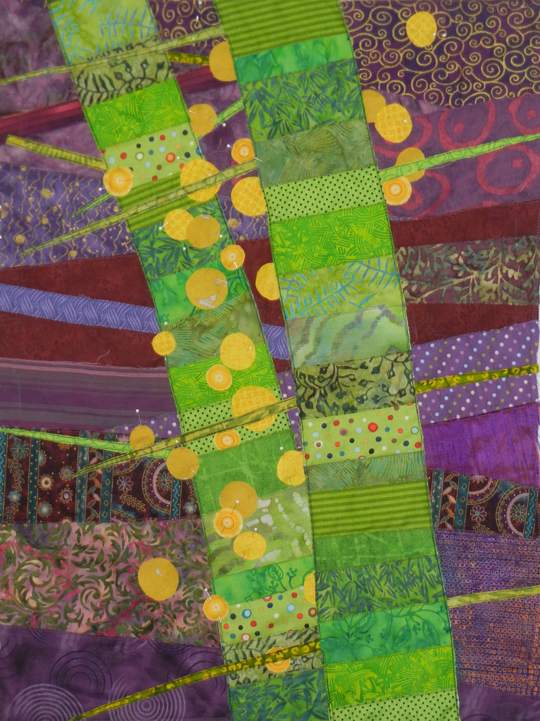
Next, I auditioned fabrics.  Working at this very small scale gave me the idea of using striped fabrics as the veining in the leaves.  I pulled them out to see if I was on track.

SAQA-fabrics

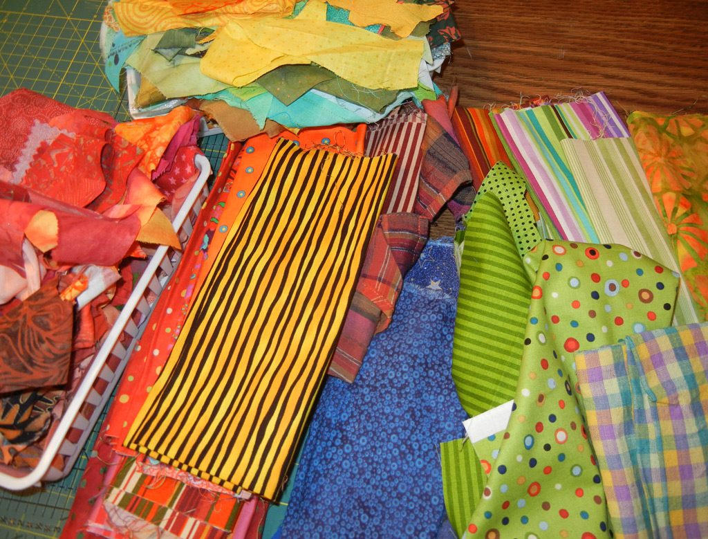
Yes!  I could definitely see these fabrics working.  Still, I planned a little bit more, making sure I’d have the contrast I needed.

SAQA-planning-fabric

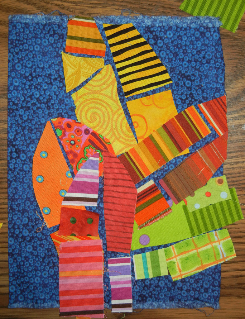
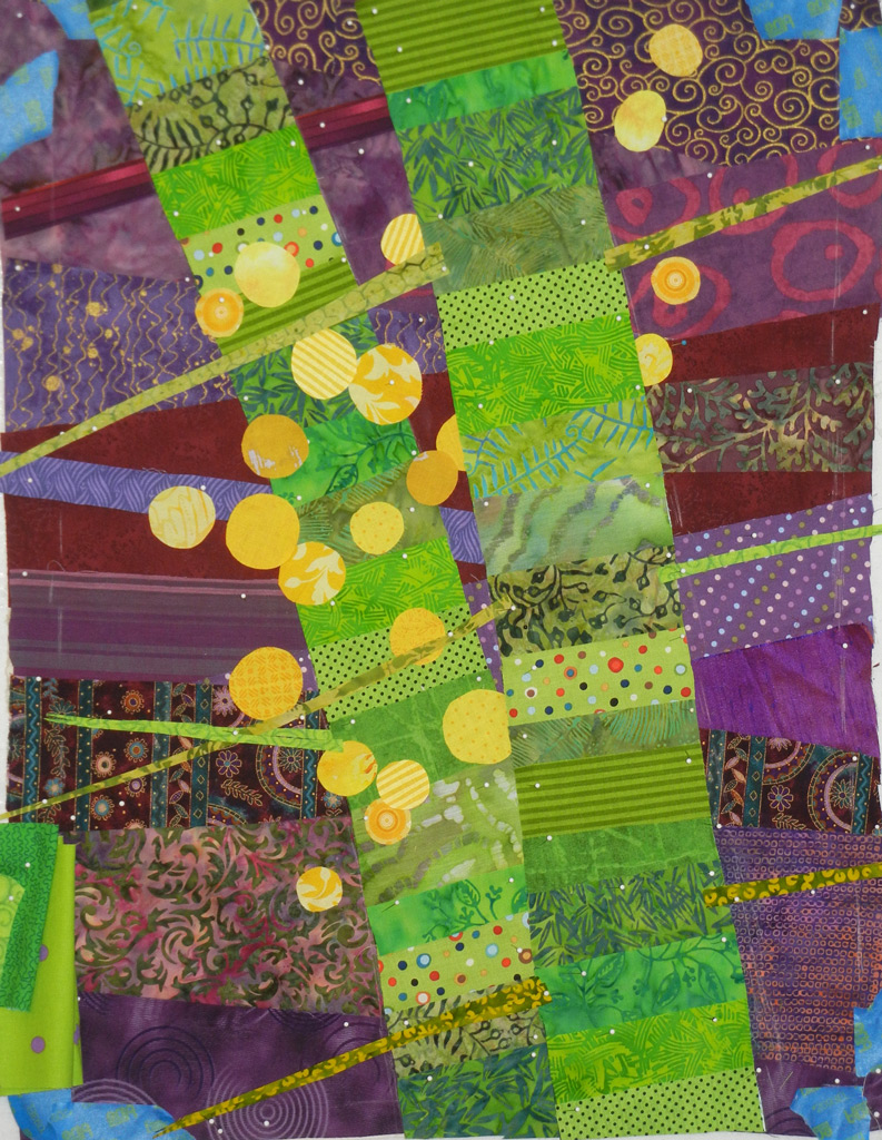
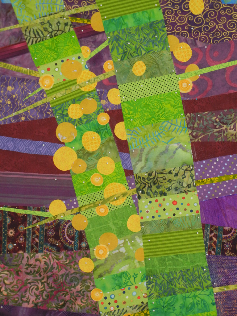
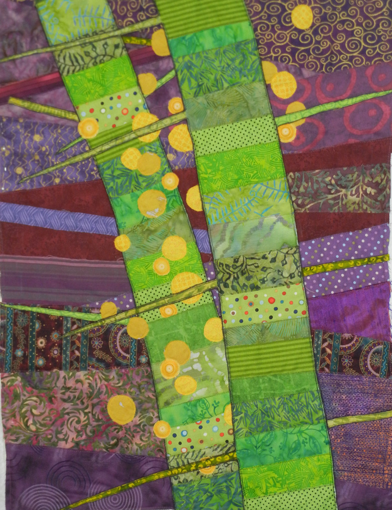
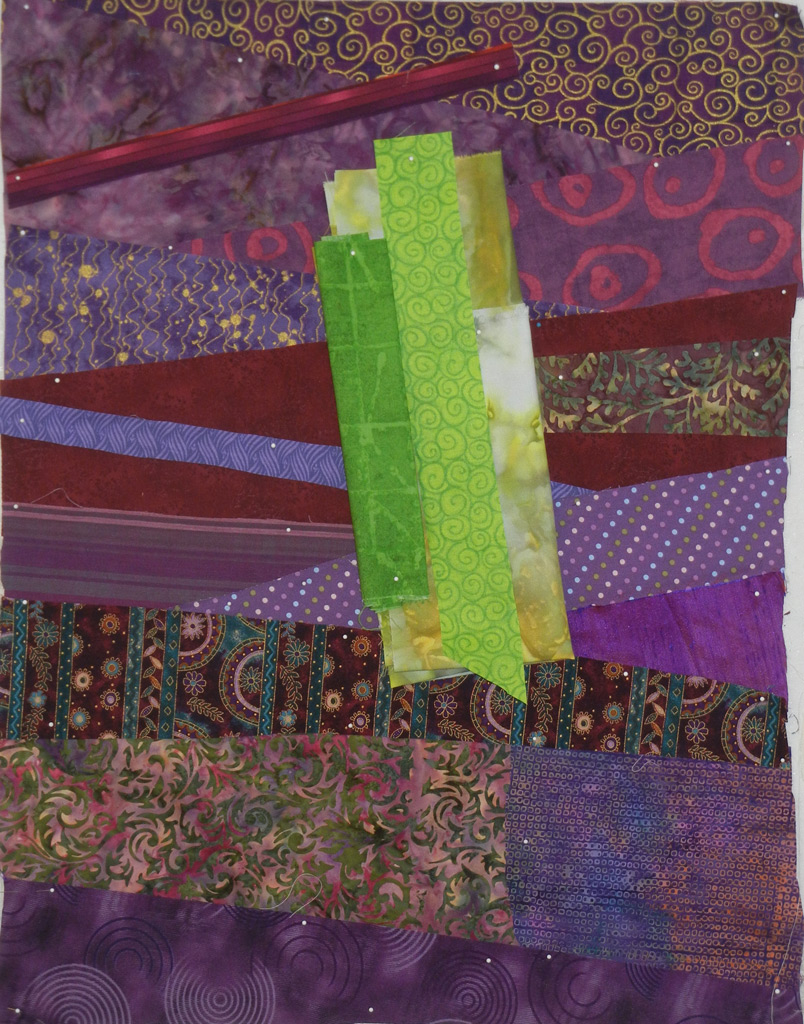
Gee, it has a lot of energy at this stage, doesn’t it?  Definitely something to revisit.

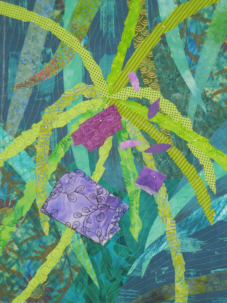
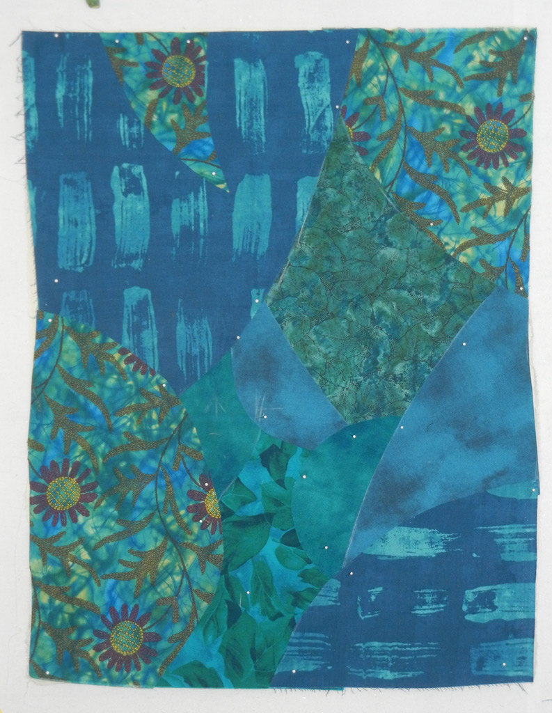
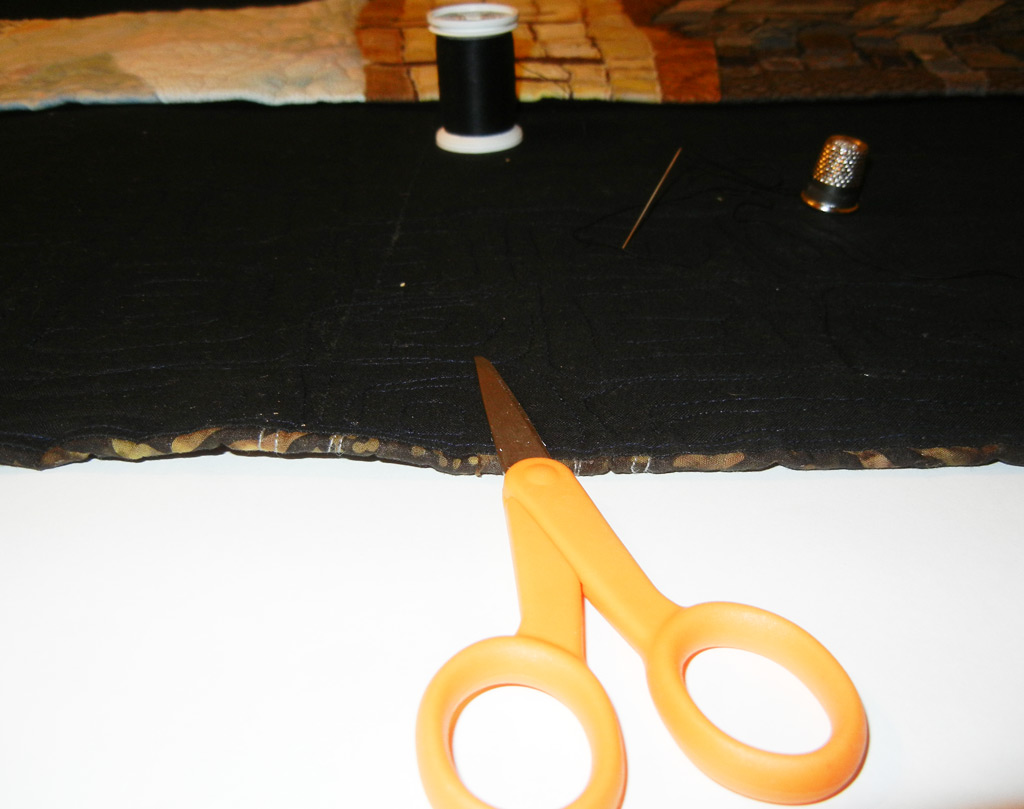
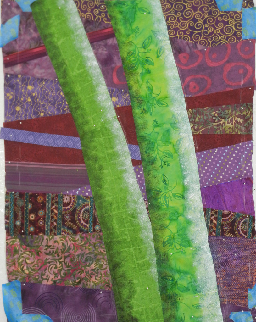
But back to the quilt at hand.  I started cutting fabrics and laying them in place. 

SAQA-yellow-and-green

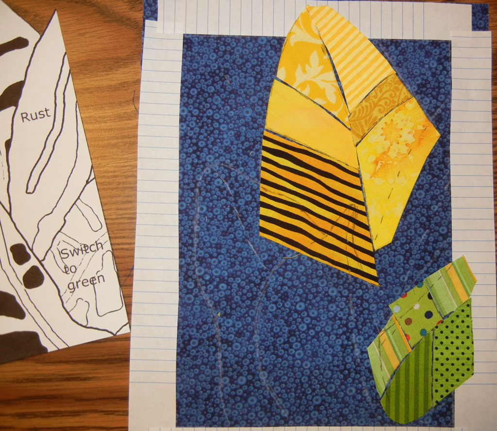
My plan was to leave a gap between the pieces where the largest vein is and to allow the blue background to show through.  I knew it would also show a little in some of the other pieces, and I figured that was a good thing.

I was loving how this was coming together, and the fun of playing with these stripes!

Have you ever tried working in a completely different scale?  It sure can be challenging.  But, rewarding, too.  Especially when the piece goes this quickly.

Ellen Lindner

“The Last Few Dates”

My latest quilt is finished, and I’m very happy with it.  I’ve named it “The Last Few Dates.”

Click any image for a larger viewQueen_Palm-onwhite

I kicked up the contrast every so slightly by outlining the foreground elements with a skinny black marker.  You can’t see it from afar, but it adds a little definition to the close up view.

queen-detail

This piece came together very easily, with very few changes from my initial vision.   That almost never happens!

Ellen Lindner
P.S.  This piece is available for puchase.  See details here.

Queen Palm: Foreground Twigs and Favorite Things

After completing the background, and auditioning fabrics for the foreground, I set to work on the Queen palm twigs.  I was loving the “measles” fabric.

Click any image for a larger viewqueen-foreground-ip2

But, was it taking over?  Hmm.  Have you ever heard the artistic advice:  If it’s not working, try removing your favorite thing?  Darn.  I was pretty sure that’s what it needed.

queen-twigs-finished

Yeah, that was better.  Not as colorful, certainly.  But, I knew I’d be adding colorful dates, so I was happy with these twigs.

(Remember, I work in a collage fashion.  So, I can always move things around and make adjustments late in the process.  This makes it easier to experiment and move forward, even when I’m uncertain.)
 
Time to audition date fabrics.
 
queen-auditioning-date-fabr

Yes.  That’s working.

What about you?  Have your quilts ever benefitted from having your favorite thing omitted?

Ellen Lindner

Queen Palm: Background and Stitching

After designing a plan for my Queen Palm (twigs) quilt, it was time to create the background.  After some consideration, I decided to slightly mimic the colors in the inspiration photo:  blue-green in the background and yellow-green for the foreground.  Since the colors are similar, I knew I’d have to create contrast with value.  I’d keep the background pretty dark and make the palm twigs lighter.

Click any image for a larger viewqueen-background-first-fabr

Plus, I wanted the background to have long sweeping curves, to contrast with the nubby twigs of the foreground.  So, as you can see above, the first pieces were cut accordingly.

Then, I started adding long curving leaves.  I wanted them to show, but not so much as to compete for attention with the upcoming foreground.  I auditioned each fabric choice to get it just right.

queen-background-ip

I decided to go ahead and quilt the background, before adding the main elements.  That was especially helpful, since I wanted to play up the long curving lines with the quilting.

In the photo below, you can see the quilted background, along with the early fabric auditions for the palm twigs.  (Click for a better view.)

queen-auditioning-foregroun

The contrast seems to be about right.  And I love the bright polka-dotted fabric!

Ellen Lindner

Sketching Palm Twigs

In my neighborhood there are a lot of Queen Palms.  They’re sort of THE classic palm:  tall and willowy. 

Click any image for a larger viewqueen-palm

But, what I keep noticing about them is the fruit clusters.  And the bumpy twigs that remain when the dates are all gone.  (I get to study these up close on yard trash days, when I’m walking the dog.)

quueen-palm-twigs-photo-1

The fruit clusters are actually huge.  About half the size of one of the fronds.  And the dates change colors as they ripen and fall:  green, purple, red, orange, and yellow.  See the close up shot of ripe dates above.  Since I needed to do a quilt with certain measurements, you can see that I’ve drawn those onto the photo, in anticipation of doing some sketching.

First, I recorded the general spray of the twigs, as well as their nubby shape.

queen-palm-twigs-sketch-1

Next I began to consider more abstract options.  What intrigued me the most about these fruit clusters?  What did I want to showcase?  Clearly, it was the bumpy twigs, their gentle curves, and secondarily, the dates.  I sketched.  Maybe I could do an abstracted piece that showed a close up of the twigs and fruit.

quuen-palm-twigs-abstracted

But, I needed it to be vertical, so I changed it up.  In the sketch below, I didn’t take time to draw the twigs with bumpy edges, but I knew I’d include them in the final quilt.

queen-palm-twigs-vert.-abst

But, maybe the twigs should be more delicate.  Eventually, I came full circle and decided on a more realistic composition.

queen-palm--skinny-twigs-7

Now that I had my design sketch, I still had a few things to consider.
– I had originally planned to make this piece with complementary colors:  a berry/fucshia background with yellow-green twigs.  But, after doing the last two quilts in this colorway, I was getting tired of it.
– What should I do to the background?  I didn’t want it to be too plain.  It would need to both contrast with and support the foreground twigs.

Check back to see my decisions.

Ellen Lindner

Remembering 9/11

We all remember where we were when we learned about the 9/11 terrorists attacks.  And the horror of seeing those buildings fall.  Apalling!

But then, the surge of patriotism and unity we all felt.  Powerful!

Although I didn’t make a 9/11 quilt right away, I did in 2002, when I had to make a challenge quilt for the month of September.  Like the rest of the country, I thought back to the events of one year earlier.  So, I made “Aerial View of Ground Zero, One Year Later.”

Click any image for a larger viewSept, 4x4,300dpi

It’s an accurate portrayal of the geography of the area, with a heart placed at Ground Zero.  After adding the heart, I cut all the way through it in the shape of the Ground Zero destruction.  (The black below is black fabric behind the quilt.)

Gnd_zero_IPw_whole

Finally, I partially patched the heart in a very hazhazard way.  Materials include a Band-Aid, gauze, and various red and near-red fabrics.  All held together with big obvious messy stitches.

Gnd-zero-detail

My idea was to show that one year later the heart of the nation was partially healed.

In memory of those who died, and in honor of those who tried to make a difference.

Ellen Lindner

I Don’t Like “Friendly” Quilts

And by that I mean quilts that are so friendly they’re waving.  Or curling.  I’m not a fan.

Like this quilt (shot from an angle.)  The sides are supposed to be straight and flat.

Click any image for a larger viewField, before blocking03

I know there’s some debate about whether or not art quilts should be expected to hang flat against the wall.  But, I come down firmly on the side of “Yes, they should!”  To me, a quilt that waves, or flares out from the wall is like a painting with a dented canvas or a cracked frame.  Such things are very distracting, and in my opinion, they actually detract from the art.

That’s why I typically block my quilts.  This is a process of pinning a quilt to it’s proper shape and then steaming it so it stays that way.  I’ve written an article about it on my website.

But, let’s back up a bit and discuss the cause of all these “friendly” quilts.  It’s generally caused by machine quilting, especially if the density of the stitching varies throughout the piece.  Some forethought will sometimes make it possible to alter the quilting plan in order to avoid this.

If not, I’ve had great luck with blocking.  Some people suggest that it’s a temporary fix which will last only until the humidity climbs.  Since I live in hot and humid Florida, I think the quilts hanging on my walls are a perfect testing ground for this idea.  My observation:  the quilts generally stay flat.  I will sometimes notice a little curling on the sides, which I can ease back into place with my hands.  (And when I say sometimes, I mean every few years.)  Also, I have had to reblock a few quilts if they were tightly folded and packed for shipping.

Recently, I made a quilt that had some very uneven quilting.  (See below.) 

York-wall-wht-web

I quilted around every stone in the wall, making the stitching much more dense on the left than the right.  I definitely had waving, but I wasn’t worried about it since I knew I could count on blocking.  But, for the first time ever, it wasn’t enough.  The right side was still waving a little.

My solution was twofold.  First, I added a lot more quilting to the right side, using clear thread.  That pretty much took care of it.  But, because I avoided stitching in the outside 1/4″ (due to the bulk of the facing seam allowance,) it still had a tiny ripple right at the very edge.  So, I turned to something new.

Following the blog instructions offered by Alison Schwabe, I bascially gathered up the edge of the quilt.  To do so, I used heavy thread and hand stitched a line of running stitches all along the edge.  I kept the stitching buried in the batting, invisible from both front and back.  Initially, I left the ends of the thread loose and with long tails.  Then, I gathered the quilt along that thread, drawing it up until it laid flat.  Finally, I anchored the threads with tacking stitches.

Here’s the edge before and after.  To the right of the scissors, the gathering has been completed.  But, left of the scissors, the ripple still exists.

blocking-running-stitches-b

The bottom line:  I like flat quilts and will work to make mine so.

How do you feel about friendly quilts? 
Do you have other techniques that you use?

Ellen Lindner


Berries, Thorns, and Contrast

After completing the stalks, it was on to the thorns and berries.
– How thick should the thorns be? Skinny enough to be sharp, but fat enough to show up.
– In light fabrics, so they’ll show.
– And what about the berries?  Yellow seems like a good choice, but will the high contrast make them the stars of the composition?

Click any image for a larger viewthorns-first-thorns-and-ber

My first experiment with berries and thorns is shown above.  I thought I could do better and tried again, below.  Notice that I removed the very lightest berries.  The berries still attract a lot of attention, but not as strongly.

thorns-better-thorns-and-ye

But, I thought the thorns blended in too much.  To help correct that, I used black thread to quilt around the stalks and the thorns.

thorns-stalks-and-thorns-qu

That helped, but it still didn’t provide the definition I wanted.  So, I began to consider radical solutions.  Could I paint a black outline around them?  Even though the quilting was finished and the quilt was nearly complete.  Was I that brave?  Well, I did some experimenting and decided a black permanent marker would do the trick.  See the effect below.

thorns-sharpie-added

I was happy with the reults.

thorns-harpie-added-detail

Next, it’s on to more background quilting.  And maybe some hand stitching.

Ellen Lindner


Thorny Palm Underway

After sketching the design for the thorny palm quilt, I was ready to audition fabric combinations.  Purple background or green? 

Click any image for a larger viewthorns-Auditioning-green-ba

thorns-auditioning-purple-b

Since the purple background provides such a nice contrast, I selected it. 

I wanted the background fabric shapes to hint at the horizontal thorns I’d be adding.  You can see how I achived that in the photo below.  Also in this photo, I was beginning to consider the challenge of making the stalks look 3D. 

thorns-background-in-place-

I experimented with creating a 3D effect with paint.  See my experiments below, on the right. 

thorns3d-paint-audition

Hmm, that seemed to work, so I committed to it.

thorns-stalks-after-paint

But the result was not to my liking.  I mean, it DID look 3D.  But, not quite right somehow.  And it seemed pretty boring to only have 2 fabrics on the stalks.  So, I went back to my usual technique of collaging multiple fabrics.  I left the painted stalks in place as my patterns.

thorns-redoing-stalks

Better.

Much better. 

Next up, thorns and berries.  I had several things to consider.
– How fat should the thorns be?  I wanted them to show up, but to still look very sharp.
– And what color should the berries be?  They’d almost surely create a high contrast with the background.  Would they take over?

I love these artistic puzzles!  SO much more fun than a pattern with all the answers already provided.

Ellen Lindner
P.S.  Check out that top photo again.  I’ve purposely shown you a wide shot so you can see all the lovely fabric postcards and artists’ trading cards I’ve received.  Click the photo to get a better view.  From top to bottom, they were made by Linda Matthews, Holly Knott, Rosemary Claus-Gray, Dale Anne Potter, and Andrea Luliak.  Aren’t I a lucky girl?

Ellen Lindner

Starting in Left Gear – Sketching a Thorny Palm

Remember when I went on a Photo Safari with my fiber art friends?  One of our assignments was to photograph something with contrasts.  I thought the sharp thorns and round berries of this palm fit the bill perfectly. 

Click on any image for a larger viewpalm-w-thorns-photo

I really enjoyed my last palm quilt, and decided this photo would be a good inspiration source for  another one.  So, I started sketching. 

Being left brained, my first sketch always tends to look almost exactly like the subject.  I have to get that out of the way first.  I say that I always start out in “left gear.”  I crack myself up.

thorns-1

After that very exact sketch, I’m able to loosen up a little and consider other options.  Like a cropped and stylized version of stalks and thorns.

thorns-abstracted-flat-sket

Much better!  I really liked this composition and began to consider berry options.  Once again, I had to get the realistic version out of my head first.  Even though they were tiny and boring.

thorn-berries-actual

But, then I got more creative.

thorns-and-berries-3d-sketc

 Who says berries need to be attached?  I realized I could just imply that. 

I was pretty happy with these plump and scattered fruits.  Not sure about the 3D aspect, though.  I liked the look, but since I’d be working fairly small, I was afraid it might be difficult to represent.

On to fabric selection. 

Ellen Lindner
P.S.  If you want to have your own photo safari, you’ll find some hints and prompts here.
P.P.S.  What gear to do you start in?