Green, Brown, and Blue – Oh My!

Yikes!  I realized that I needed more thread.  After all, look at my thread drawer “before.”

Click any image for a larger viewthread-drawer-blog

I mean, where are the olive greens, browns, and light blues?  I use these a lot, but I didn’t have them.

Then, I got an ad from my local quilt store advertising 10% off all thread.  Yippee!  $60 later, I added these to my collection.

blog-thread

I’m SO delighted to have a really good quilt shop about 10 minutes from my house.  It’s wonderful to have the supplies I need readily available!  I want that store to stay around, so I like to shop there whenever possible. 

Where do you purchase your supplies?

Ellen Lindner

Hairy Wall

After taking a break, I’m finally back to quilting  “York Wall.”
(Click on image for a larger view.)

blog-quilting

I’m quilting twice around each of the stones.  I like the effect.  But, I can see that they’re definitely going to need haircuts!

Ellen Lindner
P.S.  Did you know that my blog is searchable?  See the search box at right, above my picture.  You can search for flower, color, design, whatever.  Give it a try.

Happy Spring

I hope spring has arrived in your area and that you’re enjoying all  it brings!
 blog-eggs-medium

 (As you might guess, these eggs were used to celebrate Easter, not just spring.  But, my website was down at Easter, so I’m just now getting to share them with you.) 

Ellen Lindner
P.S.  Now that my blog is back up, look for some fairly frequent posts, as I catch up.

Photo Inspiration – Part Two

More photo inspired from a recent “Design Your Own Nature Quilt” class.

Winnie’s inspiration photo showed a busy forest floor with dappled sunlight and pink flowers.  She cropped way in, focusing on just two blossoms.  Much more effective (and easier to construct as this scale.)  She also darkened the background fabrics, allowing the pink flowers to stand out more.

 winnies-before-border

 A confident sketcher, Winnie worked along with very little help and made lots of progress.  Most of the quilting was completed on her piece, above, by the end of the second day.

Jenette brought a photo from her garden, below.  Right away we knew we’d need to find a way to add definition to the mass of like-colored flowers. 

jeanettes-insp.-better

Jenette wisely decided to eliminate a few flowers, creating more space between the remaining ones, and thus giving each one more definition.  She also played up the dark central shadows of each flower, and improved the composition.  Her quilt (in-progress below,) will be much more interesting than her photo!

jeanettes-quilt-ip

This was Barbara’s inspiration photo, below.  When asked what she liked about it, she said the picket fence and the central poppies.  So, she cropped it way down, focusing on just those elements.

barbaras-insp.-photo

She did an excellent job editing! Here’s her finished quilt, called “Summer Splendor.”

Barbara_Fyffe_poppies
What a transformation!  Look how she altered the background, while keeping the pickets.  And the complete rearrangement of the 3 flowers.  (But, you can see the inspiration for that composition, right?)

The large purple flower has faced petals, so she turned several of them up and stitched them in place.  After class – so completely her ideas – she added the beads in the centers of each flower and the FUCSHIA binding.  Who would have thought of that color?  I didn’t, but I think it’s perfect.

I’m SO delighted with not only the quilts these ladies produced, but also the thrills they received as they realized they could successfully complete something so new for them!

Barbara summed it up well when she sent me a follow up email.
I’ve gained more confidence in an area that I hesitated to go, and am  very pleased to discover that it’s more fun than frustration.  

I had to smile at that.  New things like this CAN be intimidating, (which is why I tell the students to pack their artistic courage.)  But, like most students,  Barbara had newfound confidence in the process by the end of the class.

Ellen Lindner
P.S.  I also teach an online version of this class.  If you’d like advance notice about the next one, you can sign up on the class information page.

Photo Inspiration – Part One

In my class, “Design Your Own Nature Quilt,” each student starts with her/his own inspiration photo.  It sure is tempting to perfectly replicate a photo you’re in love with!  But, after learning some design principles, they almost always find something upon which to improve.

Our class motto,  “Be inspired by your photo, not owned by it,”  was put to good use in a recent class.

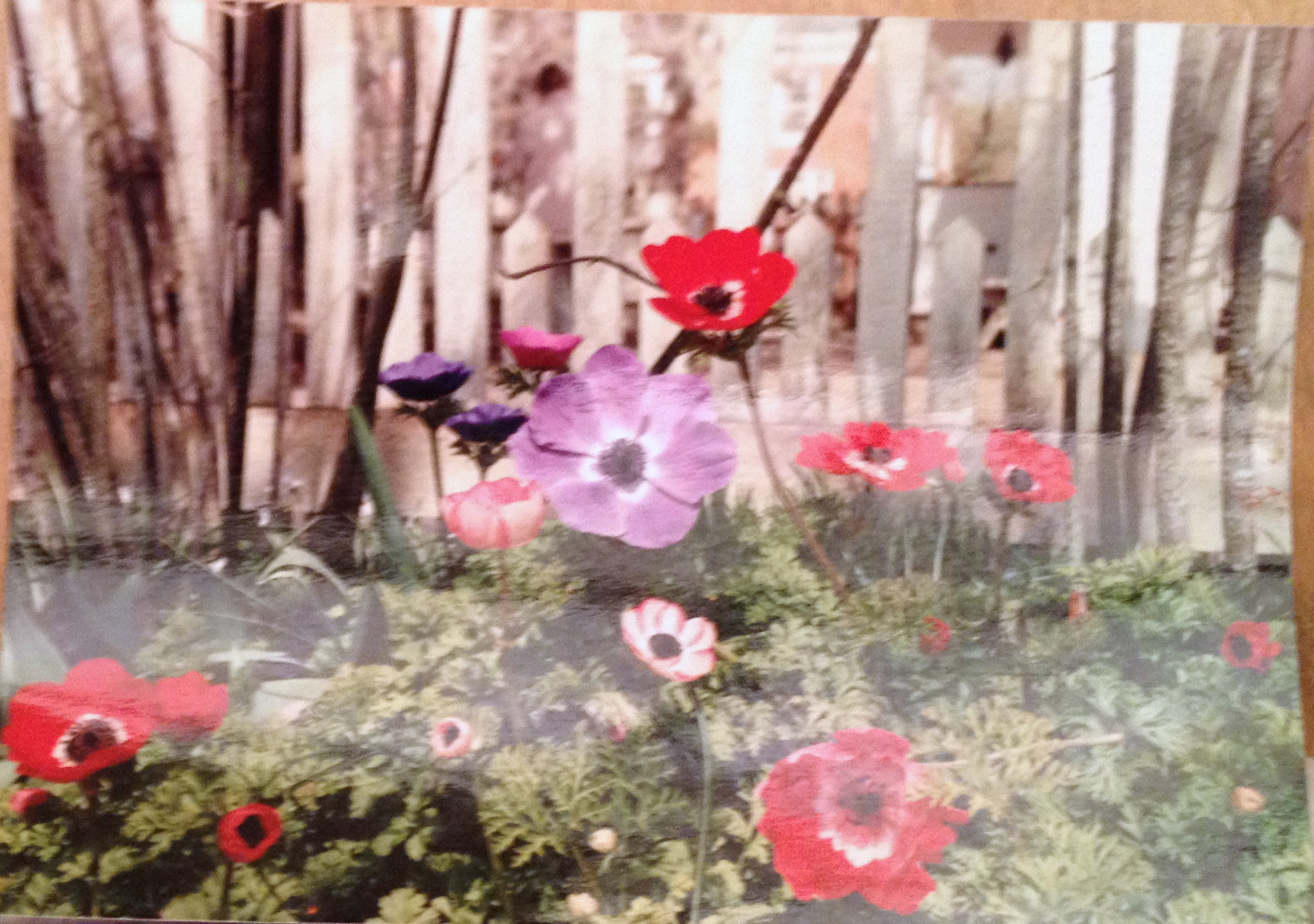
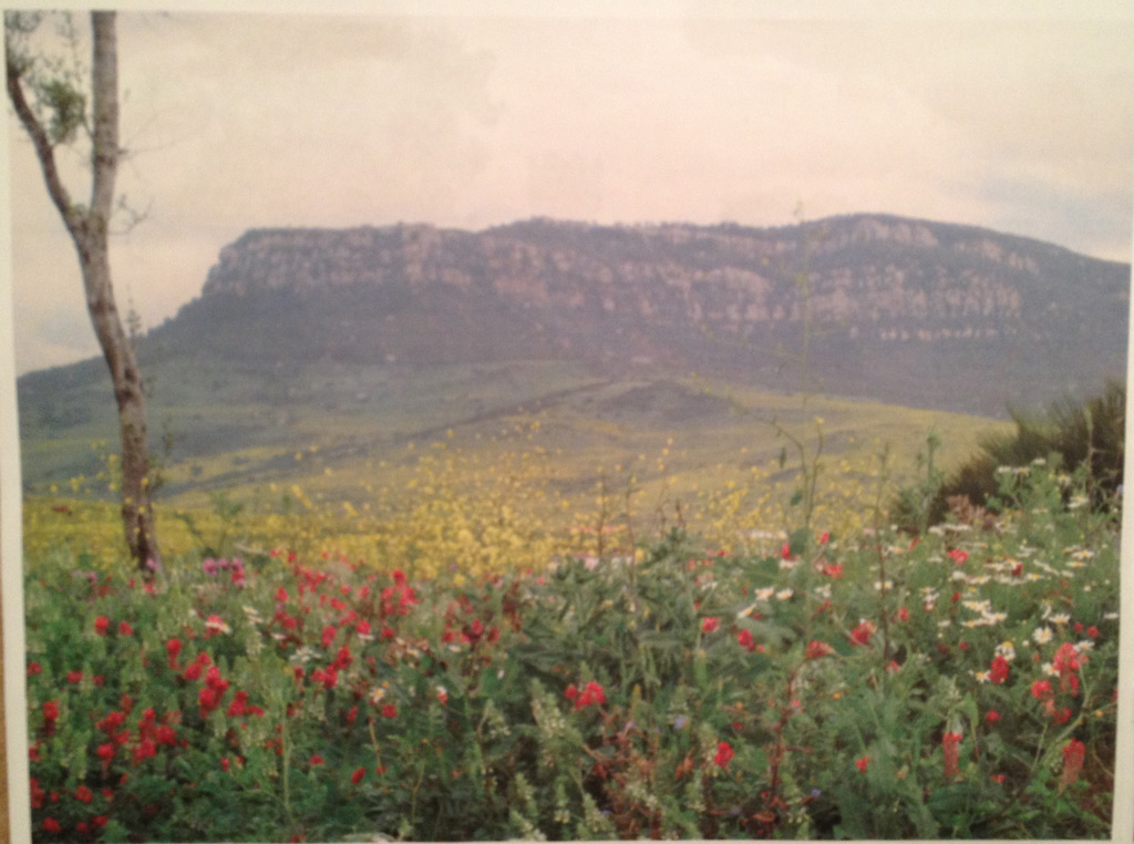
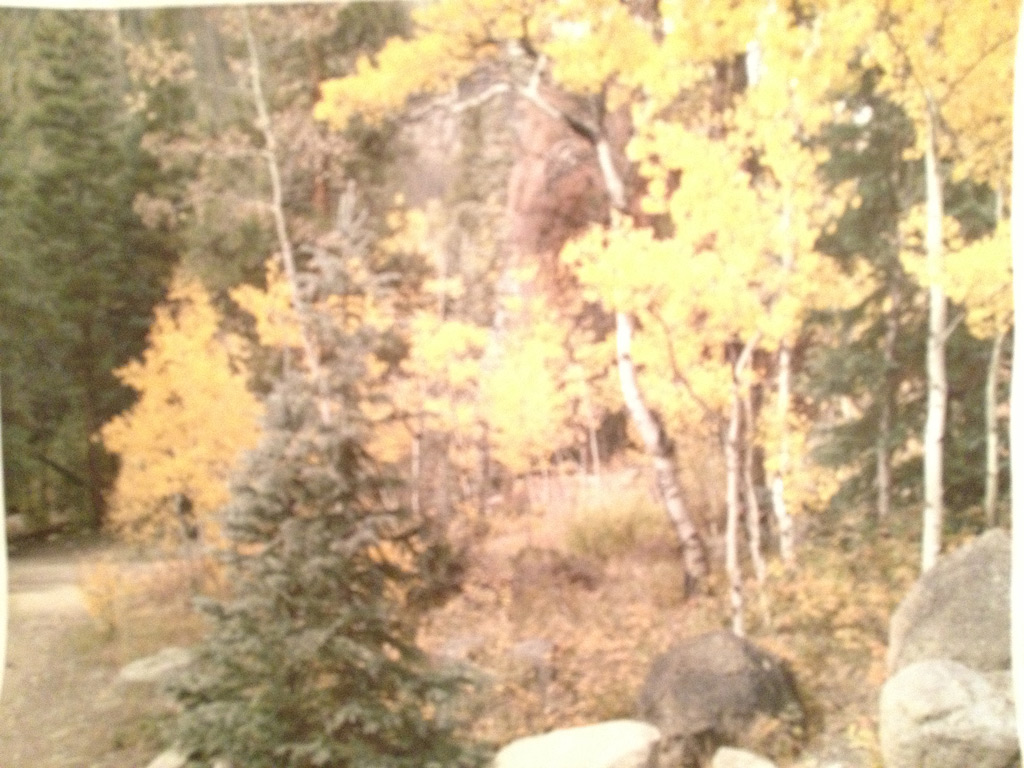
Here’s June’s inspiration photo, taken by her husband. 

Click any image for a larger viewDub_Scroggin_butterfly-blog
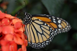
©2012 Dub Scroggin, All Rights Reserved.

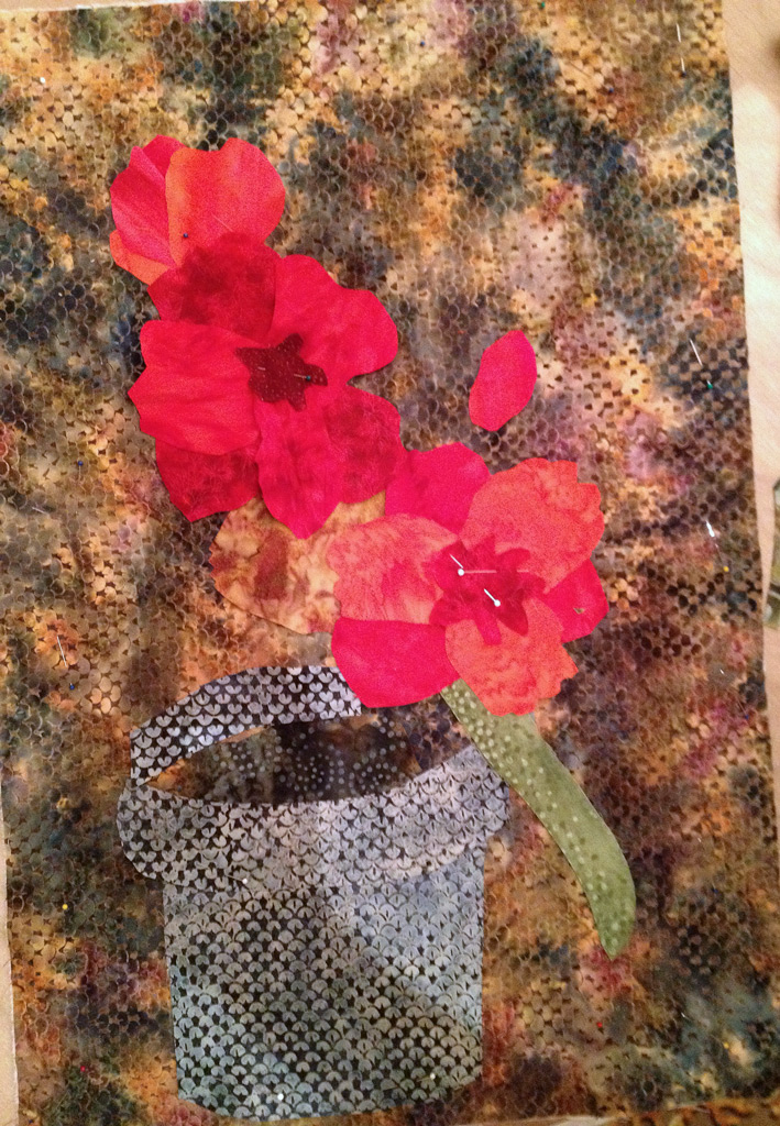
The photo is wonderful, but June had good reasons for making a few changes.  For starters, she realized she didn’t need all the TINY detailed lines within the butterfly.  Also, the strong orange flower attracts a lot of attention.  June decided to show off the butterfly more by playing down the color of the flower.  Very smart. 

I was able to share a couple of construction tricks to help her get the effect she wanted.  For instance, the black lines in her butterfly are really slits allowing the background black fabric to show through.  Much easier than trying to manipulate tiny black pieces!

For the flower, June bought a floral fabric, but it was too “perfect” for her purposes.  I suggested that she use a jagged cutting technique to cut random chunks.  Then, they were laid in place and overlapped to give a nice soft flower.

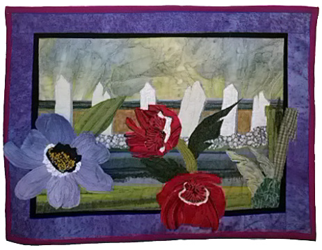
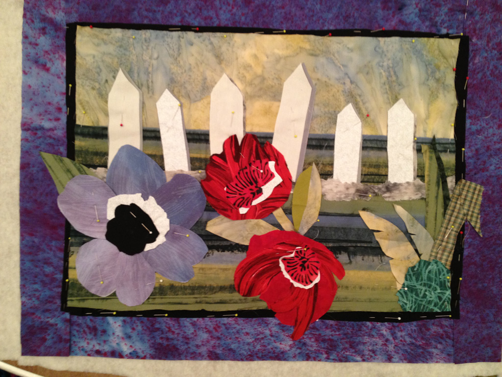
And here’s her finished quilt, called “Dub Honey’s Butterfly.”  (Her nickname for her husband is Dub Honey.)  I’m sure he loves it!

June_Scroggin_Dub_Honeys_Bu

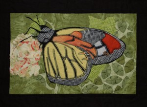
Her black stitching played up the contrast and definition nicely.  And the tiny legs brought the butterfly to life!

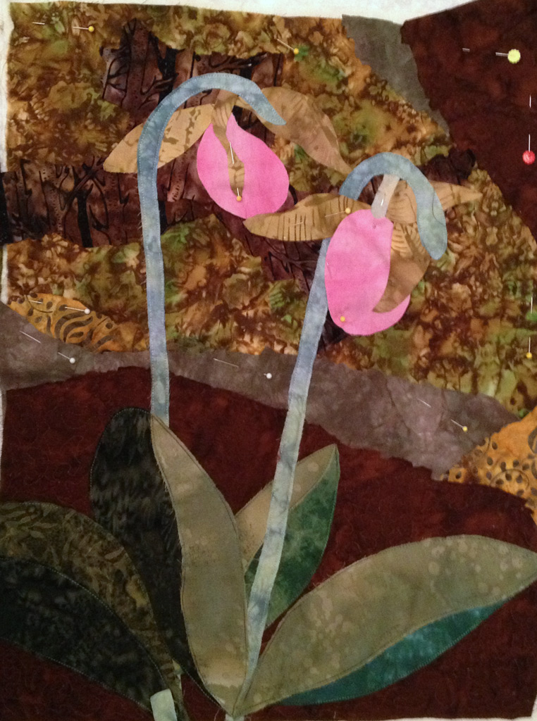
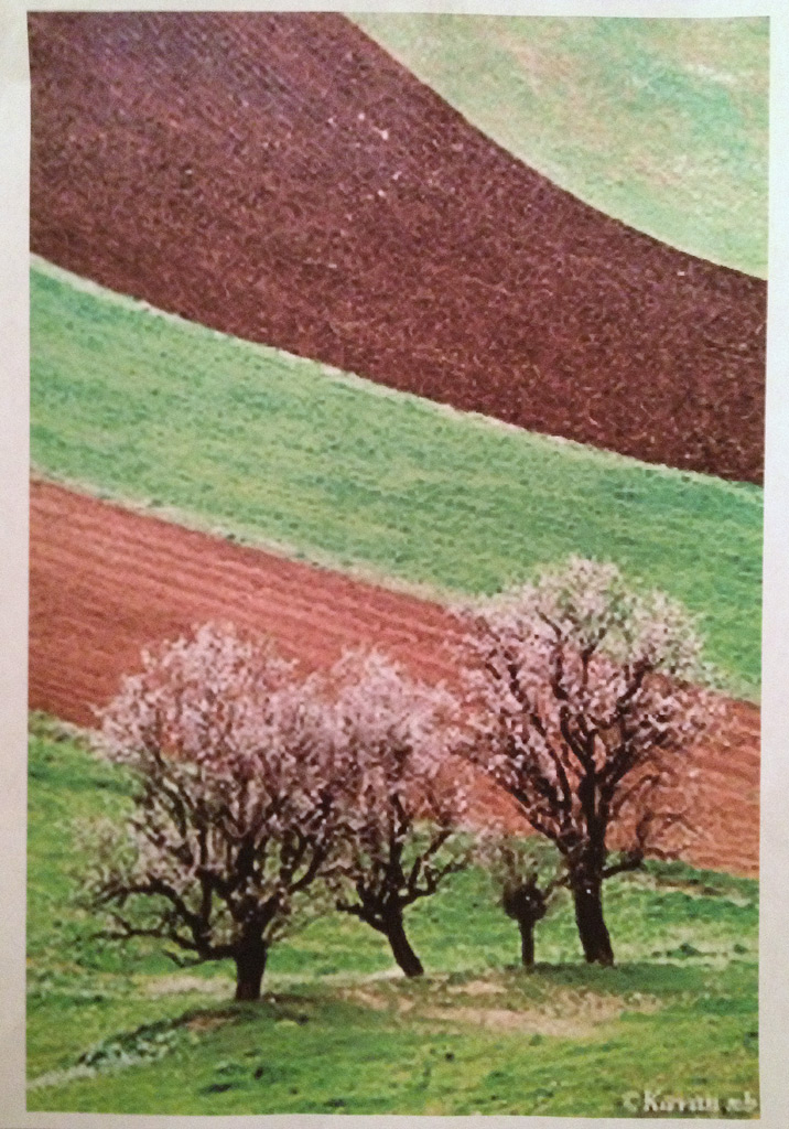
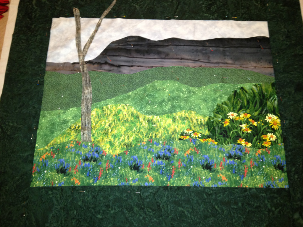
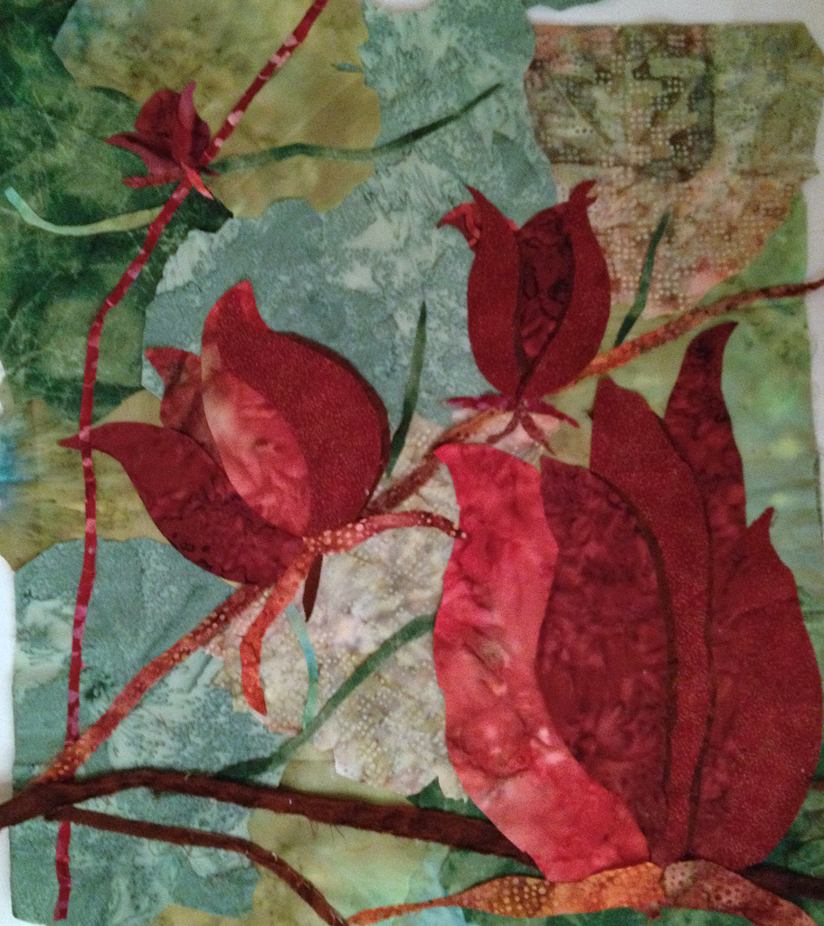
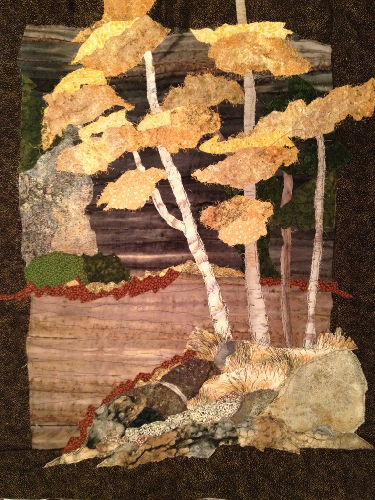
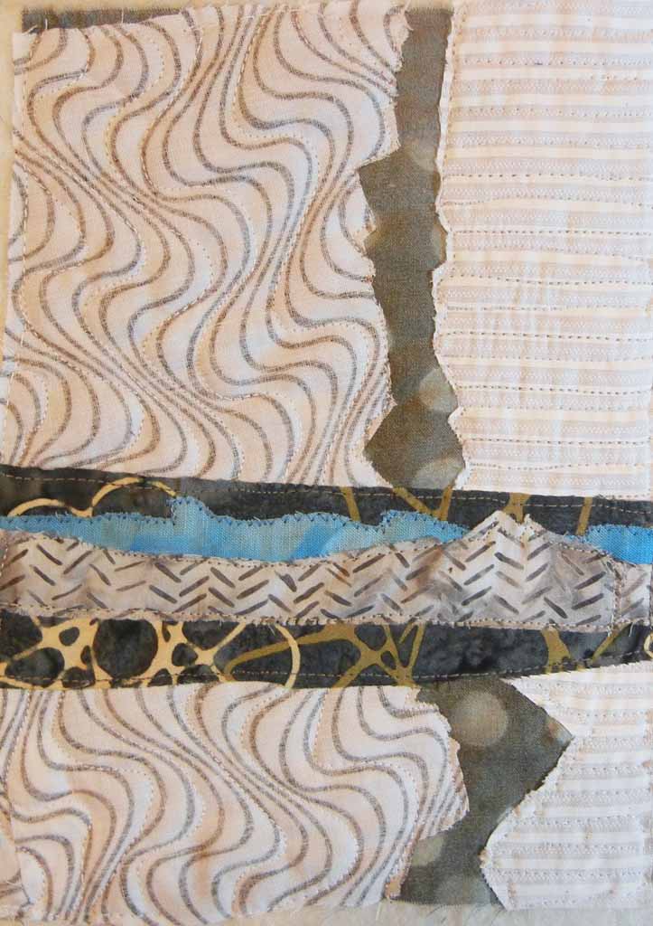
I sorta swallowed hard when I saw Lynette’s inspiration photo, below.  How on earth would we depict the delicate flowers on those trees?  She was very enthusiastic about the image and had lots of ideas for adding beads for the flowers, etc.  So, we jumped in.

lynettes-insp.-photo


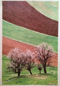
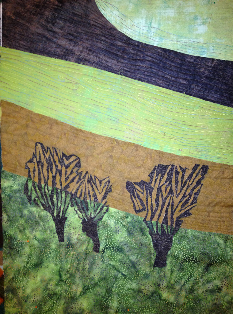
Lynette was comfortable working pretty loosely on the trees, so we started with a jagged cut outline.  Completely brainstorming, I suggested jagged cut tan fabrics to represent the spaces between the branches.  The effect worked!  We were both delighted.  As you can see below, she continued adding “spaces,” paying attention to the placement of both brown and green fabrics.

lynettes-w-partial-quilting 
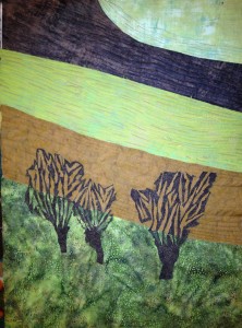
She’s going to add some delicate thread painting with white, as well as the aforementioned beads.  I sure hope I get to see the finished quilt!

I’ll have more photo inspired quilts for you in the next post.  Keep reading!

Ellen Lindner
P.S.  I also teach an online version of this class.  If you’d like advance notice about the next one, you can sign up on the class information page.

Design Vistas

 Addie came to our “Design Your Own Nature Quilt” class with a wonderful photo, shown below.  

She decided to work with the existing composition, but to add interest with her fabrics.

addies-quilt

She did an extraordinary job of letting her fabrics work for her.  (Click the above photo to see an enlargement.)  Plus, the light shining on just one face of the mountain is extremely effective.

Donna came to class with a photo she had taken on a special vacation. 

donnas-insp-photo

After we discussed composition, she realized that shifting the tree and mountain edge to the right would work well.

Donna's-quilt-w-border

Donna came well-armed with appropriate fabrics.  She had done her homework and brought floral fabrics in a variety of scales.  They worked well and helped her create a strong sense of depth.  She’ll consider adding more flowers in the left foreground.

Did I mention we had fun in this class?  Oh yes!

Ellen Lindner
P.S.  I’ll be teaching “Design Your Own Nature Quilt” online, later this year.  If you’d like to be notified about the next class, use the subscription box on my newsletter page to sign up, and then select advance notification for any desired classes.

Cropping for a Better Design

In my “Design Your Own Nature Quilt” class, students start with their own inspiration photos.  Sometimes, the students interpret the photo’s composition almost exactly.  But frequently, the design is better when the image is closely cropped.  This allows the maker to focus on the most important elements.

I already showed you one example of this, from my Destin, FL class.  Here are two more.

This was Barabara’s inspiration photo.  The things that she wanted to include were the poppies and the picket fence.


barbaras-insp.-photo

 But, since we were working roughly poster size, she knew that lots of tiny details would be tricky.  Instead, she used the photo as a starting point and came up with her own very tight composition.  Like this:

barbaras-quilt

Great, right?  She has exciting plans for the purple flower at left.  Each of the petals has been fused to a second fabric, giving more body.  When stitching, she’ll curl a couple of the petals and secure them that way.

UPDATE:  Barbara sent me a photo of her finished quilt.  Can you see the little changes she’s made?  Including fucshia binding.  I love that!  And the details added to the flower centers really bring it to life.  Wonderful!

Barbara_Fyffe_poppies

I don’t have an Debbie’s inspiration photo, but it was a tangle of flowers and vegetation, with no real focal point.  Once again, she cropped it severely and focused on one small group of flowers.

debbies-quilt-before-shadow

Isn’t that more effective?  Late in the process, I realized that her largest flower needed more definition between the petals.  She added darker shadows and that worked beautifully!

debbies-w-shadows-added

Do you ever work from photos?  If so, you may want to consider cropping your image, as well.  Much more drama!

Ellen Lindner
P.S.  I’ll be teaching “Design Your Own Nature Quilt” online, later this year.  If you’d like to be notified about the next class, use the subscription box on my newsletter page to sign up, and select advance notification.

Design in Destin

Oh my, did I have fun teaching at a retreat in Destin, FL!  It was put on by the hardworking members of Flying Needles Quilt Guild, and I highly recommend it.

To give you an idea of the fun and high spirits, check out Gabriele Bullard and her sassy apron.

gabrielles-apron

 Ooh-la-la!  Gabriele was a vendor at the event, selling GORGEOUS hand dyed fabrics!  (She doesn’t have a website yet, but when she gets one I’ll definitely let you know.)

Meanwhile, down the hall, my students and I were working hard in our “Design Your Own Nature Quilt” class.  This was the two-day version of the class, which was wonderful.  It provided the students time to make excellent progress on their quilts and gave me time to cover a few extra points, as well.

My students were amazing!  (As always.)  None of them had ever designed a quilt and several of them had only made one or two quilts.  But, that didn’t slow them down at all.  Although they were intimidated at times, they bravely continued, and were all THRILLED with their results.  Me too!

Doris quietly worked away and almost completely finished her quilt in the two days.

doris-working

This was her inspiration photo (although it was actually focused in her version.)

doris-inspiration-photo

Definitely lots of potential.  However, because we were working on a wall quilt about poster-sized, I knew she wouldn’t be able to include ALL of those details.  I suggested that she crop it way down, focusing on her favorite part.  She did, and she ended up with this:

doris-quilted

Amazing, right?  Doris applied several lessons from class:  cropping, tweaking the composition, adding contrast, and working loosely.  She also had several unique ideas:  shaping the golden leaves in a horizontal fashion, adding the rust color as a transition, letting her images run off the edges, and using rough “messy” stitching to enhance the grass and leaves.  Click the photo to see.

Can you see why I love teaching this class?

Ellen Lindner
P.S.  I ocassionaly teach this class online.  If you’d like to be notified about the next class, use the newsletter subscription interface to sign up and indicate which notifications you’d like to receive.


Problems = Improvements

“Ugh, that looks terrible.”  And so it begins.  The recognition that I’ve got a problem.  Never a happy moment!  But, thankfully, these problems sometimes point me in a totally new direction which greatly improves the piece.  Like this recent one.

I’ve been working on the next set of “Notes for a Friend.”  I wanted to imitate the low contrast and soft colors of a cloudy winter day.  As it turns out, I just don’t own that sort of fabric, but I decided to still use a grey and white palette.  Of course, I eventually had to add some color.

Click any image for a larger view
9 before painting

Then, I decided to integrate the blue and white better by painting some blue on the white fabrics.  But this one just looked BAD.  Very cheesy.

9 after painting - BETTER 

I auditioned the idea of covering most of the painted area with more of the unpainted fabric.  When I did so, I noticed the high level of contrast within the fabric.  Not what I was going for.

9 - problem solving paint

How could I get a softer feel?  What about the back of the fabric?

 9 showing back side of fabric

Yes!  Much better.  I reworked the piece and was much happier with it.


9 after quilting

Above, I’ve machine stitched this tiny quilt.  Next comes the hand stitching.  I’m getting there.

Ellen Lindner


Paint as Sculpture

Oh my!  The work of Leslie Wayne is amazing!  She uses oil paints, applying them in solid layers.  Then, while still malleable, she pushes the barely wet layers of paint into 3D hills, vallies, and undulations.

Slice of Life (Right)<br>detail

Is that cool, or what?  I recently saw her work at the Foosaner Art Museum, in Melbourne, FL.  The exhibit runs through March 17th and I HIGHLY recommend it!  Be sure to check out her website, as well.

Before the Quake detail<br>oil on wood<br>36” x 132” <br>2006

The layers of paint remind me of layers of fabric.  I might have to do some experimenting.

Ellen Lindner