January 17, 2013
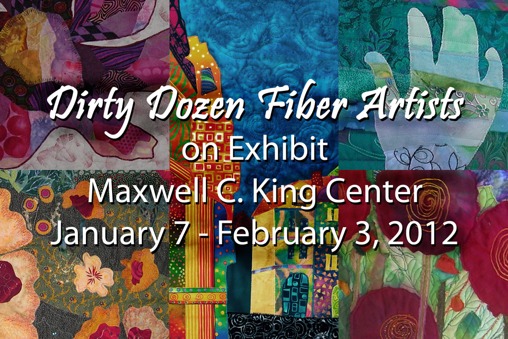
My local fiber art group, Dirty Dozen Fiber Artists, has an exhibit currently on display at the King Center for Performing Arts. This is a lovely venue, and we’re excited to show our work there.
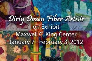
Unfortunately, you can only see the exhibit if you’re attending an event at the center. I hope you get to see a show and some art!
Ellen Lindner
Tags:
Exhibits Comments Off on Fiber Art on Display in Melbourne, FL
January 5, 2013
You’d probably be surprised by how long it takes me to compose one of these small collages. I’m working with scraps only, so that limits my selection. (Which is probably a good thing.) Even so, it takes quite of bit of fiddling and good ole trial and error to get a mostly monochromatic design that’s still interesting. (Monochromatic can be boring, if you’re not careful.)
Then, the contrasting pieces have to placed just so. Never in the center. The photo below shows this piece after I’ve made most of the decisions.

Later, I rearranged the blue squiggle, added some yellow at the center, and added some hand embroidery. (Click the photo for a larger view.)

Hmm. I see that it needs a little haircut. Thus is the nature of raw edge collage.
I’ve now made three of these, and I intend to make quite a few more. Which is your favorite so far? This is #3. Here are links to #2 and #1.
Ellen Lindner
January 1, 2013
I’ve been having lots of fun working on these small (5 x 7) collages. After composing the second one, I began to select threads for hand embroidery. This photo gives an idea of my lively palette. LOVE these strong colors!

And here’s the final product. (Click for a larger view.)

Ellen Lindner
December 25, 2012
Merry Christmas!

- My foyer chandelier, lit by the afternoon sun
May you notice all the blessings around you.
Ellen Lindner
Comments Off on Merry Christmas
December 23, 2012
Remember the quilt I started featuring the old medieval wall in York, England? Well, I’ve made good progress on it. Here it is with almost all the components in place.

I was happy with the perspective (and happy to have it done,) but it just didn’t excite me somehow. I realized the inspiration photo had a much more golden glow, due to the setting sun.
So, I decided to change up the colors, making them more yellow. But, what was the best way to do that? I sure wasn’t about to change out the fabrics! How could I best alter them? I experimented with water soluble pastels, oil pastels, colored pencils and watercolor pencils. The winner was oil pastels and I set out to brighten things up.
And these are my early results. In the photo below I’ve just begun to “yellowfy” the wall, starting with the top stones. Can you see the difference? I think this will really bring it to life.

But, do you know how exciting it is to color fabric stones? Not very. Which is why I’ve taken a break. This is still on my design wall and I’ll get back to my coloring soon. But, in the meantime, I’ve been having fun on the little “Notes to a Friend” series. (Watch for more of those.)
Do you ever take a break from your projects? Or do you work straight through?
Ellen Lindner
December 18, 2012
I recently made a fabric postcard, and really enjoyed it. Not only was it fast-ish, but I found that I needed to work slightly differently with the smaller size. Which made it challenging enough to be intriguing, even on such a small scale.
So, I started on a small 5 x 7 piece called “Note for a Friend.”
Click any image for a larger view

I tried mounting it on one of those floating frames. (The white textured mat/border is really crinkled paper underneath.) I messed it up, but I think something along these lines has merit. I’ll try again.
Working at such a small scale means that every fabric, shape, and color selection is very important. (Thus, requiring lots of trial and error!) A little hand stitching adds texture and dimension and doesn’t require a lot of time. I love the effect!

More to come, I think!
Ellen Lindner
P.S. Once I get this properly mounted, it will be for sale.
December 16, 2012
I’m really fortunate to belong to a wonderful group of fiber artists. The women all get along beautifully and are completely comfortable with one another. Add in large doses of creativity and laughter, and we are truly blessed.
So, it’s hard when a member moves away. Thus is the case with our friend, Andrea. As a send off, we each made her a fabric postcard. This was my contribution.
Click image for a larger view

Gee, I had fun with this! I worked only with scraps, and the small size meant it went together quickly. I enjoyed it so much, I’m thinking of making several more small quilts.
Goodbye Andrea. You’ll be missed!
Ellen Lindner
December 11, 2012
I’m very happy to have an article, “Second Look,” in the Winter 2012 issue of Art Quilting Studio. The article is about the way one quilt inspired another. Can you see it?


These pages show the article as published in Art Quilting Studio. You can find a longer version, with more photos (and better color) on my website.
I do so love to share my thoughts on quilt making! Let me know what you think.
Ellen Lindner
P.S. I have many more free articles on my website.
December 6, 2012
I think color is really important in artwork. So, I was super happy when my quilt, “Crotons,” won the Best Use of Color award at the World Quilt Show – Florida! How nice!
Click any image for a larger view

- “Crotons”
I often use complementary, or opposite, colors. The background above sorta falls into that category. Blue is the complementary color of orange. And although the croton leaves aren’t all orange, I felt like it was approximately the mid-color. Colors that are such opposites automatically create contrast and drama. Love that!
I also used complementary colors for many of the veins in the leaves: yellow-green with fuchsia, blue with orange, green with red, and so on. I really like that effect.
I’ve noticed that Best Use of Color always goes to a colorful quilt. But, I certainly don’t think a quilt has to be bright to benefit from the properties of color hue, intensity/saturation, and value!
Want a little creative exercise? Why not surf the websites of some of your favorite artists and notice how they use color.
Ellen Lindner
P.S. I’ve got several
free articles about color on my website. As well as a down-loadable
ebook.
P.P.S. See a
thumbnail gallery of my own quilts. (Yes, most of them employ bright colors.)
December 2, 2012
Are you giving gift cards for Christmas, this year? If so, you might like to dress them up with fabric envelopes. They’re super easy to make.

See the full tutorial.
I’d love to see some of your finished projects!
Ellen Lindner
P.S. My current online class, “Sticky Fingers,” has just started, but there’s still time to join in. Full details.
Tags:
Projects Comments Off on Make Fabric Envelopes for Those Gift Cards