Floral Commission: Making Progress

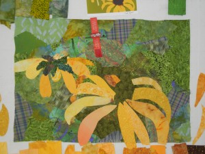
 I’m continuing to make progress with this second “Black Eyed” Susan quilt. 

Click any image for a larger view

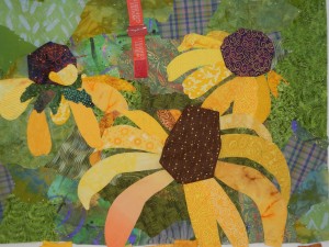
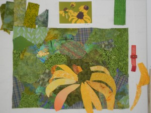
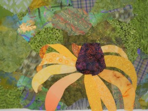
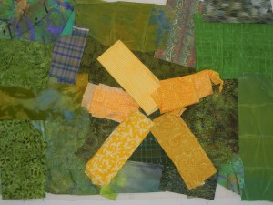
In the previous photo, I’ve added the second flower.  It’s supposed to tilt away from the viewer, but that wasn’t too obvious at this point.  However, once I added the last petal and loosely added some fabric for the center, I think it gave the proper effect.  (Next photo.)

Things began to come together with the addition of the third flower.  At this point, I was still undecided whether to use brown or purple for the flower centers, so I auditioned both.  Although the fabrics are just loosely folded and placed, I have a clear favorite.  Do you?

Do you ever alter the colors of your realistic art?  If so, for what reasons?

Ellen Lindner
P.S.  I need a title for this piece.  Any ideas?

Art on the Living Room Floor

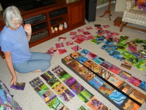
Last week, two of my fiber art friends and I were crawling around my living room floor.  Not for exercise, but for the fun of creating.

One of my guests, Jo-Ann Jensen, was working on a project involving 365 square fabric collages she’d made in 2007, one each day!  We had the fun task of helping her arrange them into larger pieces of artwork.

Click on any image for a larger view

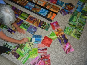
In the photo above, Jo-Ann is considering her MANY options.  (Definitely click this image for a better view.) 

She’s planning to arrange the collage pieces into long strips.  Since Jo-Ann shies away from sewing, she’ll probably mount the finished pieces in some fashion.  I think these are going to be extraordinary!

Ellen Lindner
P.S.  The next time you need a little creative break, why not grab a handful of paint chips and play in a similar fashion?

Continuing with Black (?) Eyed Susans Quilt

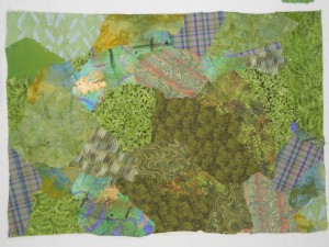
After selecting the fabrics for this quilt, I was ready to create the background.  Since it was meant to represent busy grasses and foliage, I knew that a variety of patterned green fabrics would do the trick.


I often include a few plaid fabrics in the mix, being careful to tilt them a little.  I also paid attention to value, making the spot behind my future focal flower the darkest.  This will create the most value contrast and draw attention to that area.

Below, you see the first flower almost complete.  I drew each petal by eye.  After all, it’s a flower, so I can “mess up” and it will still look fine.  I did draw the basic oval perimeter of the flower on the background fabrics.  This helped me keep the proper scale in mind.

I had to line each petal with another piece of (inexpensive) solid yellow.  It was easy, though.  I drew the petal shape on the primary fabric, layered it with the bottom yellow fabric,  and cut them together.  A little glue stick held them together.

I was considering a little variation on the usual black/brown center for the flowers.  What do you think about purple?  (Here, it’s just folded and placed for auditioning purposes.)  I think I like it.

More to come soon.

Ellen Lindner


Getting Started on a Commission

Back in April, I received a commission to make a piece for Nemours Children’s Hospital, in Orlando, FL.  I feel very privileged to do so!

The request was for a quilt similar to Natural Progression, which features Black-Eyed Susans.  So, my first task was to come up with a design.  I had previously isolated some photos of Black-Eyed Susans, so I began to work with them.


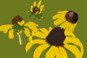
Photo editing software allowed me to work with each flower independently, changing sizes, orientations, and positions.  After a good bit of trial and error, I decided on this design:

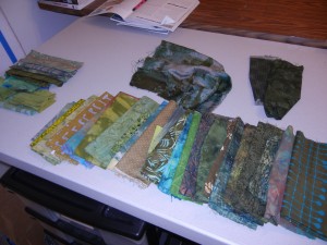
Next came fabric selection.  Always fun!  I chose these green fabrics,which will make up the background.  I love to use a wide variety of patterns and scales for this, especially when I’m depicting foliage.  Click any image for a larger view

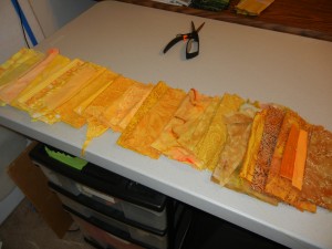
And here’s my selection of yellow fabrics.

I’ve got both groupings laid out by value, since this is important to my design.  I’ll make sure I have the darkest greens behind my focal flower, for maximum contrast.  With the yellows, I’ll use shifts in value to give a subtle suggestion about the direction of the light.

Just to be sure of my choices, I pinned a few fabrics to my design wall.  I wanted to make sure I had enough contrast between the two colors.  I was satisfied with the result, and got to work. 

Do you audition fabrics like this?  If not, what technique do you use?

Ellen Lindner

Glued Garden Collage: Part Two

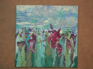
Oh, I’ve had fun with this piece!  It’s SO fast and easy!  (See how I started in this post.)

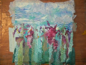
After establishing the sky, foliage, and little bits of flowers, I finally added the sheer green paper I had painted.  Along with the first “flower.”  Just a wacky shape of paper, really.  I think I just tore it randomly.

Click any image for a larger view

Next, I added the remaining flower shapes, and added some definition with a black Sharpie.

Time to finish things up.  I wrapped and glued the paper to the sides and back. (That looks a lot better, doesn’t it?)

Next, I added hand embroidered French Knots, and drew in partial stems.

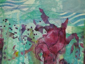
This detail shot shows some of the texture created by using very thin paper.  The French knots are dark purple.

I REALLY like this piece!  But, I need a name for it.  Any ideas?

Ellen Lindner
P.S.  For this collage, I used the same technique I teach in my Sticky Fingers class.  You can learn a little about it on this video, filmed and hosted by Bonnie McCaffery.

A Visit to New York City

Every year, my mom, sister, and I head out for a Mother-Daugther weekend.  We go somewhere different every year, and take turns doing the planning.  This year, our destination was New York City, where we had a blast!

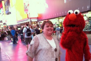
Although we skipped some of the more obvious tourist attractions, we did find ourselves in Times Square several times.  It’s amazing who you meet there.

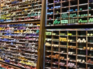
Because we had all been to NYC before, we decided to take things slowly, and to do some exploring.  One day we wandered around SOHO, where we found an awesome art store.  (This is where I purchased some of the paper earmarked for my recent glued collage.)

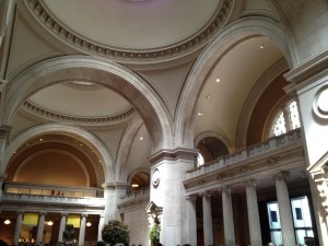
We spent about a half day at “The Met,”  (The Metropolitan Museum of Art.)  The building itself is extremely beautiful.  This is the lobby.  Isn’t it gorgeous?

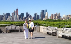
We started our day with a visit to the rooftop.  A great place to appreciate Central Park, with skylines beyond.  Is this an iconic view or what?  (My mom and sister shown.)

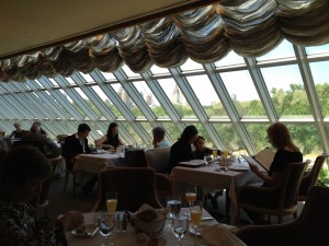
Lunch was in the members’ dining room.  What an event!  Looking out over Central Park, while enjoying delicious food and very attentive service.  In keeping with of our “take things slowly” philosophy, we lingered over our meal and really enjoyed the total experience.

My favorite activity was going to the musical “Memphis.”  It was the second time I’ve seen this great show and I think it’s my favorite musical of all time!  Very energetic, with great music, an EXTRAORDINARY cast, and an excellent story.  I highly recommend it.

Gee, we had fun!

Ellen Lindner


Glued Garden Collage: Part One

I’m currently teaching my online class, Sticky Fingers, which is about glued collage.  Oh the fun!  The technique is VERY fast, and I got inspired to join the students and make another collage, myself.

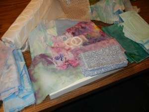
These are some of the materials I was considering, several of which are thin paper.  The purple-pink-yellow piece of paper was my inspiration.

Click any image for a larger view
I wanted to very loosely convey a sky, with foliage below.  First, I painted some paper with water soluble crayons.  I used these very loosely:  just smearing them on (laid flat), spraying with a little water, and moving the colors around with a paint brush.

You can see the dried result in this photo, as I’m considering my next move.  Notice also the spotted fabric in the lower left corner.  I put the paper on top of the fabric and colored in the circles with those same water soluble crayons.  But, no water this time, so the spots stayed in place.
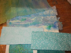
In the photos above and below, you can see the finished sky.  I used fabrics, but then overlaid them with colored paper.  (All the green is paper, along with various spots of blue.)  One of the papers was actually a paper towel, with the layers pulled apart.  It was very fragile, but still very easy to use with this technique.

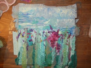
Next, I started adding foliage.  Just vertical pieces of fabric and paper,which collectively will give the impression of stems and leaves. 
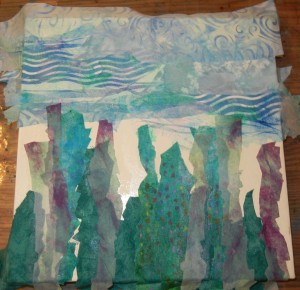
 If I had been smart, I would have extended the sky lower, so it could peek through.  Instead, I created that effect with lighter pieces.  Here, the foliage is almost finished.  I’m saving the sheer paper for later, so it can go in front of the flowers I’ll be adding.
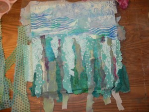
Here’s that inspiration paper cut into snippets and allowed to fall randomly on the glued surface.  More glue is added on top – decopage style.  I’m loving the results thus far!

This has been so much fun!  And, it only took me a few hours to reach this point.  Love it!

Ellen Lindner
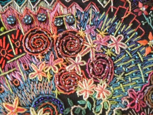
Eleanor’s Embroidery

In my blog posts, I always discreetly indicate that you can click on an image to see a larger view.  But, this time, I’m saying CLICK ON THE IMAGES!  You’ll enjoy them.

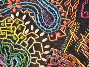
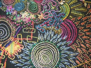
Wow, can you believe that embroidery?  (In spite of my somewhat blurry photograph?)  This is part of an in-progress piece made by Eleanor Chambers.  Amazing, right?

Check out these additional images:

Aren’t the colors amazing against black?

Of Scandinavian origin, Eleanor has done needle work since she was a young child.  And she was taught to do so with perfection.  Recently, however, she’s been learning to trust her own artistic judgment and to experiment more.  She’s even been known to (gasp) leave threads hanging on the back!

You go girl!

How has your work changed as you’ve gained artistic confidence?

Ellen Lindner

“Florida in Fabric: Wish You Were Here”

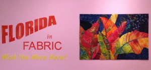
I made my quilt, Crotons, for a specific exhibit.  One called “Florida in Fabric:  Wish You Were Here.”  Since this exhibit is being displayed in a nearby prestigious venue, with a published catalogue, I couldn’t resist.

The only problem:  the size.  Quilts were required to measure 40″ x 60″, about twice the size of my typical quilt. (Also, as wide as I am tall!)   The dimensions were meant to replicate the proportions of  postcards.  Although I wasn’t crazy about working that large, once I saw them on display, I had to agree that the size worked really well. 

Here’s my contribution, as seen in the exhibit.

Click any image for a larger view

Wow!  I was thrilled to have my quilt placed on the title wall!  (This wall is about 15′ long, so that gives you an idea of the scale.)

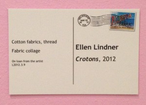
Since the quilt sizes represented postcards, the signs did too.   The “stamp” is actually the Florida in Fabric logo.  Very clever, I think. 

In addition to this exhibit, the Ruth Funk Center for Textile Arts is also showing a retrospective exhibit of Yvonne Porcella’s work.  This display is extremely colorful and energetic!

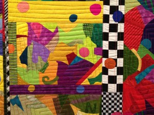
Here’s a detail shot of my favorite piece, Dick and Jane.  I kept studying it, trying to see Jane and Dick at play.  I never found them, but then I did see…
Spot!

Knowing that Yvonne has a wonderful sense of humor, I suspect this is exactly why the quilt has circles on it!

These two exhibits will be on display through August 18th.  If you’re in Melbourne, FL, I hope you’ll get the chance to see them.  (Admission is free!)

Ellen Lindner


Inspired by Scraps

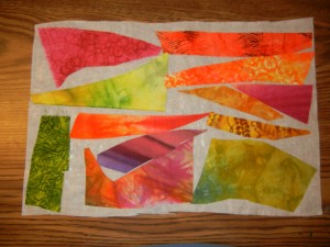
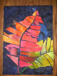
After completing Crotons I had a lot of colorful scraps.  I always just let these fall to the floor, raking them up with my fingers when the project is complete.  But this time, there were some larger pieces and the colors were irresistible!  So, I had to make another Croton quilt!

Click any image for a larger view

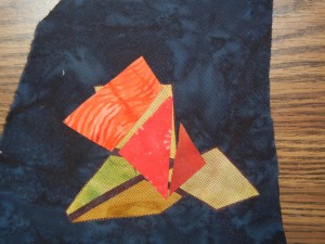
Although I seldom use fusible web, I know that many people love it.  So, I decided to use it for this project, and fused the scraps to a sheet of Wonder Under, (above.)

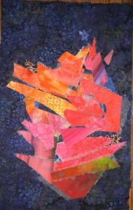
The first thing I needed to figure out was what size Croton leaf I could create with the existing scraps.  When I laid them out, I noticed the energy created by all the oddball and angular shaped pieces.  How exciting!  I decided to leave the scraps almost completely “as is” and I gleefully started arranging things.

Cool, huh?  This was great fun!  A major adrenalin surge.

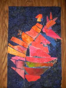
Next, I added a yellow-green leaf, (with a little more scrap alteration this time.)

But wait.  The new leaf was lighter than the first one, attracting more attention.  And that wasn’t what I wanted.  I considered adding tulle over it to dull down the colors.  That required an experiment to see how well tulle would hold up to the heat needed for the fusible.

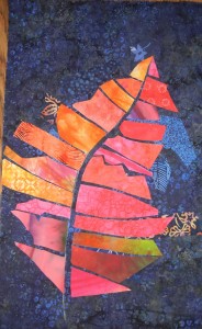
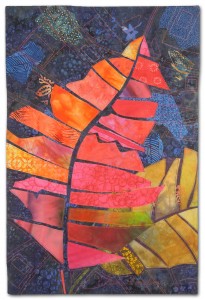
That experiment went well and I proceeded with the tulle idea.  One layer each of red and brown.  Here’s the finished quilt, When Crotons Cut Loose.

Back to the tulle decision.  I’m big on color, so it was VERY tempting to let the lower leaf be bright and vibrant.  But, I felt like an attention getting item like that in one corner threw the balance off.  So, I sacrificed color for what I considered an improvement in the overall composition.  Definitely a matter of personal preference.

You can see a detail shot, plus pricing and other information on my website. 

Ellen Lindner
P.S.  You can audition this quilt in your home for two weeks, before commiting to a purchase!