They Like Me. They Really Like Me.

Like all teachers, I greatly appreciate feedback on my classes.  One of the guilds at which I taught this spring provides this, through the use of surveys.  I just got the stats and was delighted at the excellent responses I received!

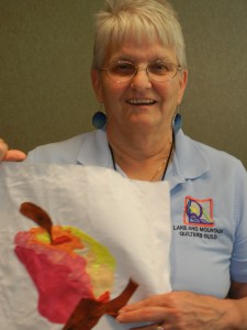
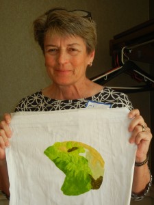
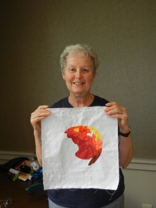
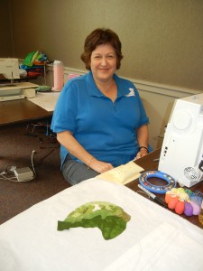
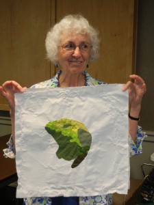
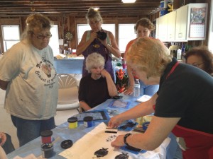
Demonstrating in a Double Reverse Applique class

 I taught two full day classes.  When asked about my preparedness, 100% of the 15 responders said I was extremely prepared.  About my level of knowledge, 100% said I was very knowledgeable (the best response possible.)   These are exactly my standards for myself, and I’m so glad my students feel like I’m achieving them!   

Students also provided several complimentary comments with their responses.  One said “Ellen is great:  knowledgeable, upbeat, and helpful.”  Another said, “Great teacher:  encouraging and always happy to help.”  Watch out!  I think my head is swelling!

I think a class survey is an excellent idea.  The one used by this guild is online, so it’s very easy for students to participate.  Their form asks about everything from the teaching to the lighting.  Very useful information!

Ellen Lindner
P.S.  I’d love to visit your guild as well.  Teaching information here.


Thread Heads Exhibit at Duke Power

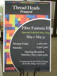
While teaching in SC, I got to see the “Thread Heads” exhibit, Fiber Fantasia III, at the Duke Energy Center. 

Duke Energy features revolving art exhibits in their lobby.  This is the third time the fiber group, Thread Heads, has shown their work.

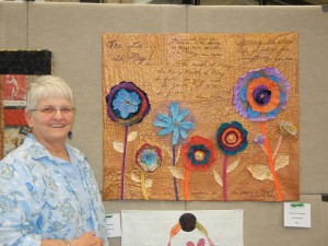
While viewing the display, I enjoyed the company of Donna and Judy, two members of the group.  Here’s Judy Rapelje with her piece, Tra La, It’s May.

Click any image for a larger view

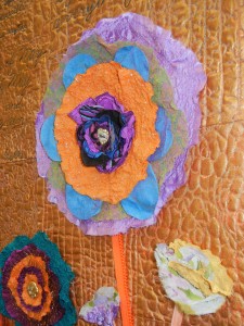
 This quilt has wonderful texture, with 3D flowers and leaves.


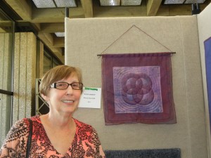
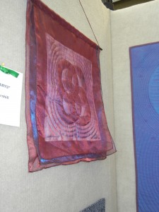
Here’s my chaufeur, Donna Barnhill, with her piece,  Four Marys.

This side view shows the delicate layers of this better.  Lovely!

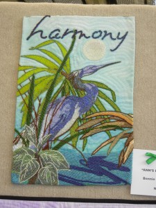
Bonnie Ouilette is a beader extraordinaire!  (Or is that “beader obsessed?”)  Either way, she does amazing work, as seen in Ann’s Rookery, below.  (Click the photo to see the TONS of beads!)


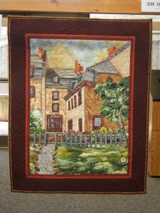
Jean Loussairan’s Beethoven Haus  has wonderful details and depth.


There were many more nice pieces in this exhibit, but my photos didn’t come out that great.  I hope you’ll get to see Fiber Fantasia III before it closes May 31st.

Ellen Lindner
P.S. After viewing the exhibit, Donna and Judy took me to a wonderful dinner.  Delish!

Southern Hospitality in Seneca, SC: Part Two

Our fun in Seneca continued with a 3-hour Double Reverse Applique class.

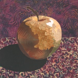
We ended up stopping early, so no one quite finished their apple.  To give you an idea of the finished project, here’s one of my class samples (in a different color combo.)

Click any image for a larger view

You can definitely appreciate the student’s  progress and pride in these few photos.  They’ll each be finished in about another hour.

Judy:

Cheryl:

Martha:

Ronnette:

Dillman:

(Unfortunately, I didn’t get to photograph’s everyone’s progress.)

These ladies had a busy day, at the end of which they had learned two new techniques and had nearly completed two projects.  Great work, ladies! 

Ellen Lindner
P.S.  I teach this class online and also offer it as an e-book.  

Southern Hospitality in Seneca, SC: Part One

In early May I got to teach in Seneca, SC, which was a wonderful experience.  The members of Lake and Mountain Quilt Guild were very gracious hosts.  I had multiple chauffeurs and dinner companions:  a total of TEN!  What fun for me.  Plus, the area is really pretty and I got to see the lovely campus of Clemson University.

After an evening lecture, I taught two half-day classes.  We started off with Instant Art Quilt, which challenged the ladies to work in a new way.  They rose to the challenge magnifcently and were all at the quilting stage by the end of the 3-hour class.

Cheryl set some of her pieces at an angle, which gave her quilt a unique  look.  She used the light focal spot to her advantage, placing a loose tropical tree there, for highest contrast.

Click any image for a larger view
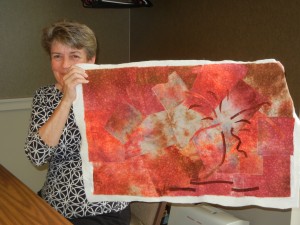
Penny did a beautiful job arranging the pieces of her fabric.  Complementary blue was the perfect accent color.
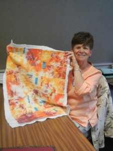
Martha used a vibrant fabric which gave her creation lots of drama. 
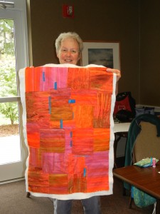
She was nice enough to share her fabric with Dillman, who’s quilt was equally colorful.  Notice the difference diverse accent colors create.  (If I remember correctly, Dillman’s was still in-progress at this point.)

Ronette also placed some of her pieces askew.  Plus, she had lots of fun planning her accent pieces.
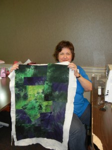
She had the foresight to bring some leftover purple bias tape.  It was the perfect addition to her background, and launched her into playing with a loose tree idea.  Here, she’s auditioning the idea of pale purple dots and bright green leaves.  She removed it all for quilting and will play more afterwards.  Fun, huh?
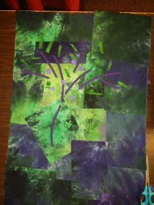
Libby took on the challenge of working with three different fabrics.  This can be quite tricky, but her fabrics were very similar and she created a wonderful piece.  Accent pieces of complementary yellow-green worked really well.
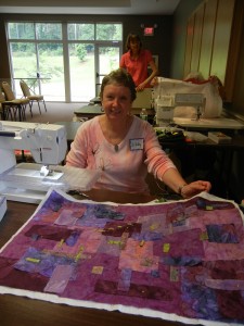
Judy’s multi-colored fabric provided lots of high contrast interest.  She’s considering adding skinny twisted pieces of fabric for her accents.  (I love it when the students get inventive!)
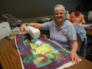
Shirley’s fabric was practically begging for fuchsia accents.  Aren’t they wonderful?
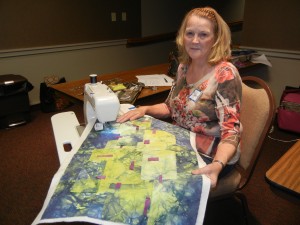
Beatriz’s fabric was subtle, which gave her the opportunity to add TWO accent colors:  orange and blue-green.  Very unexpected, but effective, choices.
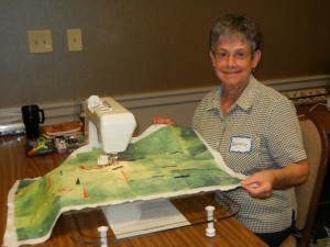
Since Chris wasn’t participating in the second class, she took advantage of the time and continued quilting her piece.  It was pertty before, but the stitching really added to it!  Please click on the photo for more detail.
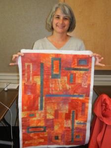
(My apologies to Sue, who got away without me photographing her quilt.  You can see her working away behind Dillman, below.)
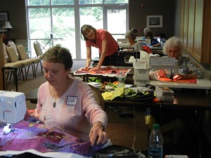
After this morning class, we switched gears and did Double Reverse Applique in the afternoon.  See Part Two for that.

Ellen Lindner
P.S.  I also teach this class online.  More info here.
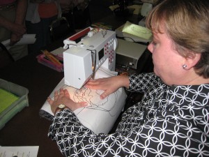
 

“Crotons” Finished!

Yahoo!  My Crotons quilt took longer than I anticipated, so I’m doubly glad to finally complete it.  I’m really happy with it, though.

Click any image for a larger view

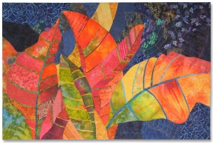
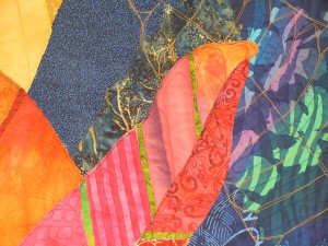
At 40 x 60, these croton leaves are huge!  Major drama – which I love.  Detail shot below.

I have to say, I love these colors.  The scraps were so enticing that I’ve even started a little quilt with them. 

Crotons will soon be on display as part of the “Florida in Fabric:  Wish You Were Here!” exhibit at the Ruth Funk Center for Textile Arts, in Melbourne, FL.  (More details coming.)

I’ve been posting about this quilt since January of 2012.  If  you’re interested in seeing the process  please do a little browsing.  Plus, pricing and other details are on my website. 

Ellen Lindner
P.S.  You can audition this quilt in your home for two weeks, before commiting to a purchase!

Bleeding Fabrics

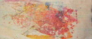
I’ve been working with hand dyed fabrics and fusible web lately.  When steaming the fabrics, I was surprised to see a lot of color coming through onto my pressing cloth.  See what I mean?

Click image for a larger view

Only the hand dyed fabric bled.  Thankfully, it didn’t show against the dark background.

I never wash my fabrics, since I don’t wash my quilts.  But, if I’m likely to use fusible much, I’ll have to rethink this.

Ellen Lindner

Results from Surface Design

I recently had lots of fun playing with my art quilt buddies as we learned about ice dyeing and screen printing.

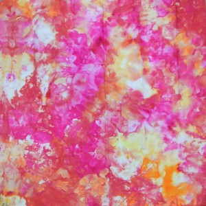
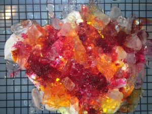
The ice dyeing results were absolutely fabulous!  What vivid colors!

Click any image for a larger view

I used fuschia, golden yellow and lemon yellow dyes.  I expected to get a lot of orange as the colors mixed.  But, as you can see, the three colors stayed pretty much intact, as they bled and migrated.  Not that it matters.  I love this piece!

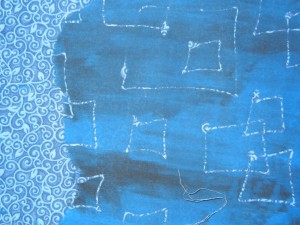
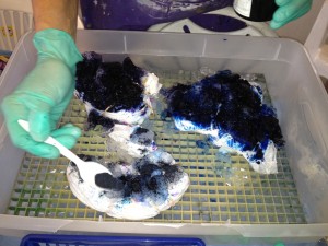
My screen printing technique definitely still needs some work, but it certainly has a lot of potential.  For this next piece, I applied water soluble glue directly to the screen, as a resist.  Then, I screened on both blue and black ink.

The next time, I’ll add the glue much more heavily.  Still, this will make an interesting addition to a blue background, etc. 

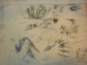
Too late I realized that some very interesting things were happening on the plastic under my fabric.  If only I had another layer of fabric in place!  Instead, I scrunched up some fabric and wiped it in the extra paint, resulting in a pretty cool “clean up rag.”  Actually, I can see it as part of a sky.

When I do this sort of play, I often get mixed results.  But, that’s NOT important.  It was SO exhilirating to experiment and to spend time with my friends!  Even if every piece of fabric had turned out horribly it still would have been a wonderful day.

Has it been a while since you had a play day?  If so, I hope you’ll be able to manage one soon.

Ellen Lindner
P.S.   The glue washed out easily.  It still showed as a shadow on the screen, which worried me, but it was completely gone.

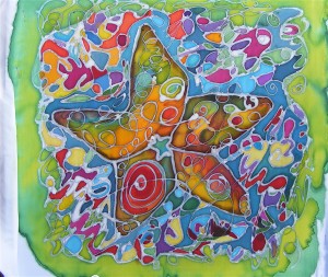
“Sea Star” by Jo-Ann Jensen

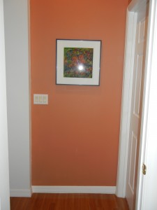
I have new artwork on my wall and I love it!  It’s Sea Star, created for me by my good friend, Jo-Ann Jensen.  Here it is installed in my hallway.

Click on any image for a larger view

I love this location.  The colors look great together and this is a spot where it will be viewed close up – better for appreciating the details.

Clearly, this piece is hard to photograph, due to the glass covering it.  But, I hope you’ll click on the image above to get a better idea.  It’s painted silk:  two different images, one on organza and another on habotai.

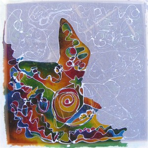
Jo-Ann sent me some in-progress photos of this piece.  The photo below shows the first (back) layer, which is opaque.

The next layer, shown in progress below,  is sheer.  It’s mounted in front of the first painting, but with a little gap between the two.  The result is an almost holographic effect.

Jo-Ann developed this technique and she calls it “Double Vision.”  Please check out her website for more of her work.

Ellen Lindner

Fun with Surface Design

Gee, I had fun today!  I met up with some of my fiber art buddies for play and experimentation. 

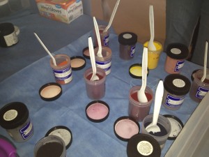
After donning our face masks, we opened the dye powder jars and were ready to get going.
NOTE:  Dye powder is very harmful.  You MUST wear a mask when handling it!

Click any image for a larger view

First, Jill showed us how to do ice dying.  Below, Marlyn is adding dye powder to hers. 

And this is what mine looked like after I added fuschia and two different yellow dyes.

How exciting!  (I’m now being VERY disciplined and letting it sit still until the 24 hour mark.)

Next, Andrea showed us a bunch of ways to do screen printing.

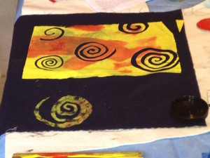
In addition to using prepared screens, she showed us how to use a variety of objects as resists.  These included glue, newspaper, and freezer paper, shown below.  After placing freezer paper spirals on dark fabric, she pulled yellow and red paints through the screen.

An added bonus:  after applying paint the cut outs can be lifted and used as stamps.  See the foreground spiral as an example.

After seeing all this, I played with freezer paper cutouts, glue resist, “painting” several clean up rags, and painters tape as a resist.  Where are the photos, you ask?  Well gee, a girl can’t be expected to stop playing in order to take pictures now can she?  (I’ll show the results after the fact, though.  Deal?)

It sure was great to play and to be with frends!!  Hope you’re having fun, too.

Ellen Lindner


A New Commission!

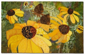
I’m delighted to have recieved a commission to create artwork for Nemours Children’s Hospital, in Orland0, FL!  The client wanted to purchase this piece, Natural Progression:

Click any image to enlarge

However, this piece has sold, so I’ve been requested to make something similar. 

Having not worked with an Art Design Service, before, I was suprised at the amount of thought that had gone into the art plans for this new facility.  The architechts, clients, and designers spent months coming up with a theme for the hospital’s art, coordinating materials and colors, and ideas for integrating the art into the building. 

In this case, the overall art theme is Florida gardens.  You might think they would have decided on bright juvenile colors for the art.  But, realizing that each child would be accompanied by at least one adult, they wanted a color scheme with broader appeal.  A very wise decision, I think.

Soon, I’ll start designing the new piece.  I’ll use the same photo sources I did with the first quilt. 

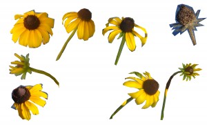
I’ve isolated some of them and layered them in a Photo editing program.  This allows me to manipulate each item independently.  I can move, rotate, or resize them, and much more.    This is very helpful when considering various composition alternatives. 
How would you arrange these flowers?

Ellen Lindner

P.S.  I’ve spent A LOT of time in hospitals, and I’ve always noticed the art.  I’ve found that interesting art does, indeed, lift my spirits.  I hope my quilt will be able to do the same.
P.P.S.  SAQA PAMs, note that my work was discovered via Portfolio 18.