When Visible Veins are Good (Croton Quilt)

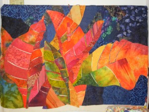
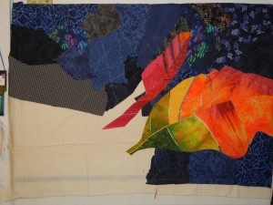
After completing the leaves on my Croton quilt, it was time to move it from the design wall to the table.  This involves switching the pins from push pin mode to holding-fabrics-together mode. 

The photo below shows my progress at about the half way point.  The left portion has been freed from the design wall and is all pinned to the muslin.  It’s scrunched up so I can reach behind it to the next part, which is still secured to the design wall.

Click any image for a larger view.

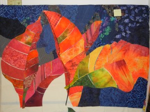
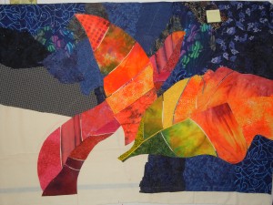
Next, came the veins.  In the photo below I added blue veins to the leaf on the right.  LOVE the color contrast, but I wasn’t sure it showed up well enough.

I did the fuchsia leaf in the same fashion.  Not sure it showed well enough either.  When I got to the green leaf, I cut the fabrics so the veins were wider.

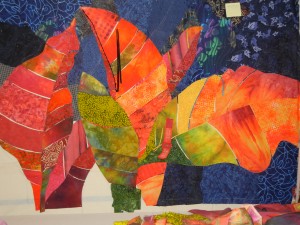
That definitely showed up better.  Which means I had to rework the first two leaves.  The photo below shows that, as well as the far left leaf done. 

Only the big orange leaf remains.  The photo above shows me auditioning vein colors.

All of this took much longer than expected!    Soon, though, I’ll be ready to start stitching.

Ellen Lindner
P.S.  Learn more about my collage and pinning technique here.

Final Croton Leaves

I’m winding down on the design phase of my Croton quilt.  Here it is with everything pinned in place – except for the vein fabrics.  (The fabrics aren’t really this bright, though.)

Click image for a larger view

I’ll add the vein fabrics by slipping skinny pieces of fabric under the adjacent larger pieces.  (It’s easier to hold everything in place with the little guys on the bottom.)  I’ll probably use a little glue to hold them in place.  And definitely LOTS of pins throughout!

My construction technique is rather unusual, I guess.  I don’t make a quilt top before stitching it to the batting.  Instead, I just leave everything pinned together, layer it with batting, and start stitching.  The stitches holds all the design fabrics in place, as well as adding wonderful texture.  

Ellen Lindner
P.S.  You can read more about my process here.

Zentangles with Shading

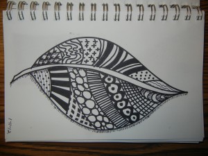
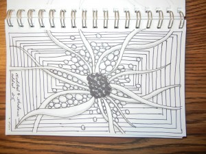
I’ve been researching Zentangles a little bit, and have found many online that I love.  I’ve noticed that many use shading to achieve a 3D dimensional.  This is very appealing to me, so I give it a try.

This is an early Zentangle, without shading.

Click any image to view larger

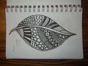
I tried adding some shading for depth.  It definitely helps, but I think I need to be more heavy handed.


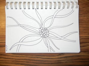
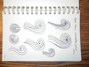
To help me draw these designs, I decided to copy some from online sources.  I got several ideas from this site.  Like this one:  Isn’t it cool?  I love the way the “tentacles” go over and under each other.

Continuing on, I got this:  (Also copied from the website.)


But, there’s still room for more.  What about the background?  Plus, I think nearly all of the shading needs to be darker.

I’m DEFNITELY still learning:

Forget solitaire.  I think this will be my new time-filling activitiy.

Ellen

Croton Quilt: Adding More Leaves

I’m still enjoying working with my colorful croton quilt.  I’ve added a red leaf on the left.

Click any image for a larger view

I couldn’t decide whether the fuschia leaf or the orange one (center) should go in front.   I fully constructed each one, so I’d have maximum flexibility down the road.

A yellow-green leaf front at center adds interest.

Or does it?  I thought I could just work it loosely, for color.  But, I see that it’s going to need the full treatment.

Since the veins are not visible yet, I think it’s hard to tell which leaves are folded and which are open.  I auditioned a black edge to help with that, but have since decided against it.

Ellen

Scrappy Inspiration?

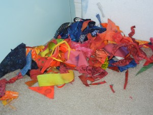
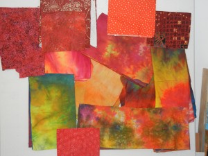
My latest quilt is larger than I normally make:  60″ wide by 40″ high.  This requires larger pieces of fabric, putting many more in the not-big-enough category.  I save the pieces that are larger than fist size, but I let the others fall to the floor.  It’s quite a colorful mess.

Normally, I don’t save these pieces.  After a project, I rake the carpet with my fingers and bag up these scraps for my friends.  They ADORE getting these!

But, daggone it, these look really enticing don’t they?  I might have to change my ways and do something with them.  Something with a sort of confetti look?  I welcome suggestions.

Ellen Lindner

“Color Makes the Quilt”

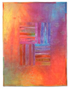
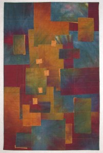
What to do with a gorgeous piece of hand dyed fabric?  Back in 2003 my ideas were limited, so I decided to use it as a sampler for quilting designs.  But, it was just too pretty to be relegated to sampler status, so I added some more fabrics and created this, called Color Makes the Quilt.

Click any image for a larger view

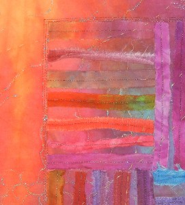
This piece has been living in my UFO (unfinished objects) drawer since 2003.  I always thought it needed something more and I tried a couple of things.  But, they all seemed to detract from the lovely colors, so I finally left it as is.  (Detail shot below.)

I came across it recently and immediately knew what to do with it:  donate it to the small quilt auction at my guild’s upcoming show.  I often do this with samplers, old class samples, and the like, so this fit the bill perfectly.

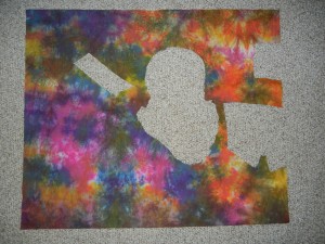
Since 2003, I’ve come up with lots of things to do with hand dyed fabrics.  Here’s a photo of one I’ve been using a lot lately.

 As you can see, I no longer have any hesitation about cutting up these fabrics!

These days, one of my favorite things to do with hand dyed fabrics is to turn them into Instant Art Quilts.  With such quilts a gorgeous fabric is torn into pieces which are then rearranged.  This yields very interesting and wonderful results.  Like the one shown below, called Afterglow.

I teach a class in this technique, both live and online.  My students have great results and you can see their quilts here.   Plus, my own class samples.

Would you like to be notified when the next IAQ class is offered online?  If so, leave me a comment.  Your email address will show in my private email (but not publicly) and I can add you to my list.

Ellen Lindner
P.S.  I’ll also be teaching this class live in both South Carolina and Florida this spring.  Consult my teaching schedule for dates and locations.


Croton Quilt: Additional Leaves

Although croton leaves are very colorful, I’ve never really seen fuschia in them.  But that’s not slowing me down.  I’m definitely taking liberties with the colors.

Click any image for a larger view

I’m really liking the way this piece is coming together. 

I’m continuing to think about alternate vein colors.  Maybe lime green for the fuschia/red leaf?

Ellen Lindner

Croton Quilt: Getting Started

After a false start on my croton quilt, I selected new fabrics and was ready to go again.  I love these hand dyes.  And I think the addition of commercial prints makes the mix even better.

Click any image for a larger view

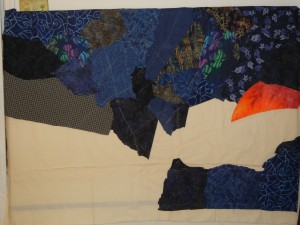
After deciding on dark blue as the background color, it was time to get started.  I layered irregular fabric pieces in place, leaving the muslin showing in areas where blue was not needed.  (See my inspiration photo here.)

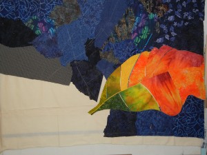
I really enjoyed constructing the first large leaf.  I love the vibrant colors and way the veins add details.  I think I’ll try some unusual colors for the veins.  Maybe bright blue for this leaf.  (Click to see.)

I’m having fun!

Ellen Lindner

Selecting a Background Color

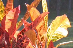
This is the photo I’m using as inspiration for my next quilt.  These vibrant colors really excite me.

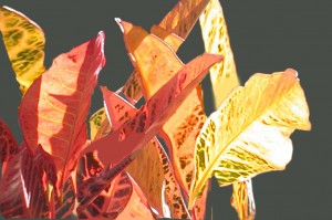
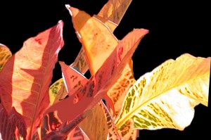
But, I wasn’t too keen on the green/black background.  To audition options, I used my computer to isolate the foreground elements and tried a variety of background colors.  First, dark green.

Well, it matches my photo.  And it coordinates with the green found in these leaves.  But, it’s just not exciting me. 

To help show off the colorful leaves, I know I want a background color that is both dull and dark.  (Thus making the foreground attract attention with it’s lighter and brighter colors.)  What about black?

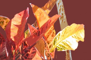
That’s certainly dramatic!  But, it doesn’t relate to the leaves at all.  Maybe I should go for an analagous (similar) color scheme.  Maybe a dark rust/burgundy.

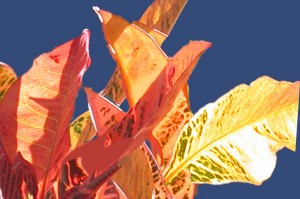
Interesting.  Definitely viable, but not as much constrast as I’d like.  Finally, I auditioned the tried and true, a complementary color:  blue.

Wow, that’s a lot more dramatic than the previous one, isn’t it?  I kinda love this.  But, the black is pretty awesome, too.  Maybe I’ll use darker blues.  Still deciding.

None of these are right are wrong.  It’s all personal preference.  Which one is your favorite?

Ellen Lindner
P.S.  I have lots of articles on my website about color (and other topics.)
P.P.S.  You may have noticed that the compositions of the above images are slightly different.  I’m still playing with that, too.

Zentangles

Do you know about Zentangles?  They’re basically doodles within contained spaces.  You draw some large shapes, fill them in with small motifs, subdivide, and continue.

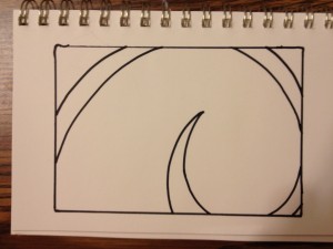
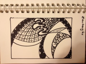
I tried my hand at one the other day.  First, I drew a lovely shape (which ended up being a complete waste of effort.)

 Then, I had fun subdividing and devising little patterns.

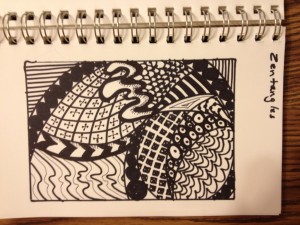
Until I got this.

There’s no real right or wrong way to do these, so I guess mine is successful.  I’ll definitely do more, but without so much thought at the beginning. 

Why not give one a try?  They’re fun and a good exercise in creativity.

Ellen Lindner