Collaborations Vignettes, Part 5

More photos of the Collaborations exhibit.  The ladies in this group work in a variety of media.  The quilts on the left were made by Mary Dyer.  The painting in the center  and the quilt on the right were made by Jo Ewald, and the fabric tree doll was made by Ruth Anne Parker, who’s also a quilter.

Click any image for a larger view

Ruth Anne’s tree doll was magnificent.  The hanging parts were made from threaded little bits of sheer fabrics.  They were very lightweight and moved with the slightest breeze.

 See it better in the detail shot, below.

 Jo Ewald created this painting, which was the inspiration source for the rest of the work.

Also an art quilter, Jo made this quilt to compliment her painting.

?

A very talented group!

Ellen Lindner

Collaborations: Favorite Vignette and More

As part of the Collaborations exhibit, viewers voted on their favorite fiber art piece, favorite non-fiber art piece, and favorite vignette.  These were really hard decisions, because so many things were wonderful!  The photo below shows my favorite vignette before the addition of a very cool fabric tree.  This group included painter Kaye Shannon, and quilters Dij Pacarro, and Bev O’Connell.  Their theme was cityscapes.

Click any image for a larger view

Dij’s colorful quilt:

Painter Sue Franklin, and quilters Sandy Micheal and Margie Engel used an African theme for their vignette.
 

Reflections was the theme for potter Rudy Pacarro, and quilters Barbara Bilbo
and Barbara Soumar.

This chicken vignette was a three-time winner, winning Best Vignette, as well as Best Art for painter Marti Meyer, and Best Quilt for Laurel Merrill.  These photos show it as they were installing it.  Later, many funky fabric chickens were added, along with eggs, chicken wire, and such.  Very cute!

All the vignettes were SO interesting!  (And I have many more to show you.  Stay tuned.)

Ellen Lindner

Our “Collaborations” Vignette

After arranging plants and such, our vignette looked like this:

Click any image for a MUCH better/larger view.

That’s Renee Decator seated near her painting, and me standing near my quilt.  The quilt at left was made by Lynn Greenberg, not shown. 

Here’s a better view of Renee’s painting, Taking a Bath with You:


I REALLY like it!  Doesn’t she use fantastic colors?  And great texture, too.

Lynn’s quilt is called Bromeliad.  Again, great colors and contrasts, inspired by the real thing.

And mine is called Blossoms Overhead.

Photo credit for all photos: Ed Clough

It’s very unusual.  An experiment that almost ended up in the trash.  With the exception of the blossoms, the design is made entirely with stitching and paint.  I stitched the design first, and then painted it.  Ugh!  It looked terrible.  Like a cartoon!  So, I over painted the entire thing with white.  This helped in two ways.  It unified all the elements, and it added an interesting textural look.  Initially, the blossoms were created in exactly the same way.  But, eventually, I added interest by stitching little loose sheer petals over them. 

When I first finished this quilt I really disliked it.  I think mostly because of the frustration I had encountered when making it.  But now it’s growing on me, and I’m generally satisfied with it.  (I don’t think I’ll be using that technique again, though!)

Ellen Lindner
P.S.  You can see my inspiration photos and progress with this quilt in several December 2010 and January 2011 posts.  Of particular interest is the “before” image, in the January 22nd post, showing the “cartoon” version.

P.P.S.  Have you had any near disaster quilts? 

First Video Online!

Woohoo!  My first video is finally online!  It’s about a fun little mixed media book.  I hope you’ll take a look.


I’ve decided to call my video series Adventure Quilt Works, (a name that was suggested by a former student.)  What do you think?

What would YOU like to see me demonstrate or discuss in a video?  I’d love to hear your ideas.

Ellen Lindner

More Collaborations Vignettes

More pictures for you, from the “Collaborations” exhibit.  Below is the vignette (in-progress) for painter Lois Mittleman, and quilter Diane Smith.  What great lively colors!

Click any image for a larger view.

Quilter Mary deMunecas and mixed-media artist Donna Vines used “A Partridge in a Pear Tree” as their theme.

Donna Vines’ mixed media piece:

Mosaic artist Lou Ann Weeks, and quilter Lyn Smith paired up for “Piecing it Together.”  Their display included photos and explanations of their process.  Very interesting.

Lyn emulated the look of mosaic, or stained glass, with her quilt.

Isn’t it interesting how the artists borrowed from each others’ materials and appearance?

Ellen Lindner

Awesome “Collaborations” Exhibit

Imagine grouping art quilters, doll makers, painters, and potters, and then asking them to collaborate on new art pieces.  This is exactly what happened with an exhibit called Collaborations, and it was exciting to see!  The exhibit was on display for two days, in Melbourne, FL, and was free to all.   

One of the things that made it so special was the way the groups displayed their work.  Each group had a space to create a vignette.  The idea was to showcase the art, but to also explain the concept behind it. 

This is how my group’s vignette looked, as we were still arranging it.  The quilt at far left was made by Lynn Greenberg.  The central painting was created by Renee Decator.  And my quilt, Blossoms Overhead, is shown at right.  (Thankfully, we eventually got it to hang much straighter.)

Our inspiration was the garden area of a local florist, Eau Gallie Florist.   (You can see some photos here.)  The owner, Link Johnsten, was super generous in allowing us to borrow many items for our display.  Do you see those two tall sculptures on the right?  If you click on the image, you’ll see that Renee has painted them into her piece.  Wasn’t that nice of Link to loan us exactly the items that inspired us? 

I think you’ll definitely want to click on some of these images, to bring them up as larger views.

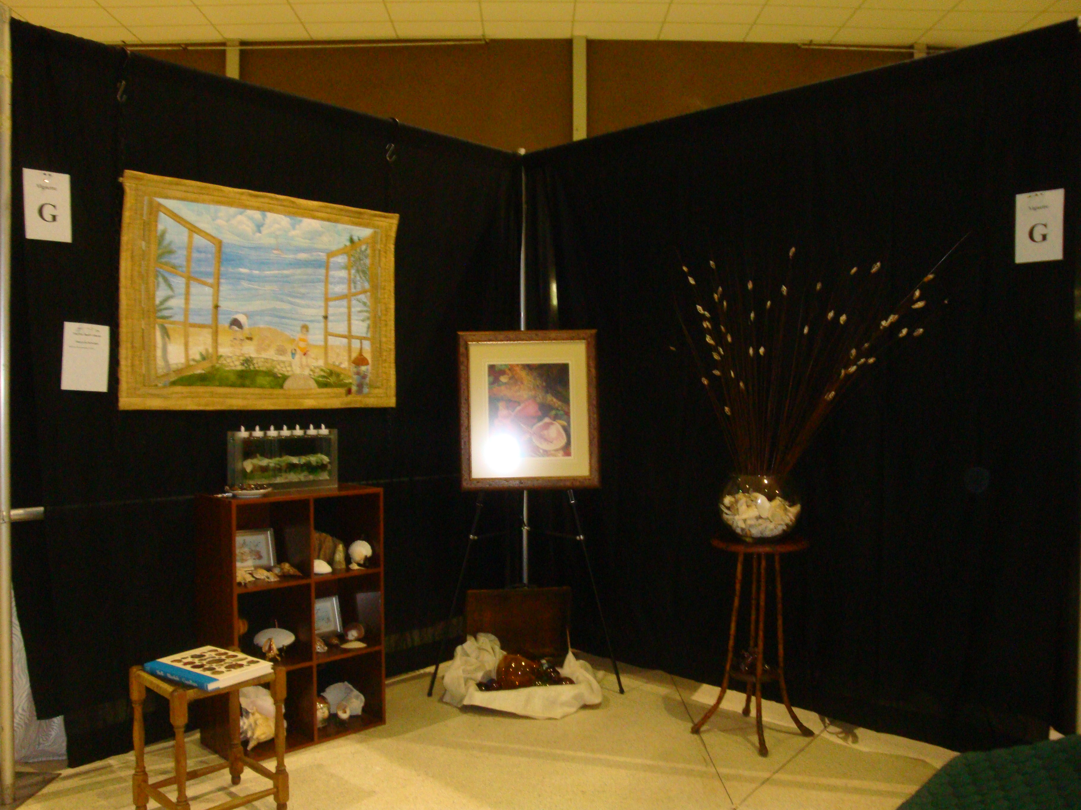
This picture shows the vignette right next to ours.  I thought it was lovely.  The theme was “Back to Nature,” (or something close to that.)

Carmen Beecher created the two paintings.  Great colors and contrasts.

Peggy Strauchman found inspiration in Carmen’s paintings.  She really used value contrast to accentuate the focal point.  And the irregular shape is very intriguing.

Greta Bitting paper pieced a lovely Bird of Paradise.  I like the way the leaves “escape” into the border near the bottom.

Don’t you think this is an interesting concept?  I think it was very successful. 

There are a ton more vignettes for me to show you.  I’ll get to those in the coming days.

Have you ever collaborated with another artist?  If so, what was your experience?

Ellen Lindner


Class Fun

Don’t you just love taking a class?  I do, and I also LOVE teaching them!

I’ve shared many class photos on this blog, but I don’t always have time to take photos.   And, since I thought perhaps you readers were growing  tired of them, I didn’t intend to post photos of my recent Double Reverse Applique class.  But, one of the students, Nancy, did such an excellent job  capturing the students’ concentration and jubilation I just had to share them.

The class was held in Port St. Lucie, Florida, sponsored by The Thimblebuddies.  (Isn’t that a great name?)

Chris is the president of the guild, and she was a very gracious host.  Although her machine didn’t cooperate during class,  her upbeat attitude never wavered.

Carolyn demonstrated the concentration required for learning a new technique.

It helps if you hold your mouth just right, too.  See Cindy’s example.


Pat, Gerri, and Lori shared a table (and a few stories) as they worked steadily along.

With the Double Reverse Applique technique, sewing is done from the back, as Cathy is doing.

Before the end of the three hour class, several students had completely finished their apples.  Jeanne chose very vibrant colors for her apple.

Can you get a sense of the steady progress, fun, and sense of accomplishment these ladies experienced?  Isn’t that what makes a great class? 
(I enjoyed it too!)

Ellen Lindner
P.S.  You can easily learn this technique (and this project) with my ebook.  It’s available as an immediate download, so you can start creating right away!

Lights, Camera, Action!

If only it were that easy!  I’m really excited about producing free videos for my website, but (as with so many things I take on,) I’ve found it to be a bigger project than I anticipated. 

No worries, I’m taking it one step at a time and steadily making progress.  So far, I’ve learned about sound and purchased a lapel mic, learned about lighting and purchased a light kit, begun to learn about video editing, and, MOST EXCITING, shot the first video!!!

This is what my set up looked like from behind the tripod.

See how high the tripod is?  That’s because this was the position for the close up shots.  Sorta looking down on my hands.

This is what it looked like from the opposite direction.

Perhaps you can tell that my studio is just BARELY big enough for this set up.  I’ve got one light on the floor and one on the table.  And the tripod leg blocks the door behind it from opening.  Still, I only needed to relocate one small set of drawers to make it work.  (I REALLY wanted to avoid the “furniture Olympics” each time I had to set up!)

Hope you’re getting excited too!  And, if not, I’ve got enough to go around.

Enthusiastically,
Ellen Lindner

Video Lighting

Wow!  Do you have any idea how bright 1120 watts is?  Here’s a hint.  Can you say “burnt retinas?”  I mean we are talking BRIGHT!!!

I’ve just gained this knowledge after my new video lights arrived.  We did a quick set up in the living room and got this:

Click any image for a larger view.

Did I mention this is BRIGHT?  The photo above was taken while the lights were covered with a thin fabric scrim.  Even so, my eyes were still hurting from looking at them.

The lights are definitely going to make a big difference, as shown in the still shot below.  Notice how much brighter the love seat is than the room behind it.

Next, I need to learn about light placement and see if I can fit them, the camera, and me into my crowded studio.  I’m looking forward to this continuing adventure!

Ellen Lindner

Finishing Details: Mountain Meadow

I’m winding down on Mountain Meadow, so it’s time to add the facing and other finishing details.  First, the signature.  (You sign your quilts, right?  I do, and I consider it an important part of completing the piece.)

I have a terrible time stitching my signature straight, so I rely on good ‘ole painters tape to give me a guideline.  (Don’t stitch through the tape!)

Click any image for a larger view.

Choosing the best thread color for the signature is something I haven’t entirely mastered.  I aim for enough contrast to show up, but not so much that it creates a distraction.  In this case, I think the olive green I chose was not dark enough.  (See what I mean?  Click the photo if you want a better look.)

You’ll notice that I’m stitching the signature before facing the quilt.  That avoids any potential thread problems that would otherwise show on the back.

I find the finishing details of quilt making to be a little tedious.  After all, the fun was in the creative part!  Therefore, I want to finish the quilt as easily and quickly as possible.  So, I face all my quilts.  With a little planning, I can actually machine sew the label and sleeve onto the facing before attaching it, and have NO hand sewing needed!  Yahoo!  (See the facing that’s ready to go in the photo below.)

I’ve actually created a finishing checklist, so I don’t forget anything.  After all, this quilt will still need to be photographed and treated with a UV/Stain protectant.  It’s easy to overlook such details, especially since I tend to do those last two tasks in batches.  (My checklist is taped inside the door of my storage unit, in my studio.)

What are your favorite finishing techniques and tips?  Do you sign your quilts?  Why or why not?

Ellen Lindner

P.S.  Want to face your own quilts?  I highly recommend it.  See this article/tutorial on my website, to learn how.

P.P.S. The finishing checklist is available on my website as either a Word document, or a PDF.