Mountain Meadow: Trees and Fence Posts

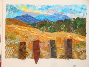
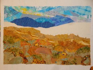
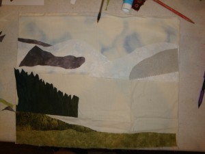
After stitching the sky, mountains, and foreground, it was time to tackle the trees and near hills.

DSC05672

I found that my usual stash of green prints had patterns that were too large for the appropriate sense of distance.  And several of them also had too much brown.  So, I had to actually buy more fabric!  (That almost never happens.)  

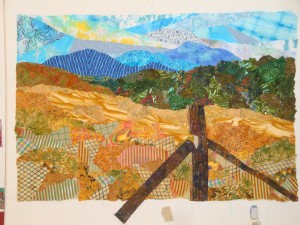
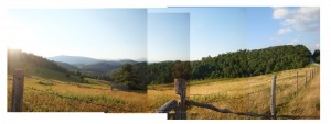
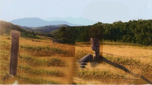
Next, I began auditioning fabrics for the fence posts.  Since the ones in my inspiration photo had a strong shadow, I decided to depict this, preserving the 3D aspect of the posts.  But, I also knew I couldn’t make the posts too realistic since that wouldn’t be consistent with the other funky areas. 
A little bit of a design tightrope.

DSC05749

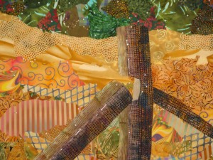
I used two fabrics to make the posts look 3D.

DSC05751

Oil pastels and colored pencils were used to soften the transition between the two pieces.

DSC05756

What do you think?  I was pretty happy with the balance of 3D and looseness.

Next will come the remaining fence posts, quilting and barbed wire.  That should be fun!

Ellen Lindner

Mountain Meadow, Early Developments

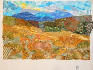
Want to see what I’m working on?  It’s inspired by a photo taken at one of my favorite spots:  an overlook on the Blue Ridge Drive.  But, as you can see, I turned away from the distant view and noticed the one behind me.  The setting sun gave the grass a wonderful golden hue!

Click any image for a larger view
Mtn. meadow comp_med

I fiddled around in the computer, creating a photo compilation, editing items, “growing” mountains, and kicking up colors.  Evenutally, I arrived at this for my “sketch,” of sorts.

Mtn. Meadow sketch

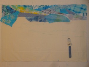
I wanted to use saturated colors and lively prints, so I got busy. First, I created the sky and added what I thought was the perfect mountain fabric.  What?  You can’t see the mountain?  Yeah, that was a problem.

DSC05641 

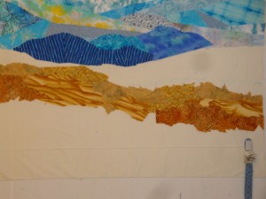
So, I switched out the mountain fabrics.  Much better!  How do you like the mountain with vertical stripes?  I really enjoying doing unexpected things like that. 

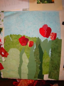
Next, I began to work on the grass in the foreground.  My goal was to create a sense of depth by using smaller scale prints at the back of the meadow and larger scale ones in the near foreground.  It was fun to work in this way.

DSC05657

Okay, that seemed to be successful.  What do you think?

DSC05668

“Grass” detail shot:

DSC05671

I was very happy with it at this stage.  What a great feeling!

Ellen Lindner

Phyllis’ Palm Trees

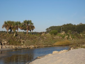
Phyllis Tarrant was one of my students when I taught Design Your Own Nature Quilt in Charlotte, NC.  She recently sent me photos of her finished quilt, as well as her inspiration photo.  I thought you’d enjoy seeing the progression.

Her starting photo featured a simple tropical scene.  A very good candidate for a class project.

Click any image for a larger viewPhyllis_Tarrant_insp_photo

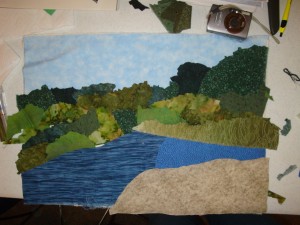
During class, Phyllis accomplished quite a bit, kicking up the colors and contrasts a little.

Phyllis

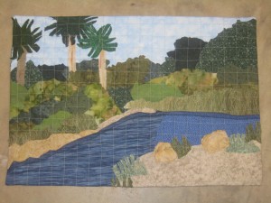
As you can see in her finished quilt,  Phyllis made several improvements by altering the palm trees.  She staggered their heights, and allowed two of them to run right off the edge.  This is VERY effective!  An excellent example of our class motto: 
Be inspired by your photo, not owned by it.

Phyllis_Tarrant_Swash_at_Myrtle_Beach quilt

Phyllis finished off her quilt, Swash at Myrtle Beach, using
the facing instructions on my website.

I’m REALLY pleased with this quilt!  Not only because the end product is so successful, but because I know the process and the learning that went with it were very useful to Phyllis.  She brought her artistic courage to class and gained a lot of design skill in a short amount of time.  Bravo, Phyllis!  This is exciting! 

Ellen Lindner

Decorating = Designing

Think you don’t have any design skills?  Have you ever decorated your home?  If so, you’ve used design skills in the process.   I was reminded of this recently, when I did some redecorating in my kitchen.

First, I painted the walls a lovely blue-green.  Then, it was time to decorate the space above my cabinets.  Since the ceilings are high, there’s about 30″ to fill.

I knew I’d need to keep a few design principles in mind when filling this space:
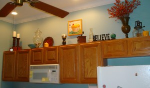
– Use items that are the correct proportion.  In this case, that meant large.
– Aim for rhythm by having the heights of the objects vary, creating an  undulating “line.”
– Create interest with a variety of objects.
– Add “movement” with diagonals.  This would come both from the undulating height and from placing items in front of one another.

First, I considered the proper placement of a fantastic “paper painting” by Elizabeth St. Hilaire Nelson, propping it on food cans to audition heights.

Click any image for a larger view.Auditioning cupcake placement
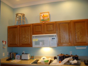
The milk stool was also in consideration.  I used it in the previous collection of cabinet top items, with a plant on top.  But, I wasn’t sure I wanted to stay this rustic.  Was some updating in order?

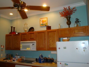
It quickly became apparent that I couldn’t properly place the cupcake piece in isolation.  I needed to see some of the other large pieces, so I could see how they’d work together.  After all, (as I tell my students,) “Every item relates to every other.  When you make one change, others may also be needed.”
DSC05603
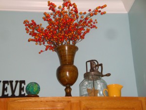
I LOVED the arrangement of orange berries on the right!  (Blue-green and red-orange is one of my favorite color combinations.)  I added it first, and then set about trying to balance that height with something on the left.  My other fairly tall item was the class container.  Of course, it didn’t visually fill the space that much, so I had to really study what was happening.

As I decided on the placement of these objects, I tried to vary their heights.  I also made a point of mixing the various surface textures, so that wood, metal, and glass were all spread out.  Progress!

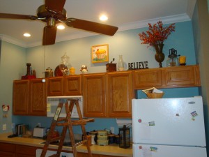
Later, I added smaller items, again spreading colors, materials, and heights throughout.  It was a challenge to give some of these things the visibility they needed, due to the top “lip” of the cabinets.
DSC05604

Finally, I was happy with the arrangement, and gleefully put the ladder away!
full top cropped

Can you believe it?  I eventually had to climb back up that ladder and make a few more changes! 
DSC05712

At any rate, I think the design skills I’ve gained from making art quilts definitely came in handy with this decorating project.  I’ll bet you use your skills in other ways, as well.

Ellen Lindner
Final NC Photos: Quilts and More

Although it was rainy in Charlotte, we were warm and dry inside during the Design Your Own Nature Quilt class.  Since the emphasis was on learning about design, we spent most of the morning working on that.  The students used the remaining three hours in the afternoon to quickly create their compositions.  They got a lot done in that short time!

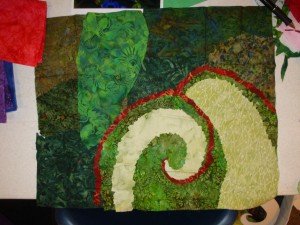
Lisa’s photo included a caladium leaf which had a wonderful swirling patten.  As you can see, she interpreted it beautifully.  She’ll also tackle a coleus leaf, (which was only a green shape when this photo was taken.)  Soon, it will have wonderful colorful speckles, just like her photo.

Click any image for a larger view.Lisa

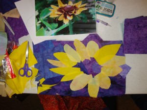
I always encourage the use of artistic license, and Lynn did just that when she altered the background color of her piece.  The purple really sets off her flower wonderfully!

Lynn

Phyllis made very good progress on her quilt.  She’s ready to add her focal point:  3 palm trees against the sky on the left.  She’s decided to make them 3D, which I think is a great idea!

Phyllis

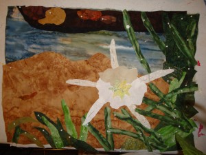
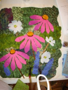
Alice had a challenging image to work with because her flower was solid white.  She’ll add a little contrast with thread and/or pencils.  But, look how great her foliage is.  She had the perfect fabric, and used it well.  It offers an excellent contrast to the flower, and the two will look fabulous together.

Alice

Alice was also my driver to Greensboro, so she quite literally “went the extra mile.” 

In Greensboro, I had fun giving a lecture to the Gate City Quilters Guild, whose members were very warm and welcoming.  The next day the sun was shining and this Florida gal got very excited by every little bit of fall color.  (Surely, my chauffeurs got tired of hearing “Ooh, there’s some color!”)

good color 1

My hosts, Linda and Larry, are avid gardeners.  As I stepped out their back door, for a long awaited photo opportunity, I was greeted with this delightful image.

tomatoes

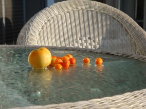
Who knew that unripe tomatoes could look so beautiful on a brisk dewy morning?

My time in North Carolina was fantastic, filled with great company, stimulating creativity, warm welcomes, and beautiful scenery.  I hope to visit again soon!

Ellen Lindner

More Charlotte Class Results

More student results from Design Your Own Nature Quilt, in Charlotte, NC:

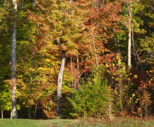
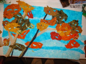
Beth was working from some photos of fall trees.  However, it’s difficult to get an accurate representation of this at the scale we were using.  No worries:  Beth decided to interpret her leaves loosely.  She cut little bits out of her  leaf fabrics, allowing the sky to show through, just as in real life.  Her composition is almost complete and it’s going to be  very effective!

Click any image for a larger view.
DSC05865

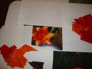
Suzie worked from a photo of a lily (I think.)

DSC05846

After completing her background, she added the first petal shapes.  (It’s kinda hard to get yourself to cut such large petals, especially freehand, but she did it.) 

DSC05845

After this photo was taken, she added some color variations and I taught her an easy technique for making little contrasting parts, like those in the veins. 

Pat created a wonderfully balanced composition.  She’ll use pencils or threads to add a little shadow between the layers of flower petals.

  DSC05847

The background of her photo had lots of little white spiky looking things.  Pat added something similar, after this photo was taken, and it added a lot of drama.  This quilt is going to be exciting!

Stephanie worked mostly independently, inspired by a mental image, rather than by a photo.

Steph piece

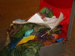
I loved the way she packed for class.  Her vintage suitcase was over flowing with fabrics and other supplies.  Doesn’t it look like fun waiting to happen?

steph suitcase

 TONS of tulips filled Mary’s inspiration photo.  She edited the image to include just a few flowers and designed a nice arrangement.  As you can see, she’s got things well underway.  Her interesting fabrics and variety of flower sizes will add lots of personality.  She’ll add the stems last.

Mary

This class is always a big kick for me.  The students are SO good about trying to work in a new way and their results always make it worth their while.

Still more photos to come!

Ellen Lindner
P.S.  See the first round of photos from this class.

A Great Trip

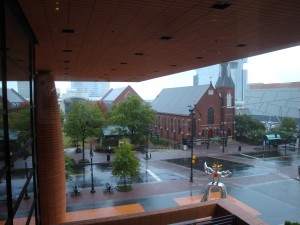
Do you know where I was when I took this picture?

Click any image for a larger view.
Charlotte view

I was in Charlotte, NC, at the Bechtler Museum of Modern Art.  Don’t you love the mirrored sculpture out front?  Especially when seen in front of the old church and “The Green” behind it.

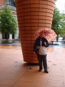
Charlotte has many wonderful art museums, and my host, Nancy Cook, made sure I got a nice taste of them. 

Nancy C.

I was in town to give a lecture and to teach a class for the Charlotte Quilters’ Guild.  They gave me a very warm welcome, and created some wonderful art, as well!

The class was “Design Your Own Nature Quilt,” my favorite to teach.  In it, students bring their own inspiration photos, and after learning some design principles in the morning, come up with a plan for converting the photos to fabric.  Later, they cut pieces by eye and pin them into place.  By late afternoon they head home with their compositions almost ready for stitching.  It’s very exciting to see these images take shape so quickly!

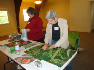
Below, (L-R) Debra  and Judy hard at work.  Debra and Judy

The photo below shows Debra’s results after three hours.  She did a very good job of editing out distracting details and showcasing only her favorite parts of her photo.
DSC05874

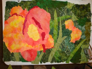
Judy’s composition is shown in-progress below.  A variety of fabric values allowed her to create depth within her left flower and she’ll add more with thread and/or pencil shading.  (The flower is about plate size.  Compare it to the camera at bottom right.)
DSC05873

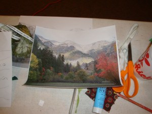
Nancy got off to a great start with her mountain scene.  First, she drew directly onto her photo, to help identify the fabric shapes she’d need.
DSC05844

Next, she began to cut and place fabrics, and her mountains started to take shape.

DSC05843

Many more workshop photos to come in future posts!

Ellen Lindner

More Double Reverse Applique Apples

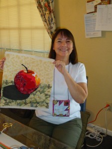
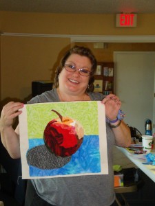
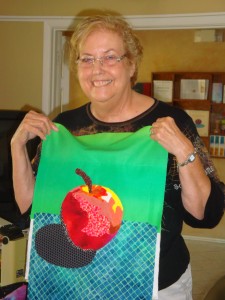
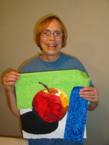
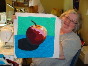
Identical patterns.  Identical fabric/color list.  VARIED results.

It’s always amazing to see how different the DRA apples are, even though everyone starts with the same pattern and color suggestions.

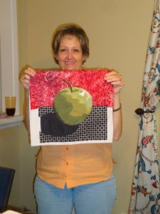
Peggy’s speedy results:Peggy

Rachel softened her piece with different background colors.
Rachel

Shawn was busy with her duties as hostess, but still found plenty of time to complete her colorful apple.  She was also my fun chauffeur on the last day.Shawn

Wow, Yvonne’s colors really pop!
Yvonne

Linda had never done free motion stitching before, but didn’t she do a great job?  All she has left is to add the blue background fabric.
Linda

Sherrill got creative and completely changed the colors.  She was also
a huge help with the smooth running of this class.
Sherrill

Didn’t these ladies do a fabulous job?

If you’d also like to learn the Double Reverse Applique technique, you may be interested in my online class, starting November 12th.  It’s also available as an e-book.

Ellen Lindner
 

Teaching in Texas

I’m just back from a teaching trip to Texas, where I learned a new term:  high five.  In this area of dense traffic it refers not only to a high hand slap, but also to a stack of five freeways crossing in various directions. 

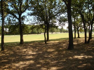
However, the workshop venue was in a beautiful wooded spot, well away from freeways both high and low.  

Click any image for a larger viewtrees

My hosts, the Bear Creek Quilters, were very welcoming and gracious.  During our Double Reverse Applique class, we had a lot of fun, and everyone created dramatic apples. 

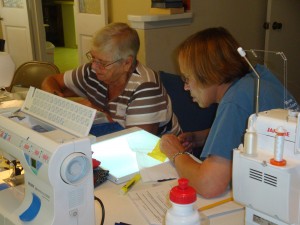
Below, Teaa and Linda were hard at work.  Linda is using a light box, which is integral to the technique.

Teaa n Linda

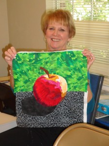
Here’s my wonderful hostess, chauffeur, and dinner companion, Charna, with her apple.  Can you believe this was the first time she had done any free motion sewing?!?

Charna

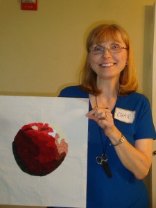
In the Double Reverse Applique technique, pieces are added from lightest to darkest.  So, stitching starts with the white highlight and ends with the shadow, stem, and background fabrics.  Char’s apple, below, shows this progression, still underway.

Char

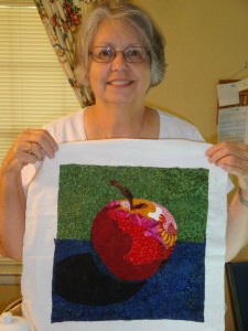
Dana with her colorful apple:

Dana

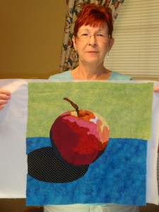
Maggy added interested with a large scale print, and a blue-ish shadow.

Maggy

Great work, ladies! 

I’ll have more apple show and tell in the  next post.

Ellen Lindner
P.S.  I also teach Double Reverse Applique online, and I offer it as an e-book.  This is an awesome technique, especially when a high level of accuracy is needed.


Paint, Play, & Poisson (Fish)

My Dirty Dozen Fiber Artists group just does the most fun stuff!  Recently, we met at Ruth Anne’s “barn” for a day of experimentation.  Most of us worked with synthetic materials, painting them and then cutting them with a soldering iron.  This was too much fun!!!
workspace

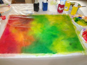
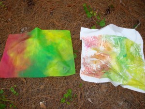
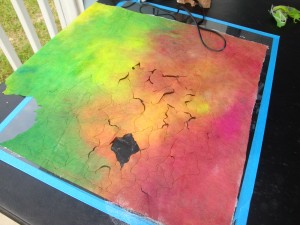
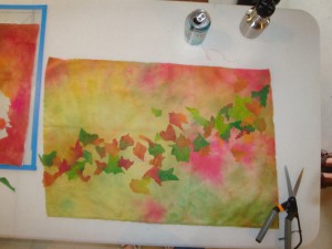
The idea was to paint this synthetic material to use as the source material for the foreground elements of a quilt.  Which begs the question:  what will the background be?  I selected a beautiful hand dyed fabric as my starting point, and painted this new fabric to loosely match.

When I lifted the fabric, the underlying bits of paint were very interesting.  So, I laid a piece of white fabric on it, and got a very cool matching mono-print.  Here they are drying.
Click any image for a larger view.
1st 2 pieces drying

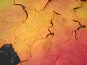
Next, for some instant gratification:  using a piece of glass as a working surface, and a very hot soldering iron, quickly draw shapes.  They cut instantaneously, and you just lift them out.  This is flat out exhilarating!

DSC05690

DSC05691

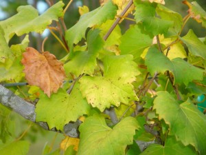
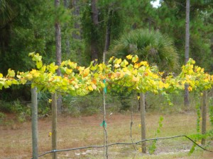
See how you can cut multiple organic shapes with absolutely no waste?  Wondering where am I going with these shapes?  To grape leaves, inspired by the vineyard right outside.

grape leaves

DSC05679

Here’s a VERY general idea of my concept.

DSC05693

I can see that the scale is off.  Either I’ll need to cut some larger leaves, or dramatically shrink the size of the background fabric.  (This is the one that inspired my painting colors.)

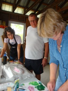
Meanwhile, Martha and Siggy tried their hand at fish printing!  See Martha at work below, with Lisa and Siggy looking on.

Fish printing

I was too enthralled with my own project to tell you about their process.  I look forward to seeing their results.

Oh, we had fun!

Ellen Lindner