Circle Challenge

My small art quilt group, Dirty Dozen Fiber Artists, is trying out a new format this year.  Each month, we’ll have some sort of theme or assignment.  That month’s coordinator will send several emails throughout the month, to get us going.  Then, those who desire to do so, can follow the instructions and ideas and bring their project to the following meeting.

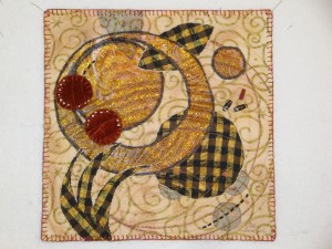
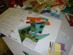
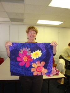
In January, our project was circles, led by Ruth Anne.  She sent emails with very specific instructions, like “cut one circle apart, making at least one of the cuts curvy.”  I followed her instructions pretty well but with a little modification.

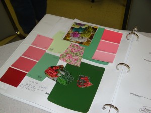
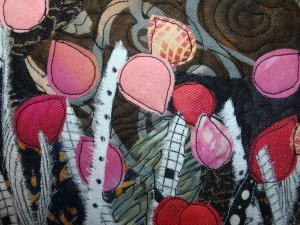
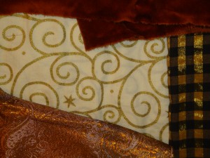
Here are the fabrics I selected:

fabrics

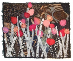
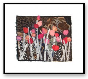
And here’s my little project:

finished

This is definitely not the type of thing I usually do!  However, it was a  good exercise, which pushed me artistically.

What experiments have you tried lately?

Ellen Lindner

Another Beautiful Book

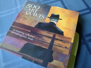
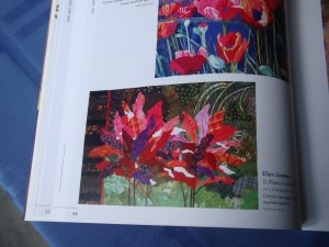
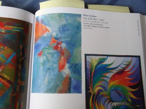
Have you seen the new book 500 Art Quilts?  It’s really wonderful, filled with many beautiful pieces.

DSC03977

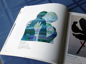
I’m delighted to have three of my quilts in it.  Reconciliation:
(Partial work shown by Marilyn Wall)

rec.

Ti Plants A-Glow-Glow:
(Partial work shown by Denise Oyama Miller)

ti plants

and Out of the Blue:
(Partial work shown by Caryl Bryer Fallert)

blue

See better images of each of these by clicking on the name of each piece.

Ellen Lindner

Color Class in New Smyrna Beach

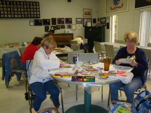
Last week, I had fun teaching a color class in New Smyrna Beach, FL.  The ladies were very welcoming and enthusiastic.  They worked diligently cutting and pasting paper pieces, as they created their own color workbooks.  Click on any image for a larger view.

mollie +

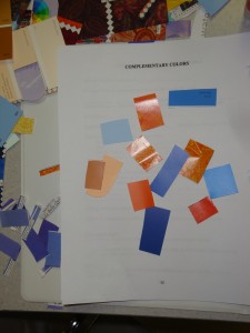
We spent quite a bit of time talking about opposite (complementary) color schemes.  The ladies produced really exciting workbook pages with these combinations.

Red and green:
red & green

I encouraged them to include both light and dark in their example pages.

Blue and orange:
orange and blue

The complementary combination of blue-green and red-orange
created quite a bit of excitement in the class room.  Isn’t it gorgeous?

b-g & red-o

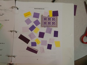
We did an exercise called “Messing with Mono” in which a few pieces of the opposite color were sprinkled onto the previously created monochromatic page.  Like this:

messing w. mono purple and yellow
The lesson?  Adding the complementary color always adds drama. 
(The additional complementary pieces went home in a baggie, to avoid
an error on the monochromatic page.)

Now, these ladies are armed with colorful knowledge, which will help them in all their artistic (quilt making) endeavors.

Ellen Lindner
P.S.  Would you like to learn more about color?  This class is available as a “Personal Workshop” e-book.

My Collage to be Auctioned FEBRUARY 9th!

My quilted collage, Hope Emerging, will be auctioned online
on February 9th,
to benefit the American Cancer Society.
UPDATE:  This collage was purchased with a $120 bid to ACS!

Ellen-Lindner-collage-on-wh

Seen above, it’s a petite 10″ wide by 8″ high.  See a detail image below.
Click on images for a larger view.

detail, in progress Hope Emerging, Detail

Although offered unmounted and unframed, I envision it being matted
on white and framed with a skinny black frame, like this:

ACS-collage-w.-black-frame-

The auction is part of the Tote Tuesday fund raising effort.  Each  Tuesday, several
tote bags and finished fiber art pieces are  auctioned.  The tote bags feature
items for fabric artists and lovers of fiber art. 
ToteTuesday-logo-web

Previews of all the February 9th auction items are here.  The bidding begins at noon EST.  Find full auction details here.

Don’t miss out on this great opportunity to feed your need for art while simultaneously helping the American Cancer Society!

Ellen Lindner

Tote Tuesday Fund Raiser Starts Feb. 2!

ToteTuesday-logo-web

Have you got your eye on one (or more) of the totes being auctioned in support of the American Cancer Society?  I do!

Called Tote Tuesday, each tote bag features items for fabric artists and lovers of fiber art.  The excitement starts on February 2nd here.

I’ve made a small quilted collage to benefit this event.  Called Hope Emerging, my piece will be auctioned Feb. 9th. 

Here’s it is, 10″ wide by 8″ high. 

Ellen-Lindner-collage-on-wh
Hope Emerging

 (Yes, it’s completely finished, even though I maintained the frayed edging.)

detail, in progress
Hope Emerging, Detail

Click on images for a larger view.

Although offered unmounted, I envision it being matted on white and framed with a skinny black frame, like this:

ACS-collage-w.-black-frame-

Finished art such as this will be auctioned individually, rather than in a tote bag.

Don’t miss out on this great opportunity to feed your need for art while simultaneously helping the American Cancer Society!

Ellen Lindner
P.S. Read about the construction of this little piece, by clicking on American Cancer Society, at right.   (In the collection of blue words.)  It will bring up all the related posts.

Most Beautiful Book

I own the world’s most beautiful book, and I’m about to show it to you! 

But first, a little background.  I purchased this book in the gift shop of the Cathedral of Ste. Chapelle, in Paris.  Ste. Chapelle, is a BEAUTIFUL cathedral, known for its stained glass windows.  The cathedral was built by Louis IX in the 13th century.  (He was the only French monarch to be sainted:  Saint Louis.)  Ste. Chapelle was originally built to house the Christian relics belonging to the Cathedral of Notre Dame, just around the corner.

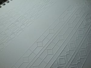
After viewing the soaring arched ceilings and colorful windows, I made my way to the gift shop.  And there it was:  a book with no color.  No black even.  Just beautiful white pages that were embossed with images from the cathedral. 

This is what I saw:
Click any image for a larger view
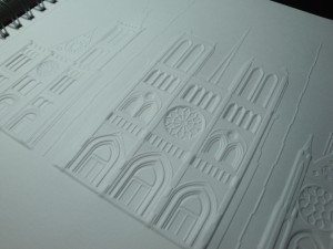
or 1

Wow!  I hope the photo does it justice, because this embossed page is magnificent! 

Because of the way the book was displayed I could only see one page, but I knew I had to have it.  I told the cashier, in my very pathetic French, “I want the book with the white pages.”  She asked “Something in French that I didn’t understand????” and I answered “Oui.”  Soon, I was walking out with the most beautiful book in the world.

I was amazed by the creativity of such a book.  “Who had the idea to make such an exquisite representation of this cathedral?” I wondered.  I was impressed with that vision and with the publishers who acted upon it.

Later, I got to pull out my new prize and study it.  I found that each page featured a different architechtural aspect of the catherral:  exterior, arches, window images, or lead work.
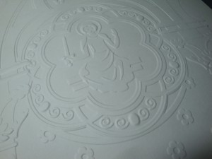
good1

good2

This page shows the circular window for which the cathedral is best known.  
The shapes used in it were a new style, which looked somewhat like flames. 
This is the origin of the term flamboyant.
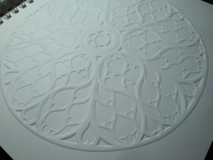
flamboyant window

Eventually, I figured out why the book was all white:
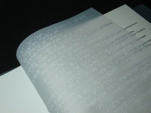
braille page

Yes, braille!  Finally, it made sense: a book for the blind.
But just look at how beautiful the transparent braile page was!
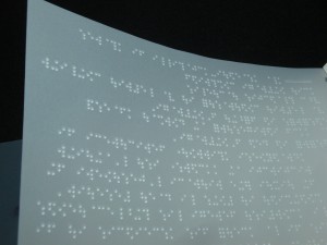
braille 2

Even the braille itself was wonderful!

So, was I right?  Have you ever seen a more beautiful book?

Ellen Lindner
Be Inspired by Your Photo

“Be inspired by your photo, not owned by it.”

Sticking to this as our class motto, the ladies in Design Your Own Nature Quilt produced exciting work.  This often required working slightly outside their comfort zones, but they were willing to do so, achieving  great results.

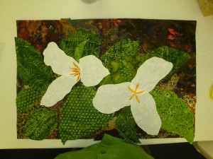
Donna used a photo of two Trillium.  She rearranged them within her composition, and is planning to later crop the right one.  This will enhance her design even more!  Donna will add further details with thread painting.  Click any image for a larger view.

Donna's trilium

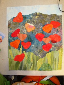
Linda’s poppies are really going to dance!  She created interest by using a variety of fabrics for the flowers.  Soon, curving stems will complete the image, giving it even more motion.

Linda's poppies

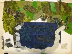
Pam worked on a woodland pond.  She completed the background vegetation and water, and was just beginning to consider the stones around the pond.

Pam's woodland pond

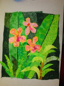
Lou started with a great orchid photo.  She dramatically darkened the background to create more contrast for the flowers.  She also modified the surrounding vegetation quite a bit.  Lou’s handling of the two big leaves was brilliant:  she cut each half from different fabrics and created the vein effect by simply leaving a gap between the two pieces.

Lo's collage

When creating vegetation, it’s easy for all the green fabrics to blur together.  Lou’s dark background helps with that.  She’ll define things even more with contrasting stitching.

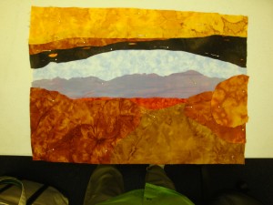
Sharon’s photo of a rock arch was a dramatic starting point.  She translated it to fabric very well, achieving a wonderful sense of depth.  (Plus, she completely finished the layout  in class. )  Sharon will add some shading in the foreground with stitching or art media.

Sharon's landscape

What an exciting and fun class!  I love teaching it, both in person and online.

Ellen Lindner
P.S.  I often create fabric collages inspired by nature.  Here are a few examples, including the inspiration photos.  (I always use my own photos, to avoid infringing on the copyright of another photographer.)

Sarasota “Design Your Own Nature Quilt” Workshop

On my second day in Sarasota, I taught Design Your Own Nature Quilt to a great group of women.  This is my favorite class to teach because the students gain a lot of skill and confidence.  However, getting there can be slightly intimidating since the students put several new concepts to work.  Therefore, the class description includes this phrase:  “Artistic skill is not needed, but artistic courage is required.”

In the morning the group learned about design,  doing quite a few individual and group exercises.  By late morning, they began to sketch and plan their own quilts.  To keep things loose, the class motto was repeated frequently:  “Be inspired by your photo, not owned by it.”  The students bravely rose to the occasion and accomplished a lot in the remaining afternoon hours.

Cass started with a photo of a bouquet of flowers.  Next, she cropped it to a better composition, used a variety of purples for the background, and altered the flowers, making them whimsical and funky.   A great example of inspiration. 
Click any image for a larger view.

Cass w. bouquet

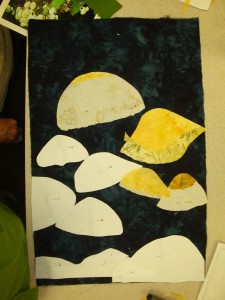
Helen severely cropped a woodland photo of mushrooms, resulting in a very dramatic composition.  She was a little uncertain about cutting shapes directly from her fabric, so she made some paper templates first.  Her luscious selection of tan and cream fabrics will really pop against her dark background.  And the curvy stems will be fantastic!

helen's mushrooms
Marcia’s photo needed very little editing.  She had fun picking fabrics that would do
the bulk of the work for her.  Later she’ll add some surf with, perhaps, cheesecloth. 
An excellent use of materials.

Marcia's golf course

Marty made some very smart decisions with her piece.  First, she moved the central rock shape off center.  Much more interesting!  Next, she used the BACK of her pre-printed sky fabric, for a subtle effect.  Then, she picked fabrics based primarily on value, as she began to develop the nooks and crannies of the rock face.

Marty's landscape
I get a renewed adrenalin surge just looking at these photos.  It’s VERY
exhilirating to be in a room with so much creative energy and courage! 

Most of these women had never designed their own quilts before. 
Can you get a sense of how thrilling that was for all of us? 

I’ll show you more examples in my next post.

Ellen Lindner
P.S.  You may also be interested in the gallery of student work from previous Design-Nature classes.  Most of them had never before designed their own quilt!

“An Apple a Day” Continued

An Apple a Day is the title of the pattern we use in my Double Reverse Applique class.  I’ve given the technique this name because:
1- Fabric is cut away to reveal the fabric below it, and
2 – Since the stitching is done from the back, there’s a second kind of reversal.

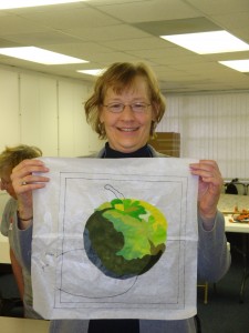
This is Pam’s apple at the end of the 3 hour class.  Notice that the perimeter
of the apple is not properly defined, since this happens when
the background fabric is added.

Pam's apple

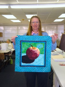
Here’s what it looked like when she showed up for class on the
second day.  Isn’t it great?

Pam's apple w. borders

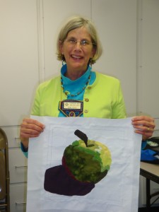
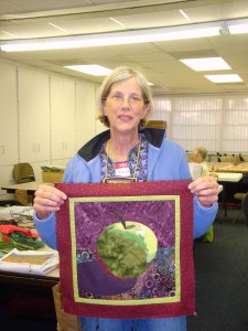
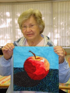
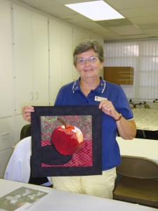
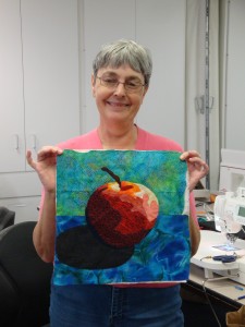
Several other ladies attended the second class and brought finished projects with them.  Catherine shows off  her apple:

Catherine and apple

And Donna:
(Who I kept calling by the wrong name, so she earned two postcards from me!)

Donna's apple finished

And Lou:

Lou's apple w. borders

What a fabulous variety of colors!

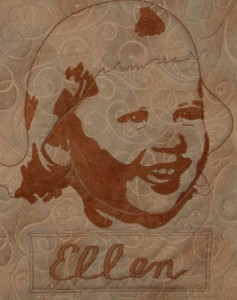
One of the great things about the Double Reverse Applique technique is its accuracy.  This makes it great for portraits and such.  Shown below is the first project I attempted with this method:

Ellen-web

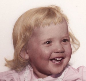
I created the pattern from this photo of me at the age of two:

Ellen_photo_web

See what I mean about accuracy?  How cool is that? 

And it was easy too.  This early success is what made me decide to teach the technique.  You can see additional DRA examples here.

Ellen Lindner
P.S.  You may be interested in the online version of this class.  There’s also an 
e-book which includes the same material as the class, including the apple pattern.


Sarasota “Double Reverse Applique” Workshop

Oh my, did we have fun on my recent teaching trip to Sarasota, Florida!  For starters, I taught my half-day Double Reverse Applique class.

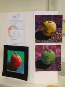
The photo below shows my teaching display.  The pattern matches the red apple,
but as you can see, it’s awesome in any color variation.

Class board

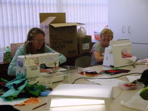
Lou and Denise (L-R) stayed busy:  Click any photo to enlarge.

Lou & Denise

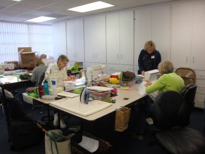
Roberta, Marcia, and Pam (L-R) worked diligently. 

Roberta, Marica, & Pam

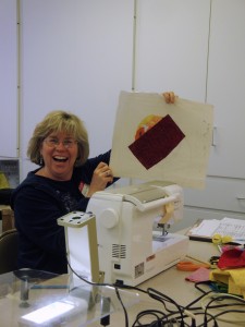
Marcia cracked me up when I asked to photograph her work.  She was in the
middle of applying the next piece and gleefully showed me this:

!Marcia

That looks like an apple, right?

I somehow didn’t get photos of everyone’s apples, but they were all terrific. 
Check out Debbie’s vibrant colors!

Debbie's apple

Susan completely finished hers during the three hour class:

Susan

Aren’t they fantastic?

Ellen Lindner
P.S.  You may also be interested in the online version of this class.  There’s also an 
e-book which includes the same material as the class, including the apple pattern.