3 Steps Forward, 2 Steps Back: Collage Finished
You can see that the white tulle dampens the strong black a little (below.) However, I decided this was acceptable and started stitching.
I was worried that the stems for my little collage might be too chunky for the petal/flower shapes. I auditioned the combination and got this:
Just as I suspected. It looks more like birthday candles than foliage. (And the colorful flowers will need a much better arrangement, as well.) So, back to the drawing board with skinnier stems.
I also added some triangles previously fused and cut for an earlier project. At this point, I liked them. Since I hadn’t ironed them on, I could still move them later, if needed.
Next, I added all the petal/flower shapes.
That was colorful, but I thought the flowers needed more definition. That is, more
black showing between them. So, I removed quite a few. I also lowered the highest flower.
Hmm. Not sure about the missing high flower, but I know I can add it back, if needed.
I liked the white triangles as part of the foliage, but I began to think they were attracting more attention than the flowers. So, I removed those, as well.
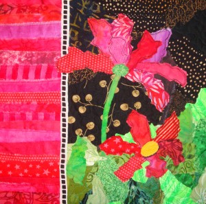
After more editing and tweaking, this is the final (?) composition.
Next: stitching.
Ellen Lindner
P.S. This little collage is being made to benefit the American Cancer Society. It will be part of an online “auction,” with the “payment” being a donation to ACS. More details here.
Is that not gorgeous?!? I love it!
This one was apparently not quite ripe, because it tasted pretty sour. But, honestly, this fruit is so eye catching I think I’ll buy one for my next party – just for adornment!
I often find inspiration in the produce department. One day, I noticed the way the strong lighting showed through the translucent onion skins. I asked the produce guy if I could have the loose skins and he agreed. I brought home several and had fun arranging them, considering this nothing more than a creative exercise.
I’ve also made several art pieces with produce as the subject. For instance:
Where do you find inspiration?
Ellen Lindner
Using the appeal of art quilts, Virginia Spiegel has done a fantastic job raising funds for the American Cancer Society. In past years she’s asked artists to donate small quilts, which were later distributed online, in return for ACS pledges.
This year, the project is “Tote Tuesdays” which will feature themed tote bags, each filled with a variety of small art quilts and other fiber art items. Peggy Schroder is organizing a tote bag to be featured near Valentine’s day. Her theme is “Have a Heart”, aka “Big Names – Big Heart”, and it will include items with lots of pink and red. Peggy has asked me to make a small piece for the tote bag. Since my family has been touched by cancer, I’m especially happy to oblige.
And, so I started on a very small collage. My idea was to use lots of black and white, with only a little pink and red. Peggy confirmed this was acceptable, so I started sketching.
First, I tore an 8 x 10 piece of black fabric to use as the base. Then, I grabbed scraps from my black bin and started adding them for a busy background. In many cases, I was able to use the scraps “as is.”
Next, I started cutting small circles. (Actually, I had quite a few left over from a previous project.) Oops: one slip of the scissors resulted in a “circle” that looked more like a guitar pick. After studying it, I decided I preferred this shape and altered all of the circles to have a little pointed end.
Next, I tore strips to use as stems.
After a little ironing, the stems were ready to be put in place.
This came together quite quickly, and I was pretty happy with it. However, I was concerned the chunky stems might be too heavy for the petal shapes I’d already cut. I’ll address that in the next post.
Ellen Lindner
P.S. You’ve got some scraps, right? Why not join me in making a little something for this worthy cause? (Or plan a donation in order to win one of these terrific totes.)
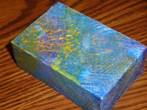
In an earlier post, I showed you how I collaged a little box. For the second box, I wanted to try something completely different.
I decided to paint it in a process similar to the one used by Renee Decator. The basic idea is to texture the surface with molding paste, randomly apply opaque paint, and then apply transparent paint over it. I had some success with this on an earlier project, and I was anxious to try it again.
The photo below shows the texture created with molding paste. Click any photo to enlarge.
Next, I randomly added strong colors .
I got so caught up in the process that I forgot to photograph the next two stages. First, I overpainted everything with a variety of transparent colors. This was interesting, but it produced an almost solid blue area, which I didn’t like (bottom right.) I decided to add more blue overall so I gave it a light smudging of additional blue.
That was much better. Next, I decided to play up the textures more by adding a light layer of white, catching just the tops of the textured areas.
Finally, I added some iridescent gold paint stick to highlight the texture even more.

I’m pretty happy with this little box, and it was great fun to create!
Ellen Lindner
I have a piece that’s in the too-ugly-to-see-the-light-of-day category. I finished it in 2003 and was pretty happy with it until I decided to make some “improvements.” My attempts backfired, resulting in the quilt’s current status.
It’s been languishing in my closet ever since, waiting for more, uh, improvements. So, I got the idea to paint over it. My idea was to paint sort of lightly so the stitched areas wouldn’t catch the paint, and this would create an interesting texture and design.
Not being brave enough to try this on the front of the quilt, I started experimenting with the back. Here’s my first little spot: Click images to view larger.
Hey! That looked pretty intriguing! Pretty soon I was considering the back as the new front. I removed the label and hanging sleeve and had great fun adding paint.
Painters tape was used to mark off a few areas.
This is how it looks right now. I think it’s very interesting, although it’s clearly just a start.
What now? Is it the new front? Should I add more paint? Or alter these colors? Should I paint the faced edge? With such a subtle design, how can I add to it? Sheers, perhaps?
Maybe I’ll paint the front a little and then see which side excites me the most. Either way, this was a big adrenalin surge, and I’m glad I did it. Not sure where it will lead me, but I’ll keep you posted.
Ellen Lindner
After making good progress on my cosmo commission, (on live TV,) it was time to tweak some
of the original flower petals and to add a few more. Click image for larger view.
Because my original sketch included one or more white flowers, I did some experimenting
with that. I liked these little spiky shapes (above,) but I felt that they were
somewhat distracting. Therefore, I removed them later.
Finally, it was time to add the black and white “ladder” fabric strip on the left, and to stitch all the elements together.

I used matching thread for most areas, but I chose black to add definition to the flower petals.
I love the effect of very loose double stitching.
This piece is now ready for my signature, a facing, and a hanging sleeve.
Ellen Lindner
I’ve been working on a commission piece, featuring cosmos. I started with this computer sketch:
Since this piece is only about a foot square, I was able to use a lot of my scraps. First, I used them to
create the black background. Then, I tore fabrics to create rows of fuschia
on the left. (I love the frayed edge that tearing creates.) Click reamining images for larger views.
Soon, I had the background complete. I stopped at this point, because I intended
to use this as a demonstration for an upcoming TV interview.
On air, I recruited the host and my co-interviewee to help cut and place fabrics.
We worked on it for a few minutes, roughly placing petals, and arrived at this:
At this point, many petals and details were missing, and some of the proportions were off. But, it was
clearly taking shape. In the next post, I’ll show you how this piece came together.
Ellen Lindner
 Merry Christmas! May you have a fun and joyful one. Whatever your reason for celebrating, I hope you’ll remember it and allow it to color your thoughts and activities.
I tried to downscale my “to do” list this year, and managed to succeed, for the most part. Still, I found myself scurrying around stressed on the 24th. A Christmas Eve church service slowed me down, and helped me focus on the true meaning of Christmas.
May you slow down enough to find the joy in Christmas.
Ellen Lindner
People ask me which of my quilts is my favorite. Gee, that’s a hard question! I’m not sure I have a favorite, but if I do, it changes. Someone once told me that your most recent piece is always your favorite. In my case, there’s a certain amount of truth to that, but not always.
Here are a few that fall into my favorites category. (I purposely didn’t choose any recent ones, although many of them qualify.) Click any image for a larger view.
The piece above was inspried by a morning walk. It was great fun to interpret
it a little loosely. See a detail shot here.
The bananas are actually a glued collage. A great way to control very ltitle pieces of fabric. I love this piece and am considering making a very large version of it.
Whispered Prayers is part of my Body Language series. Can’t you tell exactly
what this mom is thinking? The detail shot will give you an idea as
to how I’ve answered that quetion.
Hopes and Daydreams is one of my earliest art quilts and
it’s still one of my favorites.
Urban Sprawl has had an “extreme makeover.” See a detail shot here.
And read about the makeover here.
There are many more quilts displayed on my website. Perhaps I didn’t feature your favorite. Please visit the gallery, where you can click on larger images of each piece. Do you have a favorite?
Ellen Lindner