“Sticky Fingers” Class Sample

Not only do I enjoy creating stitched collages, but I also like to make glued ones.  The thing that’s really great about them is that they’re fast!  Once you compose the piece, it’s done.  No stitching, binding, adding hanging sleeves, etc.  I love that!  Plus, you can easily manipulate tiny little pieces of fabric that would be too small for stitching.

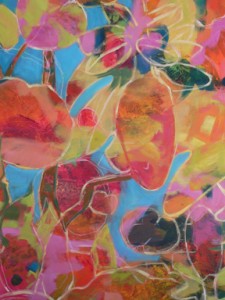
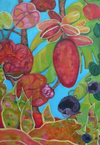
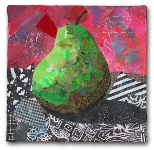
Green Pear, Ellen Lindner

Green Pear, Ellen Lindner

Soon, I’ll be offering an online class in this technique.  The title is “‘Sticky Fingers:  Glued Fabric Collage.”  In it, students will create an abstract piece with a simple cruciform design. 

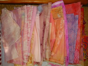
I’ve been working on a class sample.  These are the fabrics I selected for the background. 

fabrics

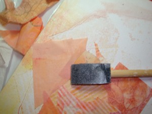
The photo below shows the very early stages.  I’ve glued fabric onto a prepared artists’ canvas.  I always use a foam brush with glue.  That way, I don’t risk gluing the brush bristles together, if I accidentally let it dry.

Start with brush

My goal for the background was to start with an off-center light spot and then to use gradually darker fabrics as I worked toward the edges.  I knew that the “gradually” part might be tricky.  And indeed it was. 

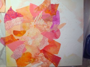
In the next photo, I’ve begun to add darker colors.  Initially, this created a sort of reverse bulls eye effect.  The value shift was too much of a hard circular line.  So, I added some pieces with sharp angles that broke up the line and helped with the transition.

radial spikes 1

I’ll be posting more about my progress in the future.

In the meantime, you can see some other glued collages in my gallery.  Look for square pieces.

Ellen Lindner
Luggage Tags

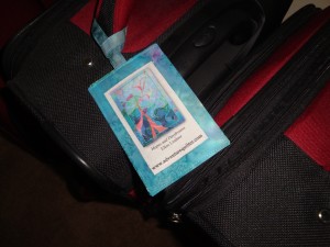
For some time now I’ve had the idea of getting my art work onto my luggage tags.   So, when I saw a luggage tag project in the 2008 Quilting Arts Gift Magazine, I decided to give it a try. 

good 1

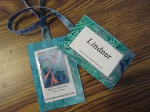
Aren’t they pretty?  I made three, and the photo above shows both front and back.  (Click images for larger views.)

1 tag on luggage

I altered the back a little, in order to add a quilt photo.  (How self-promotinal of me!  No apologies, though!)  The quilt photo is printed on fabric, and I covered it with vinyl, to protect it.  Even though this fabric from Color Plus prints really nicely, I think I’ll print onto photo paper for the next round.  After all, if I want to show off my work, I might as well play it up, right?

Ellen Lindner

Dirty Dozen Retreat

Just back from a fun retreat with the Dirty Dozen Fiber Artists, my small fiber art group.  We had so much fun being in the same space, creating, collaborating, learning, sewing, gabbing, eating, and laughing!

A few highlights:
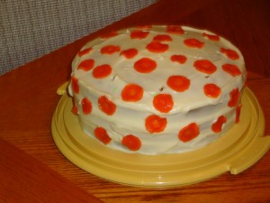
A carrot cake, made FROM SCRATCH by Martha.  Those are candied carrots used as
decoration.  I’d never even heard of such a thing, and Martha made them!

DSC02760

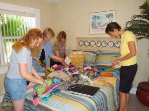
The “store.”  Irene brought a BUNCH of fabric scraps and UFOs (unfinished objects) to give away.  They all got dumped on a bed, which was promptly dubbed “the store.”  Everyone had
fun pawing through the piles and discovering treasures.

(L-R) Jill, Martha, Paula, Lisa-Marie

(L-R) Jill, Martha, Paula, Lisa-Marie

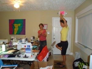
There was also quite a bit of silliness – especially late at night.  Here, Lisa-Marie is demonstrating a yoga pose for Irene.

(L-R) Irene, Lisa-Marie.

(L-R) Irene, Lisa-Marie.

Oh, yeah.  We did some sewing, too.  Including a “Group Therapy” challenge involving lots of texture.  Here’s a sneak peak of mine.

Mango Th detail

As usual, I brought the most stuff:  my sewing table, sewing chair, sewing machine, easel, portable design wall, Ott light AND all the materials needed, plus clothing and food!

Getting away like this is not only enjoyable and productive, but also a wonderful boost to the  cammaraderie and closeness of the group.  I’m already looking forward to next year!

BTW, in the third photo, the quilt in the background was made by Diane Smith.  She and her husband own the condo where we were staying, and she’s a former member of the group.

Making Leaves

I needed some leaves for the quilt I’m currently working on.  At first, I cut some from fabric and auditioned them.  I liked the effect, but thought it would be even better if I added some textured ones.  I knew just how to achieve that:  melted plastic!  I had some new plastics I wanted to try, and a great new art paper, as well.

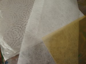
Here are my starting materials: art paper on the left, Lutradur in the center, and a gold colored page protector on the right.

starting materials

First, I painted them, on the front only.  (I ended up using the backs, in some cases.)

After painting cropped

Next, I cut the plastics into rough organic shapes, slightly larger than the final desired sizes.

pieces before

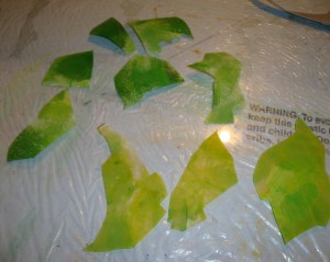
In the photo above, they’re positioned on a sheet of glass, my working surface for hot activities.  I hit each one with the heat gun, and voila:  leaves!

pieces after

Pretty neat, huh?  I love the texture of these!  You can see it better in this shot with no flash.  (Click any image for a larger view.)

pieces after, no flash

Since melting plastics is toxic, I was careful to wear my respirator and to work under an exhaust vent.  (You can learn more about my set up here.)

I’ll be tearing the paper into rough leaf shapes for use.  I think I’ll probably also give the pieces a protective coating of diluted gel medium.

I’m very happy with these, and excited to add them to my quilt!

Ellen Lindner

Renee Decator “Texture with Acrylics” Demo

I recently attended a demonstration by artist Renee Decator about how she adds texture to her acrylic paintings.  She showed us several techniques, including one in which she imprinted textures into heavy body gesso.  After spreading the gesso onto her canvas she pressed things like doilies and produce bags into it.  This gave immediate interesting texture.  Renee also demonstrated how she sometimes attaches items directly onto the canvas to create texture.  Her arsenal includes string, paper, and cheesecloth.

After creating texture on several canvasses and allowing them to dry, Renee brings out her paints.  This is when things get really interesting.  Working with her preferred palette, she begins adding opaque paint completely randomly. 

What?  No planning?  This is the part that intrigues me!

Renee thoroughly works the paint into the surface she has created.  After it’s dry, she adds more paint, but this time it’s very watered down and transparent.  While it’s still quite wet she lifts some of this new paint using things like crinkled plastic bags.  Finally, she departs from pure randomness and “cleans things up” a little, turning it into what she considers a viable abstract composition.

And all of this is just to create an interesting starting point!   Because she hasn’t used a plan to this point, everything is very playful and creative.  A very fun way to make art!

Eventually, Renee studies what she has and begins to evaluate it for possible subject matter.  A yellow spot might become a lemon, or it might be completely painted over, depending on what she determines.  This way of working is fascinating to me – and very foreign!

Renee was kind enough to provide me with an in-progress image of her painting Lookout (below.)  At this point she had just completed the process I’ve described and was beginning to create a composition.

Renee Decator lookout IP

Here’s the same piece, completed:

Renee Decator Lookout

Very interesting, don’t you think?

Although Renee’s process involves painting over things she’s previously created, it also allows for unexpected surprises, and the ability to use earlier parts as color and texture.

I’ve tried an intuitive process like this with fabric, and found that I was not well suited to it.  Maybe it would work better for me with paint?  Either way, I feel like reaching for my acrylics!

Please check out Renee Decator’s website.


Gesture Sketches with Thread

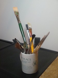
After discovering the excitement of doing gesture sketches with charcoal, I decided that I would try to do something similar with fabric and thread.  First, I set up a still life composition.

brushes photo

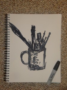
Then, I did a quick gesture sketch with a very fat marker, just to practice before going to the sewing machine.  (I turned the cup a little, for a different view point.)

DSC02354

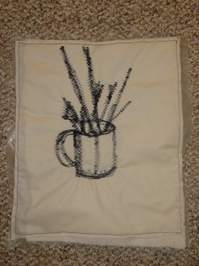
Finally, I set my machine to the widest possible zigzag stitch, and gave it a shot.

DSC02355

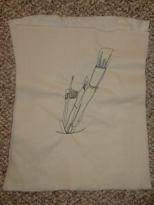
Boy, that was challenging.  I couldn’t move the fabric nearly as fast as I could the marker, and the fixed width of the stitch limited my options.  Therefore, I decided to try drawing with thread in a much more controlled manner.  (I turned the cup again.  Click on the photo to see it larger.)

DSC02356

This was much more viable, but I quickly discovered that I didn’t have the patience for it.  The big problem with drawing this way is the need to retrace lines.  Another issue is poor visibility when stitching away from your body.

Playing in this way was a good creative exercise, and a valuable experiment in determining the pros and cons of drawing with thread.  As a result of what I learned, I think I’ll limit my drawing to paper from now on.

Ellen Lindner
Gesture Sketching with Charcoal

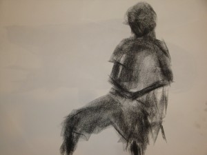
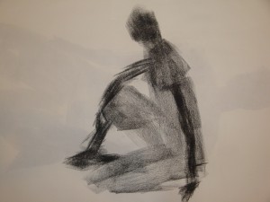
In my recent drawing class, we spent a lot of time doing gesture sketches.  These were fast sketches (3 minutes) in which we tried to capture the nature of the subject, without a lot of accuracy.

Although these were initially intimidating to my classmates and to me, I eventually came to love them because of their very loose nature.  And because the standards for realism are low! 

Still, we all felt a big jolt of anxiety when our teacher told us  we’d be drawing from a live model in our second lesson.  What???  However, it turned out that sketching a model was much easier than the still life arrangements we’d been  using previously.

gesture good 1

There are several different types of gesture sketches.  These are called “mass gestures.”  They were done with a short piece of charcoal, marking with the side of it for big heavy lines.

gesture good 2

Our teacher suggested that we first draw a stick figure, concentrating on size, proportion, and relationships.  That was very helpful!  It’s amazing how much easier it is to draw something if you don’t first lock yourself in to one of the outside edges.

The goal of these sketches was to improve our skills of “seeing.”  That is, noticing angles, lengths, proportions, and relationships.  I think they definitely accomplished that.  For that reason, and because they’re so non-threatening ,  I plan to do many more.

Artistic disclaimer:  I selected my best sketches for this post.  I GUARANTEE you that some of them were pathetic!  (Click images if you want to see a larger version.)

Ellen Lindner
Perfectly Flat Quilts

SJ Scene, before

Have you ever made a “friendly” quilt? 
You know, one that waves? 

I’ve had that problem multiple times, as can be seen in the quilt above.  (It’s lying on a flat table, but it has lots of hills and valleys.)  Thankfully, blocking will take care of such problems.  I’ve written an article on the subject, which you may find helpful:   Part One.

Tip:  If you subscribe to my monthly newsletter, you’ll always stay up to date with new quilts, articles such as this one, and class information.

Ellen Lindner
Design Class, Student Example

One of the great things about teaching online is that I get to interact with students all over the world.  One such case is Nathalie Goosens, from Belgium, who has now taken three classes with me.

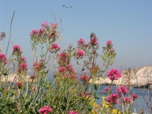
Nathalie especially enjoyed the Design Your Own Nature Quilt class, which teaches students how to interpret their own photo as a quilt.  This was her inspiration photo, taken near Marseille, France.

frioul

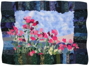
It was an excellent starting point.  However, Nathalie wisely made some important changes to the composition and contrast.  She used more saturated green fabrics for the vegetation and kicked up the contrast within the flower blossoms.  (Can you see how effective that little bit of dark burgundy is?)  The dark border is also setts off the composition extremely well.

Nathalie Goosens Marseille-Frioel copy

Marseilles V – Frioul
copyright 2008 Nathalie Goosens
(Click image for a larger view)

Nathalie improved the composition by making the blossoms form a more diagonal line.  Plus, she made the flowers spill into the adjacent border. 

It was great fun for me to work with Nathalie, as she progressed through this piece.  Along the way, she blogged quite a bit about it, and has kindly grouped her blog posts on the subject.  You can read them here.  (Start with the bottom post.) 

I’ve recently created an online gallery featuring pieces made by Nathalie and other students who’ve taken this class.  You’ll find it here.

If you’re interested, this class starts again on August 7th.  Full details.

Drawing Class

For the last eight weeks I’ve been participating in a drawing class.  Although it’s been challenging (which is the point really,) I’ve definitely gained some skill.

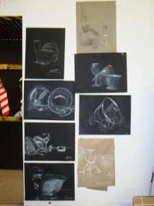
In future blogs, I’ll show you examples of some of the various techniques.  For now, I’ll show you something better:  everyone’s work from last week’s class.  Click the image to see a larger view.

DSC02564

The task for this exercise was to show the reflective qualities of the still life before us.  Most drew on black paper with white chalk.  (I was too cheap to buy the black paper, but after seeing these great results, I bought two pieces to use this week, in our last class.  Mine is in the lower right.)

At the risk of sounding too proud, I’m pretty impressed with all of us.  We’ve all improved dramatically since the first week.

Ellen Lindner