Tag Archives | Design

Drastic Reconfiguration

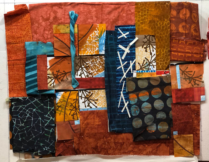
I “blame” Pat Pauly. I was watching a video in which she was teaching about color. In it, she was switching fabrics on and off of her design wall, showing how different combinations might work. Or not. It was mesmerizing!

I looked across the top of my laptop toward my design wall and KNEW that my current quilt needed a big dose of what she was describing. At the end of the video, I jumped up, with Adrenalin surging, and started throwing fabrics onto my quilt in-progress.

Drastic Reconfiguration. Ellen Lindner, AdventureQuilter.com/blog

Bam! The very first fabric added energy and excitement. Yes! This was the kind of thing that was needed!

Ooh, this next one had possibilities.

Drastic Reconfiguration. Ellen Lindner, AdventureQuilter.com/blog

Drastic Reconfiguration. Ellen Lindner, AdventureQuilter.com/blog

Hmm. Interesting (above.)

Drastic Reconfiguration. Ellen Lindner, AdventureQuilter.com/blog

Of course, I knew the large circles would work, since I had just used them in the previous quilt. But, I didn’t want to mimic the first quilt, so I’d have to be careful if using this fabric. It does look good, though, doesn’t it?

More large circles, some navy, and white. Yes, possibilities.

Drastic Reconfiguration. Ellen Lindner, AdventureQuilter.com/blog

Two blues?

Drastic Reconfiguration. Ellen Lindner, AdventureQuilter.com/blog

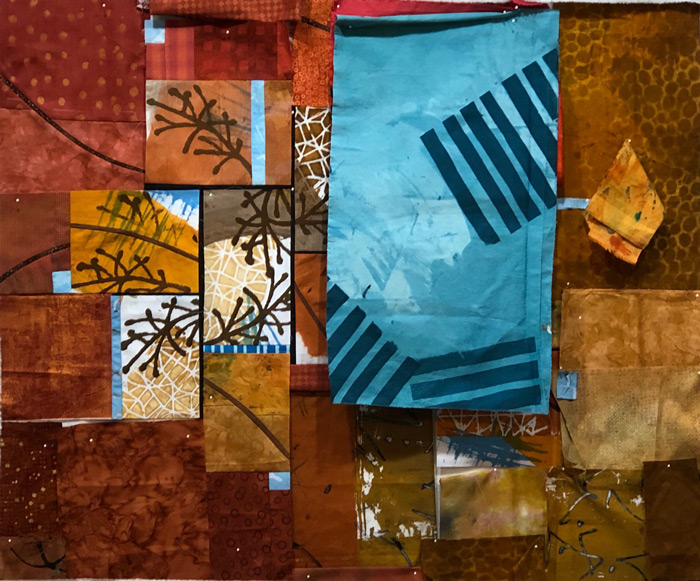
Of course, I could add more than one fabric and that’s what I decided to do. To improve the quilt I knew I’d have to take apart some of the twiggy bits, but I was willing to do that.

Drastic Reconfiguration. Ellen Lindner, AdventureQuilter.com/blog

Cuz it already looks more interesting, right?

Thanks, Pat!

Ellen Lindner
P.S. I’ve taken several classes with Pat and I’ve always gotten a lot out of them. I recommend her as a teacher and her hand dyed fabrics (which are for sale) are to “dye” for!

0

The Start of Something Twiggy

I enjoyed my last quilt so much that I decided to use the scraps from that one to start the next. With a little editing, I selected these fabrics as my starting point.

The Start of Something Twiggy. Ellen Lindner, AdventureQuilter.com/blog

Of course, I didn’t want this new quilt to look like the previous one, so I sorta shied away from the large circles, much as I loved them. I had a twiggy fabric I thought might be interesting enough to be the focus point.

The Start of Something Twiggy. Ellen Lindner, AdventureQuilter.com/blog

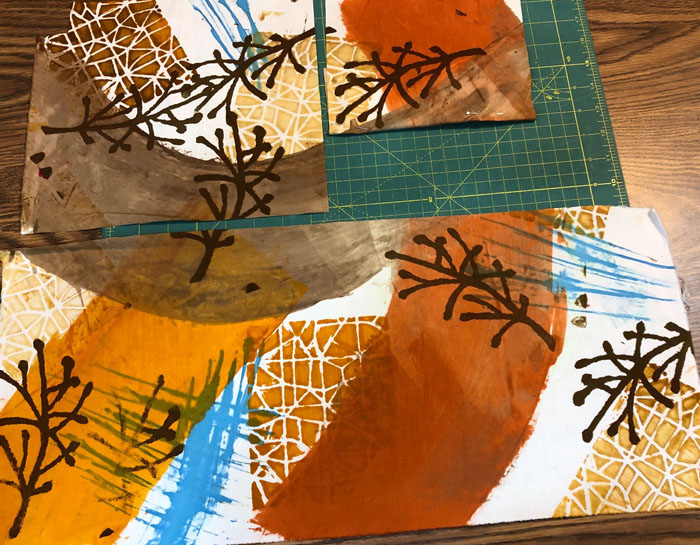
I didn’t like the dull gray brown parts, though, so I carefully cut the bulk of them away. The newly cut pieces are shown below. I really liked them and thought the high value contrast would be eye catching.

The Start of Something Twiggy. Ellen Lindner, AdventureQuilter.com/blog

So, I started to arrange things on the design wall. I clustered the twiggy parts together and planned to insert very narrow, dark lines between them. I thought this would play up the dark line contrast of the twigs. So far, so good.

The Start of Something Twiggy. Ellen Lindner, AdventureQuilter.com/blog

Hmm, I’m not sure I properly considered the scale of the twiggy parts. Could they carry all these other fabrics in a piece this size? Were they beginning to look skimpy? I could see that I needed something besides just squares of fabric for the perimeter pieces. What about curving skinny pieces? Could they play up the twigs idea? I auditioned the idea, below, and liked it.

The Start of Something Twiggy. Ellen Lindner, AdventureQuilter.com/blog

Yes, the curvy lines helped. And I added some little bits of blue. Also, because the twigs were looking a little lost, I reduced the size of the whole thing.

The Start of Something Twiggy. Ellen Lindner, AdventureQuilter.com/blog

I was getting close to piecing.

Or so I thought.

And then I watched a video.

Ellen Lindner


0

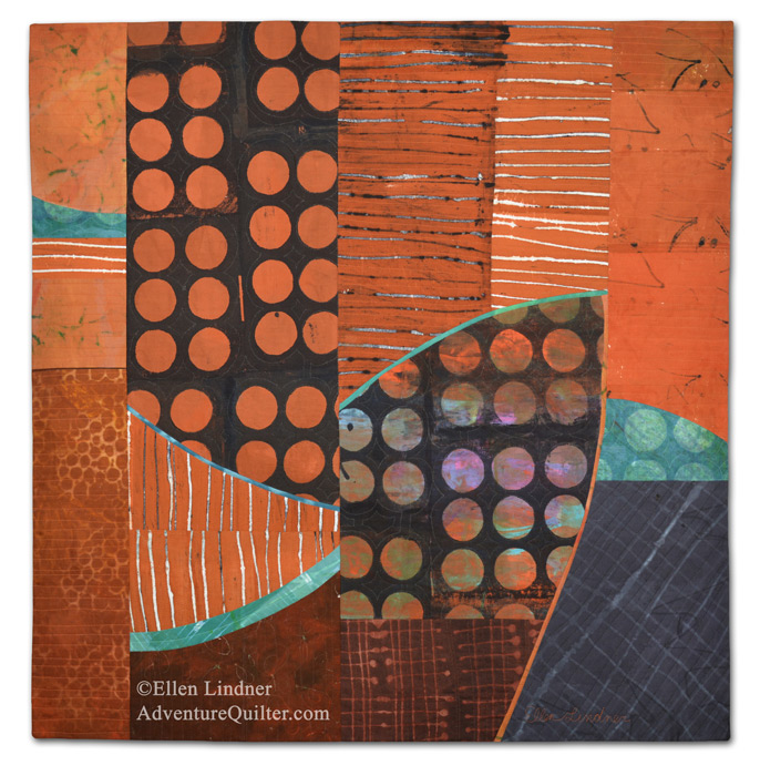
“Raking Season” Complete

I loved making this quilt and I’m VERY happy with the results!

Raking Season, an art quilt by Ellen Lindner. AdventureQuilter.com

Raking Season

I dyed all the fabrics for this quilt, except for one. I love how they go together! (Note: I didn’t dye them specifically to go together. They’re ones I’ve dyed over a couple of years, but because I’m often drawn to the same colors, stencils, and techniques they ended up being a very cohesive group.)

Can you see that this quilt only has about 12 pieces? I was able to use large pieces due to the patterns in the fabrics. I’ve tried that before, but I think this was my most successful attempt.

Here’s a detail shot:

Raking Season - detail, an art quilt by Ellen Lindner. AdventureQuilter.com

See larger images and more information about this quilt.

Ellen Lindner
P.S. If you want to see this quilt in-progress, check my posts from September 2022, or click the links below.

2

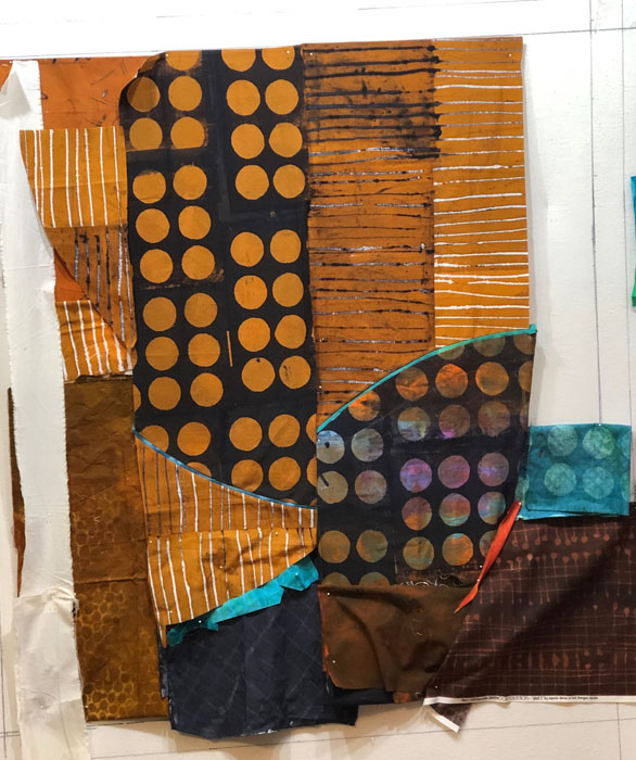
Brown Fabrics Coming Together

I was really happy with the way my latest brown quilt was coming together. It was time to add in some curves.

Brown Fabrics Coming Together. Ellen Lindner, AdventureQuilter.com/blog

Yes, that was more interesting.

Now what? I knew that massing colors together is often effective. So maybe I could add some dark ones near the bottom circle piece.

Brown Fabrics Coming Together. Ellen Lindner, AdventureQuilter.com/blog

Yes, something along these lines. As you can see, I worked in some more curves.

It looked like it now needed to get wider on the right.

Brown Fabrics Coming Together. Ellen Lindner, AdventureQuilter.com/blog

Oh yes! I was really getting excited about this!

Along the way I decided the far left panel needed to be narrower, for two reasons: 1 – to make it a different width from the far right panel, 2 – to move the dark black/rust circles away from center. I auditioned the idea by covering the left edge with a piece of muslin.

But, did the top need cropping too? Again, I auditioned the idea with a strip of muslin. (Which is exactly why I own these strips of muslin.)

Brown Fabrics Coming Together. Ellen Lindner, AdventureQuilter.com/blog

With a little tweaking and sewing the top was completed.

Brown Fabrics Coming Together. Ellen Lindner, AdventureQuilter.com/blog

I am LOVING it!!! On to quilting.

Ellen Lindner


0

Making Progress in Red

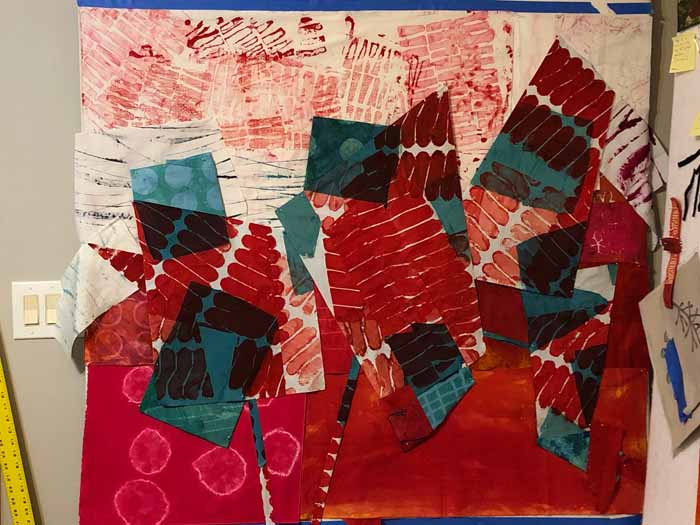
After trying several temporary background colors, I decided to make one side white and one side red.

Ta.ckling That Red Fabric. Ellen Lindner, AdventureQuilter.com/blog

I started with a new temporary background. The purpose of this is so I don’t have to compose against my pure white design wall. It helps me visualize.

This was first stab at a new composition. I could see that I’d be able to create lots of energy, thanks to the sharp angles and high value contrasts.

But again, it seemed like the green squares against the white were, once again, taking over.

I removed them and liked them better. (Note: most of the green shapes are just folded and pinned in place. This works well for auditioning ideas. I’ll delay cutting fabrics until I’m convinced about what needs to happen.)

I removed all the squares. That helped immensely in the top half, but I thought the bottom portion looked a little naked.

I added some squares against the red and I liked the effect.

Art quiz: why did I previously decide to remove green squares from a red background, but here I’ve just added them back? Answer in P.S.

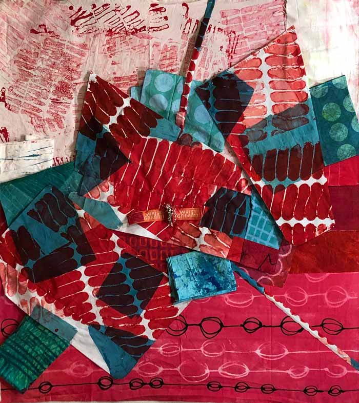
Next it was time for actual construction. It was time to remove those temporary background fabrics and switch in the ones that I’d need. In this photo I had just finished the first few red seams in the lower section.

I’ll need to go slowly, select the right fabrics, and figure out how to “tetris” this whole thing together. I imagine it will be a little challenging, but I think it will be fun too!

Ellen Lindner
P.S. Answer to art quiz: It goes back to the fact that contrasts in value always attract attention. In my last post I showed  you how the green squares were taking over against the red. That’s because of the value contrast between them. But, in this post I added those greens squares right back to the red bottom. That’s because everything affects everything else. When I change the background to white I created VERY strong value contrasts between the sharp red shapes and the white background. Therefore, they attract attention. The contrast between red and green is now secondary and not as noticeable. Remember, when you make one change you often need to make another.

0

Tackling That Red Fabric

I was excited to work with the red and blue-green fabric I had recently died. I pulled out all my other dyed fabrics in those colors and began to explore my options.

This was the starting fabric.

Ta.ckling That Red Fabric. Ellen Lindner, AdventureQuilter.com/blog

As you can see above, it was missing a chunk on the bottom right corner. So I evened that up, giving me a nice horizontal slice from the bottom. I intermediately looked to see where I might use it. What if I joined it back into the larger fabric at an angle? I auditioned the idea, below, and liked it. (Can you see how the red areas taper together?)

After a few more manipulations I was ready to see what happened on the design wall. Since I didn’t want to compose against a white background I put up a temporary red background and marked the proposed perimeter with tape. (The dimensions were determined by the width of my design wall, 4′, and the height of the primary fabric, about 42″.)

First “throw” at the design wall:

Then, with a little more intent:

I was liking the energy, but I thought the red was actually disappearing. To confirm my suspicions I looked at the composition in grey scale.

Yep. The blue-green squares were taking over.

So, what if I made part of the background white? I changed the temporary background in order to try out the idea.

Ah, yes. Now THAT had potential!

It was time to lose the temporary background and to start fresh with this new idea. I was excited to move forward!

Ellen Lindner


0

Composing with an Eye Toward Value

These were the fabrics I selected as I started on an abstract quilt with NO plan.

Working with Dwindling Fabrics, Ellen Lindner, AdventureQuilter.com/blog

Although I didn’t have a plan, I did have a goal. I wanted to use the last of my favorite fabric, the navy and yellow grid, and to let it be the star of the show.

BTW, can you see how the scale of that one print greatly affects the scale of the overall piece? I wouldn’t want to cut it into tiny pieces, for instance.

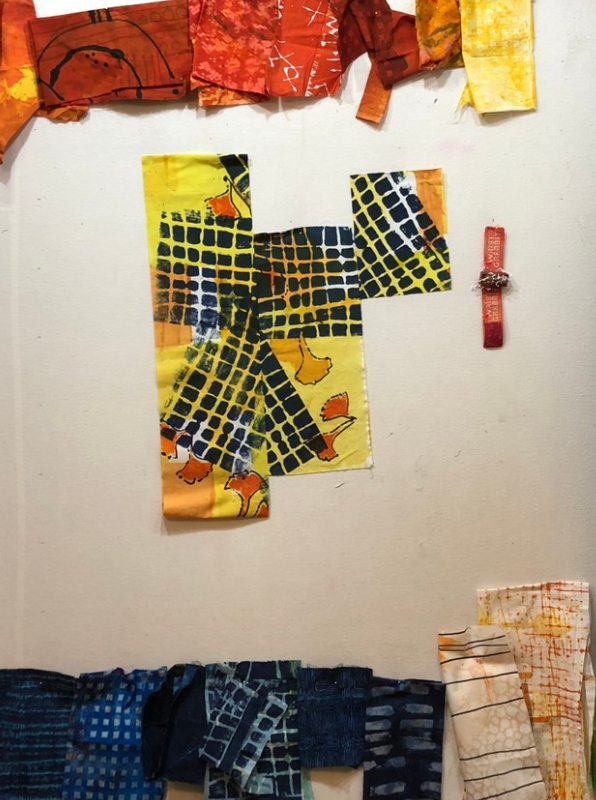
I had two lengths of the favorite fabric and I wanted to cut it as little as possible. I cut one piece into about a 1/3 – 2/3 split, so I had 3 pieces.. Since this fabric has the highest value contrast (light vs. dark) of all the other fabrics, I knew it would attract a lot of attention. Which was good.

Therefore, I moved everything else out of the way and created the first part of the composition with just these 3 pieces of fabric.

Composing with Value. Ellen Lindner, AdventureQuilter.com/blog

Because this fabric had a diagonal aspect to its design, it created a lot of energy. Plus, as you can see, I made sure to offset the pieces. I really liked this starting point! I knew I’d have to pay attention to the value contrasts that developed throughout the rest of the design, making sure that none of them drew attention away from it.

In the photo above you can probably tell that the left fabric is folded under at the bottom. I cut that off and added it to my starting composition, (see below.) I wanted to break up the large expanse of grid on the left piece and inserted a skinny orange strip (shown in the next photo.) I liked it a lot.

I let the fabric lead my next few decisions: adding more yellow and orange in their respective areas.

Composing with Value. Ellen Lindner, AdventureQuilter.com/blog

As you can see in the photo above, I didn’t have large pieces of orange, so I knew I’d have to piece those together. I thought I’d probably repeat the orange in the lower right, as well. Adding navy would be tricky. It would automatically create a very high value contrast, attracting attention. I’d have to consider it very carefully.

And what about that white in the top center of the photo above? Although I liked the fabric in the mix, it was right next to the navy grid, creating exactly the problem I was hoping to avoid. I did add some navy just right of center and I thought it worked there.

Next round. Navy top left: too strong!
Navy at the bottom: maybe.
White at the bottom right: maybe

Composing with Value. Ellen Lindner, AdventureQuilter.com/blog

Next round. Replaced top left navy with yellow-orange: MUCH better! (Low contrast, right?)
More navy at the bottom: probably. The navy is visually weighty which gives the piece some stability.

Composing with Value. Ellen Lindner, AdventureQuilter.com/blog

This hodge podge of scraps pinned to the design wall evolved only slightly as I began to figure out how to piece all of this. See the finished quilt in my next post.

Do you think about value this much? I find it very helpful, although sometimes I get seduced by a color or some such and forget to pay attention to the contrast.

Ellen Lindner


0

Working with Dwindling Fabrics

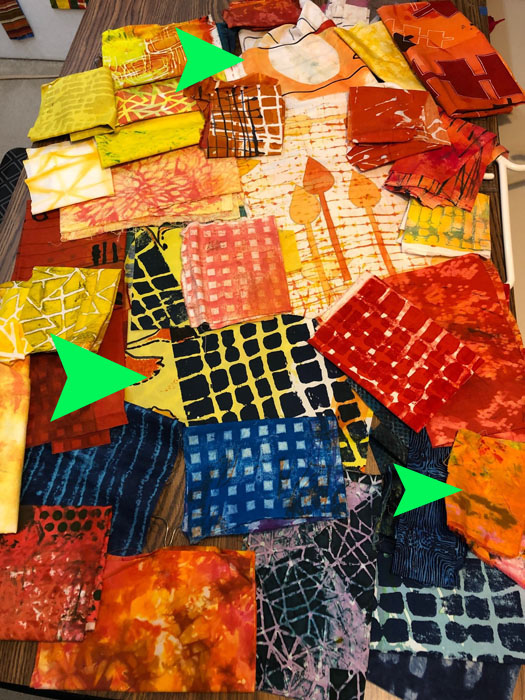
I was running low on a favorite hand dyed fabric when I decided to make a quilt with it. It’s the navy and yellow grid shown below, indicated by the largest arrow.

Working with Dwindling Fabrics, Ellen Lindner, AdventureQuilter.com/blog

I pulled every other hand dyed fabric that would go with it and this is the selection, shown above. Smaller arrows indicated two more fabrics that were down to fairly small pieces. I was loving the energy of these bright fabrics and excited to get started.

I pinned everything up on the design wall and began to edit. Now you get a better idea about the sizes of the pieces. Some of the fabrics had too much pattern and would draw attention away from my feature fabric.

Working with Dwindling Fabrics, Ellen Lindner, AdventureQuilter.com/blog

Some fabrics removed, I continued to study the combination. Still some competing fabrics.

Working with Dwindling Fabrics, Ellen Lindner, AdventureQuilter.com/blog

After deleting the “show stoppers” I thought this combination would be workable.

Working with Dwindling Fabrics, Ellen Lindner, AdventureQuilter.com/blog

I’d still need to edit and carefully consider as I proceeded. What about that near-solid navy? Will it be too strong? And the brighter blue grid on the left: too bright?

This was my starting point. These fabrics went on my work table, and all the others were moved out of sight. I didn’t have a design plan. My only plan was to feature that navy/yellow gridded fabric. All my decisions would be in support of it. I knew this would be challenging, but also invigorating.

In my next post, I’ll show you how I began to compose the design. It was fun!

Ellen Lindner
P.S. Do you ever work without a plan?

2

“Toast and Jam”

Remember that ugly exercise that I’ve been considering? This is the portion of my ugly painted which I selected as my inspiration for a small quilt.

Super Cool UGLY Exercise. Ellen Lindner, AdventureQuilter.com/blog

I played around with the individual elements in the computer and, at one point, accidentally colored the background red. Which I liked!

"Toast and Jam," and art quilt by Ellen Lindner. AdventureQuilter.com/blog

So, I started pulling fabrics and got to work. Actually, I got to work in a hotel room. This was my set up. Construction on the coffee table and Netflix on my laptop. With the iron at the perfect height, of course.

"Toast and Jam," and art quilt by Ellen Lindner. AdventureQuilter.com/blog

Once home, I stitched the background and fused up a bunch of fabrics for the background squares. (I fuse very seldom.)

"Toast and Jam," and art quilt by Ellen Lindner. AdventureQuilter.com/blog

I noticed that some of my lovely squares were attracting a lot of attention. I knew that wouldn’t work in the end, so I had to swap them out.

Eventually, I was happy with the background and started with the part I DID want to attract attention: the wonky open squares. This is a detail shot.

"Toast and Jam," and art quilt by Ellen Lindner. AdventureQuilter.com/blog

I added a little hand stitching, but that was difficult through the fused fabrics.

Here’s the full quilt, Toast and Jam, 24″ x 24″.

"Toast and Jam," and art quilt by Ellen Lindner. AdventureQuilter.com/blog

This was fun to work on, but I think I’m ready for something other than red!

This piece is available for $195 US. Contact me if you’re interested.

Ellen Lindner

2

Turning Leftovers Into a Meal

After making Potager Garden, I had quite a few scraps left over, so I decided to use them to make a small quilt. This is what I had to work with.

Turning Leftovers Into a Meal. AdventureQuilter.com/blog

I began to move them around to see how they might fit together. I didn’t like this first version, though. I thought it needed more yellow, if I could find some in my stash.

Turning Leftovers Into a Meal. AdventureQuilter.com/blog

Plus, the colors in the first version (above) were pretty evenly scattered about. That works for wallpaper, but not always for art. I remembered what I had recently learned about massing a color and switched things to this.

Turning Leftovers Into a Meal. AdventureQuilter.com/blog

Much better! And I didn’t change it much after that.

This is the finished quilt, I Hope You Like Peppers.

I Hope You Like Peppers, an art quilt by Ellen Lindner. AdventureQuilter.com

Here’s a detail shot.

I Hope You Like Peppers - detail, an art quilt by Ellen Lindner. AdventureQuilter.com

See larger images and purchase information.

Ellen Lindner


2