
Backgrounds by Design
What’s the subject of your latest quilt? Is it something representational, like a plant or a person? Or is it purely geometric or abstract? Either way, the background and foreground elements must work together to make a design work. That’s why quilt backgrounds deserve just as much thought as other design elements.
A good quilt background does two things: it enhances the foreground design and it adds interest. In that order. The main function of a background design is to provide contrast with the primary imagery/design. That contrast can be subtle or bold, based on your personal preferences.
A common way to provide contrast is with color. Apple Still Life is a good example of this.

Apple Still Life
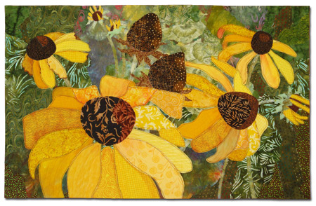
Blossom Boogie utilizes this concept, as well. With both quilts the background colors provide a high degree of contrast, setting off the foreground elements beautifully.

Blossom Boogie
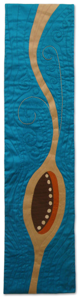
Another form of contrast is value, (light and dark.) In Gold Pear the same color was used throughout. With only value variations to provide contrast, the effect is subtle. As a matter of fact, it was almost too subtle. As I was working on it, the pear began to merge into the background on the right side. I had to increase the contrast by making the background lighter in that area.

Gold Pear
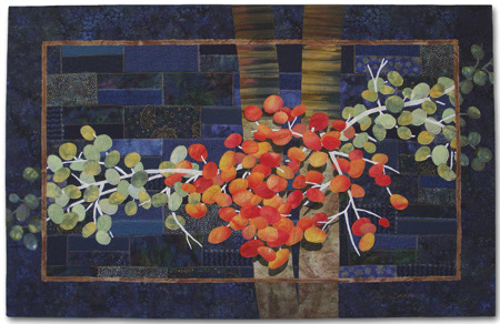
Rhapsody in Blue Berries also uses a background of a different value. It’s lighter than the berries and darker than the tree trunks, providing contrasts both ways.

Rhapsody in Blue Berries
Sketching in Silk #3
The Last Few Dates
Most quilts will have both contrasting colors and contrasting values in the background. For example, see Sketching in Silk #3, at left, and The Last Few Dates, at right. Although different palettes are used, both quilts have contrast provided by both concepts.
Also note that they both have backgrounds of dark blue-green, but they do not have the same amount of contrast. That’s because it’s always about the combination. In the left quilt, the tan foreground provides a very high contrast. But, in the right one, the foreground color is much closer to the background one. Two different combinations yield two different feelings. Either way, there MUST be some level of contrast in order for the foreground design to show.
Another way to add contrast between the background and foreground is to vary the intensity, or brightness, of the colors. Bright colors always get more attention than dull ones, so if the background is created with slightly duller fabrics, this will help show off brighter foreground elements. These next two quilts are examples. Both have similar color themes: a yellow-green background and foreground elements of yellow-orange and/or orange. In Tropical Fruit I was inspired by the colors of mangoes. Therefore, I used fairly bright colors throughout. And I’m happy with the result.
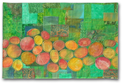
Tropical Fruit
But, with Blessings Underfoot I really wanted to emphasize the flowers only. So, I used yellow-green fabrics that were duller and darker, to help set off the yellow-orange flowers.
Blessings Underfoot
Depending on the values and colors of your design, the background plan may need to change from one spot to another. As with Natural Progression. Originally, the background was a pretty consistent value throughout. However, it was quickly obvious that the dark seed heads in the center of the quilt weren’t showing up. The solution was to lighten the background in that area, thereby creating the needed contrast.
Natural Progression
With any background plan it’s important that printed background fabrics don’t merge into the foreground elements. For instance, look at “Ripening,” at left. I had some great printed fabrics I would have liked to use in the background, but I didn’t want them to blend into the berries. So, I used near-solid fabrics in most areas. I was still able to use a few prints, placing them in the open areas of the background. This avoided any conflict with the foreground design.
Ripening
I used the same idea in several other quilts in this article. Can you identify a quilt with plaid fabrics on the perimeter only? And another with a busy print seen only on the sides? (I haven’t always been aware of this principal, so there’s a least one quilt in which I could have done better. But, now I know: paying attention to contrast is the key!)
Of course, any quilt background should do more than just provide contrast. It’s also an opportunity to add interest to your quilt, and to visually support the primary design. Hopes and Daydreams is a perfect example of this. Wouldn’t it be boring if the entire background was one solid piece of blue-green fabric? The variety of shapes, prints, and colors are big players in the success of this quilt.

Hopes and Daydreams
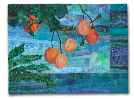
In Crotons the background has also been broken up and given interest by the use of multiple fabrics and patterns.

Crotons
The quilting stage also provides an opportunity for more variety. Especially if there are large spaces that can benefit from contrasting thread designs.

Crotons – detail
Snapdragons takes the idea of printed background fabrics one step further with the addition of highly patterned pieces. The inspiration photo had a tree in the background, which was very dark, with dappled light coming through its leaves. I thought that value contrast was interesting, but felt no need to be exact with my colors.

Snapdragons
Of course, you can go overboard with this. Too much pattern or color can actually draw attention away from the primary image. The way to avoid this is to audition both background and foreground fabrics together, very early in the design process. Because it’s always about the combination! No visual decision can be properly made without seeing how it relates to everything else.
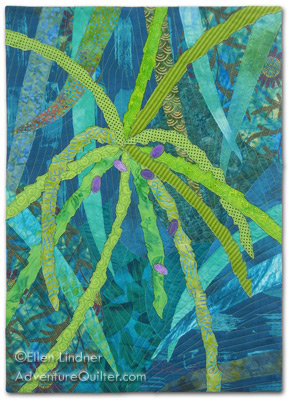
Another way to add interest to the background, and to integrate it well with the foreground, is to include shapes that help tell the story. For instance, the pygmy palm which inspired Thorns and Berries included many more thorns in the background. I eluded to these with sharply angled and straight background shapes.
Thorns and Berries
With The Last Few Dates the opposite was true. The background was composed of many smooth and curved leaves. Not only did I cut actual leaves in this shape, but I made sure the pieces behind them were similar. Wouldn’t it have been distracting if I’d used the same sharp and angled shapes I used above?
The Last Few Dates
For Lakeside Citrus it’s easy to see that the undulating and wavy shapes of the background fabrics help to give the
impression of water. There are so many options!
Lakeside Citrus
Ti Plants A-Glow-Glow utilizes all these ideas. The background has enough pattern to add interest, while the color and values provide contrast. And the shapes hint at busy tropical foliage. Again, I planned for the location of the focal point, the top area of the left plant. Knowing that I wanted a lot of contrast, I was careful to make the background darkest in that area. I kept it all green and black, however, not wanting to distract from the pink plants.
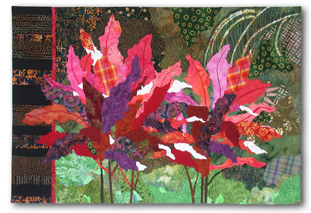
Ti Plants A-Glow-Glow
Later, I made another quilt featuring ti plants, High Ti. This time I wanted to work rather loosely, and also to represent the busy and bright tropical foliage in the vicinity. I included this in the background, even though I knew it would compete with the foreground. It was simply part of the idea I wanted to convey.
High Ti
The background above comes very close to merging with the foreground, but it was necessary to the story I wanted to tell. Of course, YOU will decide what’s important to YOUR quilt and make design choices accordingly.
Whether your quilt is a representational, abstract, or geometric, you can use these concepts to help your backgrounds work harder for you. Ask these questions:
– How much contrast do you want between the foreground and background?
– What value (lightness/darkness) should it be? Does that need to vary in any areas?
– What color will look best? (Remember that darker, duller colors will help the others to pop.)
– How can you add interest to your background with pattern, multiple fabrics, etc.?
– Finally, are there any areas where the background is attracting more attention than the foreground? What can you do to change that?
Here are a couple more quilts that employ the concepts discussed. Note that the backgrounds by themselves may
not be particularly beautiful. But, they’re what’s needed in each case.
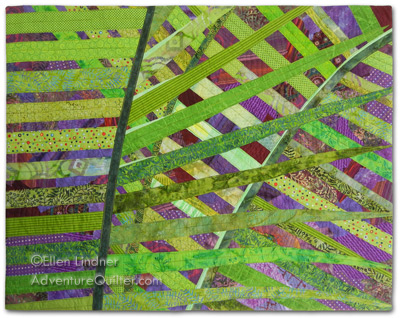
Crisscross
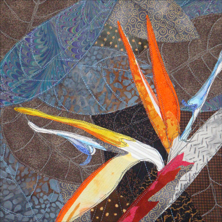
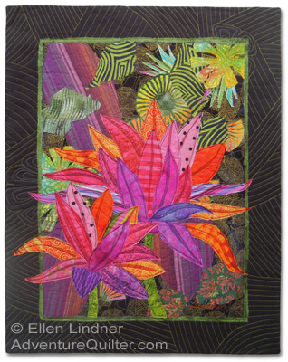
Bird of Paradise
The backgrounds of our quilts are VERY important. They visually support and enhance everything else, making them
well worth any quilter’s time and consideration
You may also enjoy a photo essay about the making of my quilt Ti Plants A-Glow-Glow.
If you found this information useful, you may be interested in my other free articles, online classes, and e-books. Full directory