“Circling Back,” a Tiny Little Thing
You’ve heard of trunk shows, right? When a group of quilts travels in order to be shown at various quilt guilds, shows, meetings, etc.? Here in Florida, my SAQA co-rep, Karol Kusmaul, had the brilliant idea of doing something like this on a statewide level. We’re calling it a “Roaming Gallery.” (Her idea, which I love.)
The idea is to make tiny quilts, only 7″ x 10″, mounting them very professionally, and then sending them around the state for various purposes.
So, I got to thinking about my contribution. As is typical for me when doing something this small, I used scraps from a recent project. You know, the stuff that’s still out on my table and not yet put away. In this case I used a small scrap of indigo, left over from Indigo Hug.
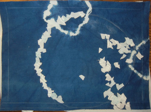
The two small circles above were created as part of the dying process. Small rocks were caught up in the fabric and secured with rubber bands. These acted as a resist, preventing the dye from penetrating in that area. Cool, right? Since the fabric already had partial circles on it, continuing with more seemed like a logical idea. Above, I auditioned the idea of adding a very irregular circle with tiny little pieces of fabric. But, I didn’t care for it.
Next, I added fatter circles cut from white fabric.
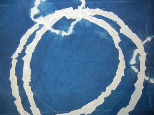
I liked that but thought it needed more. What about another circle?
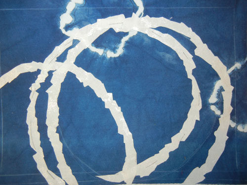
Yes and no. This 3rd circle is too much. Yes, it adds interest, but it throws the balance off. I decided to add circles in a much smaller scale. But, would that mean smaller fat circles or just skinny circles? More trial and error was needed.
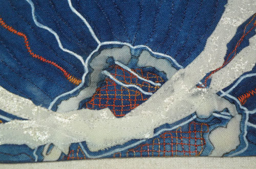
This is where I took it: squiggly lines drawn with a permanent pen, squiggly satin stitching, squiggly straight stitching, and crosshatch stitching. And, of course, I had to add some complementary (opposite) orange. Here, you’re looking at a detail of the finished left side.
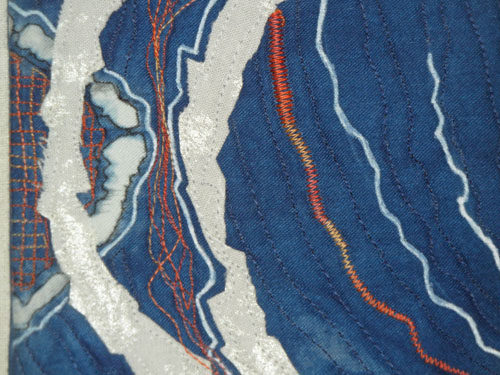
And here’s a similar treatment given to the bottom.
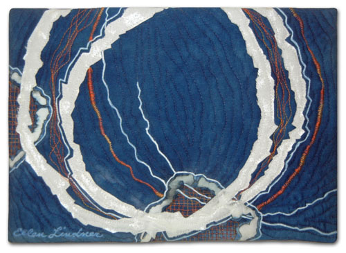
And the full piece, Circling Back.

I’m quite happy with it. Working this small is pretty challenging since each little detail carries a lot of weight. Everything has to be “just so.”
A couple of other points:
– Did you notice the white perimeter lines in the earlier photos? Those represent the dimensions of the finished quilt. When working at this scale I find them to be very important. Several times I folded the fabric back on these lines so I could check the composition as it would be when complete. At this scale that little seam allowance variation makes a huge difference.
– We’ll use these quilts to educate others about art quilts and SAQA, our organization. But, they might also come in handy when we’re trying to secure exhibit venues. If you were a curator unfamiliar with quilts as art wouldn’t you love to be able to see these tiny examples?
Ellen Lindner
P.S. See another small auction quilt.


Ellen, I use a set of right angles cut from file folders to audition my work. When making postcards I can cut the window out of the file folder, put the piece inside, and then pin it to the design wall and take a look. It is much easier than folding the sides back like you did.—–Just something I learned in my art/drawing classes.
Sort of like the hands held up to a scene in a movie–this allows you a better and far away look.
LIke the piece by the way–and a great idea. Can you write it up for SAQA journal??????
Hi Sylvia,
Thanks for the tip, Sylvia. I use the file folder trick, too, but with a variation. I’ve cut a folder into two L shapes. I can move them around to visualize cropping, etc. I also have my students do the same thing in “Design Your Own Nature Quilt” class.
I’m glad you like the piece, (but I’m not sure it’s journal worthy.)
I love your little quilt!
Thanks, Kristin! You’re good for my ego. 🙂
Love it! And I enjoyed your description of the process. Did you realize that the two original shibori circles kind of disappeared? It’s funny how often that happens.
That hadn’t quite registered, Dij, but you’re right. Glad you like it.
I ove this one. It ints at all sorts of “deep” things, from a portal into space to …?
Thanks, Candy!
Magnificent.
Ellen-I noticed you used variegated thread. I have used it to advantage, but mostly not. Do you have any pointers about when it works and doesn’t?? Thanks, MJ
Hi MaryJane,
Variegated threads can be tricky. Some brands have a lot of value shift and those are difficult to use, in my opinion. They blend in in some areas and show up strongly in others. Not generally what I want. But, if the value shift is minimal (more of a color shift) they can work really well, especially in areas with a lot of different colors in the background.
I sorta broke my own rule this time in that I used it for satin stitching. This creates a striped effect that I generally don’t care for. But, I liked it okay here. Still, I think it’s more effective in the busy “darning” and straight stitching areas.
Thanks for asking!
Thanks for your thorough answer. I must have used them where there was too much contrast. Busy area would have been better-as you suggest. I get fooled by how
pretty they look on the spool. MJ