
Thinking about Proportion and Scale
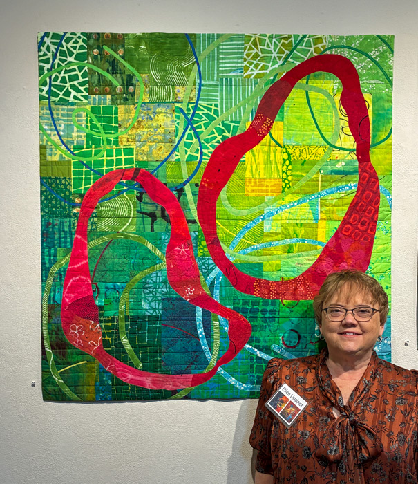
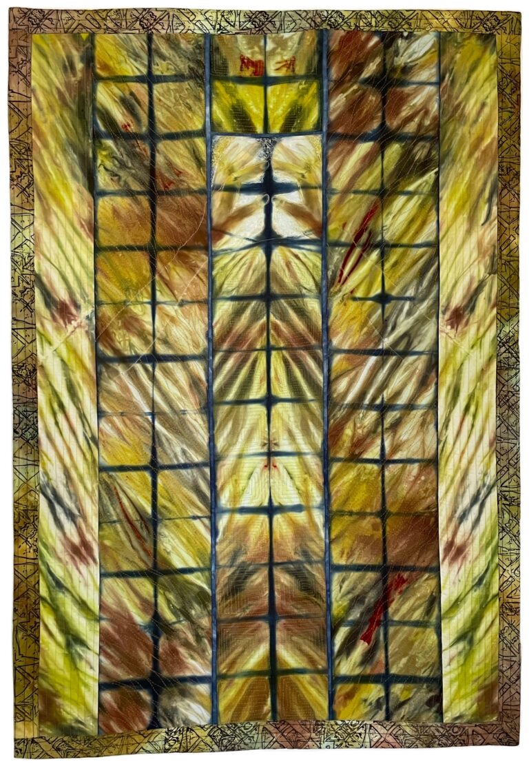
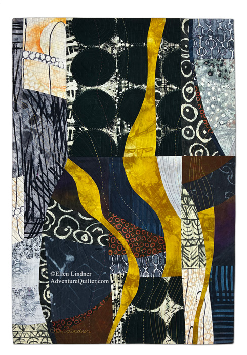
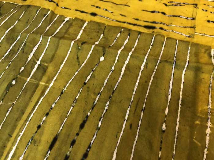
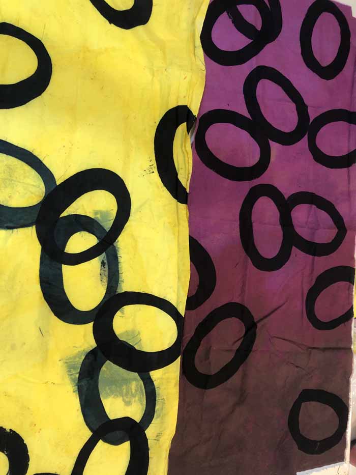
I was recently reminded of the importance of proportion and scale within an artwork. I’ve been working with some fabric I printed with a garden screen as a stencil. That gave me lots of oval “bubbles” and I’ve been trying to stretch the fabric and see how many quilts I can get out of it….