The Need for Blobs and Black
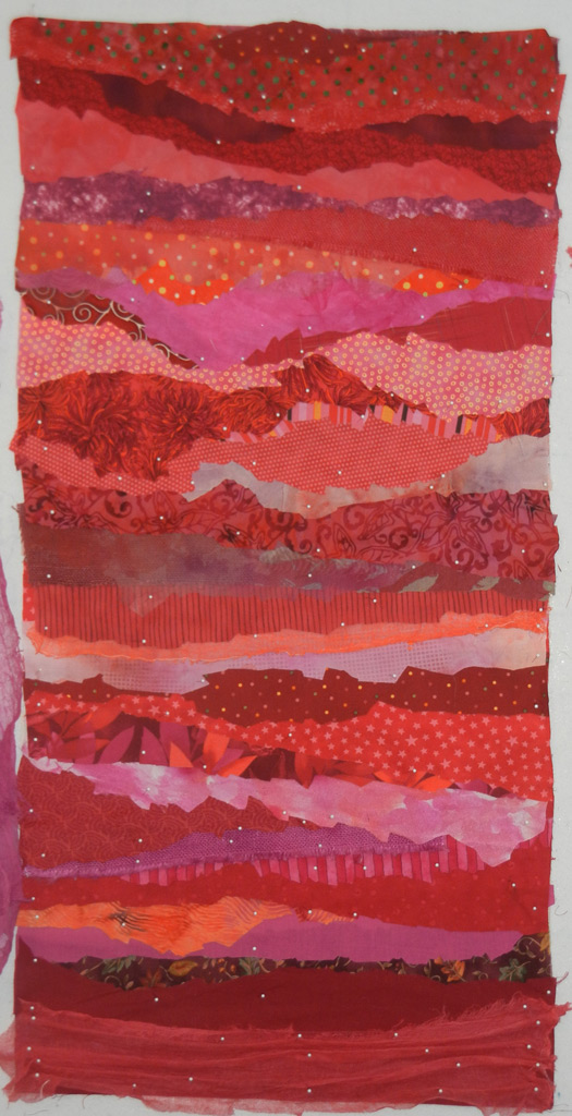
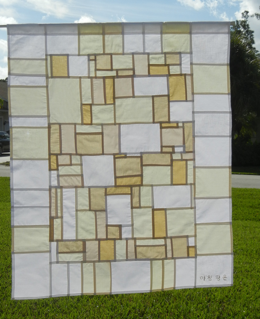
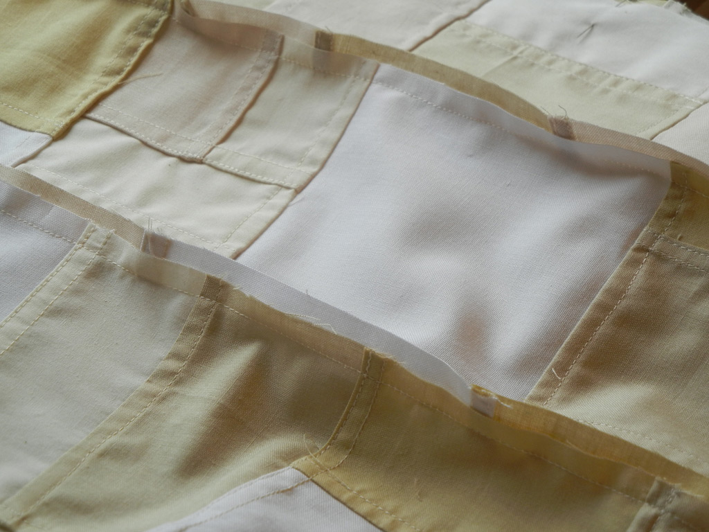
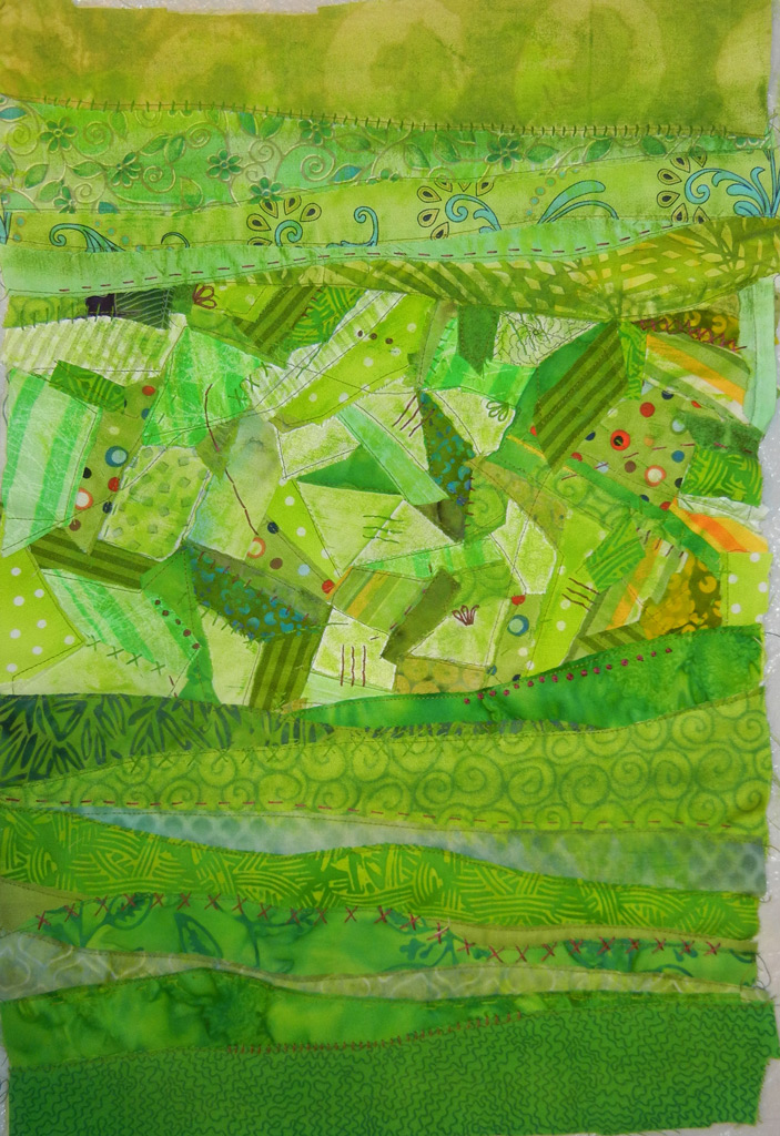
In my last post, I showed you the start of my latest red quilt. I was beginning to add colorful “blobs” to improve the composition and to add interest.
Click any image for a larger view
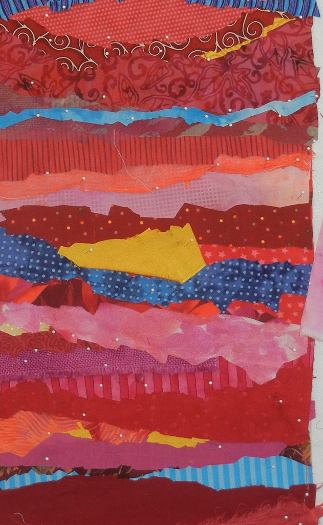
Two blobs added:
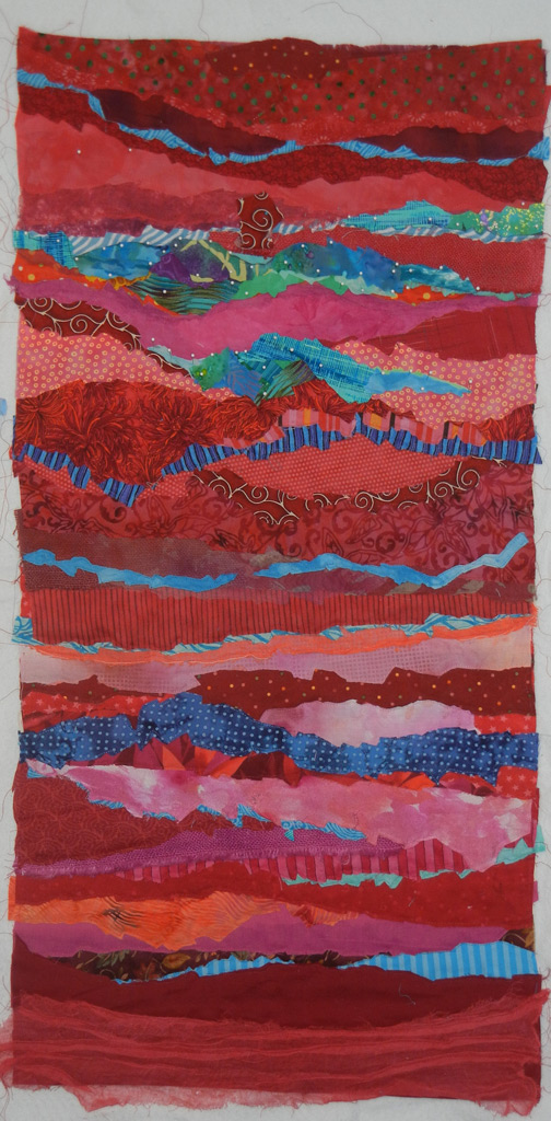
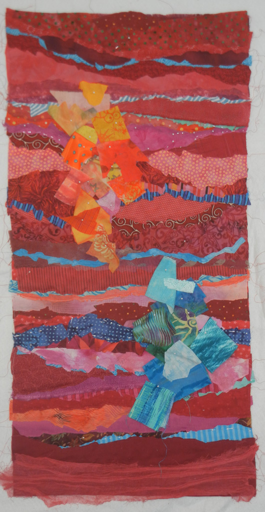
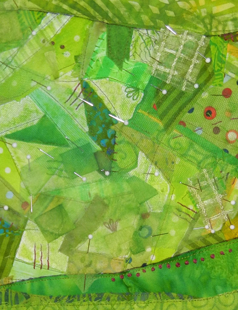
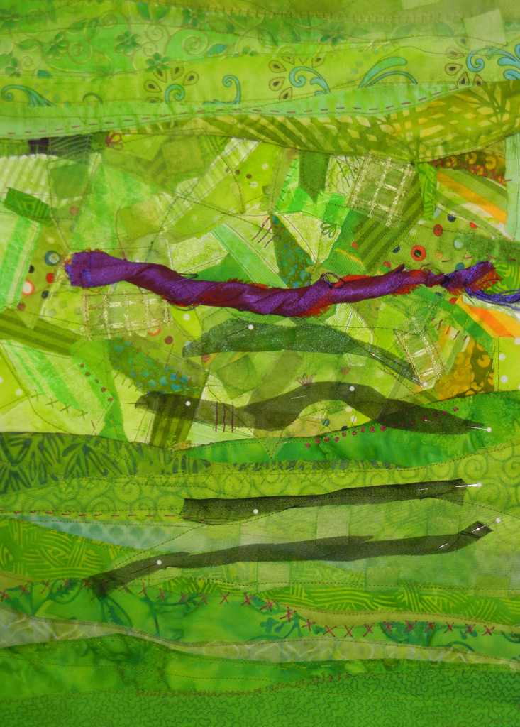
I added a couple more blobs and then began to add hand stitching. Much of this will be subtle, and will be the reward for up close inspection.
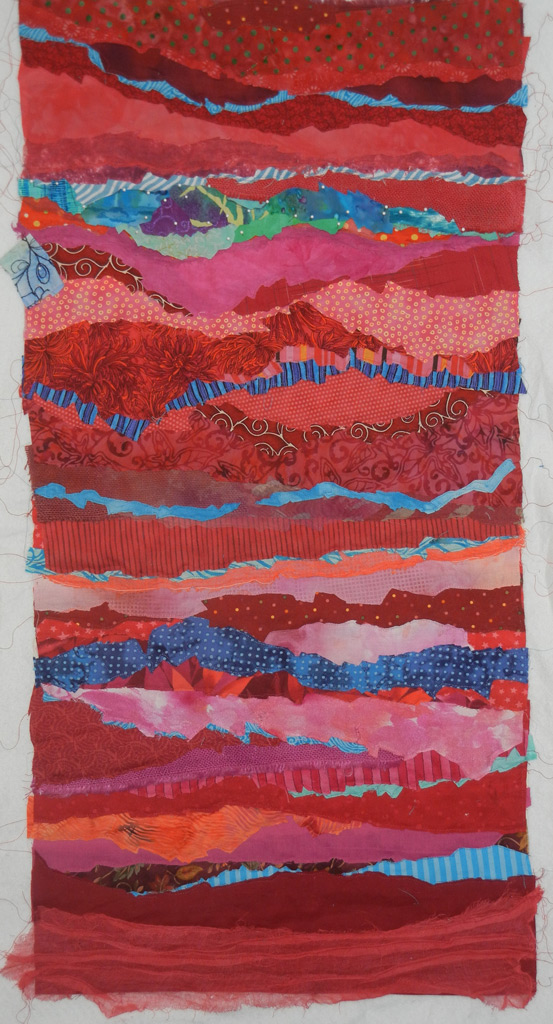
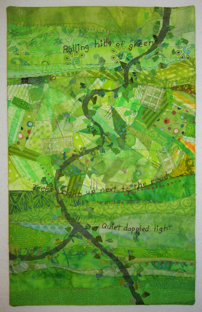
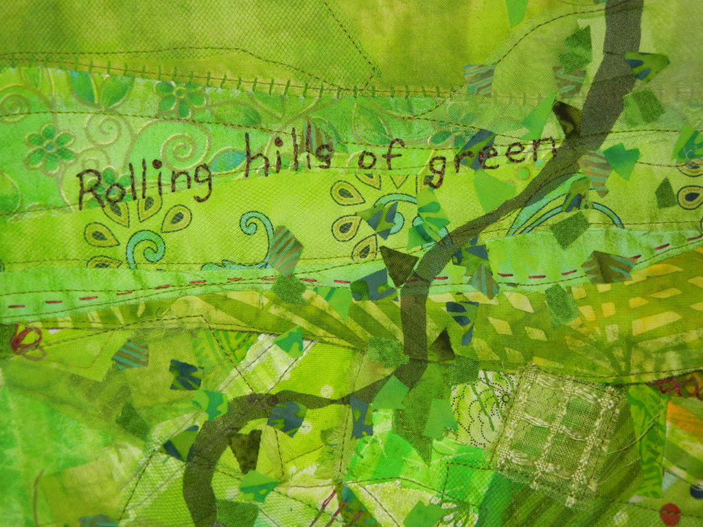
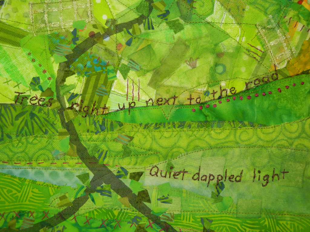
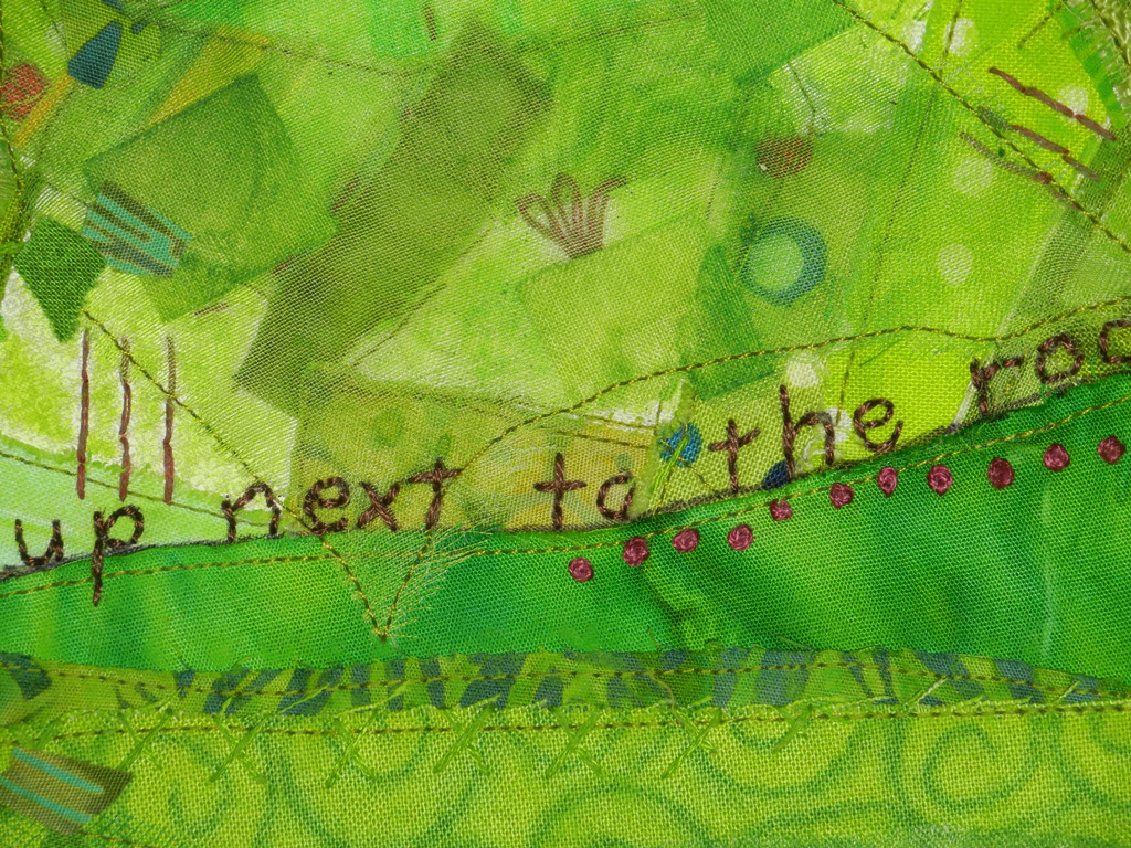
Still, I think the quilt needs some more definition. A little black. should do the trick. So, I’m adding that with hand stitching. Maybe you can see it, below.
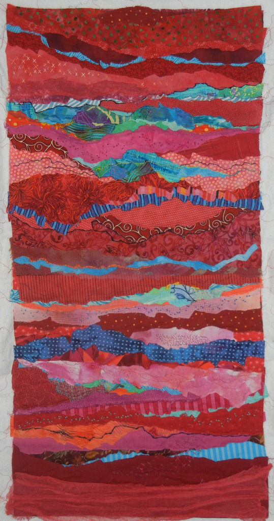
No? How about now?
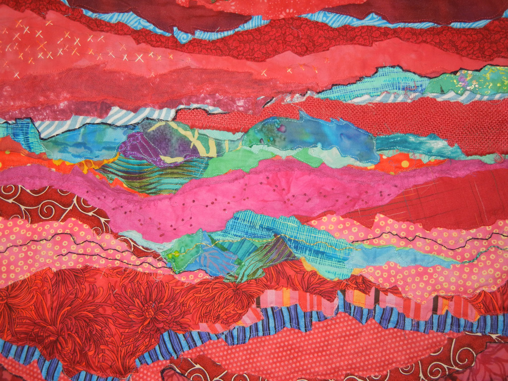
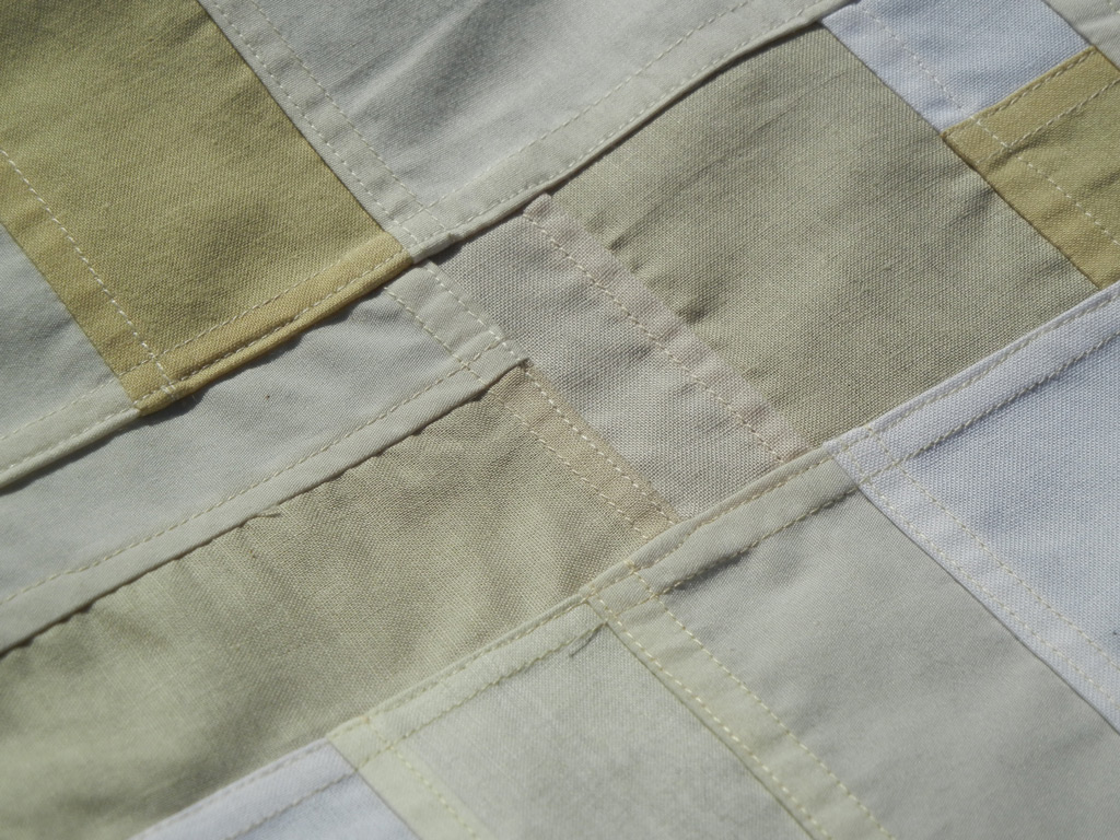
I think the little black lines work very well. Click on the image to see French knots and cross stitches, as well.
I have more hand stitching and quilting to do on this piece. Then, probably some beading. It’s all fun!
Ellen Lindner
P.S. Do you use much hand stitching on your quilts?
Check out my Pinterest board about quilts with hand stitching.