Tag Archives | Techniques

Deconstructed Screen Printing: Drawn Designs

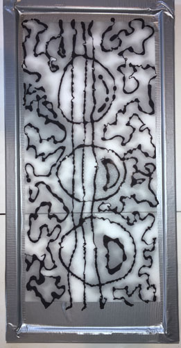
Now, THIS is exciting stuff!  After doing deconstructed screen printing with randomly created screens, I decided to draw on my last screen, with a syringe.  This is a technique I learned in a DSP class with Kerr Grabowski.

Deconstructed Screen Printing: drawn design. Ellen Lindner, AdventureQuilter.com/blog

That’s my screen above.  I drew on it with very thick black dye.  In fact, it was actually too thick and it came out in glops and curly-Qs.  None of which mattered for my purposes.

And here’s the first pull with that screen. You can barely see the clear dye paste I used on the far right.

Deconstructed Screen Printing: drawn design. Ellen Lindner, AdventureQuilter.com/blog

Is that cool or what?  Some of the dried dye in the screen has dissolved with the print paste and has given a little gray color. But, the heavy black lines are thick enough to act as resists and they’ve created white lines.  Not what you’d expect, right?

The first few pulls with colorless paste looked somewhat similar.  Here’s a more detailed shot.

Deconstructed Screen Printing: drawn design. Ellen Lindner, AdventureQuilter.com/blog

Before I show you the rest of my results, here’s more of an overview, using Gabriele DiTota’s work as examples.  She was our ring leader for the day and she got some great results.  Here are her first few pulls with her syringe-drawn screen.  (She was smart enough to thin the black dye paste so she avoided the gloppy curly-Qs.)

Deconstructed Screen Printing: drawn design. Ellen Lindner, AdventureQuilter.com/blog

After a few of these colorless pulls, she switched to red dye.

Deconstructed Screen Printing: drawn design. Ellen Lindner, AdventureQuilter.com/blog

The red dye colored the background, but the drawn squeegee lines still created a resist resulting in white lines.  Pretty cool, right?

Deconstructed Screen Printing: drawn design. Ellen Lindner, AdventureQuilter.com/blog

Like Gabriele, I decided to add a background color to my efforts.  I was aiming for blue-green, but I initially got mostly green.  As I slowly added more blue, I pulled screen after screen, resulting in a run of blues and greens.

Below you can see the detail of the first couple of pulls on the left and later colored ones on the right.  As you can see, the drawn design is beginning to break down on the right and the details are fading.  No worries.  It’s just a different design.

Deconstructed Screen Printing: drawn design. Ellen Lindner, AdventureQuilter.com/blog

I got carried away and added a bit too much black to the one on the far right.  The fabric is wet in this photo, so it looks especially vibrant.

Deconstructed Screen Printing: drawn design. Ellen Lindner, AdventureQuilter.com/blog

And here’s the full run, washed and dried.  As you can see, it lost a lot of color in the wash, but I still love it!

Deconstructed Screen Printing: drawn design. Ellen Lindner, AdventureQuilter.com/blog

A super close up.

Deconstructed Screen Printing: drawn design. Ellen Lindner, AdventureQuilter.com/blog

I LOVE these results!  If I ever do DSP again, I think I’ll do this sort of drawing on all my screens!

Now, what will I do with all this luscious fabric?  That shouldn’t be a problem!

Ellen Lindner


6

Deconstructed Screen Printing: Random Design

I recently got to play with deconstructed screen printing again, and I got some pretty cool results.

The process is easy, but it also involves a fair amount of dyes, equipment, and set up.

Deconstructed Screen Printing. Ellen Lindner, AdventureQuilter.com/blog

Here’s a brief video overview.

You start by purposely allowing thickened dye to dry in your screen.  A random design is created by putting various textured things under the screen when adding the dye.  The texture creates puddles and such, which hold the colored dye in a pattern.

Here’s my red screen.  When creating it, I put rubber bands, a strip of corrugated cardboard, bubble wrap, and plastic grid underneath the screen. Can you see how the various textures made the dye build up in interesting patterns and thicknesses?

Deconstructed Screen Printing: random design. Ellen Lindner, AdventureQuilter.com/blog

Next, you pull colorless dye paste through the screen.  This causes the dried dyes to break down and to color the fabric in interesting ways.  But, each pull is different, because the dye design is being broken down (deconstructed) each time.

These are the first 3 pulls using the red screen above.  Number 3 has been inverted.

Deconstructed Screen Printing: random design. Ellen Lindner, AdventureQuilter.com/blog

I continued on until there was not much of a pattern left, eventually printing only part of the screen.

Deconstructed Screen Printing: random design. Ellen Lindner, AdventureQuilter.com/blog

All my red fabric.

Deconstructed Screen Printing: random design. Ellen Lindner, AdventureQuilter.com/blog

Here’s my oh-so-boring blue screen.  It was made with a heavy crocheted tablecloth scrap, and a doily (I think.)

Deconstructed Screen Printing: random design. Ellen Lindner, AdventureQuilter.com/blog

Surprisingly, it printed pretty well.

Deconstructed Screen Printing: random design. Ellen Lindner, AdventureQuilter.com/blog

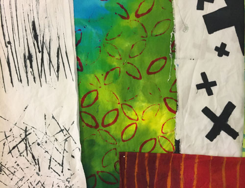
Not happy with the stark contrast of white with one color, I decided to over paint/over dye everything.  I got a little carried away with this one, making the green dye darker than I intended. I was philosophical, though.  I knew I could use green fabric as easily as blue.

Deconstructed Screen Printing: random design. Ellen Lindner, AdventureQuilter.com/blog

I over painted the red with a variety of orange, rust, brown, etc. Not bad, I thought.

Deconstructed Screen Printing: random design. Ellen Lindner, AdventureQuilter.com/blog

A detail shot.

Deconstructed Screen Printing: random design. Ellen Lindner, AdventureQuilter.com/blog

I think these fabrics will be useful.

The red fabric held it’s color well, even when rinsed four times and washed once.  But, look at the blue!

Deconstructed Screen Printing: random design. Ellen Lindner, AdventureQuilter.com/blog

What happened to the blue, you ask?  That’s what I’d like to know.  Clearly, that dye was weak for some reason.  And what about the reds spots above?  Did I accidentally get red dye on it?  Nope.  It appeared during the rinse and wash process.  I’m guessing there was some red in the yellow dye that I used to create green.  So, unexpected results, but a usable piece of fabric, nevertheless.

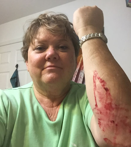
One other thing.  Dye is harder to remove from skin than paint.  Ask me how I know.

Deconstructed Screen Printing: random design. Ellen Lindner, AdventureQuilter.com/blog

The designs for this screen printing were all random.  In my next post I’ll show you what happened when designs were drawn on the screen.  They all turned out really great!

Ellen Lindner


2

My Brothers

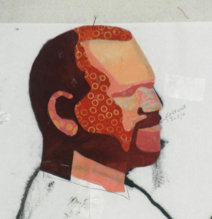
I’ve been thinking about making a quilt inspired by this photo (composite) of my two brothers.My Brothers - making faces. Ellen Lindner, AdventureQuilter.com/blog

I took quite a few photos that day and loosely merged 3 to get this composite.  In the quilt I’ll leave out the extra arm and the clay pigeon thrower.

This will be a special quilt for several reasons.
– My brother Ricky, on the left, is no longer alive.
– It depicts a family tradition: target shooting on the farm after Thanksgiving dinner.
– In shows both brothers relaxed, and in their element.  They are/were both excellent marksmen.
– It will complement an earlier family quilt I made.  I’ve sized it accordingly.
– It relates well to a current call for art titled “Guns:  Loaded Conversations.”

For this project I knew I’d need something I seldom use: a pattern.  At least for the two men. I created it with a combination of computer editing and good old tracing.

My Brothers - making faces. Ellen Lindner, AdventureQuilter.com/blog

Next came fabric selection for the faces.  Maybe something like this.  (Or do I need a darker one?)

My Brothers - making faces. Ellen Lindner, AdventureQuilter.com/blog

I used the “cutout” filter in Photoshop Elements to help me finalize the pattern for Ricky’s face.

My Brothers - making faces. Ellen Lindner, AdventureQuilter.com/blog

My process was to fuse fabrics for the features, cut out pattern shapes, and fuse/assemble them on parchment paper.  That latter part was new for me and more than once I fused fabric to my pattern instead!

Here’s his finished face and I’m extremely happy with it.

My Brothers - making faces. Ellen Lindner, AdventureQuilter.com/blog

This looks just like him.  So much so that both my sister and mother were startled when they stumbled upon it on Facebook.  Yay!  I think I’m on track.  What do you think?

Ellen Lindner


17

Online Class with Jane Davies

After getting so much out of Jane Davies’ book about abstract elements I decided to take an online “class” with her.  I put class in quotes, because this was not interactive.  You just download the content and do the exercises on your own.  More like a book – although she does have interactive classes, too.

This was MUCH more challenging, primarily because it involved a lot of – to me – tricky painting techniques I wasn’t familiar with.

The first exercise was easy enough, however: paint a lot of paper in a monochromatic colorway, then combine it in a gridded collage.

An online class with Jane Davies. Ellen Lindner, AdventureQuilter.com/blog

I made two.

An online class with Jane Davies. Ellen Lindner, AdventureQuilter.com/blog

The ease stopped there.  The next assignment was to make a horizontal collage with different background colors top and bottom.  That part was fine.  But then, I was supposed to sort of merge the background and foreground.  This is what Jane does so brilliantly that is completely foreign to me!

An online class with Jane Davies. Ellen Lindner, AdventureQuilter.com/blog

I did 4 of these, with my most successful 2 shown above.  In places, I pulled the color of the collage into the background and in other places I painted a background color onto the collage.  I had no idea what I was doing!  But, it WAS interesting.

Next came an assignment that started with a cruciform composition.  That part was okay, but the quadrants were each supposed to be different, and again, the two were supposed to be merged with paint.  Again, lots of completely random attempts on my part.

An online class with Jane Davies. Ellen Lindner, AdventureQuilter.com/blog

This next 3 examples are so hideous I hesitate to show them to you.  Ugh!

An online class with Jane Davies. Ellen Lindner, AdventureQuilter.com/blog

Again, these were cruciforms, with paint added everywhere and then wiped off.  I completely overworked these three!

Finally, it was time to put it all together.  After watching her video twice I was ready to start.  First, I referenced my earlier sample papers showing a variety of ways to make marks with paint.

An online class with Jane Davies. Ellen Lindner, AdventureQuilter.com/blog

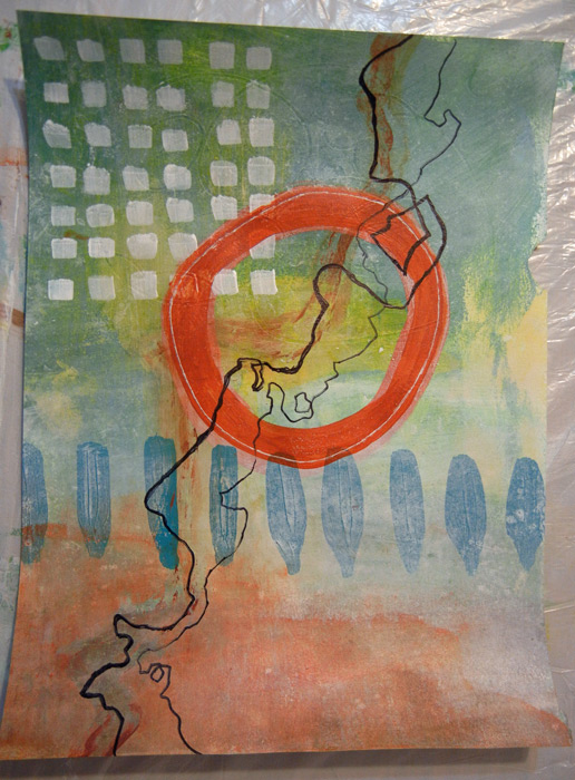
For this assignment I followed Jane’s example of painting over every single layer, (until I got to the last few elements.)  Here, the orange circle and the black lines are not painted over.  Everything else is.

An online class with Jane Davies. Ellen Lindner, AdventureQuilter.com/blog

Finally, I had a little bit of success I think.

Things I learned:
– I  love the look of partially veiled paint, but I don’t know how to do it.
– I love the idea of foreground and background merging, but I don’t know how to do that with paint either.  Maybe with fabric?
– I continue to be entranced with skinny wild lines, inspired by some of Jane’s work.

Questions going forward:
– Can I get a veiled look with fabric?  Maybe with sheers or overprinting with paint?
– What’s the best way to add those skinny lines to my fabric art?
– Can I successfully  merge both fabric and paint in my art???

You know me: I’ll HAVE to do some more experimenting as I try to answer these questions.  Stay tuned.

Ellen Lindner

8

Listening to Fabrics and Other Odd Behavior

Update: the title of this lecture was later changed to “Confessions of a Fabric Whisperer.”

That’s the title of my newest lecture and I’m very excited about it!  If you’ve been reading my blog for a awhile, you know that I DO exhibit some odd behaviors.

Things like cutting up quilts and putting them back together,

Urban Sprawl, an art quilt by Ellen Lindner. AdventureQuilter.com

Using unusual materials,

And changing the shape of the quilt.

It’s kinda funny, because when I started searching my quilts for signs of odd behavior there were lots of them!  (Of course, I’ve been quilting a long time, so there’s plenty of “normal” stuff too.)

I’ll be presenting this lecture for the first time next week.  If you live in western Florida, maybe you’d like to come.  I’ll be speaking at The Piecemakers Quilt Guild of Brandon, FL on Monday evening, September 11th.  Cost for visitors is $10.  (And if you come, please introduce yourself.)

Ellen Lindner


4

Suzanne Sanger’s Work

Back in October, I wrote about creating torn paper collages in order to loosen up and to work more abstractly.  Like this:

Original photo
Ti Plants inspiration photo. Ellen Lindner, AdventureQuilter.com/blog

Torn paper collage
Because the paper is torn, you can’t be too accurate, so you
HAVE to focus on the largest shapes.
Ti plants torn paper collage. Ellen Lindner, AdventureQuilter.com/blog

The fabric interpretation, Ti Party.
Ti Party, an art quilt by Ellen Lindner. AdventureQuilter.comOne of my readers, Suzanne Sanger, decided to give it a try and was kind enough to share her results with me (and with you.)

Her original photo, taken in Bermuda
Suzanne Sanger's Work. Ellen Lindner, AdventureQuilter.com/blog
The paper collage, with part of the original photo overlapping.
Suzanne Sanger's Work. Ellen Lindner, AdventureQuilter.com/blog
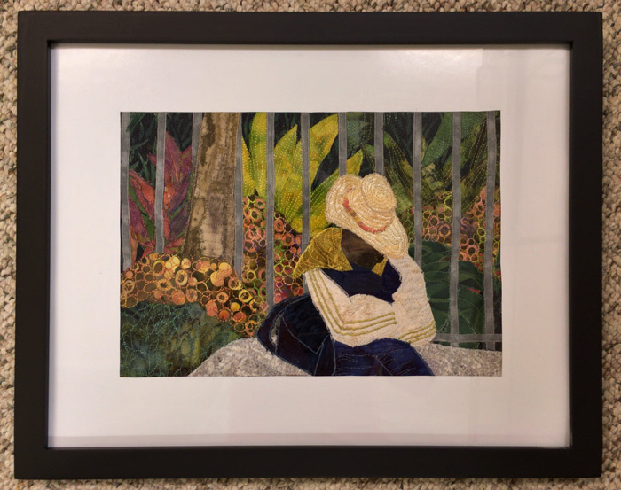
And, her final quilt, called Dozing in Bermuda.

Suzanne Sanger's Work. Ellen Lindner, AdventureQuilter.com/blog

I think it’s great.  And don’t you love the way she’s matted and framed it?

Suzanne says, “I want to thank you for inspiring me! Like you, I’ve been challenging myself to work more abstractly, and have dabbled with a range from just barely to totally non representational. Your blog post from last October about torn paper collage sent me right into the studio to tear up the only magazine I had in order to recreate a photo I took in Bermuda a few years ago. Then I did my semi-annual house switch, life intervened, I took a great abstraction class from Lisa Call, all the while leaving my torn paper start hanging on my design wall. Now I’ve switched back to my summer house, and needed a project to get myself back into the studio. Ah hah! It was time to return to my dozing man. He’s a bit more realistic than I would like, but still a move in the right direction. I LOVE this process! Hmmm. I guess I’ll have to subscribe to an image heavy magazine again, pain though that is what with changing mailing addresses twice a year. LOL. Anyway, thanks for a great idea! You always give me new things to think about.”

I love this!  So much so that it makes me want to reach for my magazines again, too. It’s a FUN way to work!

Ellen Lindner


3

Working on My Flame Vine Quilt

The quilt I’ve been working on is inspired by a friend’s flame vine, which cascades down her back porch.  In the strong Florida sun, it’s especially striking when seen against the dark porch screening.

After finishing the orange flowers, I went on to the leaves.

Project Resurrected. Ellen Lindner, AdventureQuilter.com/blog

Next, I tackled the long skinny pieces.  I’m not sure what they are, but they’re some part of the plant. Let’s call them twigs.   At any rate, they were in the original photo and I liked the graphic quality they added to the abstraction.  To audition sizes I started tearing fabrics and I liked the fuzzy quality I got with some of them.  So, I just left them that way.

Working on my Flame Vine Quilt. Ellen Lindner, AdventureQuilter.com/blog

Finally, it was time to glue everything to the muslin and start stitching.  I added black zigzag around each block unit.

Working on my Flame Vine Quilt. Ellen Lindner, AdventureQuilter.com/blog

For the petals and leaves I chose an organic quilting pattern that, in part, followed the shape of the piece.  For the background, I selected parallel lines.  In each case, they follow the angle of one of the twigs.  I really like the effect.

Working on my Flame Vine Quilt. Ellen Lindner, AdventureQuilter.com/blog

After all of this, I thought some of the petals merged a little bit too much.  To add definition, I drew around the edges with a Sharpie.  That helped, but it was partially covered by fuzzy threads, so I looked for something more significant.  I found it with a thin black cord which I hand couched on.  It gave the perfect outline.

Working on my Flame Vine Quilt. Ellen Lindner, AdventureQuilter.com/blog

On to finishing!  I faced the quilt and sprayed marked areas with water, to remove the chalk marks.
But, oops, one area bled.

Working on my Flame Vine Quilt. Ellen Lindner, AdventureQuilter.com/blog

I decided to hide it by adding more of the same.  Like this:

Working on my Flame Vine Quilt. Ellen Lindner, AdventureQuilter.com/blog

I used water soluble wax pastels, adding a little yellow and orange.  Plus, I think the extra water added faded the original spot.  Voila!  On to photo taking.

Ellen Lindner

0

Loosen Up with Torn Paper Collage

If you’ve been following my blog for a while, you know that I like to interpret foliage and scenery around me.  The problem is that my literal brain wants to depict my photos exactly as they are.  But, I know my quilts will be more interesting if I can put my own personal spin on things.

So, usually, I have to make a realistic sketch, just to satisfy my brain, and then I can get on to something more creative.  Maybe a sketch, or a torn paper collage.

Loosen Up with Torn Paper Collage. Ellen Lindner, AdventureQuilter.com

A torn paper collage is a great way to interpret a photo loosely because you CAN’T accurately depict the details.  Just what my left brain needs!

Loosen Up with Torn Paper Collage. Ellen Lindner, AdventureQuilter.com

The resulting collage can serve as a sketch for a finished quilt, or just as a creative exercise.

Loosen Up with Torn Paper Collage. Ellen Lindner, AdventureQuilter.com

I’ve just added a full article about this technique to my website.  It includes lots of in-progress photos and tips.  Check it out and try it yourself.

Ellen Lindner
P.S.  One more example on my old blog.

6

My Train Jumped the Track

I was making good progress on my two large leaf quilts when I got BADLY distracted.  The culprit was the book  Serendipity, by Susan Carlson.  In it she explains her fabric collage techniques.  In many ways they’re the same as my own, but with a much higher level of tiny details.  It was all SO intriguing and I just had to give it a try.  “BAM!  SCREECH!” The sounds of my leaf train derailing.

Learning Susan Carlosn's technique. Ellen Lindner, AdventureQuilter.com/blog

I pretty much never switch gears once I start on a quilt, but this time I did so quite gleefully.  I searched my photos for inspiration and decided to work with a photo of three tomatoes.  I tweaked the composition and will probably do some more down the road.

Ellen Lindner's tomato quilt in-progress. AdventureQuilter.com/blog

Susan typically constructs her design elements as stand-alone units.  This enables her to move them around later and to easily audition background options when the time comes.  So, I followed suit and drew a  20″ tomato.

Ellen Lindner's tomato quilt in-progress. AdventureQuilter.com/blog

I drew the design onto muslin with a Frixion (heat-way) pen.  The mini iron was my “eraser.”

Ellen Lindner's tomato quilt in-progress. AdventureQuilter.com/blog

The idea is to fill the shape with the proper VALUE, leaving the detail areas as cutouts.

Ellen Lindner's tomato quilt in-progress. AdventureQuilter.com/blog

This was my first draft as I was nearing completion of the red fabrics.  The space was covered, but it was lacking some finesse.

Ellen Lindner's tomato quilt in-progress. AdventureQuilter.com/blog

I switched the light spot from yellow to pink.  But, it still looked pretty chunky.

Ellen Lindner's tomato quilt in-progress. AdventureQuilter.com/blog
Next, I started fiddling with the details.  Susan explained the basics in her book, about how to soften any hard edges.  From studying her blog and website, I could also see that she often cut little motifs from her fabrics and used them to merge the colors and patterns better.  Like this.

Ellen Lindner's tomato quilt in-progress. AdventureQuilter.com/blog

Instead of abruptly cutting off a motif, soften the edge by continuing it onto the next fabric.

Ellen Lindner's tomato quilt in-progress. AdventureQuilter.com/blog

Well, that sort of thing is totally addicting!  AND it adds a lot of interest to the piece, as well as softening hard edges.

Here it is after a ton of fiddling (with the leaves still showing as cutouts.)  Much better, right?

Ellen Lindner's tomato quilt in-progress. AdventureQuilter.com/blog

I’m really having a lot of fun working this way.  Perhaps it will become too persnickety for me in the future.  We’ll see.

On to those twisty little leaves.

Ellen Lindner
P.S.  I’ve made several other quilts featuring produce.  Like  Mangolicious.
P
.P.S.  Did you know you can susbscribe to my blog?  When doing so, you’ll get every post in  your email inbox.  Just click the Subscribe button, top right.

12

Perfectly Flat Quilts

If you’ve done much machine quilting you’ve probably had some “friendly” quilts.  You know, the wavy ones? This is pretty standard for me so I correct the problem by blocking my quilts.

Take this quilt for instance.  Pretty bad, right?

Straighten out those wavy quilts and make them perfectly flat. Ellen Lindner, AdventureQuilter.com/blog

But, a combination of stretching, pinning, and steaming turned it into this perfectly flat quilt.

Straighten out those wavy quilts and make them perfectly flat. Ellen Lindner, AdventureQuilter.com/blog

I recently gave the same treatment to my latest quilt, Coastal Overlook.  Here it is with the top and left edges pinned straight and square.  I stretched them quite a bit  in that process, so the other two sides are still relaxed (and smaller.)

Straighten out those wavy quilts and make them perfectly flat. Ellen Lindner, AdventureQuilter.com/blog

Next, I stretched the bottom right corner to its square position and then pulled the remaining two edges into alignment.  This took A LOT of pins and about an  hour of my time.  Finally, I sprayed the whole thing with water, steam ironed it, and left it overnight to dry.

Here are the final results, nice and square.

Coastal Overlook, an art quilt by Ellen Lindner. AdventureQuilter.com/blog

Coastal Overlook

I highly recommend blocking and I’ve written a tutorial about it.  Read and learn!

Ellen Lindner

Related Post, old blog:
I Don’t Like Friendly Quilts

0