Over Dyeing Fabrics

When dyeing fabric, there are always a few fabrics that don’t quite match my intentions. When that happens, I consider over dyeing them. Which simply means dyeing the whole piece a second time.

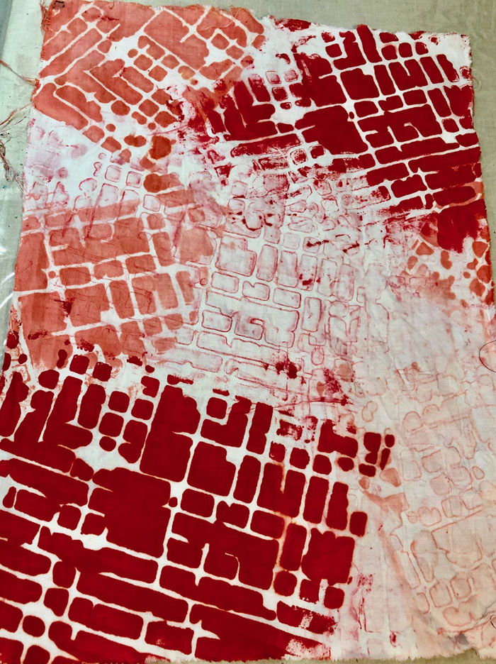
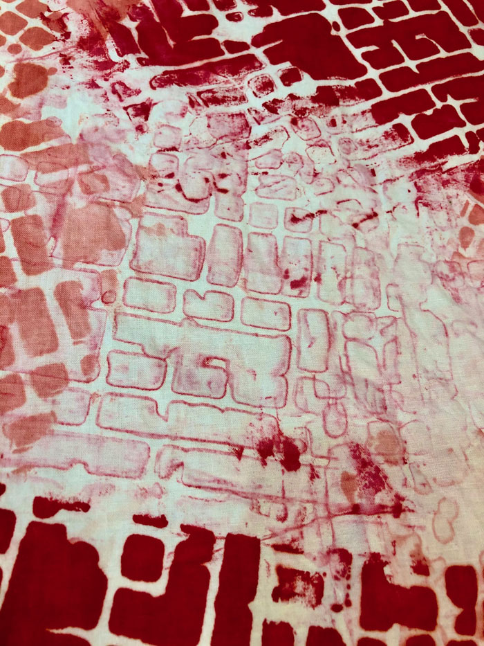
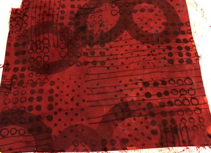
The background color on this one was just too pale for my liking.

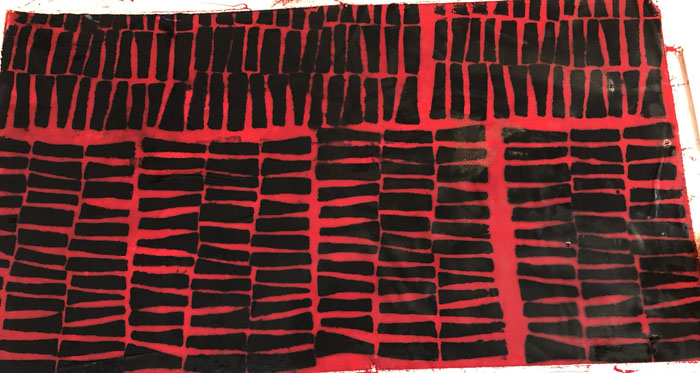
So, I over dyed it with a diluted red.

Truly. It really was diluted! But, apparently it was stronger than I realized. No worries. I like it better than before and I’ll definitely be able to use it. Maybe I’ll soften it with a subtle stamped design in white.

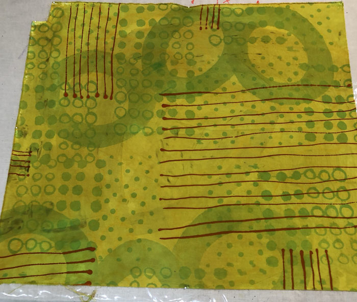
This green fabric was not bad except for the red lines I had drawn on. They made it really ugly.

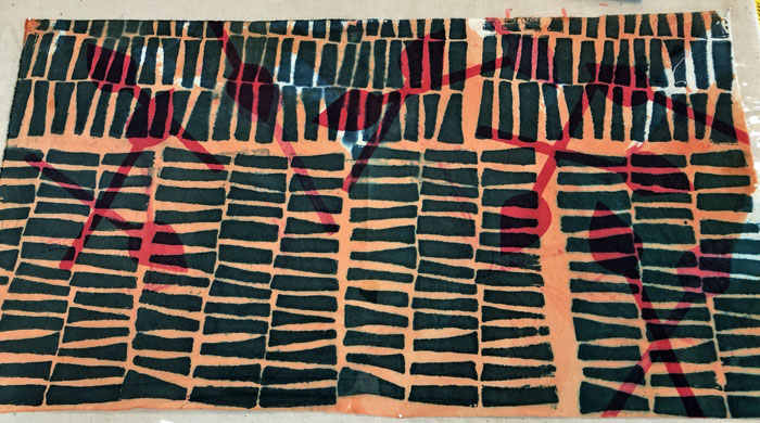
I decided to embrace the red theme by over dyeing with orange.

Hmm, well it’s better, I think. Very usable, but not that exciting. I think I’ll draw on some dark blue or black circles.

Did I mention that dyeing fabric requires patience? Yep. Patience to wait to wash out fabrics and then patience when additional steps or corrections are needed. It sure is fun, though!

Ellen Lindner
Updated July 1, 2021:

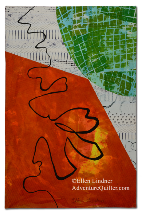
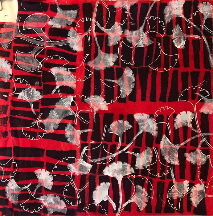
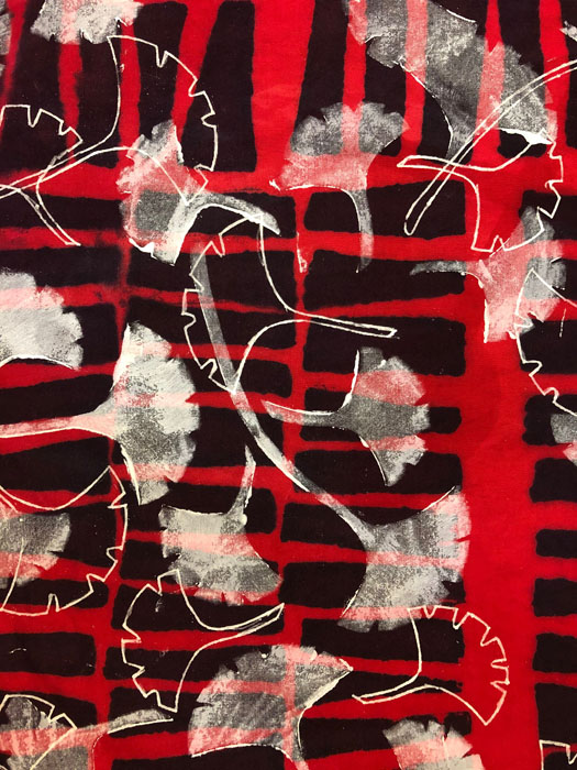
I used white transparent fabric paint and stenciled a ginkgo leaf design onto the red fabric.

Over Dyeing Fabrics. Ellen Lindner, AdventureQuilter.com/blog

I also used the stencil as a guide for drawing additional leaves with a permanent marker. I really like the effect. I think I’ll be doing more of that.

Over Dyeing Fabrics. Ellen Lindner, AdventureQuilter.com/blog


0

Dyeing Fabrics in Beet Colors

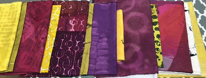
After seeing a photo of a red beet along with a yellow one, I got the idea to make a quilt in those colors. I set out to dye fabrics in a variety of beet/berry colors, along with some dull yellow ones. Thankfully, I had already done quite a bit of color swatching, so I was able to refer to my results as a reference.

All Those Swatches! AdventureQuilter.com/blog

These are my final results, and I’m quite happy with them.

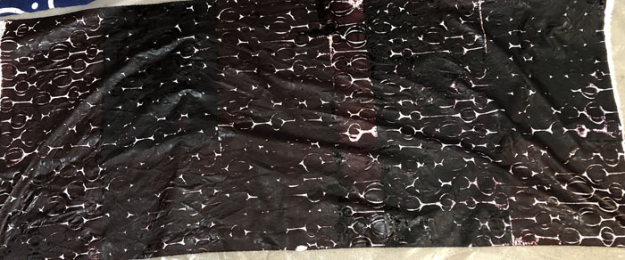
I was really thankful for the color swatches. That’s because wet dye always looks different from the washed and dried version. Especially with strong colors.

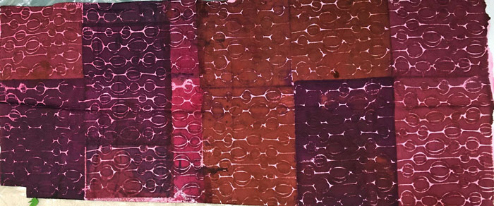
Take this piece, for example. I was aiming for a variety of beet/berry/grape colors, all in the same fabric. Although it was hard to see the variations in colors, I trusted my swatches and mixed the fabric dye colors accordingly. This is what it looked like. NOT reassuring!

But, this is what it looked like dry – almost exactly what I wanted.

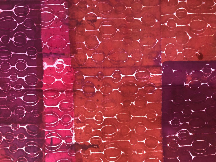
It turns out that my dye mixture was a little thin, so the stencil motif blurred somewhat. But, actually, I like the imperfect effect quite a bit. Here’s a detail shot.

I’m looking forward to using these fabrics!

Ellen Lindner
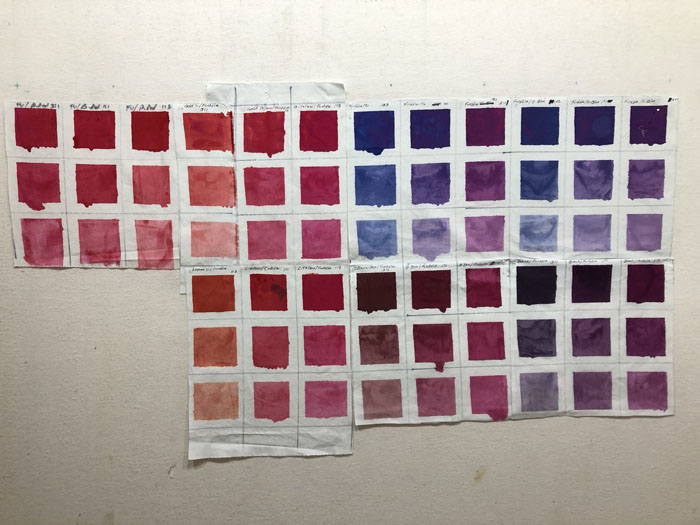
P.S. The color swatching is an exercise in the book Colour Your Palette, by Leah Higgins.

0

“And the Band Plays On”

Here’s my latest little art quilt, And the Band Plays On.

I made it as donation for a SAQA (Studio Art Quilt Associates,) fundraiser which required a size of
12″ x 12″.

Fortunately, I had some leftover units from this quilt, which I used as a starting point.

Is it Hot in Here, or is It Just Me? An improvisational art quilt by Ellen Lindner. AdventureQuilter.com

Is it Hot in Here, or is It Just Me?

After that, it came together easily.

I sure have been lucky with leftover pieces lately!

Do you ever use leftover units in new pieces?

Ellen Lindner
0

“Party Chatter” Complete

I’ve been having fun working on my “sour dough” quilt.

First, I decided on the placement of the leftover blocks. I cut a few of them into smaller units.

"Party Chatter" Complete. An art Quilt by Ellen Lindner, AdventureQuilter.com/blog

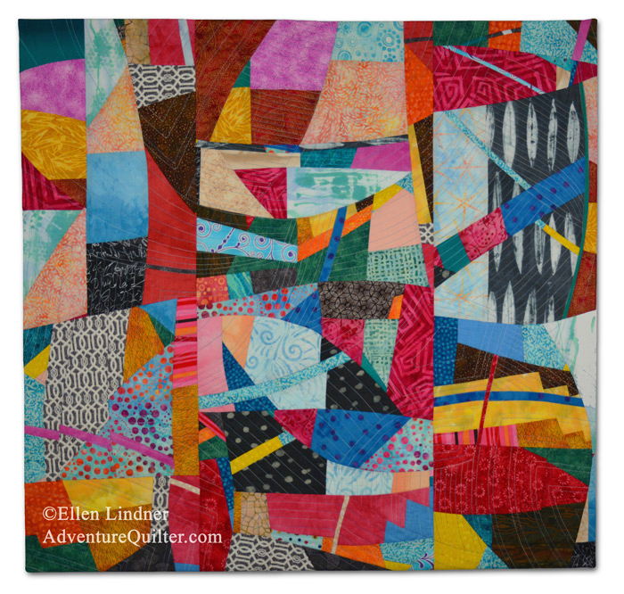
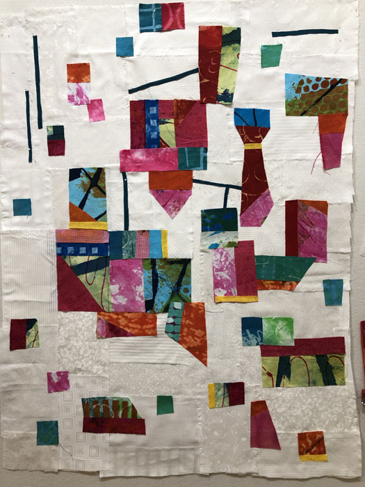
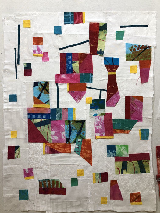
I’m a believer in this quote from Sally Sellers, “It only takes a little ugly; just enough to make the other colors sing.” So, should I add a little ugly? I decided a small amount of yellow would do the trick.

"Party Chatter" Complete. An art Quilt by Ellen Lindner, AdventureQuilter.com/blog

A nice start. Then, I added even more.

"Party Chatter" Complete. An art Quilt by Ellen Lindner, AdventureQuilter.com/blog

I like it. What do you think?

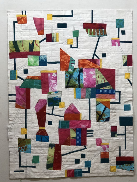
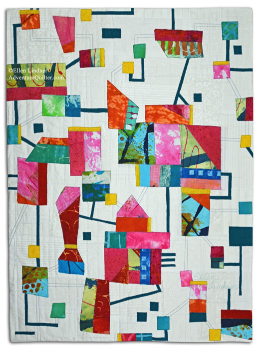
Finally, I added the skinny dark teal strips. Because they’re so high contrast, they add a lot of drama, and really make the composition.

"Party Chatter" Complete. An art Quilt by Ellen Lindner, AdventureQuilter.com/blog

In the photo above, I started quilting it. I had lots of good suggestions about a title. But, to me, it seemed to represent some sort of social interaction. A lively, happy one. So, the name “Party Chatter” seemed to fit. Here’s the finished piece.

"Party Chatter" - detail. An art quilt by Ellen Lindner. AdventureQuilter.com
Check out my website for a detail shot and other information.

What do you think about adding a little bit of ugly?

Ellen Lindner
16

A “Sour Dough” Quilt

I’ve never made sour dough bread, but I know that it requires a starter. And also that some of the ingredients are reserved for a future loaf. With this in mind, I think my current project is a “sour dough” quilt.

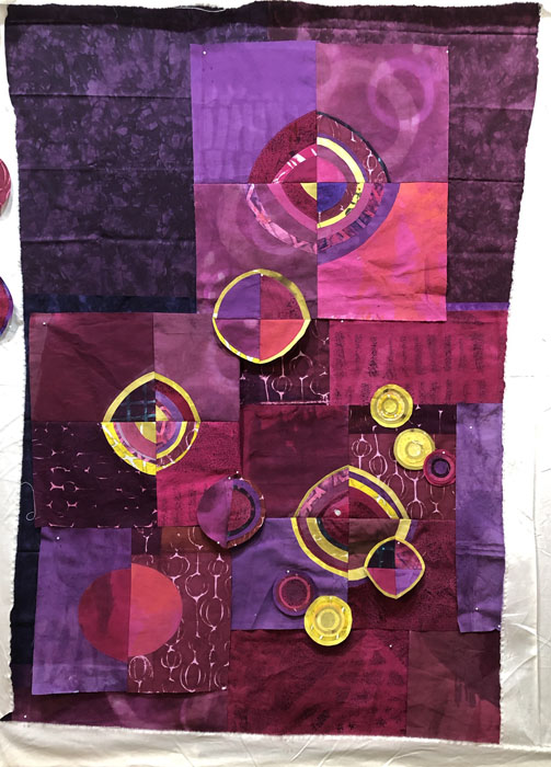
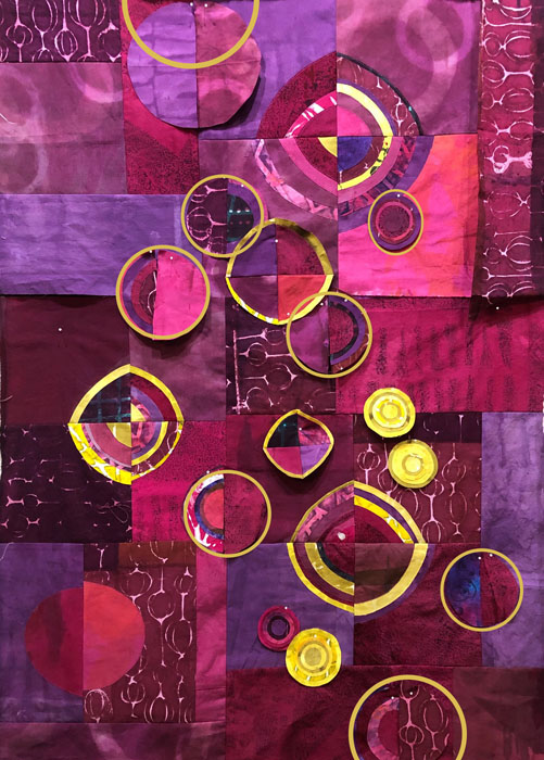
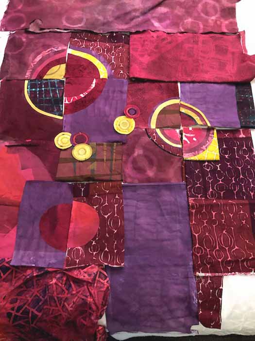
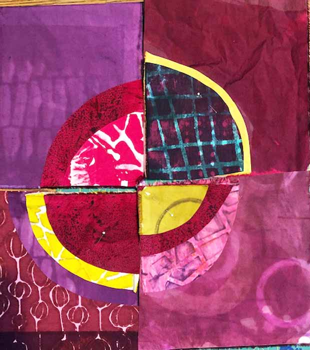
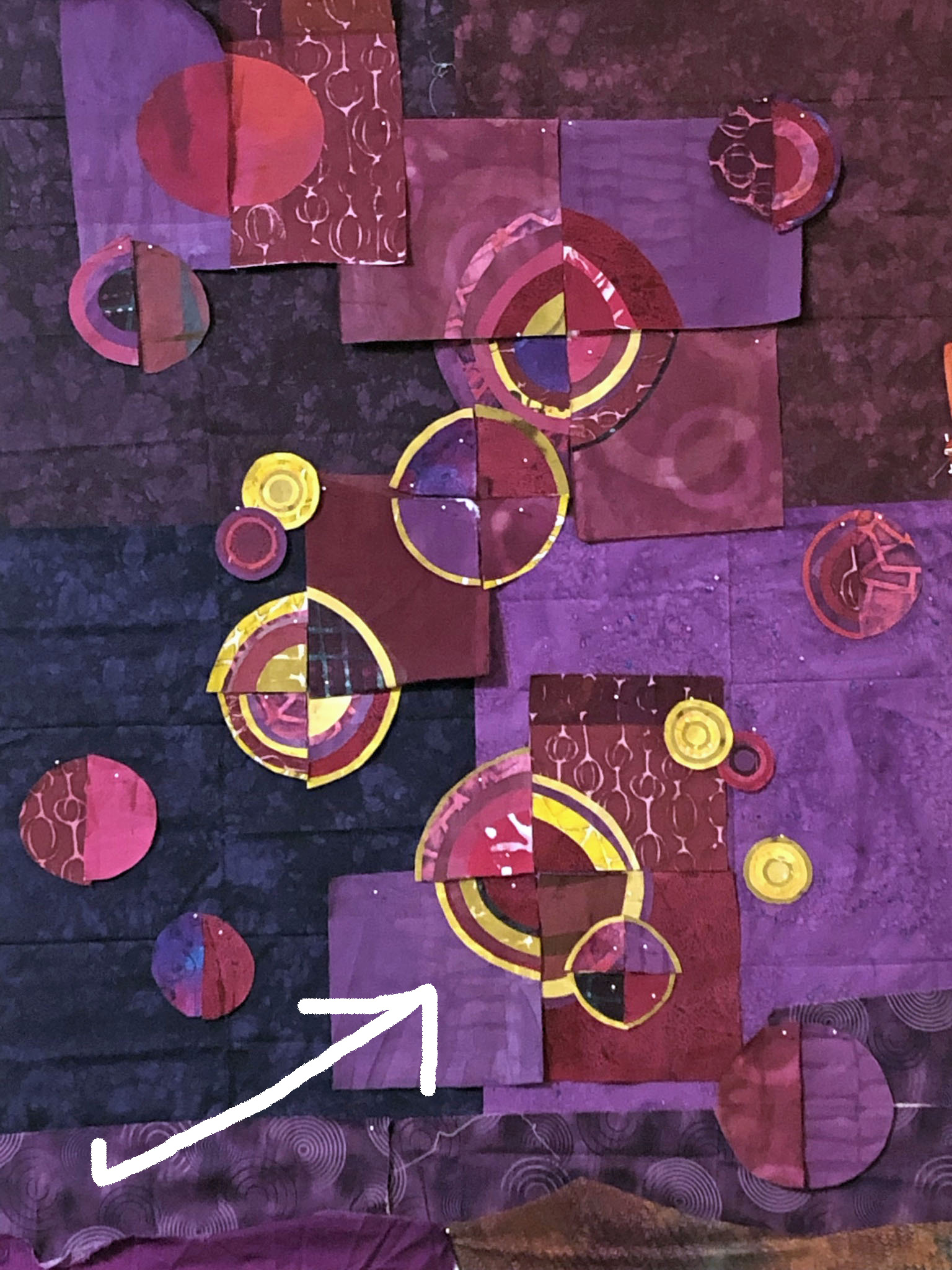
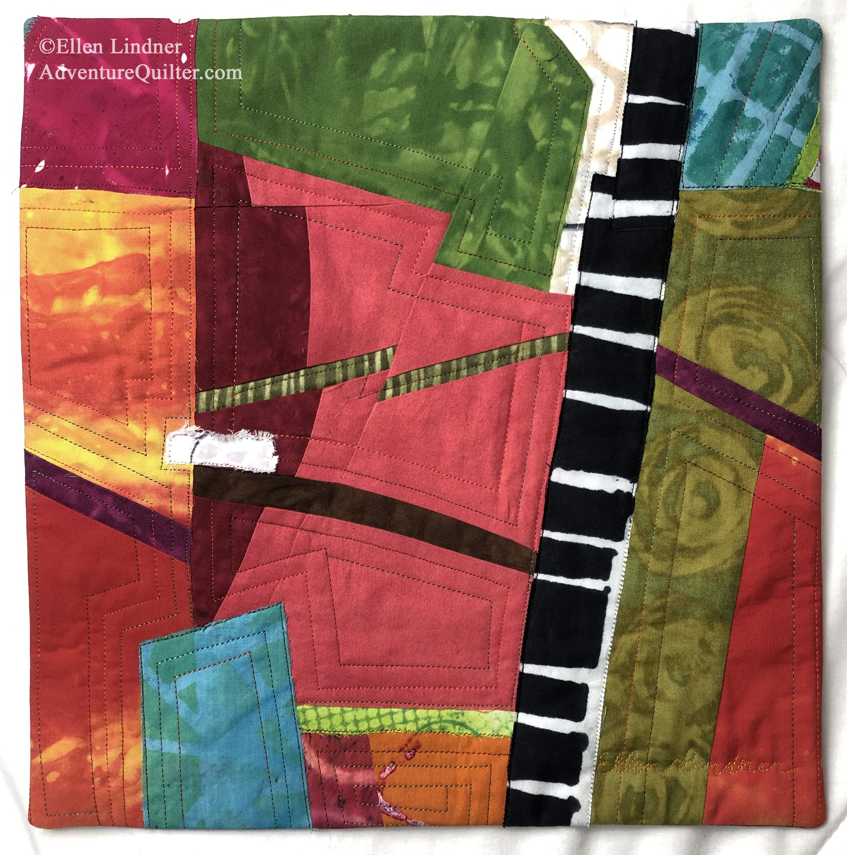
It all started with these blocks that were leftover from an earlier project. These were the starter. (Each mini composition is held together with glue.)

A Fabric-Inspired Quilt. Ellen Lindner, AdventureQuilter.com/blog

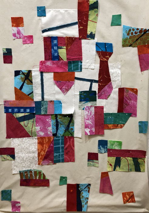
I didn’t really have a plan, but I put a piece of muslin up on my design wall and started slowly adding the blocks.

A "Sour Dough" Quilt. Elen Lindner, AdventureQuilter.com/blog

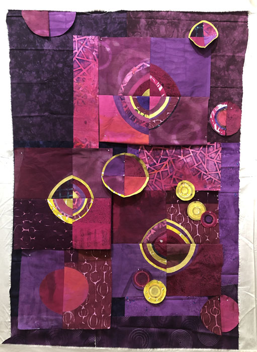
I immediately liked the colors and the energy of the oddball shapes. However, it was clear to me that I wouldn’t want to butt the pieces right up next to each other. Doing so would make all the shapes merge together. Instead, I’d need a dark or light fabric separating the colorful shapes.

That made me think of Susan Lapham’s quilts. She often uses white between here blocks and connects them with skinny black strips. I decided to emulate her style for this one.

A "Sour Dough" Quilt. Elen Lindner, AdventureQuilter.com/blog

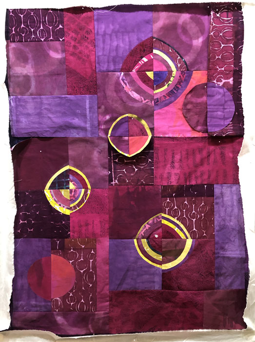
Initially, I added white blocks as I was creating the composition. But, I realized it would be easier to add the white at the end. The white fabrics are also starters, since they were torn for an earlier project, but never used.

A "Sour Dough" Quilt. Elen Lindner, AdventureQuilter.com/blog

I switched to dark teal strips pretty earlier on. (And I fused the back of that fabric: very unusual for me.)

A "Sour Dough" Quilt. Elen Lindner, AdventureQuilter.com/blog

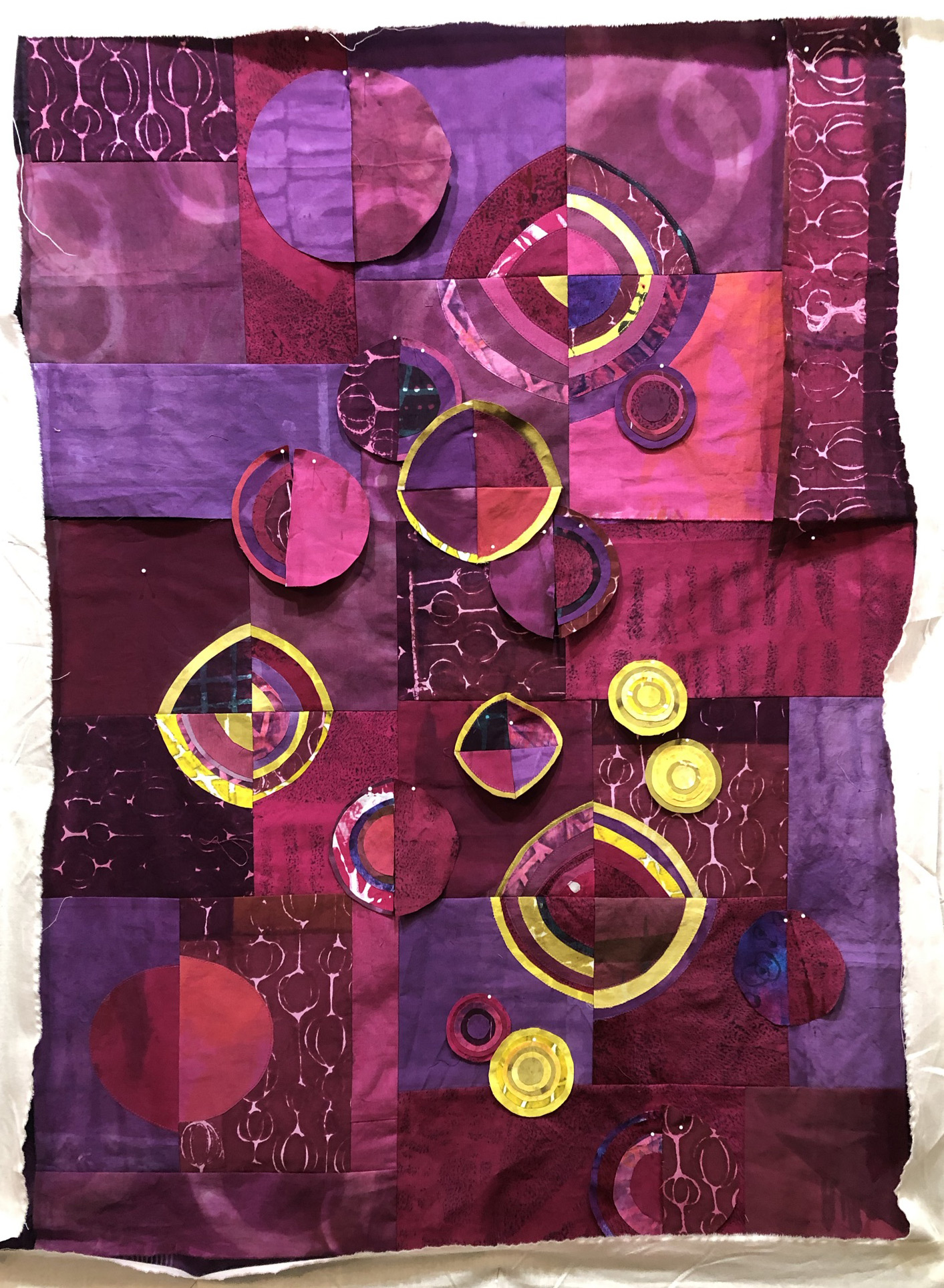
At this stage, I can see that I need some smaller pieces. Maybe I’ll cut some of my blocks or maybe I’ll add some fresh cut little squares. And what about adding an accent of a new color? It’s all up for consideration.

I’ve really been enjoying this little project. What fun things have you been working on lately?

Ellen Lindner
4

Barefoot Photo Shoot

What fun! At the invitation of QuiltFolk magazine, I showed up for a beach photo shoot, along with six other quilters and our respective bundles of quilts.

The first request was for us to show the photographer our quilts – IN THE PARKING LOT. Talk about a trunk show! It was almost comical.

Barefoot Photo Shoot. Ellen Lindner, AdventureQuilter.com/blog
They asked us to bring the chairs, too, as potential props.

Barefoot Photo Shoot. Ellen Lindner, AdventureQuilter.com/blog

Doris Hulse, left, and Karol Kusmaul, right.

And then, Carole Lyles Shaw showed up with her COLORFUL quilts. Eye candy everywhere!

Barefoot Photo Shoot. Ellen Lindner, AdventureQuilter.com/blog

Linda Hoffmeister admiring Carole Lyles Shaw with her quilt.

Once we made it onto the sand most shoes were kicked off as the photographer got down to work. Although the temperature was perfect, the wind quickly dashed any hopes of a good hair day!

Barefoot Photo Shoot. Ellen Lindner, AdventureQuilter.com/blog

L-R: Karol Kusmaul, Carole Lyles Shaw, me, Linda Hoffmeister, Doris Hulse, Regina Dunn, and Bobbi Baugh

Regina’s husband, Michael, was great about taking lots of behind-the-scenes shots for us. Here I am with Jubiliation. (This is the photo which had the quilt waving the least!)

Barefoot Photo Shoot. Ellen Lindner, AdventureQuilter.com/blog

I’m hoping this next one doesn’t make it into the magazine. Both hairdos and quilts were out of control!

Barefoot Photo Shoot. Ellen Lindner, AdventureQuilter.com/blog

We had a great time socializing and “oohing” and “ahhing” over each person’s quilts.

Additional photos were taken with quilts staged on the chairs, boardwalk, etc. I’m looking forward to seeing which photos they use.

Ellen Lindner
2

“Indian River Fruit” Complete

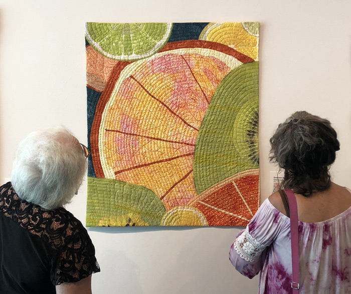
I’m really happy with my latest quilt, Indian River Fruit.

Indian River - an art quilt by Ellen Lindner. AdventureQuilter.com

With the exception of one piece, I hand dyed all of these fabrics. As I’ve mentioned before, I’ve found it somewhat challenging to use these high-contrast fabrics together. This time, though, I think I hit the sweet spot. I love the contrast between the large circles, the near solid sections, and the grids.

I quilted it to show off the various fabric designs:

Indian River Fruit - quilting detail. Ellen Lindner, AdventureQuilter.com

I’m looking forward to working with my hand-dyed fabrics some more!

Find more details about this piece.

Ellen Lindner
 

0

Join Me at a Virtual Reception

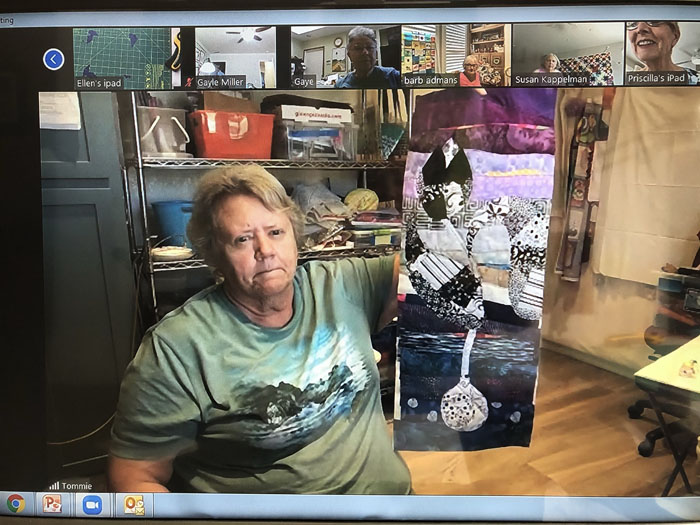
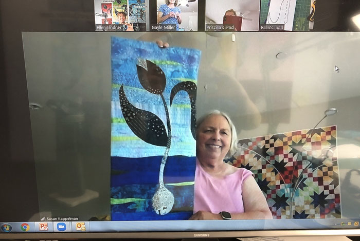
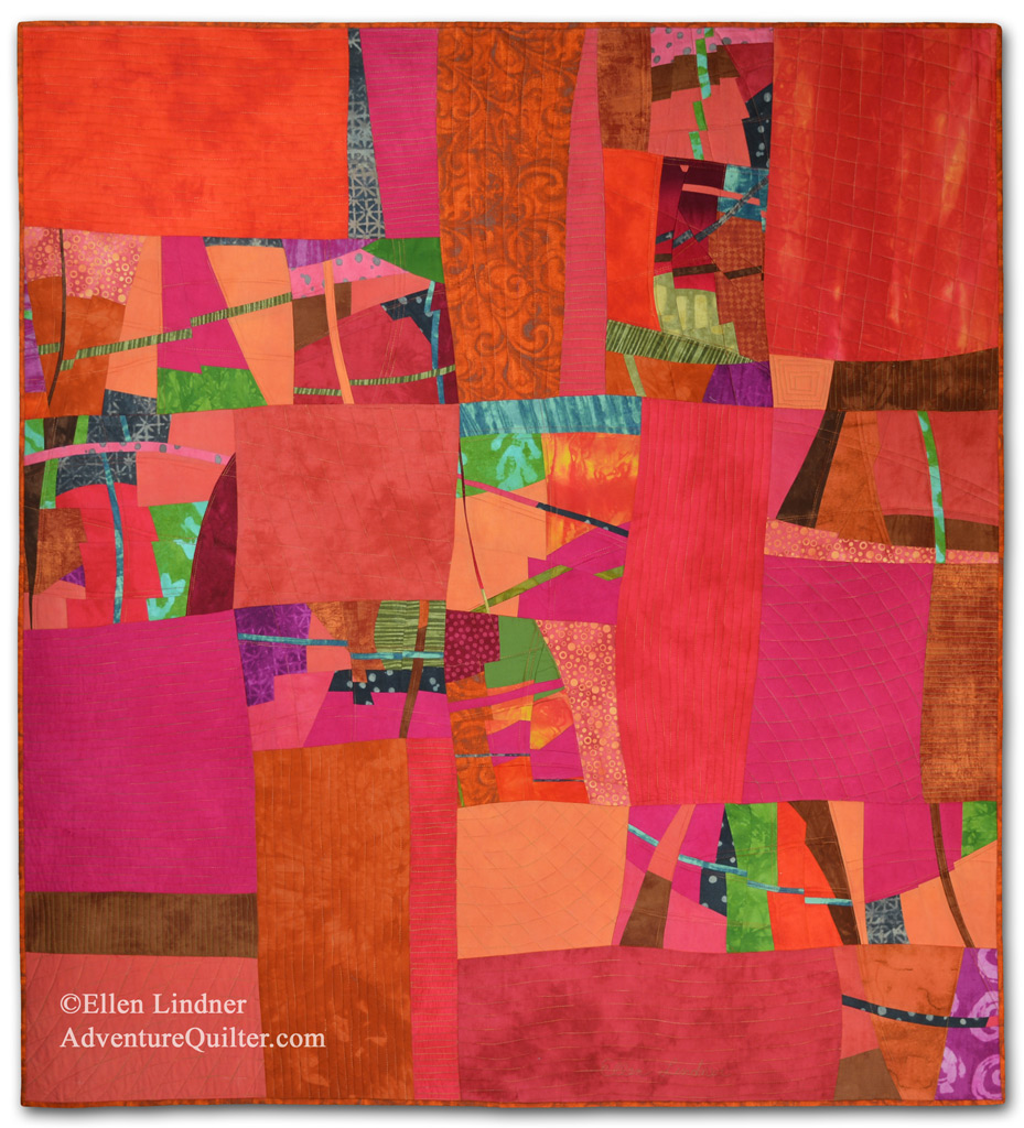
On Friday, April 30th, I’ll be participating in a virtual art reception and talking about the piece above, Melting Pot.

The occasion is the opening of “Floridian Flavors” at the Leepa-Rattner Museum of Art, in Tarpon Springs, FL. Pieces in the exhibit are all fiber, made by the Florida artists of Studio Art Quilt Associates, (SAQA.) Artists were asked to respond to the culture, cuisine, and characters of Florida. The result is a diverse collection of work, with playful pieces inspired by tourists to more serious ones about global warming. At the virtual reception, four other artists will also be talking about their work, including some in-progress photos.

Join the Zoom reception at 6 PM EDT on April 30th. Click here to do so.

And, if you’re in the Tarpon Springs area, be sure to visit the exhibit in person. It runs May 4th through August 15th.

0

Fabric-Led Design

My latest quilt has been coming together nicely, even though the fabrics are a little bit diverse. The colors, patterns, and values of the fabrics have dictated what looks good where and the fabric sizes have determined what will actually fit where.

Fabric-led Design. Ellen Lindner, AdventureQuilter.com/blog

Things evolved on the design wall as I folded and auditioned fabrics in different locations. I didn’t cut them until I was pretty sure about what I was doing!

Fabric-led Design. Ellen Lindner, AdventureQuilter.com/blog

As you can see, I was trying to move the colors and patterns throughout. I was getting close, but I thought the two yellow fabrics on the right, below, needed a darker spot between them. This is one of the fabrics I auditioned as a solution.

Fabric-led Design. Ellen Lindner, AdventureQuilter.com/blog

You can see that I decided to use it, but in a much more narrow piece.

And the big surprise: I decided I liked the quieter parts of the quilt the best, so I removed the busy patterned piece that was on the far left.

Fabric-led Design. Ellen Lindner, AdventureQuilter.com/blog

This is the final version, before quilting.

BTW, the construction time on this quilt was very short, due to the large pieces of fabric. But, it’s taking me quite a while to quilt it!

Ellen Lindner


2

Variety of Scale

Lately, I’ve been really concentrating on using a “variety of scale” in the patterns and compositions I’ve been using. First,  in a collage course  I took  with  Jane  Davies.  After  making  and  cropping  small  collages  she  directed  us  to  add  details  with  markers.  (I never  asked  for  her  feedback  on  these,  so  they’re  MY  interpretation  of  what  might  work.)

With each one I asked, “Where is there a big spot that needs some interest?” I thought this first one looked pretty good without any additions, but I thought a tiny line would add interest. And it did!

Variety of Scale. Ellen Lindner, AdventureQuilter.com/blog

Next question, “Should the additions emphasize what’s already there, or should I add an entirely new shape or color?” You can see that I’ve used both.

Variety of Scale. Ellen Lindner, AdventureQuilter.com/blog

I often let my new elements extend over two different pieces. This worked visually, since the small scale of the new items didn’t obliterate the larger pieces.

Variety of Scale. Ellen Lindner, AdventureQuilter.com/blog

Sometimes I followed Jane’s example of changing marker colors as the background color changed.

Variety of Scale. Ellen Lindner, AdventureQuilter.com/blog

Some compositions needed very little added. But, it does make a difference, don’t you think?

Variety of Scale. Ellen Lindner, AdventureQuilter.com/blog

I’ve also been thinking about variety of scale as I’ve been trying to use several favorite fabrics together in the same piece. Most of them were large in scale, so I found myself matching them up with near solids and quieter neutrals. Early progress is shown below.

Using Large Scale Prints. Ellen Lindner, AdventureQuilter.com/blog

I was liking these together. They were a challenging, but fun, mix.

Ellen Lindner
0