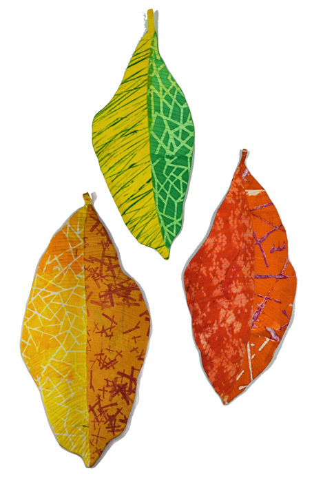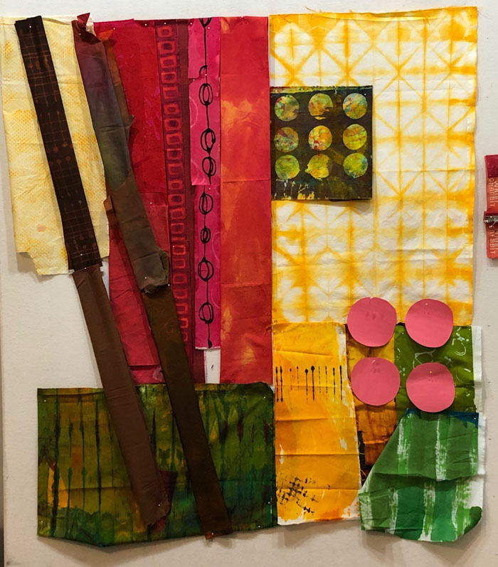

Turning Leftovers Into a Meal
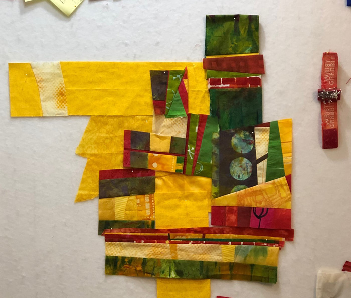
After making Potager Garden, I had quite a few scraps left over, so I decided to use them to make a small quilt. This is what I had to work with. I began to move them around to see how they might fit together. I didn’t like this first version, though. I thought it needed more yellow,…