Tag Archives | Collage

I Almost Forgot

My raw edge collage techniques involves lots of layering. Sometimes perfectly wonderful fabrics get covered by something else later. However, I don’t typically rescue those underneath fabrics. Instead, I tell myself that I bought the fabric to use and if it’s function is to support later fabrics, and to give me flexibility then it has served me in a useful way.

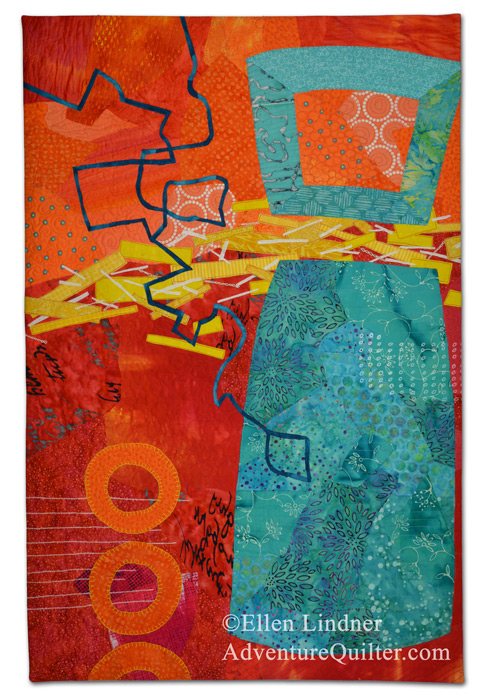
But, on my current quilt, there’s a large shape that landed on top of the background. See what I mean?

So, I decided to rescue the red section underneath the largest turquoise shape. Both the red and turquoise sections were built on – and glued to – muslin, so I knew I could easily separate them.

But then I forgot.

Meanwhile, I started quilting the background, even though there were still foreground elements to be added. This was a logistical decision, since it will help me avoid all the starting and stopping that would otherwise be necessary to dodge all the things I intend to add.

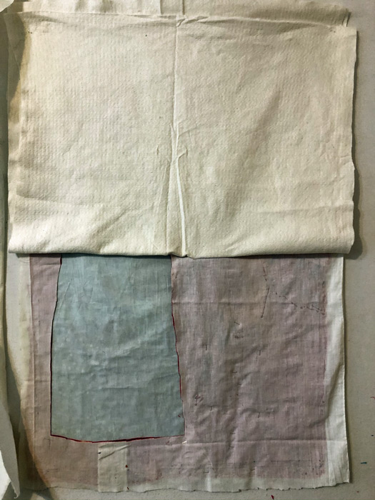
About halfway through I remembered my earlier plans. So, I pulled up the batting as best I could on the lower portion. Some of it was already stitched down.

I Almost Forgot. Ellen Lindner, AdventureQuilter.com/blog

As you can see, I cut away the red portion, where able.

And I found two pins still stuck into that fabric! Good thing I did. I’ve had to cut them out a few times in the past.

But, since I was cutting from the back, I didn’t judge well and I actually cut into the background in the area I wanted to keep. Gulp!

I Almost Forgot. Ellen Lindner, AdventureQuilter.com/blog

But, since I work in raw edge collage, and quick patch took care of that.

I Almost Forgot. Ellen Lindner, AdventureQuilter.com/blog

Back to quilting!

Ellen Lindner

0

An Abstract Self-Portrait?

I like challenges. As a result, I’m currently working on an abstract self-portrait. It all came about when my art group, Dirty Dozen Fiber Artists, came up with (another) self-portrait challenge. This one was to be inspired by another artist.

After some online searching and thought I decided on one of my favorite contemporary artists, Jane Davies.  She’s a painter and collage artist who does extraordinary abstract work.

Pattern Study 1 by Jane Davies. AdventuareQuilter.com/blog

Stripes and Dips 1 by Jane Davies. AdventuareQuilter.com/blog

Pattern Study 3 by Jane Davies. AdventuareQuilter.com/blog

Great, aren’t they? But, how do I make an abstract person? I remembered seeing one of her pieces (which I couldn’t find again,) that had a figure-like shape and I thought I could emulate that.

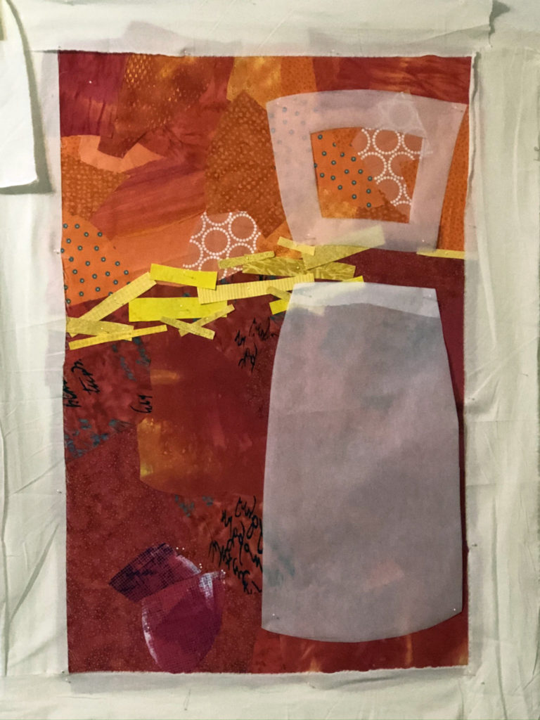
After creating an orange and red background, I auditioned the shape and placement of the figure with parchment paper.

An Abstract Self-Portrait? Ellen Lindner, AdventureQuilter.com/blog

And then, the fabrics.

An Abstract Self-Portrait? Ellen Lindner, AdventureQuilter.com/blog

I think it works pretty well. What do you think?

I’ll be adding a squiggly black line to this – again in the style of Jane Davies. I’m really enjoying working on this!

Ellen Lindner
P.S. Jane Davies has some excellent free tutorials and a great book about painting abstracts.

0

“Diversity”

When making Melting Pot, I was also considering whether I might have time to make a smaller quilt for another challenge. As Melting Pot grew, I decided to make it smaller and to use the remaining parts for this smaller quilt. Diversity is the result.

"Diversity", an art quilt by Ellen Lindner. AdventureQuilter.com/blog

It was made for an exhibit called “1 x 4: Imagination.” As you can see, 1 x 4 refers to the dimensions: 1 foot wide and 4 feet tall.  I modified the shape of the top and bottom, an effect I really like.

Like its sister quilt, Diversity was pieced improvisationally (with no pattern.)

I’ve spent a lot of time in the last few months shifting my teaching to online. That was a BIG time commitment and I didn’t have much time for creativity. Now, things have settled down and I’m easing back into quilt designing. Surprisingly, I had a little artistic block when I came back to it. I think that’s because I was so focused on black and white tasks for so many months, and my creative muscles were out of practice. Has that every happened to you? Now, I feel those old creative juices beginning to flow and it’s so much fun!

Ellen Lindner


0

Cuttin’ Up

I’ve you’ve been reading my blog for awhile, you know that I’m not shy about cutting up a quilt. Sometimes I rearrange the pieces and create a new, more exciting composition. Other times, I use the new smaller pieces as the start of new little works of art. Such was the case with this COMPLETELY FINISHED quilt, Autumn Skyline.

Autumn Skyline, an art quilt by Ellen Lindner. AdventureQuilter.com

There’s a lot that I like about this quilt: the colors, the fabrics, and parts of the design. But, it ultimately wasn’t exciting me. Therefore, I cut it into six different pieces.

Cuttin' Up. Ellen Lindner, AdventureQuilter.com/blog

Cuttin' Up. Ellen Lindner, AdventureQuilter.com/blog

Cuttin' Up. Ellen Lindner, AdventureQuilter.com/blog

I’m really liking this one. I think it’s begging for some hand stitching.

Cuttin' Up. Ellen Lindner, AdventureQuilter.com/blog

Cuttin' Up. Ellen Lindner, AdventureQuilter.com/blog

What if I turned it upside down?

Cuttin' Up. Ellen Lindner, AdventureQuilter.com/blog

I like all the grids in this one.Cuttin' Up. Ellen Lindner, AdventureQuilter.com/blog
Here it is upside down.

Cuttin' Up. Ellen Lindner, AdventureQuilter.com/blog

Hmm, I’ll have to study these. They’re each about the size of a large place mat or small poster. Easily portable. So, maybe that hand stitching would be a good way to go. I seldom have a hand project at the ready, so these could be a nice change.

Here are some other examples of me cutting things up. Urban Sprawl.

Urban Sprawl, an art quilt by Ellen Lindner. AdventureQuilter.com
Jubilation

Jubilation, an art quilt by Ellen Lindner. AdventureQuilter.com

Jubilation

Ellen Lindner

0

Trees or Skyscrapers?

After trying a pastel blue sky on my piece inspired by fall trees, I tried it with dark blue instead.

Trees or Skyscrapers? Ellen Lindner, AdventureQuilter.com/blog

I actually liked it pretty well, but I didn’t have enough bright blue to do it justice. So, I tried white. And also auditioned the idea of more twigs.

Trees or Skyscrapers? Ellen Lindner, AdventureQuilter.com/blog

The verdict: YES to the white sky, NO to the chunky twigs.

Trees or Skyscrapers? Ellen Lindner, AdventureQuilter.com/blog

But, what about those vertical shapes? Were they starting to imply skyscrapers, rather than trees? Yes, clearly they were. Well, that’s not really what I wanted, but I decided it could be trees in an urban setting. (Plus, I didn’t really care if the shapes read like trees, skyscrapers, or anything real.) I added a few twigs to add contrast and play up the tree idea.

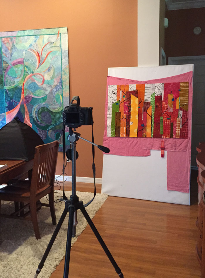
After much quilting I was ready to photograph this piece.

Trees or Skyscrapers? Ellen Lindner, AdventureQuilter.com/blog

Why use a pink backdrop, you ask? It has to do with the digital editing I’ll be doing later. I’ll “pick” the quilt away from the background and it’s easier for the computer to do that if there’s a contrast between the two. Can you see how the left side would blend into the backdrop if I left it white?

Finished photos coming soon.

Ellen Lindner

2

Retreat Project

What do you get when you add a beautiful setting, great friends, and time to make quilts? Well, fun productivity, of course!

At a recent SAQA (Studio Art Quilt Associates) retreat I took my portable design wall, my easel, and ALL of my hand dyed fabrics. I didn’t have an idea when I left home, but I got one along the way. I decided to be inspired by the colors of fall trees (which we miss here in Florida,) and to use tall vertical shapes.

First, I auditioned A BUNCH of fabric to see if I had what I needed.

Retreat Project. Ellen Lindner, AdventureQuilter.com/blog

Well, um, yes I did. Too many fabrics, as a matter of fact. (Or as Tim Gunn might say, “That’s a whole lot of look.”)

I quickly edited and started putting fabrics in place.

Retreat Project. Ellen Lindner, AdventureQuilter.com/blog

I wasn’t sure what I wanted for the “sky,” but I put some light fabrics there as place holders.

Next, I auditioned some yellow. Would one piece stand out too much? Did I need more? Could I use yellow in the sky too?

Retreat Project. Ellen Lindner, AdventureQuilter.com/blog

I settled on the arrangement below. In this photo many of the fabrics are still folded. I don’t cut until I’m pretty sure. (But, by the end of the 2 day retreat I had all these shapes cut, pinned in place, and a few glued.)

Retreat Project. Ellen Lindner, AdventureQuilter.com/blog

I knew I’d need some black to break up the bright colors, so vertical trunks and branches filled the bill nicely. And you can also see that I added more yellow/yellow-orange.

Retreat Project. Ellen Lindner, AdventureQuilter.com/blog

I also began to consider that sky. Someone at the retreat suggested a pale sky, so I tried it out. It didn’t excite me, though.

In future posts I’ll show you other options I auditioned and where I ended up.

Ellen Lindner

0

Bedroom Redo

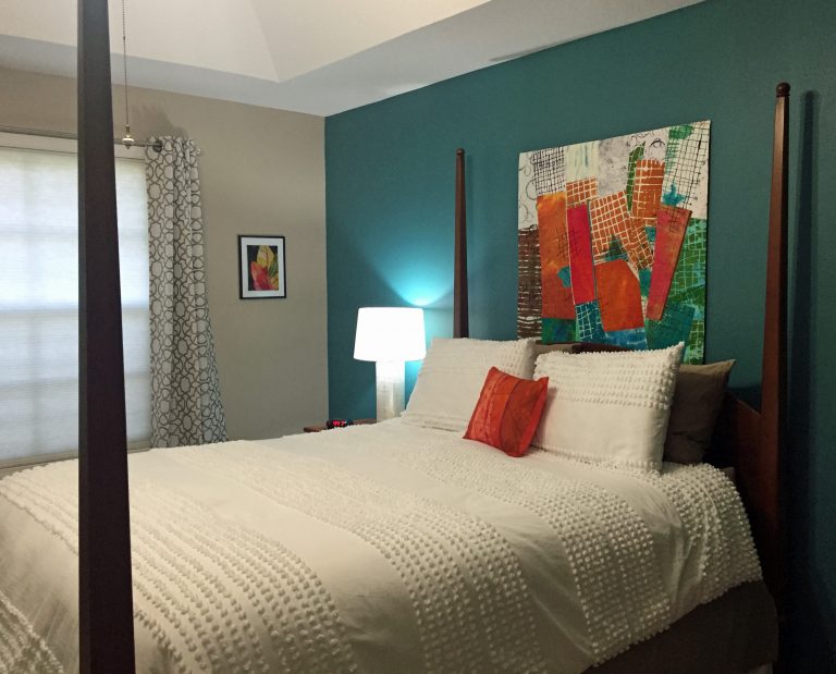
I recently redecorated my bedroom and I’m LOVING the results!

Here’s the bed wall, with my quilt Rhythm of the City prominently displayed.

Ellen Lindner's Bedroom Redo. AdventureQuilter.com/blog
More of my work moving across the window wall. This is Croton Leaves 3.

Ellen Lindner's Bedroom Redo. AdventureQuilter.com/blog

Continuing to look left, a corner featuring my paper collage Three Cherries.

Ellen Lindner's Bedroom Redo. AdventureQuilter.com/blog

And, to complete the artwork roundup, at the foot of the bed I have Brainstorm.

Ellen Lindner's Bedroom Redo. AdventureQuilter.com/blog

My tilt mirror was originally painted gold but I switched it up to “dark steel.” Although my technique was lacking it still looks good at first glance.

Ellen Lindner's Bedroom Redo. AdventureQuilter.com/blog

I wanted a taupe bed skirt, but I couldn’t find one to fit my tall bed. White was the only color available in that length. So, my friend suggested combining the two and I think it works.

It was fun to use a variety of surfaces and textures. Shiny and dull, smooth and rough, modern and vintage. I love the tufted look of the bedspread.

Ellen Lindner's Bedroom Redo. AdventureQuilter.com/blog

And these fuzzy white pom-pom flowers are the perfect contrast to my grandmother’s vintage water pitcher.

Ellen Lindner's Bedroom Redo. AdventureQuilter.com/blog

It sure was fun to put this all together and I’m SO delighted with the vibrant colors throughout!

Ellen Lindner
P.S. How do you like the way I’ve presented Croton Leaves 3, above? (2nd photo.) I bought a frame with glass and a white mat and I mounted the little quilt right on to the FRONT of the glass. I love presenting small pieces this way. They need something to give them more substance, but I don’t want to cover the texture of the piece. Lots of double-sided tape does the trick.

23

“When Fuchsia Came to Play” Complete

Well, after LOTS of trial and error, trouble shooting, and rearranging, I finally finished my latest abstract piece, When Fuchsia Came to Play.

When Fuchsia Came to Play, an art quilt by Ellen Lindner, AdventureQuilter.com

When Fuchsia Came to Play

A detail shot of the fabrics – most of them dyed by me.

When Fuchsia Came to Play - detail, an art quilt by Ellen Lindner, AdventureQuilter.com

I showed you my plans for rearranging in an earlier post. As part of that, I whacked 7+” off the bottom! It’s okay. It needed it, and I’ve already found another use for that extra part.

When Fuchsia Came to Play  is available for purchase.

My friends joke that I’m the queen of cropping, and it’s pretty true. Need me to bring my rotary cutter over?

Ellen Lindner

2

“Three Cherries” Complete

My magazine paper collage, Three Cherries, is now complete and I’m very happy with it!

Three Cherries, a paper collage by Ellen Lindner. AdventureQuilter.com

Three Cherries

I love the texture that the text of the pages adds.

Three Cherries - detail, a paper collage by Ellen Lindner. AdventureQuilter.com

Cool, right?

This technique is super easy: spread/paint matte medium on your surface, add a little bit of torn paper, and smooth on another layer of medium. The only tricky part is the little tiny details. Of course, I should have thought of that when I decided to tackle this subject at this scale (16 x 20.)

Which brings me to the pros and cons of glued magazine pages vs. stitched fabric pieces. Magazine pages are super cheap and the medium is quite inexpensive, too. However, if I wanted to do this image again (and I don’t,) I’d make it out of fabric at a much larger scale.  More like this piece, Vine Ripened, which is 28 x 40. Much more manageable. (But the materials cost a lot more!)

Vine Ripened, an art quilt by Ellen Lindner. AdventureQuilter.com

Vine Ripened

The bottom line is that both techniques are fun and effective. Try your hand at the one which appeals to you.

Both Three Cherries and Vine Ripened are available for purchase.

Ellen Lindner
P.S. I also use torn paper collages to help me abstract things sometimes. Because I’m tearing paper for a small scale composition I have to leave out details. See more.
P.P.S. See some detail shots of Vine Ripened.

2

Working with Magazine Pages

Inspired by the work of Derek Gores, I decided to make a glued collage with magazine pages. I’ve done this before on a small scale. This time I moved up to a whopping 16 x 20.

This was my inspiration photo. It’s a combination of 3 photos which I manipulated and merged on my computer. Can you guess why I chose blue-green as the background (fabric) color? (Think near-complementary colors.)

Working with Magazine Pages. Ellen Lindner, AdventureQuilter.com/blog

I drew my design directly onto a wrapped canvas and got to work.

Working with Magazine Pages. Ellen Lindner, AdventureQuilter.com/blog

I was working with friends and we used undiluted matte medium just the way you would with decoupage. You remember that from the seventies right? Glue underneath and more glue on top.

As you might imagine, the largish pieces and the lack of accuracy needed made the background go pretty quickly.

Working with Magazine Pages. Ellen Lindner, AdventureQuilter.com/blog

But, hmm, I had a problem. The shadows seemed to almost disappear. Clearly, I’d need to make them darker. More paper and more glue!

Working with Magazine Pages. Ellen Lindner, AdventureQuilter.com/blog

That’s better.

I began working on the cherries in earnest and, as you can imagine, I soon had little bits of colored paper going in all directions. Finding papers was pretty fun, though.

Working with Magazine Pages. Ellen Lindner, AdventureQuilter.com/blog

The right cherry completed.

Working with Magazine Pages. Ellen Lindner, AdventureQuilter.com/blog

LOTS more tiny bits of paper as I worked on the other two.

Working with Magazine Pages. Ellen Lindner, AdventureQuilter.com/blog

I was getting there, but I was also getting rather tired of dealing with little fiddly pieces of paper. I decided that perfection was not needed and started to work more loosely. What a relief! (I should have done this from the get-go.)

Soon, I’ll show you the finished collage and also give you a rundown of the pros and cons, as I see them, of fabric collage versus paper collage.

Ellen Lindner
P.S. See some of my earlier magazine page collages: ONE, 

6