Archive | June, 2019

“Floral Improv” in Hollywood, FL

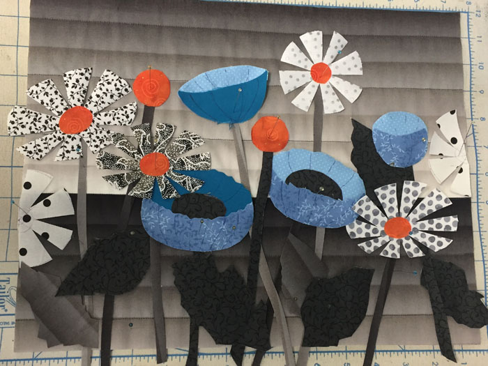
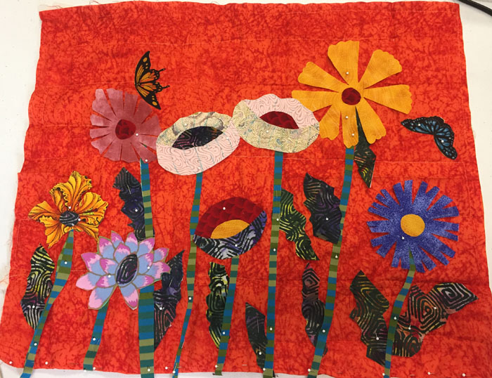
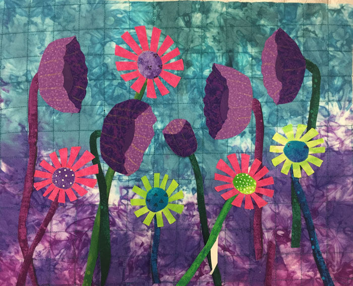
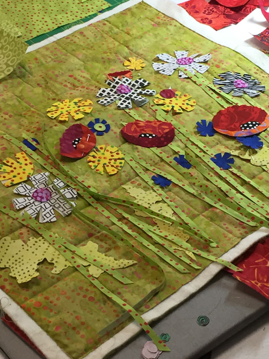
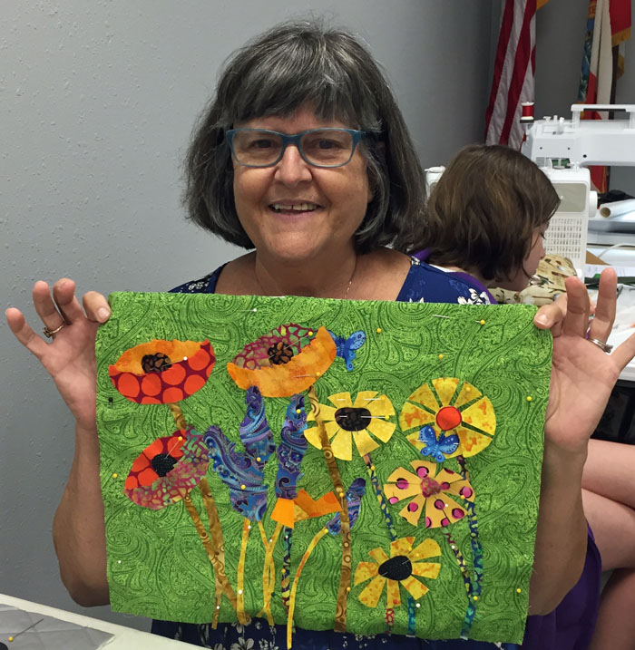
Most of my classes are geared toward somewhat traditional quilters who want to try art quilting, but aren’t quite sure where to start. Floral Improv is a perfect example of this. In it students learn how to make two types of stylized flowers without any patterns. Then, they learn about composition, and construct everything with raw edges and sketch-style stitching. Definitely new territory for most participants.

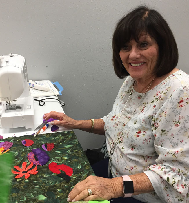
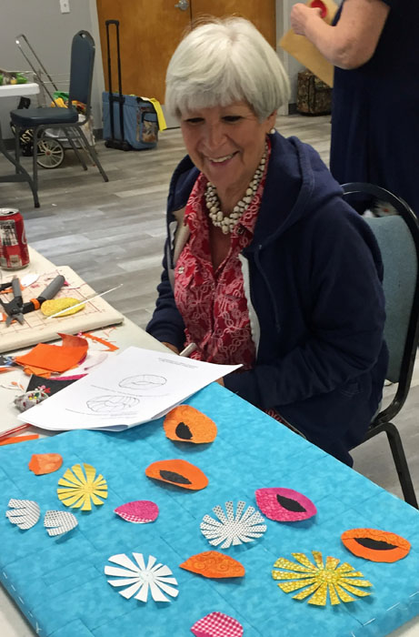
But, the group in Hollywood, FL handled it like troopers. First came the flowers.

Floral Improv in Hollywood FL. Ellen Lindner, AdventureQuilter.com/blog

Floral Improv in Hollywood FL. Ellen Lindner, AdventureQuilter.com/blog

Floral Improv in Hollywood FL. Ellen Lindner, AdventureQuilter.com/blog

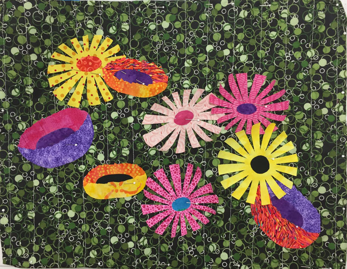
Then, composing the flowers into a pleasing arrangement. No leaves and stems to start with.

Floral Improv in Hollywood FL. Ellen Lindner, AdventureQuilter.com/blog

Sorry, but I didn’t record who made this. If anyone knows, please tell me.

Finally, the stems and leaves are added.

Floral Improv in Hollywood FL. Ellen Lindner, AdventureQuilter.com/blog

Denise’s strong contrasts create a lot of drama.


Floral Improv in Hollywood FL. Ellen Lindner, AdventureQuilter.com/blog

Nora tried a few additional things on her own, which I heartily endorse.


Floral Improv in Hollywood FL. Ellen Lindner, AdventureQuilter.com/blog

Ellen successfully used some small strips (as stems) that she had leftover from a previous project.


Floral Improv in Hollywood FL. Ellen Lindner, AdventureQuilter.com/blog

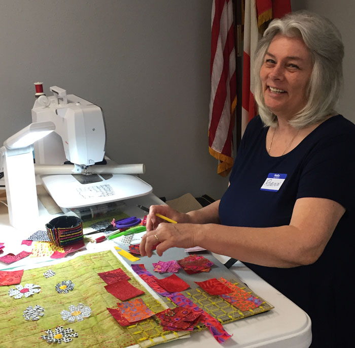
Robbin chose very subtle stems and leaves, allowing the flowers to POP.


Floral Improv in Hollywood FL. Ellen Lindner, AdventureQuilter.com/blog

Betty had hers almost ready for stitching. (And, yes, we had a younger sewer visit our class.)


Floral Improv in Hollywood FL. Ellen Lindner, AdventureQuilter.com/blog

Annette added a lot of whimsy with polka dots and plaids. They really show up well against her dark background.

I did a shortened class for this group, so they didn’t get to do a lot of stitching. Can you believe they achieved all of this in only 4 1/2 hours? It was a very successful day!

Ellen Lindner
P.S. I’d love to come teach this class for your group.

2

The Artwork of Tanja Boudal

In conjunction with the “Forced to Flee” exhibit, there’s also a presentation of artwork by Tanja Boudal and it’s VERY interesting.

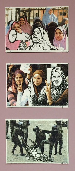
The majority of the pieces on display are like those shown here. As I understand it, she finds media pictures showing women in the midst of struggles and prints them on to fabric. She then alters one of the women using white fabric and black stitching. It’s a very striking effect.

The artwork of Tanja Boukal. Ellen Lindner, AdventureQuilter.com/blog

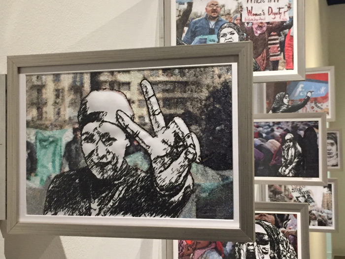
One wall featured these pieces mounted perpendicular to the wall. This gives an interesting perspective and also makes a visually intriguing presentation.

The artwork of Tanja Boukal. Ellen Lindner, AdventureQuilter.com/blog

This is the back side of the piece shown above.

The artwork of Tanja Boukal. Ellen Lindner, AdventureQuilter.com/blog

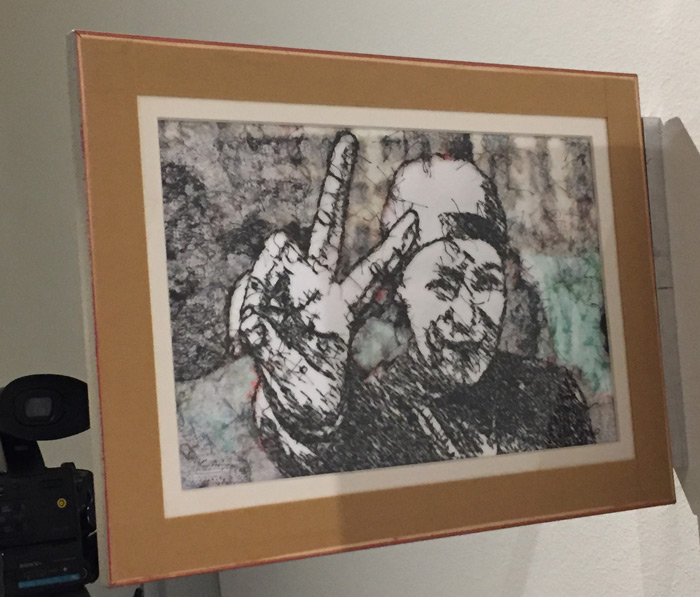
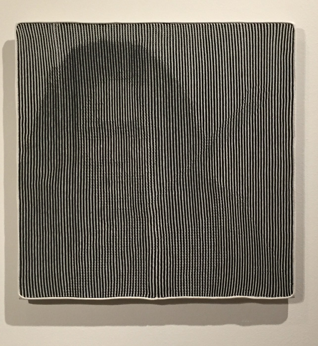
Most fascinating, however, are the pieces made with a technique Boukal calls shadow knitting.

This one is of an Indian activist named Phoolan Devi. VERY subtle, right?

The artwork of Tanja Boukal. Ellen Lindner, AdventureQuilter.com/blog

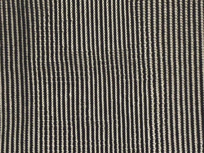
Now, check out this detail shot of the eyes. Invisible, I’d say.

The artwork of Tanja Boukal. Ellen Lindner, AdventureQuilter.com/blog

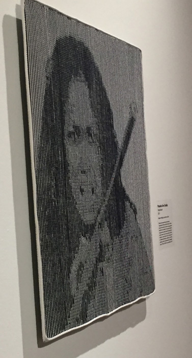
But, look what happens when you view the piece from the side.

The artwork of Tanja Boukal. Ellen Lindner, AdventureQuilter.com/blog

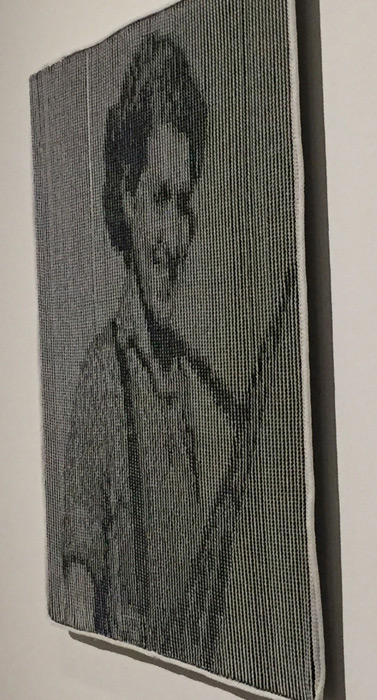
And here’s another, featuring Sarah-Ginaite.

The artwork of Tanja Boukal. Ellen Lindner, AdventureQuilter.com/blog

I have no idea how she does this! I need to go back and see these pieces again.

You can see them, too, through August 24th in Melbourne, FL. They’re at the Ruth Funk Center for Textile Arts, which is always free. Enjoy!

Ellen Lindner

6

A Tale of Two Extremes

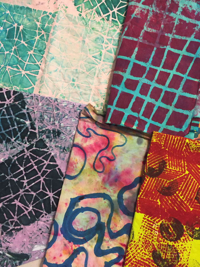
Sometimes I dye specialty fabrics: those that are almost a full design and that will be big players in a future design. After a class with Pat Pauly, I’m now designing such fabrics to have larger patterns. (These are harder for me to use, but do wonderful things in a composition, once I get it figured out.)

This is one of my favorite specialty fabrics, started in class with Pat and completed at home.

I’m not sure whether those shapes are spears, spades, or leaves, but I love them. AND the colors!

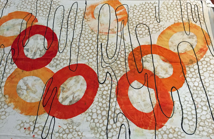
And this is my all-time favorite (so far.) I’m in love with it!

A Tale of Two Extremes

The open circles, above, were made with a 2 piece newspaper stencil. Surprisingly, the newspaper left an imprint in the center of the circles. Can you make it out? I liked it and decided to emulate it for the background. I was SO happy with the result. Some black lines finished it off, (although I need to give them more forethought next time.)

I have some other fabrics that are sorta specialty. That is, their designs are smaller in scale, meaning they can be cut up more easily. But, I’ll still need to be very thoughtful about how I use them

A Tale of Two Extremes

A Tale of Two Extremes

Don’t you love this one, above? It was initially monochromatic, but I added the hand-painted fuchsia to give it a pop. Definitely a good decision!

Then, there are those fabrics that fall on the other end of the spectrum: the ones that will be hard to use. Perhaps they have a strong contrast or unusual colors. Like these.

A Tale of Two Extremes

What would you do with that jarring fuchsia and bright yellow piece bottom right? I’m pretty sure I’ll
A) cut it in such a way so as to isolate a color or pattern, and
B) use very small amounts of it as an accent.

At some point I know that these oddball fabrics will be just the thing I’m looking for.

I’m having fun staring at these fabrics, plotting how I might use them, and finishing up some other stuff so I can get to it!

Ellen Lindner

0

Dying Yardage

When dying fabric there are two types I want to produce: yardage, and specialty. Yardage has a mostly all over pattern and can easily be cut up and used. Specialty looks almost like a whole cloth design, with thought given to composition and such.

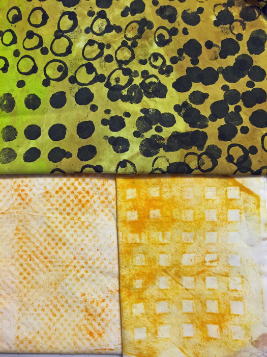
These yellow pieces fall firmly into the yardage camp. The top one had a white background initially. Can you see how such a high contrast fabric might be difficult to use? Changing the background to yellow/yellow-green makes it both more interesting and more usable.

The bottom two fabrics are both “rubbings,” (done with a foam roller.) The left texture was created by a piece of shelf liner and the right one was a plastic sink liner. I’ve discovered that I don’t like rubbings over isolated details, but these all-over ones are easy to do and they have a nice imperfection to them.

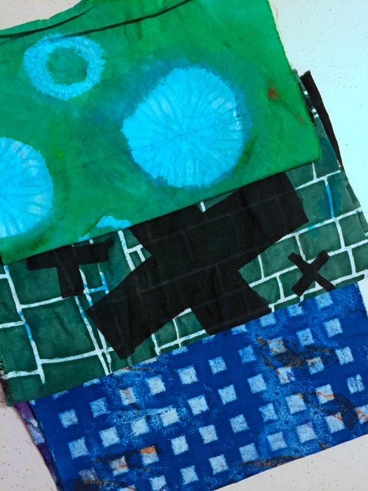
These next 3 fabrics are all re-dos. The top one was an imperfect shibori dyed fabric. The circular images were very subtle, so I played them up by painting green all around them.

The next one was large black crosses on a white background, with a few blue blotches. Again, very hard to use due to the contrast. So, screen printing the background a dark color helped minimize that.

Dying Yardage

The bottom one, above, was an ugly experiment. I rolled on some texture. Can you tell it’s the same sink liner from the yellow fabric before it? (I think this blue version is a little too perfect. I’ll aim for some sloppiness with future texture rolling.)

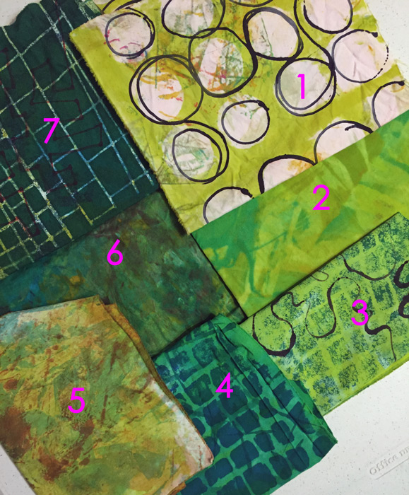
This next photo demonstrates a variety of techniques.
1- It started as a nearly white clean up rag, with some interesting marks. I screened on the yellow-green and then used a squirt bottle to add the black circles.
2-In a moment of laziness I tried to mix colors together directly on the fabric.
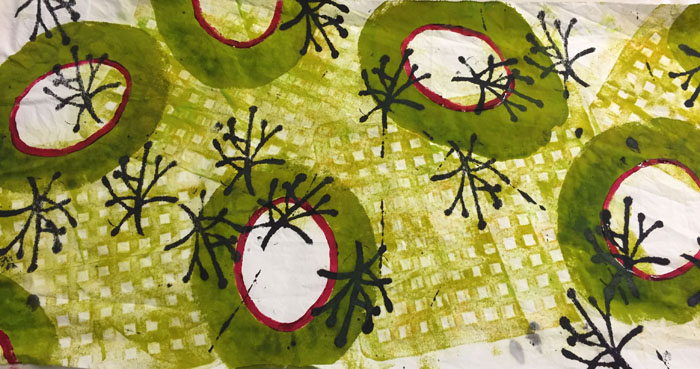
3 & 4- Both pieces originally had a white background. Again, too much contrast, so I added yellow-green to #3 and pure green to #4.
5-Some sort of ugly fabric with dull yellow-green added.
6 – A fun way to use up the last of the dye: smear on different colors and sorta smoosh them together with some clear paste.
7-A very ugly fabric was improved by the addition of a very dark screen printed design.

There’s so much to try and to learn!

Ellen Lindner

0

Accidental Learning

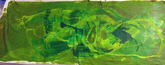
While dying fabric I’m learning a lot! Some of it comes from books and some of it I stumble upon.

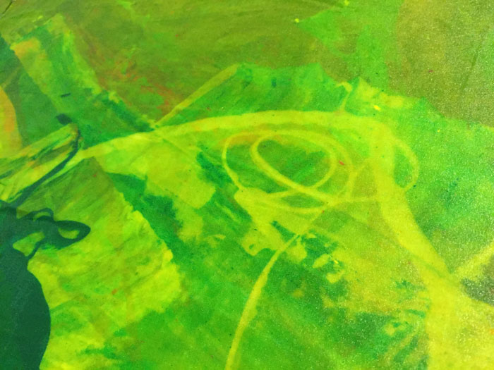
Case in point, trying to mix thickened dye colors directly on the fabric. I had heard that they wouldn’t really mix in this way, but I was feeling lazy and had to give it a try. First, I tried it with a mixture of greens and some clear dye paste.

Accidental Learning. Ellen Lindner, AdventureQuilter.com/blog

As expected, the greens were blotchy. But what was that lighter squiggly pattern? It was the clear paste, which acted as a resist to the other colors.

Bingo! That looked like something fun to play with.

Accidental Learning. Ellen Lindner, AdventureQuilter.com/blog

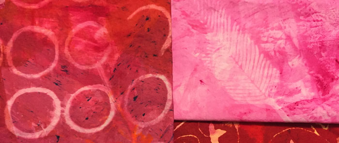
So, I tried to repeat my results with a variety of colors and patterns. Red with circles, and pink with feathers.

Accidental Learning. Ellen Lindner, AdventureQuilter.com/blog

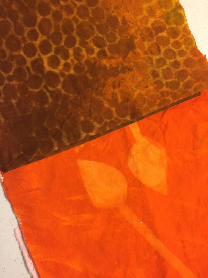
Brown circles and orange spears/leaves.

Accidental Learning. Ellen Lindner, AdventureQuilter.com/blog

Yummy! A quick and easy way to get a tone on tone pattern.

Ellen Lindner


2

“Forced to Flee”

SAQA’s “Forced to Flee” exhibit is very powerful. It recently opened in Melbourne, FL at the Ruth Funk Center for Textile Arts. As you might imagine, many of the pieces had to do with the refugee crisis, but others showcased the horrors of war, and the power of nature. There are 30+ pieces in the exhibit, so this is just a little taste.

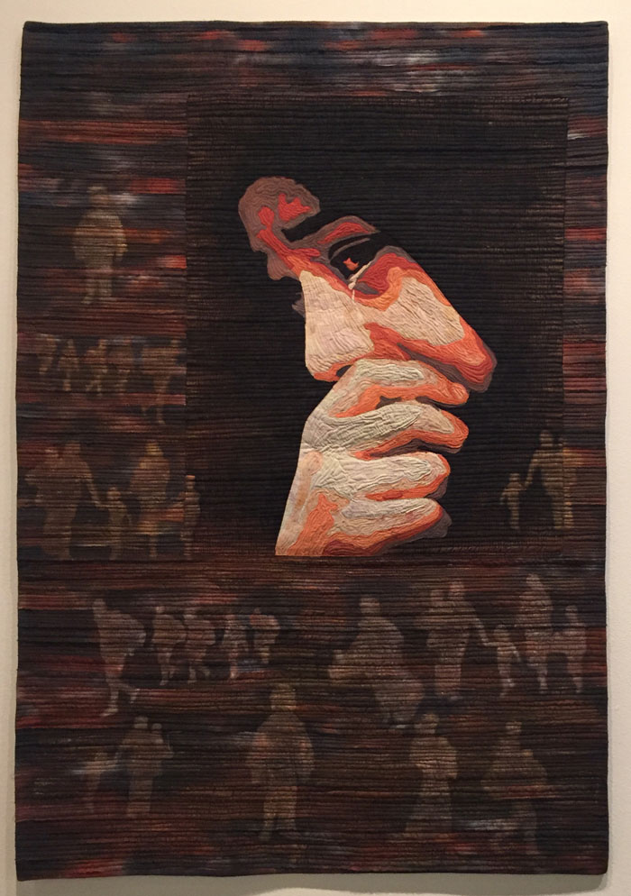
This piece, by Eunhee Lee is called “They are Also Us.” It was chosen for the featured wall image, and rightly so. It’s a very moving piece.
Forced to Flee. Ellen Lindner, AdventureQuilter.com/blog

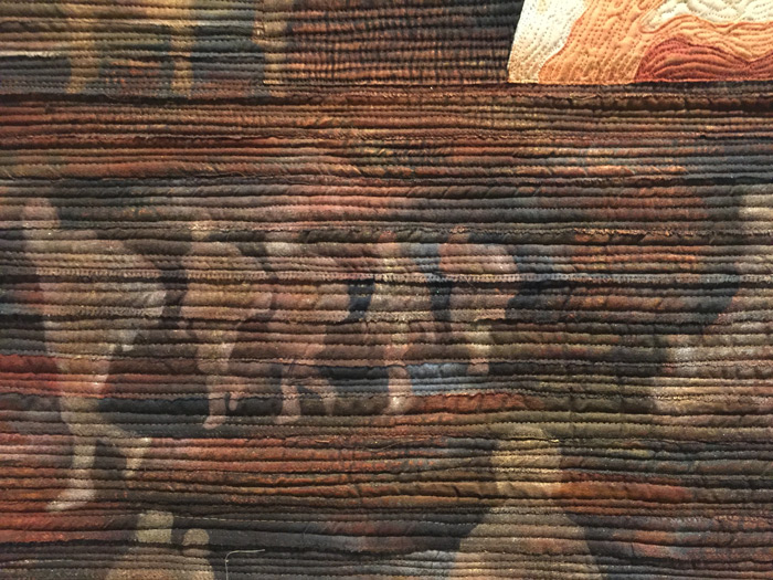
I remember seeing this quilt online and being very struck by it. But, what I didn’t notice until I saw it up close was the imagery of people fleeing in the background.
Forced to Flee. Ellen Lindner, AdventureQuilter.com/blog

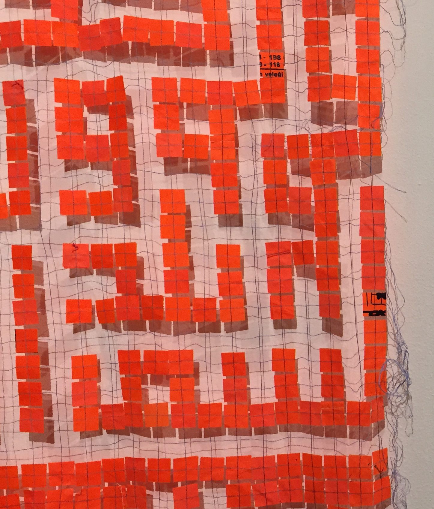
Mary Palmer’s piece, “Prayer,” was about 8 feet tall. The shapes are the characters of a Muslim prayer.

Forced to Flee. Ellen Lindner, AdventureQuilter.com/blog

It’s made from life jacket fabric cut into squares and stitched in a very open pattern.
Forced to Flee. Ellen Lindner, AdventureQuilter.com/blog
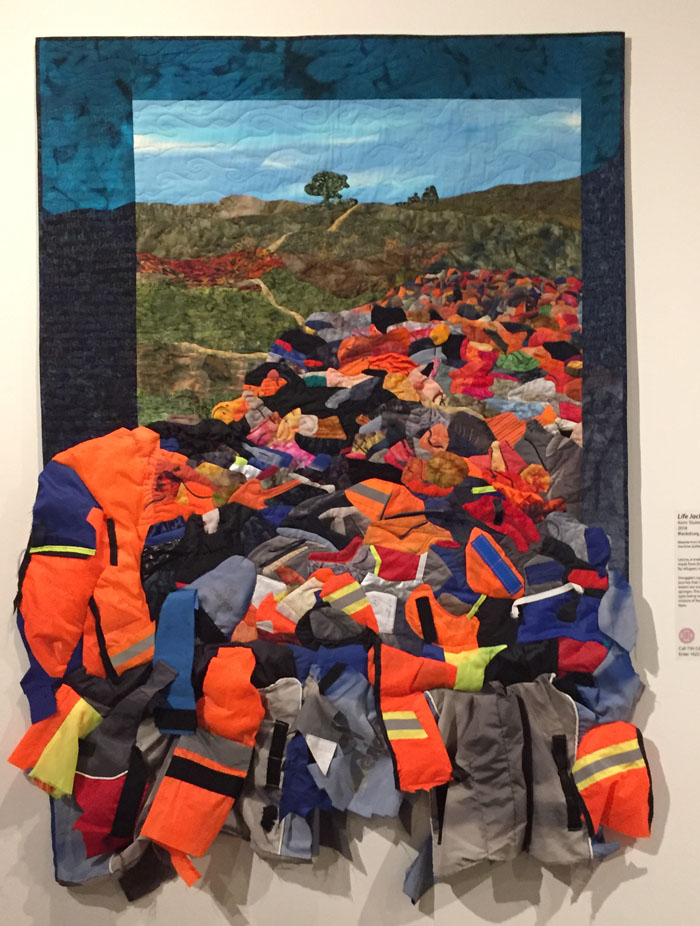
Karen Tauber’s piece also featured heavy use of life jacket fabric and imagery. It’s called “Life Jacket Graveyard of Lesvos,” and it depicts the “Mountain of Misery” created as thousands of refugees discarded their jackets and rafts on this small Greek island.
Forced to Flee. Ellen Lindner, AdventureQuilter.com/blog

As you can tell by the shadows on the wall, the bottom portion is extremely three dimensional.

“Missing Migrants” is the name of Genevieve Attinger’s piece, shown below.
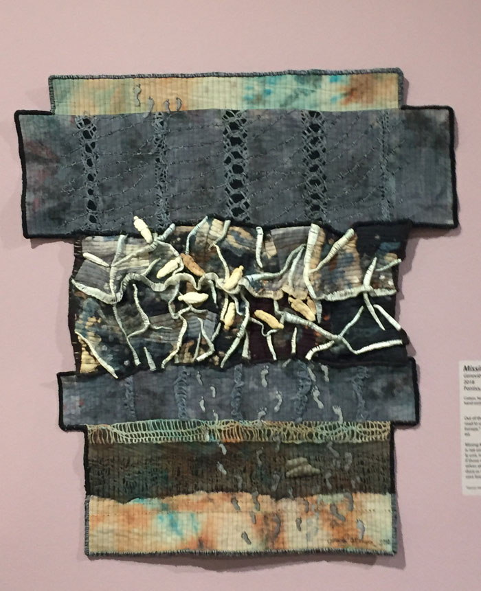
Forced to Flee. Ellen Lindner, AdventureQuilter.com/blog

As you can see in the detail shot below, she’s used tiny little “mummy” dolls to represent the people. Barbed wire depicts their final obstacle.
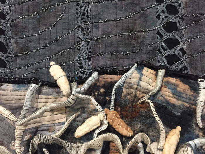
Forced to Flee. Ellen Lindner, AdventureQuilter.com/blog

Claire Passmore also shows the refugee’s journey, reading from bottom to top. Her title asks the question, “Lucky Ones?”
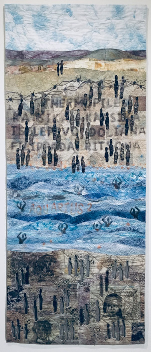
Forced to Flee. Ellen Lindner, AdventureQuilter.com/blog

She depicted those who died with sheer bodies, as seen below. Very moving.
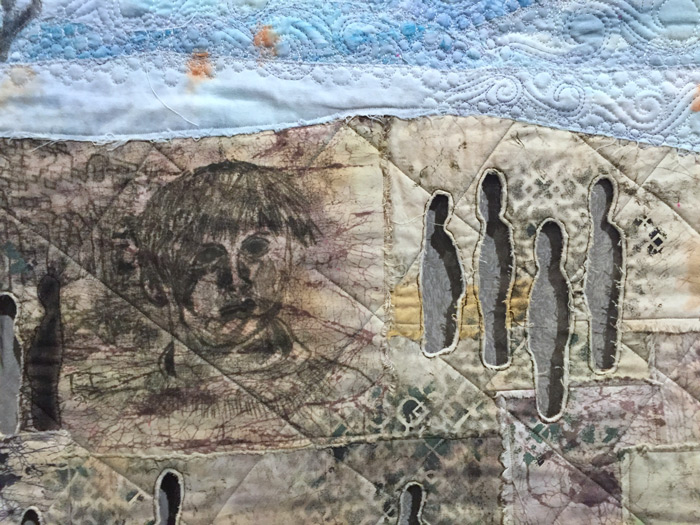
Forced to Flee. Ellen Lindner, AdventureQuilter.com/blog

And here’s one of the few pieces that didn’t focus on refugees. It’s called “Firestorm,” by Grace H. Wever. It depicts the firestorms which raged in bombed cities during World War I.
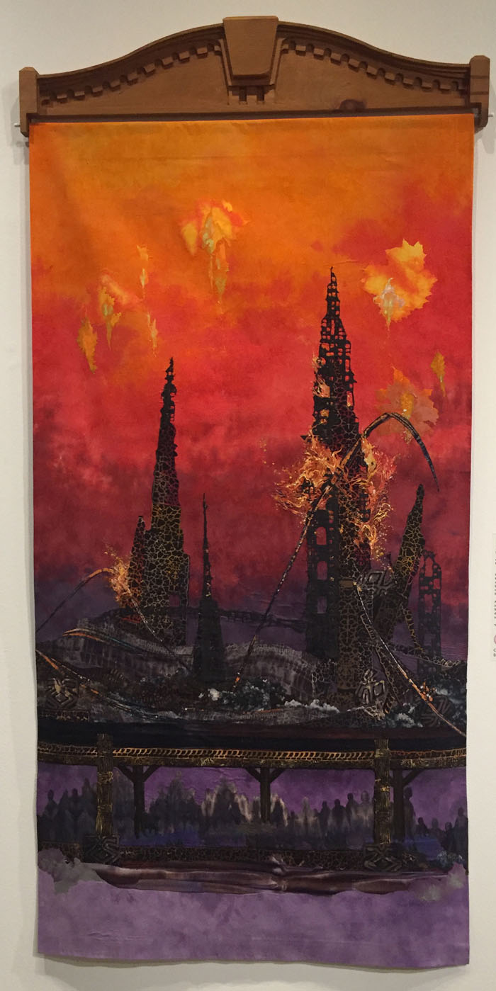
Forced to Flee. Ellen Lindner, AdventureQuilter.com/blog

She depicted the fire very effectively with a variety of materials and techniques. It almost looked like it would burn you if you touched it.
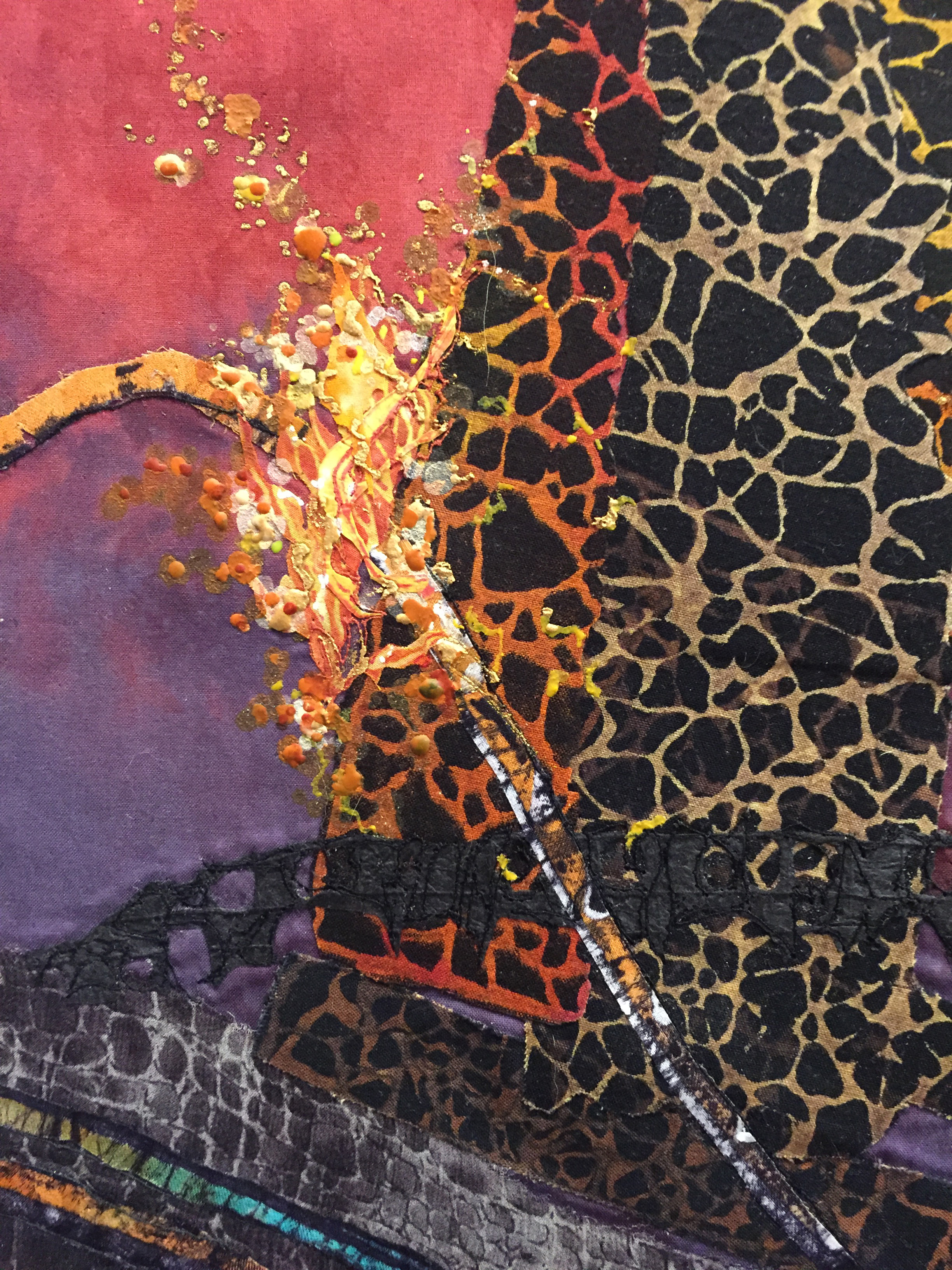
Forced to Flee. Ellen Lindner, AdventureQuilter.com/blog

All the artists in this exhibit approached their subjects in very thoughtful ways. The layers of meaning and subtle details gave strength to their stories.

Although not a happy upbeat exhibit, it is WELL worth visiting. It’s on display until August 24th, so you’ve got plenty of time to see it. (And it’s free!)

Ellen Lindner
0