After making small collages our online instructor, Jane Davies, asked us to visually crop them and to pay attention to negative space. Well, I’m sort of “known” for cropping things, so I was right in my comfort zone!
Before:

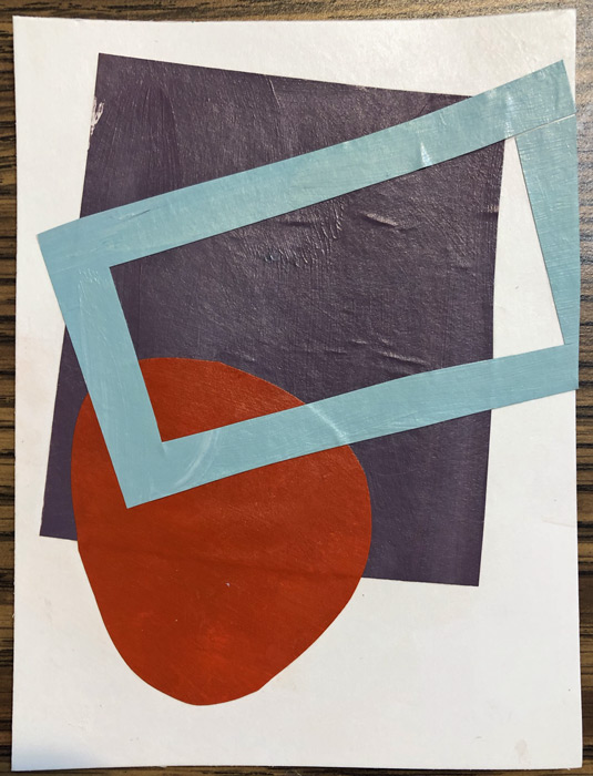
After:

As expected, everything looked better when cropped. There were several reasons for this:
– Due to the sizes of the backgrounds and the added shapes, there was just too much blank background in some of these.
– When an element runs off the edge of a composition, it engages the viewer more. The viewer subconsciously realizes that the shape continues and this holds their interest.
– *The background (negative) space becomes more interesting. Look at the example above. Initially the background was one large sort of doughnut-shaped piece of white. After cropping, it became 4 different, and more interesting shapes.
Here are some more examples:


They’re all better after cropping, right?
As a painter, Jane advised us NOT to physically crop our work, but to get comfortable with filling the size of the canvas, instead. As a fabric artist, I think I can safely ignore that advice. (Let’s hope so, because I’ve been cropping for years!)
Have you ever considered cropping your work? I find it to be a very useful design tool.
Ellen Lindner
P.S. See my most dramatic crop.
P.P.S. If you liked that article, you may be interested in others.