Archive | October, 2019

Better Planning This Time

Fresh on the heals of my recent “rough draft,” I used my lessons learned and jumped right into the next piece.

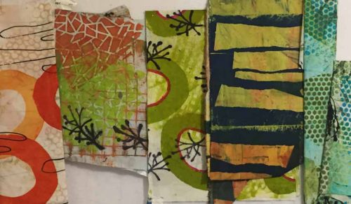
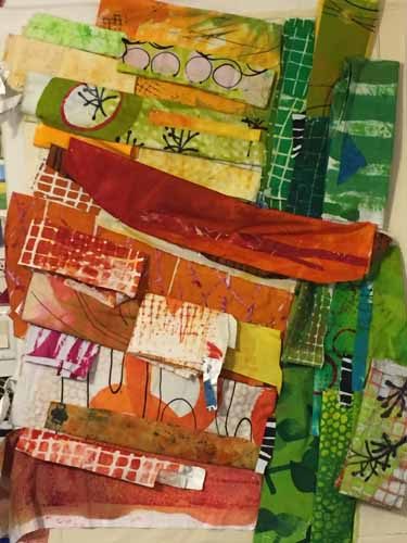
I wanted to use some of my hand dyed fabrics with larger scaled prints. This is fairly new to me and I often find it challenging. A good reason to do it! I pulled out the fabrics (I was willing to cut up) and studied them.

Better Planning This Time. Ellen Lindner, AdventureQuilter.com/blog

I could see that the four pieces on the left could play together nicely (I hoped,) so I let them dictate the color scheme.

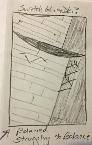
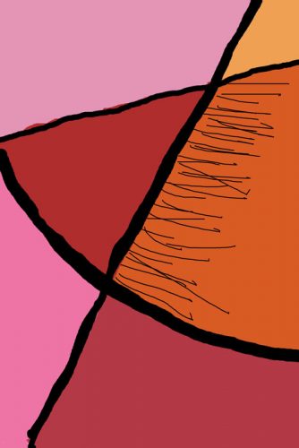
My sketchbook offered lots of composition ideas so I picked a favorite. This time I was smart enough to color in the values of the design. A huge help!

Better Planning This Time. Ellen Lindner, AdventureQuilter.com/blog

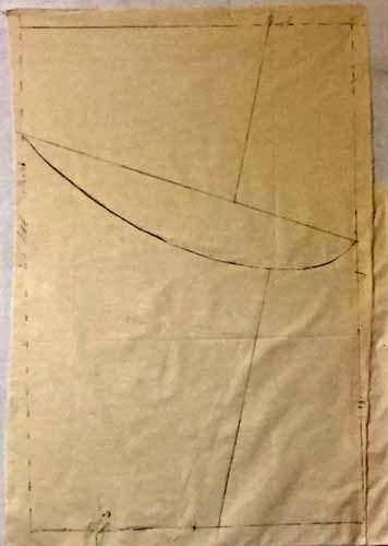
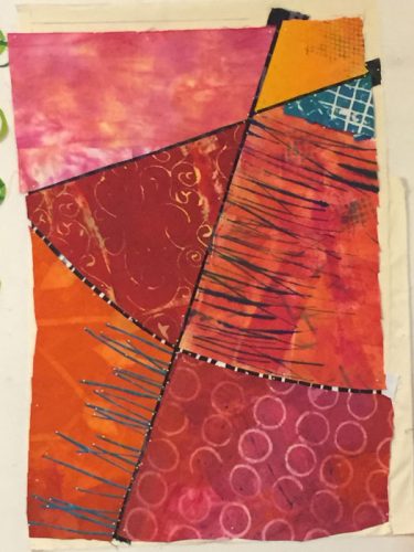
I drew it onto the muslin base, 36 x 24.

Better Planning This Time. Ellen Lindner, AdventureQuilter.com/blog

However, I could see this was not large enough for the fabrics I intended to use. If I cut them up enough to work at this size their designs would be disrupted too much. So, I got a new piece of muslin and scaled everything up to 45 x 30.

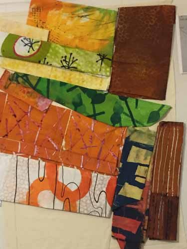
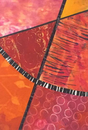
First, I auditioned fabrics and colors, incorporating several of my large-scaled pieces.

Better Planning This Time. Ellen Lindner, AdventureQuilter.com/blog

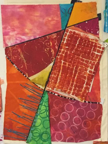
Some experimenting was called for.  During the audition phase fabrics were folded and put loosely into place.

Better Planning This Time. Ellen Lindner, AdventureQuilter.com/blog

 I was loving these colors!

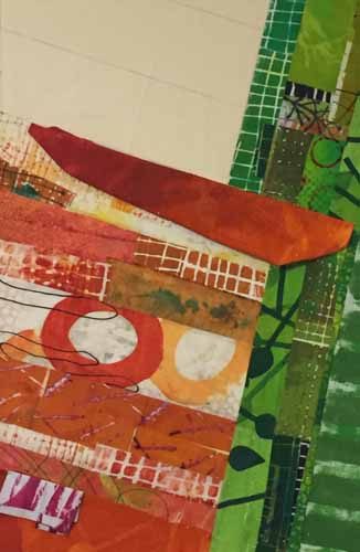
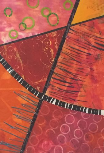
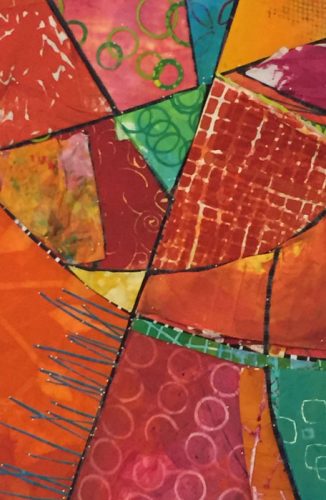
Soon, I began to cut and place fabrics, pinning them to the muslin base on the design wall. I was happy! (And having fun!)

Better Planning This Time. Ellen Lindner, AdventureQuilter.com/blog

It sure is easier when I have a plan!

Stay tuned to see where I take this.

Ellen Lindner

0

“Deja Vu Again” #1-6

When you start 6 pieces in 2001, put them away, take them out and work on them several years later, put them away, and FINALLY finish them 18 years later the title pretty much writes itself: Deja Vu Again. (I’m proud of that one!)

It all started in a class with Judy Hooworth way back in 2001. She asked us to make 6 pieces in series. I didn’t fully understand what a series was and I made my 6 pieces with exactly the same skeleton and colors. You’ll see these original squares in each of the following pieces.

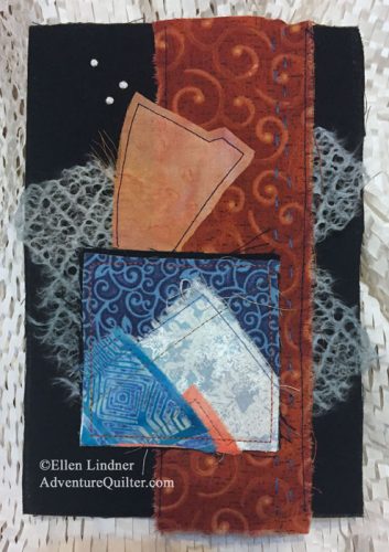
"Deja Vu Again," mixed media collage by Ellen Lindner. AdventureQuilter.com

YEARS later I finally got around to doing something with all of them. Each one is mounted onto something moderately stiff. Thick interfacing, cardboard, etc.

"Deja Vu Again, mixed media collage by Ellen Lindner. AdventureQuilter.com

Deja Vu Again #1. The background is painted fusible web.

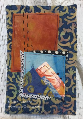
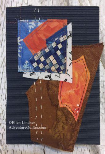
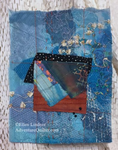
Each piece is approximately 6 x 8, made with a variety of media. Mostly fabric, but also some paper, painted fusible web, corrugated cardboard, and ribbon.

"Deja Vu Again," mixed media collage by Ellen Lindner. AdventureQuilter.com

Deja Vu Again #2 has lacy paper on the sides


"Deja Vu Again," mixed media collage by Ellen Lindner. AdventureQuilter.com

Deja Vu Again #3, includes glossy magazine paper


"Deja Vu Again," mixed media collage by Ellen Lindner. AdventureQuilter.com

Deja Vu Again #4 includes a piece of corrugated navy blue cardboard.

"Deja Vu Again," mixed media collage by Ellen Lindner. AdventureQuilter.com

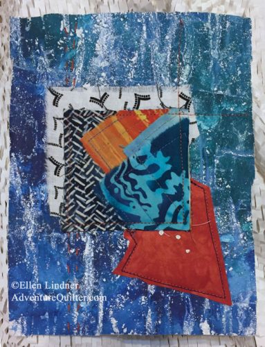
Deja Vu Again #5 has a background made entirely from layered sheer fabrics.


"Deja Vu Again," mixed media collage by Ellen Lindner. AdventureQuilter.com

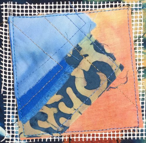
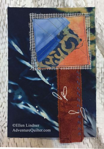
Deja Vu Again #6. The background is a wet cyanotype print and the white grid is needlepoint canvas.

As you can see, I added some hand stitching to each piece.

I’ll be offering these for sale and I’m sure my buyers will want to know how to display them. I have two good suggestions.
– Since the pieces are rigid they can easily be hung on a wall with Command strips. The strips have a little depth to them, which will create a little shadow behind each piece.
– Mount then onto the glass front of a prepared frame. This is one of my favorite ways to show off small pieces. It gives them substance, but allows all the texture to show front and center. See an example.

Here’s a link to all six pieces.

0

A Useful “Failure”

Well, it happened: I got completely stumped on my current quilt and have decided to scrap it. I’ll show you what I’ve been up to and what I’ve learned from it.

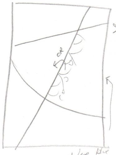
I started with what I thought was an interesting sketch.

A Useful "Failure." Ellen Lindner, AdventureQuilter.com/blog

And if I wanted to make a quilt with 3 lines in it, on a solid background, this would have worked nicely. But, what I really needed was SHAPES. And a plan for using different values. I did neither, and forged ahead.

I did take the time to do a color sketch in my computer and dubbed it “not bad.” I thought the patterns from the hand dyed fabrics I’d be using would carry it. (Note to self: why even continue with a design that needed to be carried???)

A Useful "Failure." Ellen Lindner, AdventureQuilter.com/blog

Here it is with those first 6 fabrics in place. (Which is pretty close to where I expected the design to be complete.)

A Useful "Failure." Ellen Lindner, AdventureQuilter.com/blog

Hmm. It was pretty obvious that more was needed. The patterns did NOT carry it. I decided that I should try adding more, with little fused motifs.

A Useful "Failure." Ellen Lindner, AdventureQuilter.com/blog

I really liked the very skinny blue-green strips in the lower left. But, the green circles as the top? They were a maybe.

Next, I made the lines skinnier. That did truly help. It lifted my spirits and helped me decide to continue.

A Useful "Failure." Ellen Lindner, AdventureQuilter.com/blog

Next, I did a TON of trial and error as I tried to add some energy and excitement to the piece.  New fabrics were folded and placed for auditioning. (This went on for about a week!)

A Useful "Failure." Ellen Lindner, AdventureQuilter.com/blog

And this is where I ended up when I decided to give up on it.

A Useful "Failure." Ellen Lindner, AdventureQuilter.com/blog
Is it horrible? No.
Did I like it well enough to continue? No.

Before disassembling it I asked myself, “What’s wrong with it?” I think I already knew: it needed some contrast in value. And I couldn’t quite figure out how to inject it.

Next question: “How can I avoid this error in the future?” Again, I already knew the answer: use a sketch WITH THE VALUES COLORED IN! Get happy with the shapes and contrasts before reaching for the fabric!

How do I feel about using my time and my fabric in this way? I’m not bothered by it. Of course, we’d all like to have things easily fall together, but I’m philosophical about this “rough sketch.” It made me really study why things go wrong and that examination revealed concepts that will be helpful in the future. As far as I’m concerned, I wasted neither my time nor my fabric.

Have you ever scrapped a project? How did you feel about it?

Ellen Lindner
P.S. I don’t actually call such incidents failures. I call them rough drafts or sketches. The word failure was just to add interest to the title.
P.S.S. I’m excited to start on my next project, which has a value sketch! Yippee.


6

Color eBook Now on USB

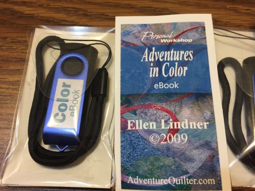
I’m kinda proud of myself. I’ve just started selling my Color eBook on a USB/thumb drive. The tricky part was trying to figure out how to package them. I thought they should have good labeling and be large enough so that I could keep track of them. This is my solution. Each thumb drive has it’s own plastic pouch with labeling both inside and out.

Color eBook Now on USB. Ellen Lindner, AdventureQuilter.com/blog

I think it looks pretty professional and I’m quite happy with it. I’ll be selling these when I teach in person. In the meantime, you can get the Color eBook as an immediate download to your computer.

Ellen Lindner
2

“Floral Improv” in Peachtree City, GA

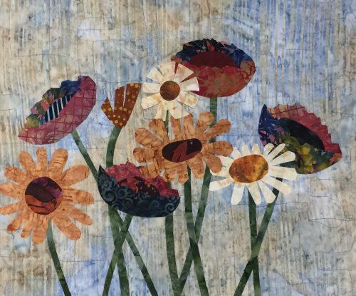
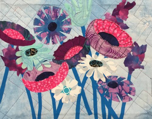
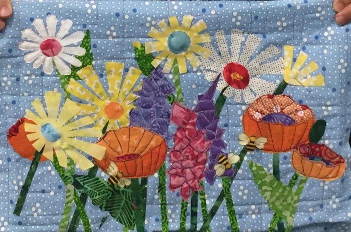
There was lots of energy, colorful fabric and fun when I met up with the quilters of the Southern Crescent for a “Floral Improv” class.

Floral Improv in Peachtree City GA. Ellen Lindner, AdventureQuilter.com/blog

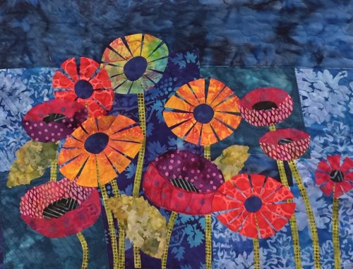
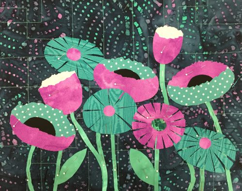
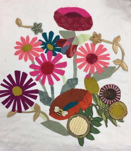
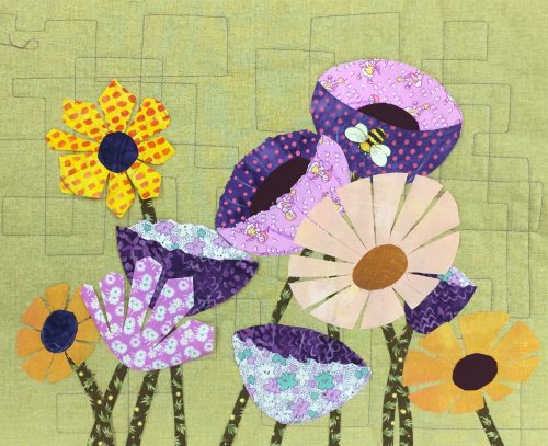
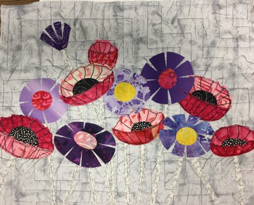
First, students learned how to make free-form “daisies” and “poppies.” No rulers or patterns, please!

Floral Improv in Peachtree City, GA. Ellen Lindner, AdventureQuilter.com/blog

Evie chose bright colors with a darker background.

Floral Improv in Peachtree City, GA. Ellen Lindner, AdventureQuilter.com/blog

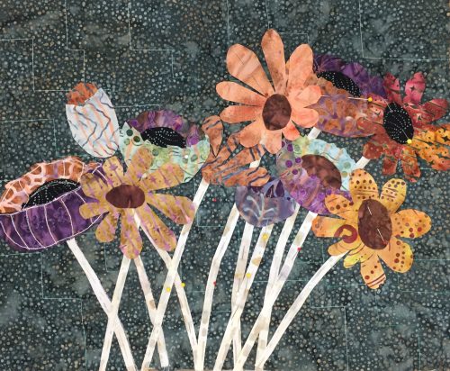
Ellen chose complementary colors

After creating their flowers, students learned about composition as they arranged all their elements and added stems and leaves. Some liked high contrast foliage.

Floral Improv in Peachtree City, GA. Ellen Lindner, AdventureQuilter.com/blog

MJ’s stems added a lot of contrast so she decided to omit the leaves

Others wanted very low contrast.

Floral Improv in Peachtree City,GA. Ellen Lindner, AdventureQuileter.com/blog

Brenda opted for vibrant flowers and played down the vegetation.

Students carefully considered each option and made their own decisions at every turn.

Floral Improv in Peachtree City, GA. Ellen Lindner, AdventureQuilter.com/blog

Sherri’s sherbert colors and dark contrasts really popped.

Floral Improv in Peachtree City GA. Ellen Lindner, AdventureQuilter.com/blogSteph chose subdued colors and they worked beautifully.

Floral Improv in Peachtree City, GA. Ellen Lindner, AdventureQuilter.com/blogCandy selected both high and low contrast flowers.

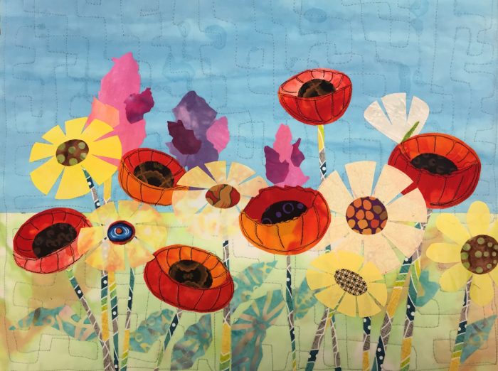
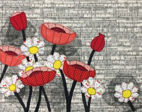
After fusing everything in place it was time to add contrast stitching (usually black) to the poppies. Can you see how it adds definition?

FLoral Improv in Peachtree City, GA. Ellen Lindner, AdventureQuilter.com/blog

Kathy’s garden even had a horizon.

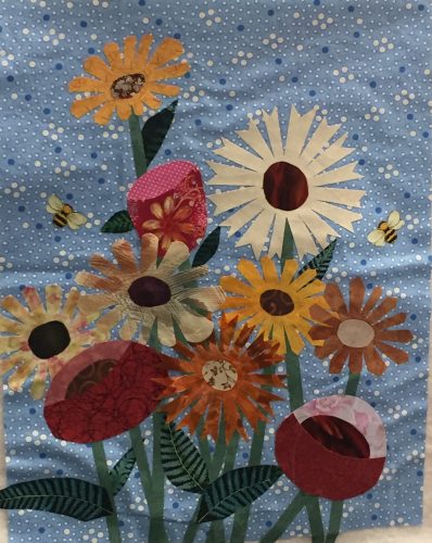
Although most of the students made a horizontal quilt (which is easier,) Laura challenged herself with a vertical orientation. It gives more of a bouquet effect.

Floral Improv at Peachtree City, GA. Ellen Lindner, AdventureQuilter.com/blog

Laura’s vertical composition.

Several students added snap dragons to their pieces. (See also Kathy above.)

Floral Improv in Peachtree City. Ellen Lindner, AdventureQuilter.com/blog

Sarah made excellent progress.

A couple of students deviated from the norm, which I whole-heartedly endorse!

“Floral Improv” in Peachtree City, GA

Wanda brought lots of interesting foliage options with her. And some of her flowers even have fur centers!

Heather wanted to increase the contrast between her white daisies and her background fabric. So she brought a lot of precut black tulle circles with her. They worked very well and also added interest.

Floral Improv in Peachtree City, GA. Ellen Lindner, AdventureQuilter.com/blog

Layers of black tulle add interest to Heather’s piece.

These quilts are all shown at the end of a one day class. Didn’t they accomplish a lot?

I’d love to come teach this class for your guild!

Ellen Lindner
P.S. We learned that paper backed fusible web slows things down. I’ll be recommending paperless fusible in the future.

6

“Caring” Wins Best of Show

My piece, Caring, has just won Best of Show in a local exhibit. How nice!

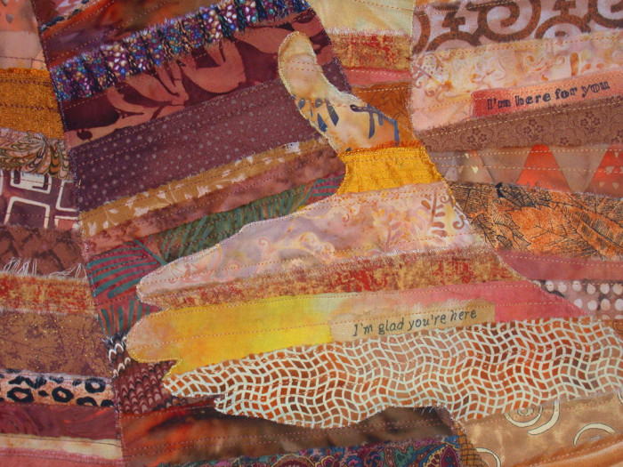
Caring, an art quilt by Ellen Lindner. AdventureQuilter.com

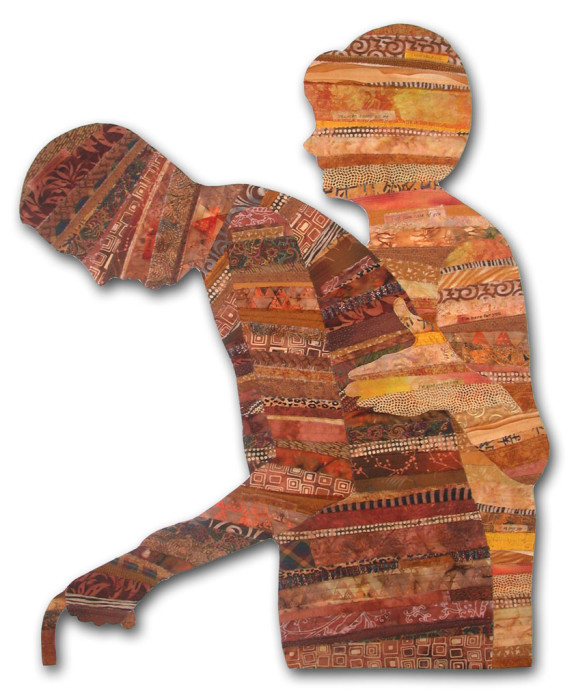
At 40″ high, this piece is nearly life-sized. To enhance the message I’ve included little thoughts throughout. He thinks, “I rely on you.” She thinks “I’m here for you, you can count on me,” and so forth.

This piece is part of my “Body Language” series. Each one shows bodies (or parts of bodies) in various positions which tell their own stories. See more of them.

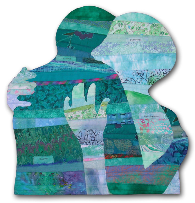
It was a joy to design these pieces. In each one I tried to edit out as much as possible, while still keeping the message in tact. I wanted them to be both universal and personal at the same time. For instance, in Reconciliation , above, is it showing a husband and wife hugging? Two women? A parent and their grown child? Your answer will depend on your life experience.

These pieces are mounted onto Plexiglas, which makes them hard to ship, so I’m always happy when I can show them locally. If you want to see Caring and also Security in person, vision Studios of Cocoa Beach between now and November 19th.

Ellen Lindner
P.S. Caring is available for purchase. (And I have a free audition-it-in-your-home program.)

1