Archive | June, 2021

Quilt Design: Playing with Those Fabrics

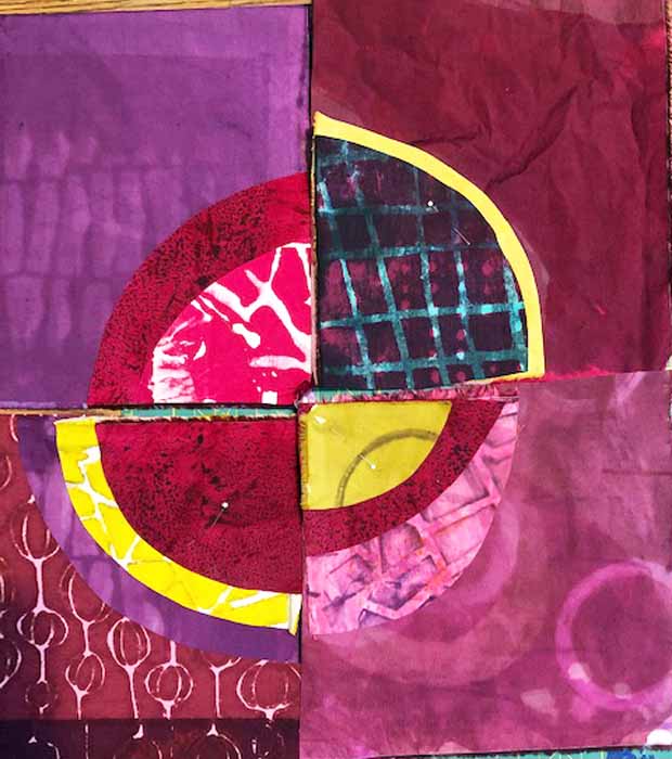
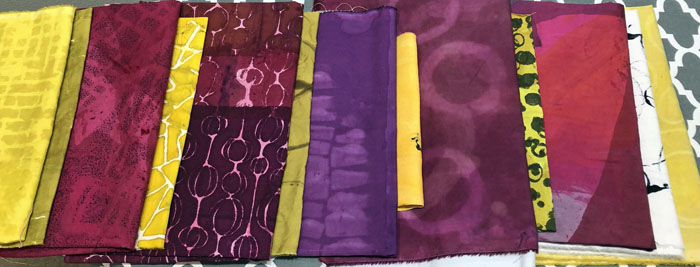
Earlier I showed you the fabrics I dyed in anticipation of making a beet colored quilt. Next, it was time to start the quilt design. I knew I wanted the berry-colored fabrics to be the stars, with the yellows as accents. My first thought was to piece little sharp bits of yellow, but I wasn’t sure that played well with the idea of curvy beets. So, I decided to play with wonky, improvisational circles.

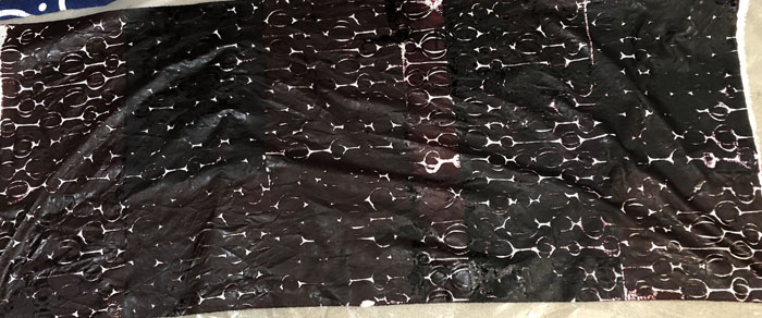
Maybe something like this.

Quilt Design: Playing with those fabrics. Ellen Lindner, AdventureQuilter.com/blog

I liked it!

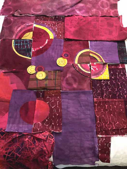
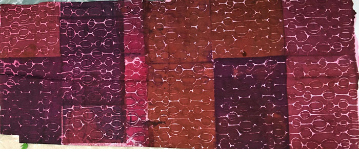
I’ve been traveling and I took my fabrics with me. I made a few more units while away and tried them all laid on my hotel bed.

Quilt Design: Playing with those fabrics. Ellen Lindner, AdventureQuilter.com/blog

Definite potential for a quilt design!

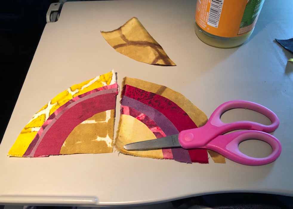
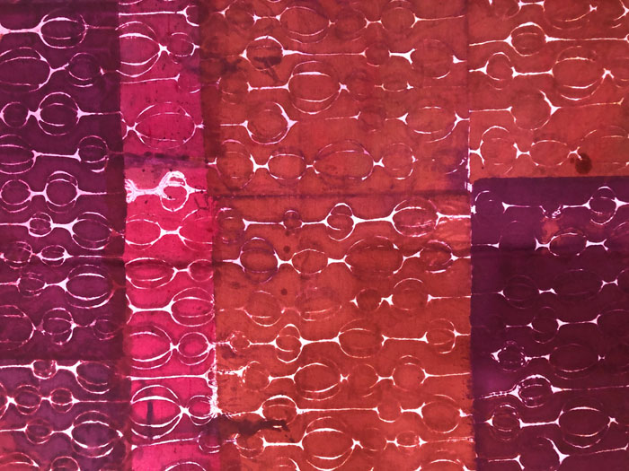
And then, I played some more on the flight home. It’s amazing how sharp those little kiddie scissors are.

Quilt Design: Playing with those fabrics. Ellen Lindner, AdventureQuilter.com/blog

My plan is to make a lot more units and then to start arranging them on my design wall. Stay tuned!

Ellen Lindner
P.S. I’m just gluing these circles together. Fast and easy!

0

Fabric Dyeing: Sometimes I Get it Right

I’ve shown you some of my fabric dyeing challenges, as well as over-dyed corrections. But, sometimes everything comes out exactly as I had hoped. This little scrap is one such example.

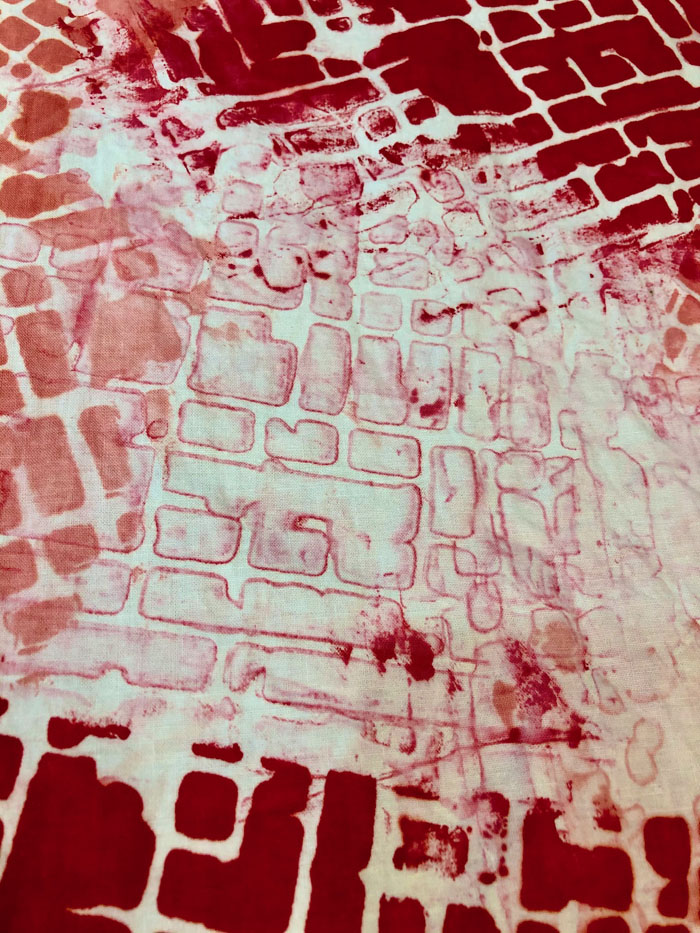
I made it with a two step process. First, I scraped dye through a stencil in a couple places. Then, I cleaned my squeegee and used the same dirty stencil for another couple of pulls with clear paste. The clear paste prints the little bit of dye caught in the crevices, resulting in a ghost image. I just love the delicate effect!

Here’s a detail shot.

Don’t you love the effect?

Ellen Lindner

0

Over Dyeing Fabrics

When dyeing fabric, there are always a few fabrics that don’t quite match my intentions. When that happens, I consider over dyeing them. Which simply means dyeing the whole piece a second time.

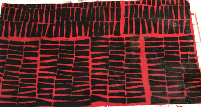
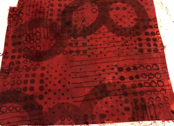
The background color on this one was just too pale for my liking.

So, I over dyed it with a diluted red.

Truly. It really was diluted! But, apparently it was stronger than I realized. No worries. I like it better than before and I’ll definitely be able to use it. Maybe I’ll soften it with a subtle stamped design in white.

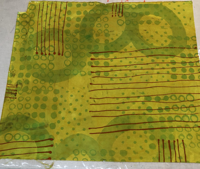
This green fabric was not bad except for the red lines I had drawn on. They made it really ugly.

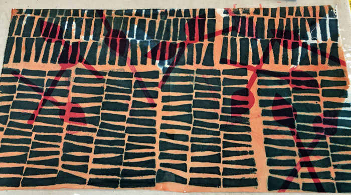
I decided to embrace the red theme by over dyeing with orange.

Hmm, well it’s better, I think. Very usable, but not that exciting. I think I’ll draw on some dark blue or black circles.

Did I mention that dyeing fabric requires patience? Yep. Patience to wait to wash out fabrics and then patience when additional steps or corrections are needed. It sure is fun, though!

Ellen Lindner

Updated July 1, 2021:

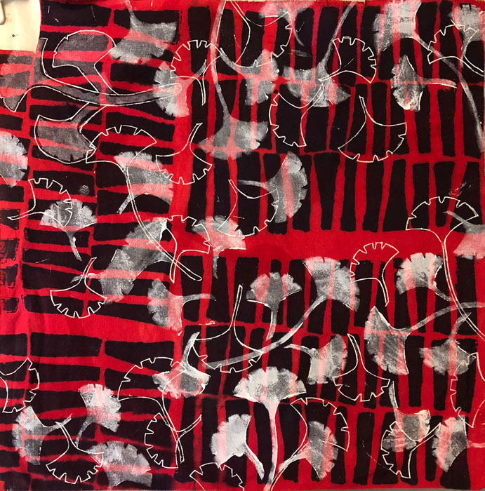
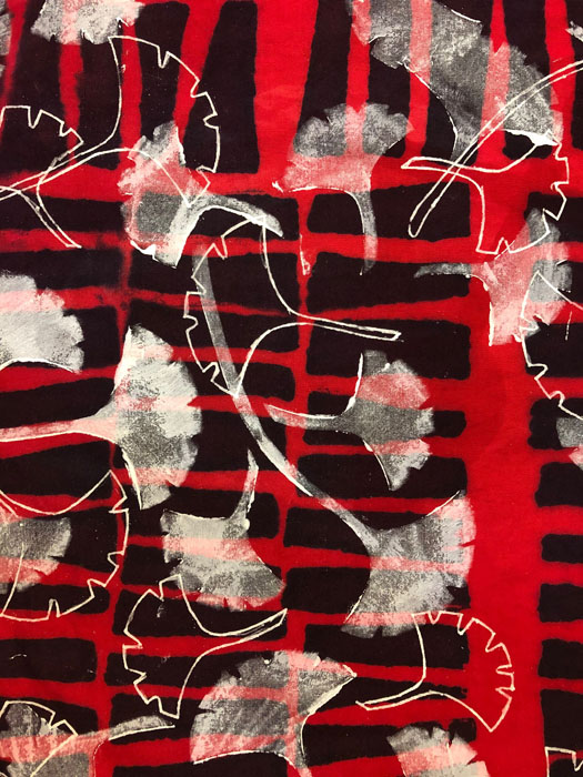
I used white transparent fabric paint and stenciled a ginkgo leaf design onto the red fabric.

Over Dyeing Fabrics. Ellen Lindner, AdventureQuilter.com/blog

I also used the stencil as a guide for drawing additional leaves with a permanent marker. I really like the effect. I think I’ll be doing more of that.

Over Dyeing Fabrics. Ellen Lindner, AdventureQuilter.com/blog


0

Dyeing Fabrics in Beet Colors

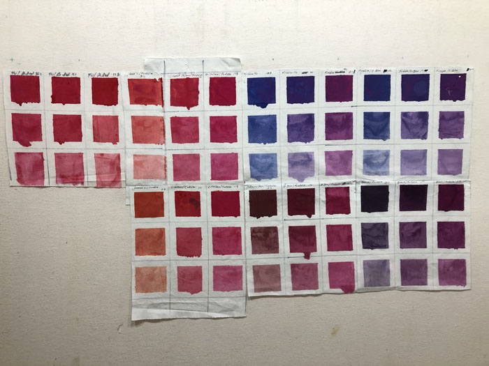
After seeing a photo of a red beet along with a yellow one, I got the idea to make a quilt in those colors. I set out to dye fabrics in a variety of beet/berry colors, along with some dull yellow ones. Thankfully, I had already done quite a bit of color swatching, so I was able to refer to my results as a reference.

All Those Swatches! AdventureQuilter.com/blog

These are my final results, and I’m quite happy with them.

I was really thankful for the color swatches. That’s because wet dye always looks different from the washed and dried version. Especially with strong colors.

Take this piece, for example. I was aiming for a variety of beet/berry/grape colors, all in the same fabric. Although it was hard to see the variations in colors, I trusted my swatches and mixed the fabric dye colors accordingly. This is what it looked like. NOT reassuring!

But, this is what it looked like dry – almost exactly what I wanted.

It turns out that my dye mixture was a little thin, so the stencil motif blurred somewhat. But, actually, I like the imperfect effect quite a bit. Here’s a detail shot.

I’m looking forward to using these fabrics!

Ellen Lindner
P.S. The color swatching is an exercise in the book Colour Your Palette, by Leah Higgins.

0

“And the Band Plays On”

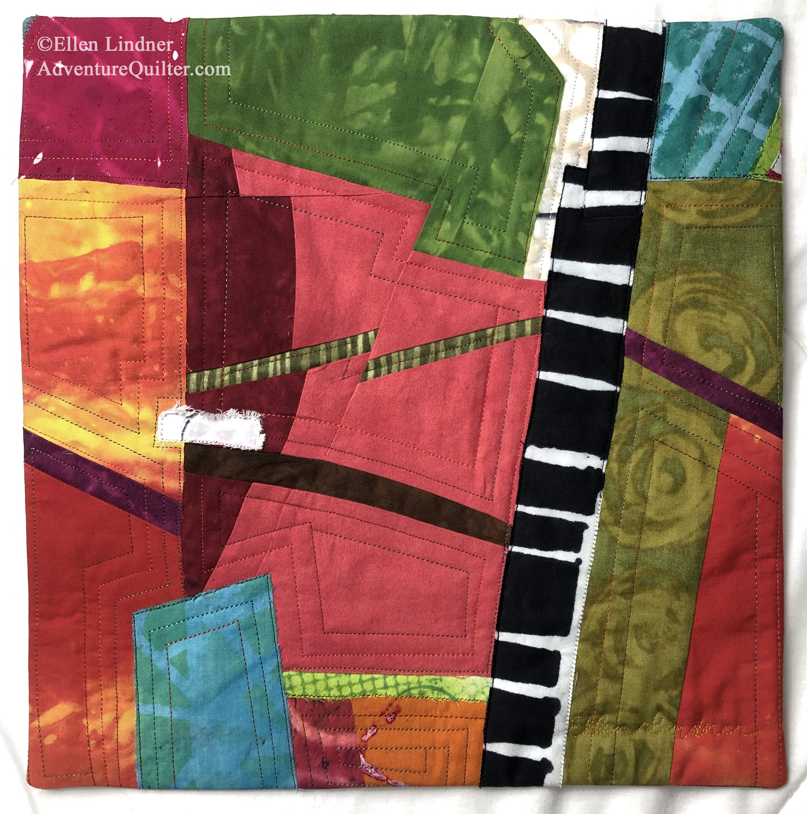
Here’s my latest little art quilt, And the Band Plays On.

I made it as donation for a SAQA (Studio Art Quilt Associates,) fundraiser which required a size of
12″ x 12″.

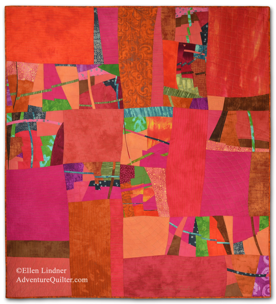
Fortunately, I had some leftover units from this quilt, which I used as a starting point.

Is it Hot in Here, or is It Just Me? An improvisational art quilt by Ellen Lindner. AdventureQuilter.com

Is it Hot in Here, or is It Just Me?

After that, it came together easily.

I sure have been lucky with leftover pieces lately!

Do you ever use leftover units in new pieces?

Ellen Lindner

0