Archive | August, 2022

“Textile Trends” Part Two

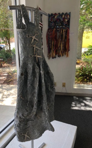
The recent “Textile Trends” exhibit, in Melbourne, FL included some very interesting pieces. This “oddball” dress was made with staples. I think it’s wacky and wonderful!

"Textile Trends" in Melbourne, FL. Ellen Lindner, AdventureQuilter.com/blog

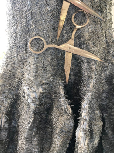
It’s called A Woman Prerogative (signage spelling,) by Lydia Friedland. Just check out this detail shot!

"Textile Trends" in Melbourne, FL. Ellen Lindner, AdventureQuilter.com/blog

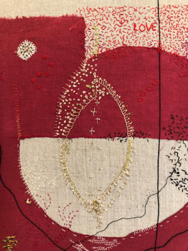
I loved the hand stitching on this small piece.
It’s called Wabi Sabi Red, by Grace Cormier.

"Textile Trends" in Melbourne, FL. Ellen Lindner, AdventureQuilter.com/blog

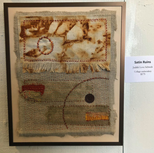
Here’s another small piece, with intentionally rusted fabric. And, again, great hand stitching. It’s called Satin Ruins by Judith Schwab.

"Textile Trends" in Melbourne, FL. Ellen Lindner, AdventureQuilter.com/blog

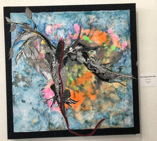
My off-kilter photography doesn’t quite do justice to this piece. It was made by Esta Rubin and is titled The Rising of the Dark.

"Textile Trends" in Melbourne, FL. Ellen Lindner, AdventureQuilter.com/blog

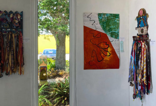
And, finally, my own piece – in the corner – called Miscommunication.

"Textile Trends" in Melbourne, FL. Ellen Lindner, AdventureQuilter.com/blog

There were some growing pains with this first-ever-textile-show for the gallery. But, I hope they’ll offer it again. There’s clearly plenty of great art to show off!

Ellen Lindner
P.S. See a better image of my quilt.

0

“Textile Trends,” in Melbourne, FL: Part One

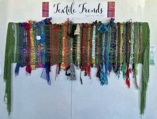
“Textile Trends,” and exhibit in Melbourne, FL is winding down in the next few days. (The last day is the 27th.) It was the first time Fifth Avenue Art Gallery has had an all-textile call for art, and the resulting show was pretty impressive.

This large weaving was made by Lois Mittleman.

"Textile Trends" in Melbourne, FL. Ellen Lindner, AdventureQuilter.com/blog

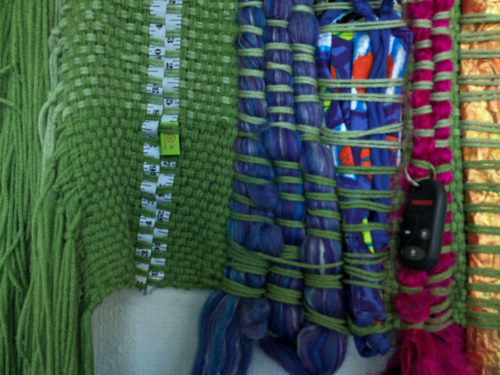
She found LOTS of interesting things to include! Measuring tape and bundles of yarn:

"Textile Trends" in Melbourne, FL. Ellen Lindner, AdventureQuilter.com/blog

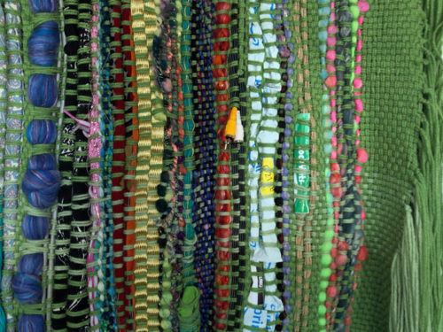
Electronic cables, and an Amazon Prime mailing bag:

"Textile Trends" in Melbourne, FL. Ellen Lindner, AdventureQuilter.com/blog

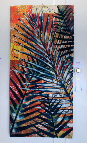
Nearby was this fabulous piece by Gabriele DiTota, called Bothered. 

"Textile Trends" in Melbourne, FL. Ellen Lindner, AdventureQuilter.com/blog

The palm is done with cyanotype. Made during the pandemic, she used a serendipitous dyeing technique for the background fabrics and included words like “Fear” and “worry,” reflecting her mindset at the time.

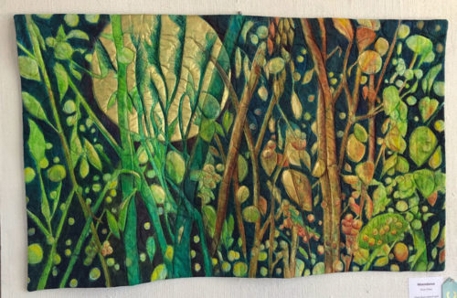
I also liked Moondance, by Doris  Hulse.

"Textile Trends" in Melbourne, FL. Ellen Lindner, AdventureQuilter.com/blog

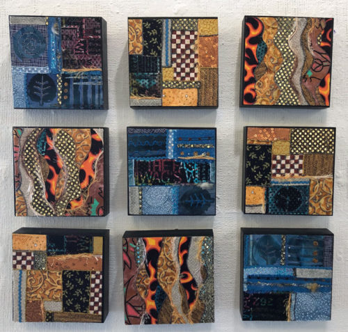
And here’s a great mixed-media piece from Jo-Ann Jensen.

Textile Trends in Melbourne, FL. Ellen Lindner, AdventureQuilter.com/blog

More images coming soon.

Ellen Lindner

0

Making Progress in Red

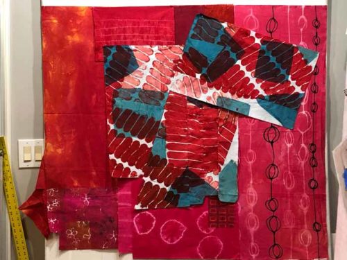
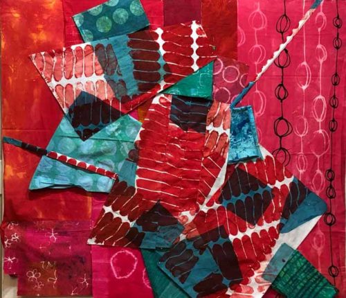
After trying several temporary background colors, I decided to make one side white and one side red.
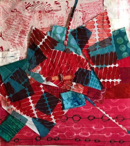
Ta.ckling That Red Fabric. Ellen Lindner, AdventureQuilter.com/blog

I started with a new temporary background. The purpose of this is so I don’t have to compose against my pure white design wall. It helps me visualize.
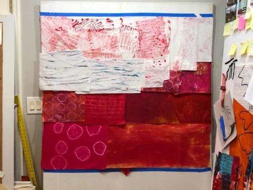
This was first stab at a new composition. I could see that I’d be able to create lots of energy, thanks to the sharp angles and high value contrasts.

But again, it seemed like the green squares against the white were, once again, taking over.
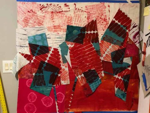
I removed them and liked them better. (Note: most of the green shapes are just folded and pinned in place. This works well for auditioning ideas. I’ll delay cutting fabrics until I’m convinced about what needs to happen.)

I removed all the squares. That helped immensely in the top half, but I thought the bottom portion looked a little naked.
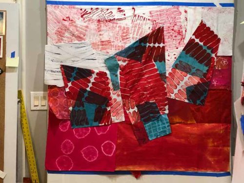
I added some squares against the red and I liked the effect.
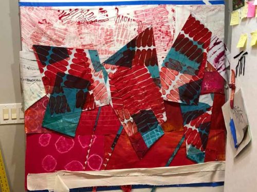
Art quiz: why did I previously decide to remove green squares from a red background, but here I’ve just added them back? Answer in P.S.

Next it was time for actual construction. It was time to remove those temporary background fabrics and switch in the ones that I’d need. In this photo I had just finished the first few red seams in the lower section.
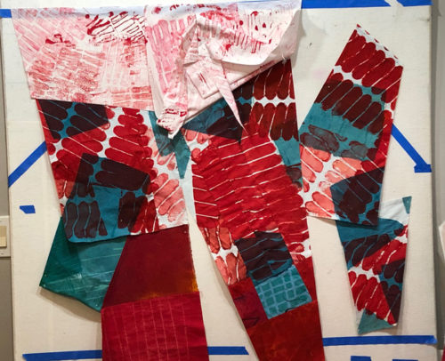
I’ll need to go slowly, select the right fabrics, and figure out how to “tetris” this whole thing together. I imagine it will be a little challenging, but I think it will be fun too!

Ellen Lindner
P.S. Answer to art quiz: It goes back to the fact that contrasts in value always attract attention. In my last post I showed  you how the green squares were taking over against the red. That’s because of the value contrast between them. But, in this post I added those greens squares right back to the red bottom. That’s because everything affects everything else. When I change the background to white I created VERY strong value contrasts between the sharp red shapes and the white background. Therefore, they attract attention. The contrast between red and green is now secondary and not as noticeable. Remember, when you make one change you often need to make another.
0

Tackling That Red Fabric

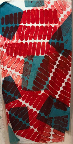
I was excited to work with the red and blue-green fabric I had recently died. I pulled out all my other dyed fabrics in those colors and began to explore my options.

This was the starting fabric.

Ta.ckling That Red Fabric. Ellen Lindner, AdventureQuilter.com/blog

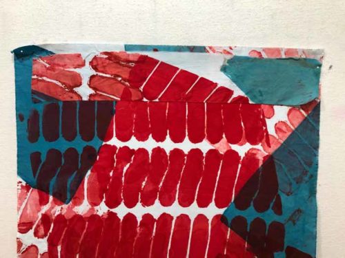
As you can see above, it was missing a chunk on the bottom right corner. So I evened that up, giving me a nice horizontal slice from the bottom. I intermediately looked to see where I might use it. What if I joined it back into the larger fabric at an angle? I auditioned the idea, below, and liked it. (Can you see how the red areas taper together?)

After a few more manipulations I was ready to see what happened on the design wall. Since I didn’t want to compose against a white background I put up a temporary red background and marked the proposed perimeter with tape. (The dimensions were determined by the width of my design wall, 4′, and the height of the primary fabric, about 42″.)

First “throw” at the design wall:

Then, with a little more intent:

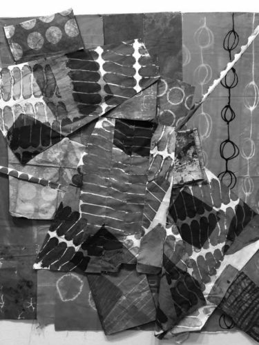
I was liking the energy, but I thought the red was actually disappearing. To confirm my suspicions I looked at the composition in grey scale.

Yep. The blue-green squares were taking over.

So, what if I made part of the background white? I changed the temporary background in order to try out the idea.

Ah, yes. Now THAT had potential!

It was time to lose the temporary background and to start fresh with this new idea. I was excited to move forward!

Ellen Lindner


0

Dyeing On a Larger Scale

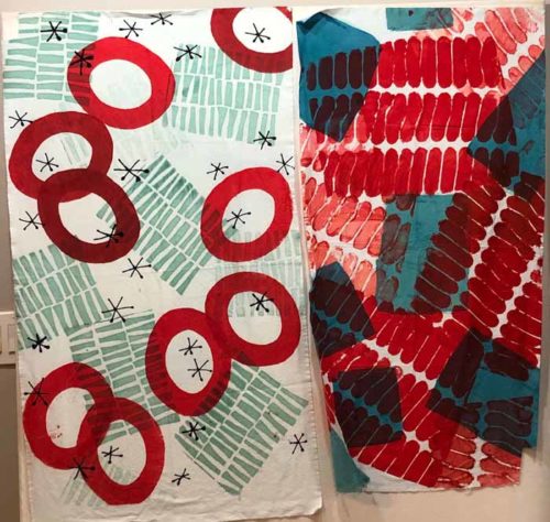
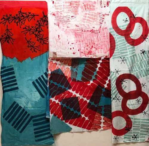
Lately, I’ve been trying to dye fabrics to a larger scale. I feel like I succeeded with the one on the right. I screened red on through some construction fencing, and then added some blue-green squares. It should be very usable.

Dyeing at a Larger Scale. Ellen Lindner, AdventureQuilter.com/blog

I like the large red circles on the left one, but the design reads a little  Christmasy. It will probably need further attention.

I’m drooling over the orange and blue “twiggy” fabric, below left. It will take a good bit of thought, I imagine, to figure out what to  do with it while till maintaining the “twigginess.” The pink and white fabric below was made as a “ghost print” from some red screening. I think it will work with some of these, too.

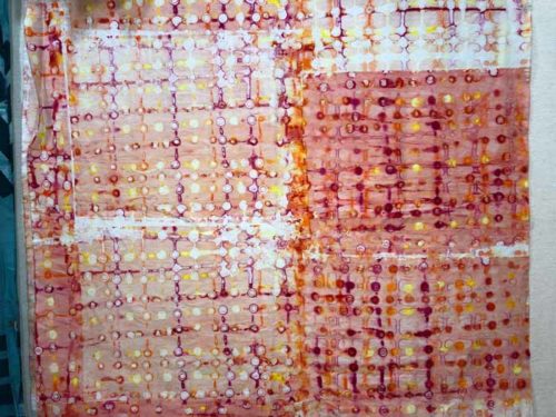
I also did some deconstructed screen printing. With it you let dye dry onto a screen and then later screen a color or clear paste through it. The original dried dye initially acts as a resist and later breaks down, adding its own color to the mix. With this one, I drew on horizontal and vertical lines using all my warm dyes: yellow, orange, red, and fuchsia, and let it dry (over 2 days!) I screened clear paste through, which eventually took on t he other colors and finished to a nice peach.This is detail shot. 

I don’t normally work with pastels so I’ll have to dye a few more to go with this one. I’ve got lots of fun stuff to think about!

Ellen Lindner
P.S. Each of these fabrics is about 43″ on the longest side.

10