A little more eye candy for you from the AQS Daytona show.
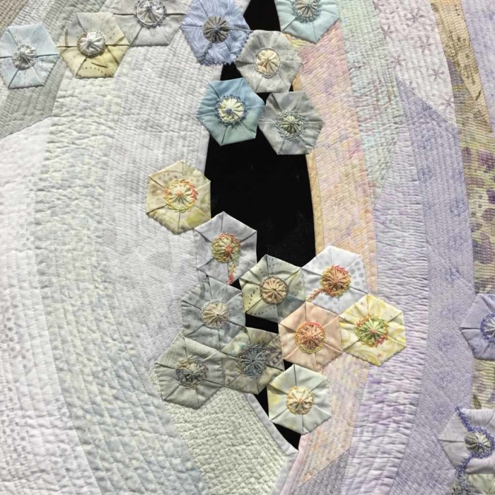
This is Petals in the Wind by Cassandra Ireland Beaver. (Sorry for the fuzzy phone photo.) There is no black in this quilt. The black you see are holes which show the black curtain behind.
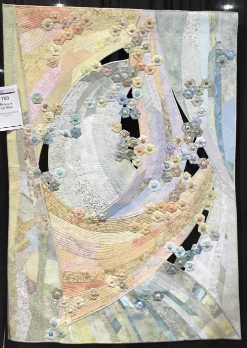
Wouldn’t this be pretty against a pale wall, with some excellent lighting? (To create shadows?)
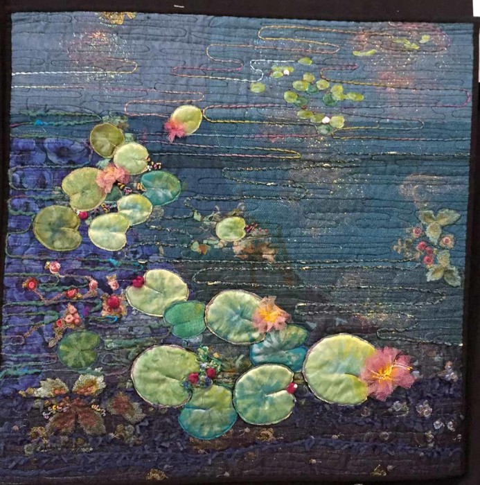
There was an exhibit of small quilts in which the makers had interpreted artwork of famous makers. (I didn’t catch the name of the exhibit.) I’m sure you can tell this one depicts the work of Claude Monet. It was made by Michelle Schaal, from France.
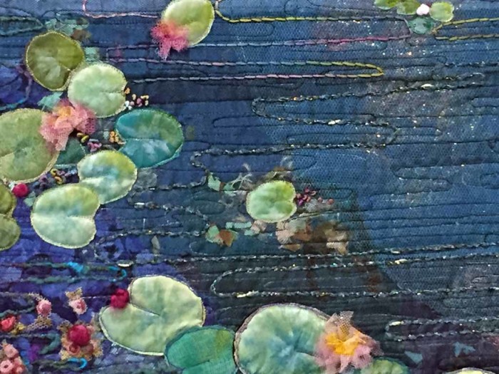
Although this detail shot is rather fuzzy, I thought you’d like to see the very effective way that couched yarns were used to depict the water. Especially the one with a little white in it. Those white bits look like sparking reflections.
One of the special exhibits featured quilts made by Karen Stone and her students. Windsor Gardens, was made by Karen. Although the leaf colors aren’t overly bright, when combined with the dark background they really pop!
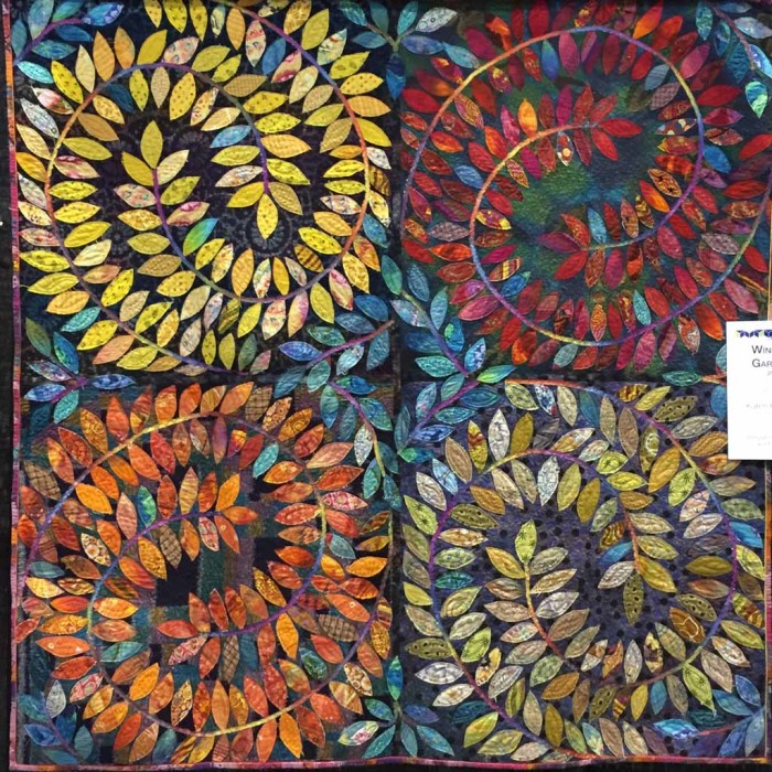
Check out the great variety in her leaf fabrics. Wouldn’t this be fun to recreate?
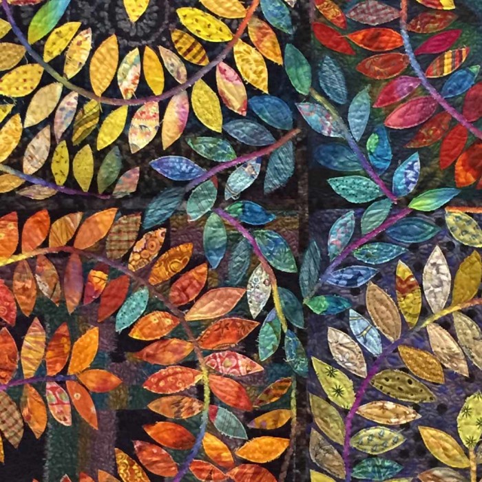
On an unrelated topic, why couldn’t something like this win “Best Use of Color?” It doesn’t always have to be something with complementary or bright rainbow colors, does it? Although beautiful, those combinations are very predictable. A quilt like this required more creative thinking and I really admire that. What do you think?
Ellen Lindner


Your art often reflects the intensity of the tropical colors of your environment. I think the slightly less bright colors are beautiful and more reflective of the Midwest – where I live. They happen to be my favorite palette. In either, I think the relationship of the colors and the ground help please our eyes. I love each of the quilts in this post- you have a great eye for color, balance and design.