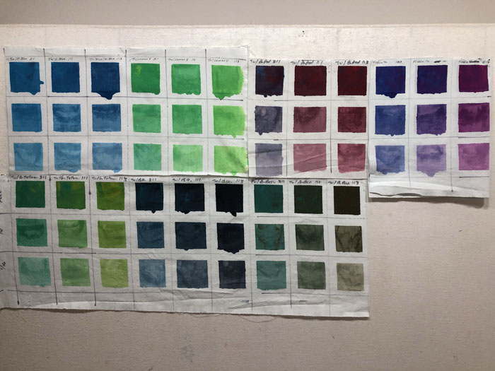
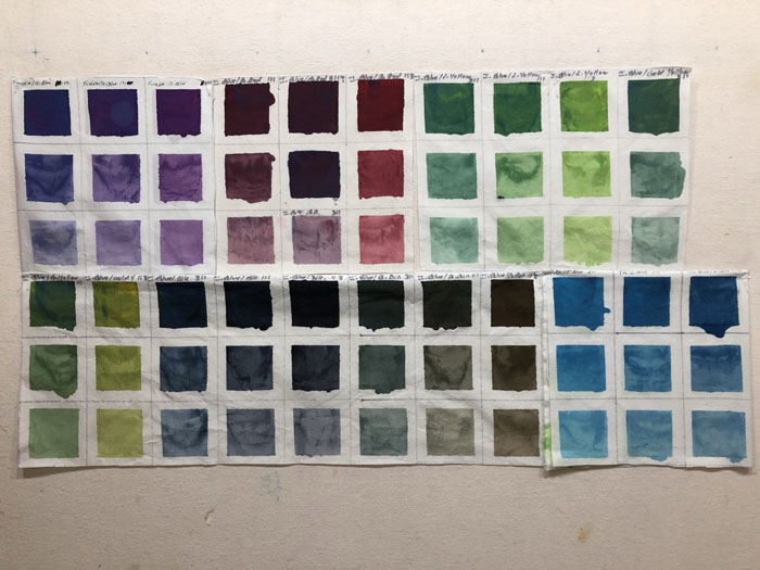
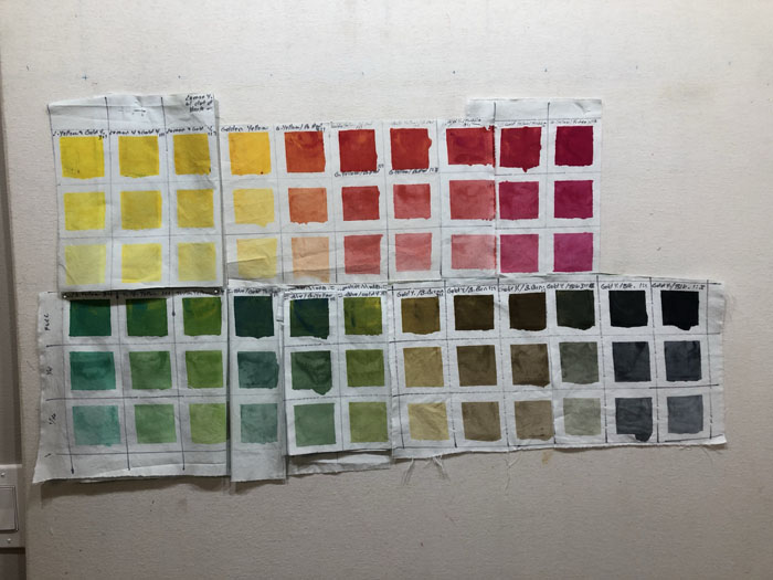
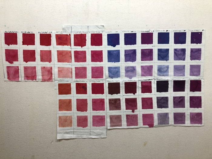
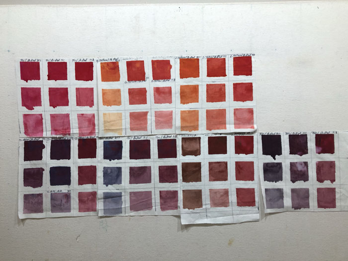
I stopped counting when I got to 250. TWO HUNDRED AND FIFTY unique color swatches! More than, actually. These are the swatches showing what each of 7 different basic colors looks like when mixed with the remaining color, Turquoise.
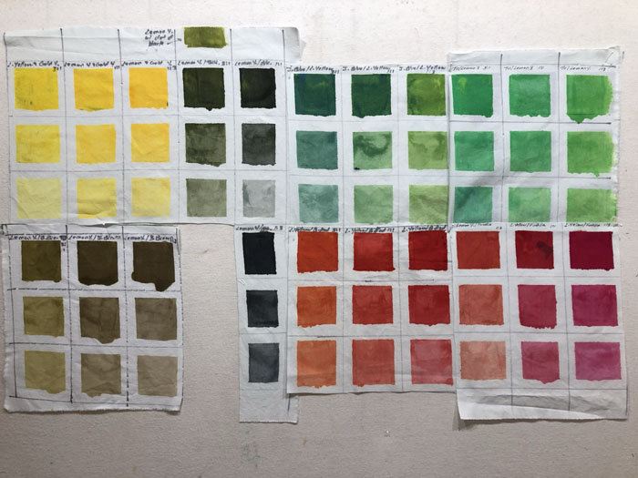
Each color combination has been mixed in 3 different proportions, and 3 different strengths. Here’s Lemon Yellow. The black I’m using has a blue cast to it. Can you see how greenish they look? (Just right of the 9 yellow squares.) A good thing to know.
Black: Some of these are lovely, aren’t they?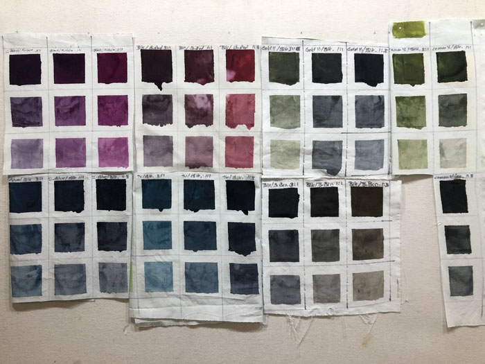
There was also a combo made with Basic Brown, but I forgot to photograph it.
Can you see how useful these will be? I’m going to sort them by color and glue them to card stock, with notes about the color combination and proportion. Oh, I’ll be so organized!
Of course, I also dyed some yardage. I’ll show you that soon.
Ellen Lindner



I am not clear in how you got all those colors? Are the mixed with the other colors or diluted with water?
Hi Ann. Good question. It’s a little involved. I have 8 basic colors that I use, with tangerine (T) being the newest. I mixed it in a variety of ways with each of the other 7. (I’m using thickened dye, so I can loosely “measure/eyeball” amounts.) For instance, with fuchsia (F) I mixed 3 different proportions: F1/T3, F1/T1, F3/T1. I did these one at a time. While I worked with each ratio I also added clear print paste to dilute the colors. I did this at 1/4 strength and 1/16 strength. That’s a total of 9 swatches with some combo of fuchsia, tangerine, and clear paste. And then I repeated that for the other 6 colors.
Of course, I labeled everything. Now, in my swatch book, I can quickly tell what combo/ratio to use to get a particular color and value.
Thanks for commenting!