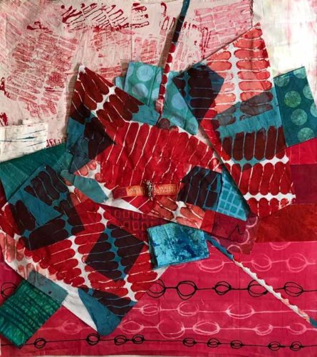
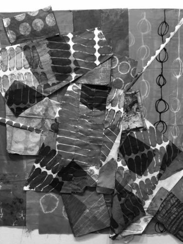
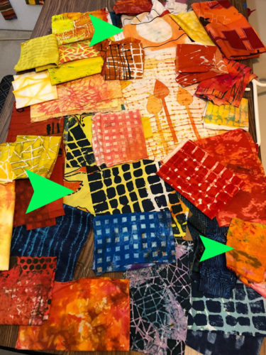
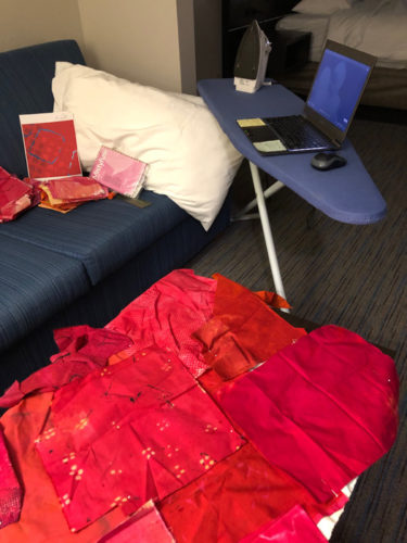
These were the fabrics I selected as I started on an abstract quilt with NO plan.
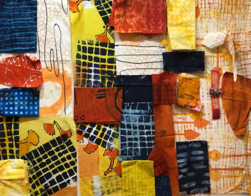
Although I didn’t have a plan, I did have a goal. I wanted to use the last of my favorite fabric, the navy and yellow grid, and to let it be the star of the show.
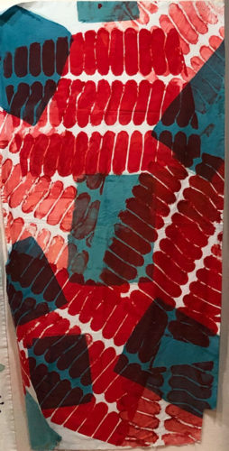
BTW, can you see how the scale of that one print greatly affects the scale of the overall piece? I wouldn’t want to cut it into tiny pieces, for instance.
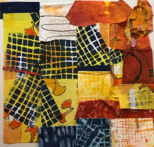
I had two lengths of the favorite fabric and I wanted to cut it as little as possible. I cut one piece into about a 1/3 – 2/3 split, so I had 3 pieces.. Since this fabric has the highest value contrast (light vs. dark) of all the other fabrics, I knew it would attract a lot of attention. Which was good.
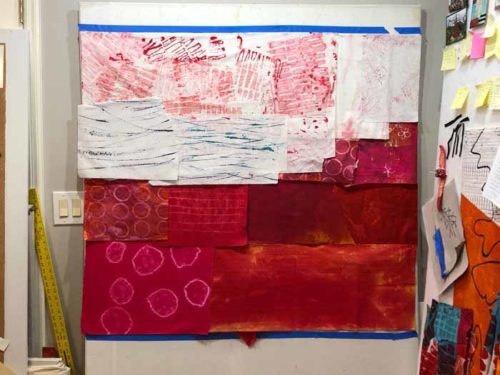
Therefore, I moved everything else out of the way and created the first part of the composition with just these 3 pieces of fabric.
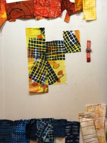
Because this fabric had a diagonal aspect to its design, it created a lot of energy. Plus, as you can see, I made sure to offset the pieces. I really liked this starting point! I knew I’d have to pay attention to the value contrasts that developed throughout the rest of the design, making sure that none of them drew attention away from it.
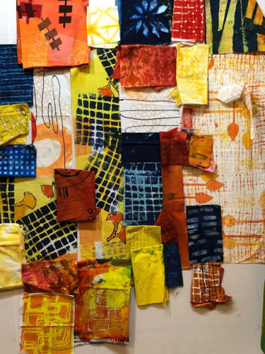
In the photo above you can probably tell that the left fabric is folded under at the bottom. I cut that off and added it to my starting composition, (see below.) I wanted to break up the large expanse of grid on the left piece and inserted a skinny orange strip (shown in the next photo.) I liked it a lot.
I let the fabric lead my next few decisions: adding more yellow and orange in their respective areas.
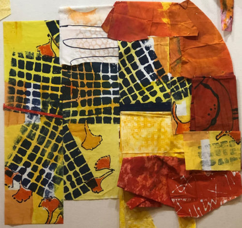
As you can see in the photo above, I didn’t have large pieces of orange, so I knew I’d have to piece those together. I thought I’d probably repeat the orange in the lower right, as well. Adding navy would be tricky. It would automatically create a very high value contrast, attracting attention. I’d have to consider it very carefully.
And what about that white in the top center of the photo above? Although I liked the fabric in the mix, it was right next to the navy grid, creating exactly the problem I was hoping to avoid. I did add some navy just right of center and I thought it worked there.
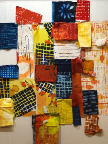
Next round. Navy top left: too strong!
Navy at the bottom: maybe.
White at the bottom right: maybe
Next round. Replaced top left navy with yellow-orange: MUCH better! (Low contrast, right?)
More navy at the bottom: probably. The navy is visually weighty which gives the piece some stability.
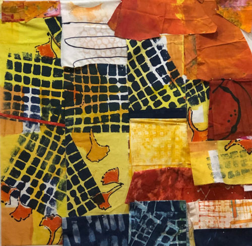
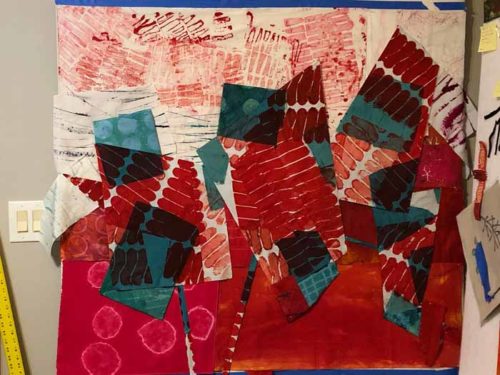
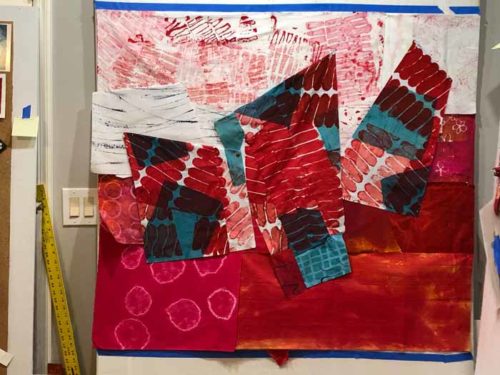
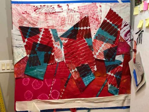
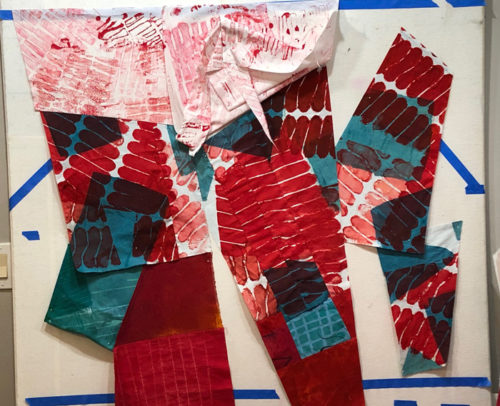
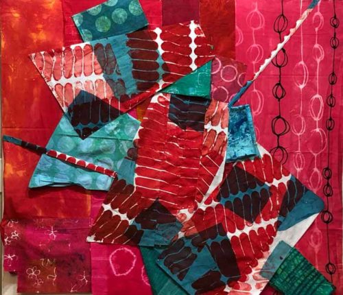
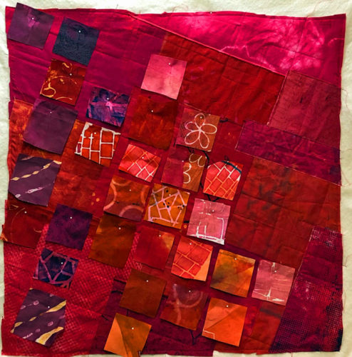
This hodge podge of scraps pinned to the design wall evolved only slightly as I began to figure out how to piece all of this. See the finished quilt in my next post.
Do you think about value this much? I find it very helpful, although sometimes I get seduced by a color or some such and forget to pay attention to the contrast.
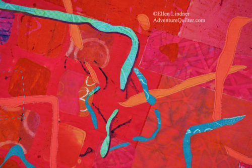
Ellen Lindner

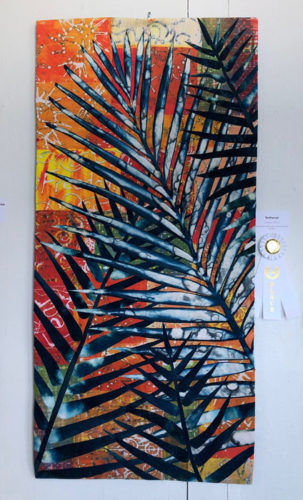
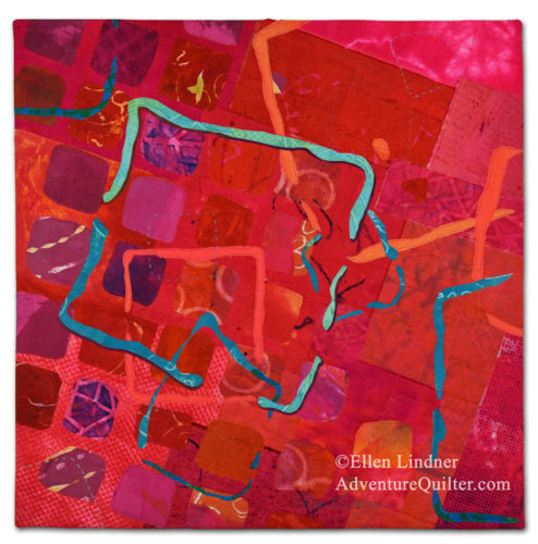
 Adrenaline Rush